App Icons - 4 Questions to Guide Your App Icon Design
November 13th, 2015


by David Bell
CEO at Gummicube, Inc.
App icons.
They are the
first thing potential users see when they open the app store. Curated app selections from "Best New Apps" and "Shopping Essentials" on Apple's App Store to Google Play's "New and Updated" are 80% icons. App icons
are how users find your app on their device once they have it installed. Notifications include app icons which provide an immediate visual cue for identifying the sender. A mobile app icon helps convert app listing views to installs and users, and helps to retain these users.
How do we make sure we have an app icon that drives results?
Here are 4 questions to ask about your app icon:
Does it help tell the story and sell the unique features of your app?
Part of developing an app store optimization strategy is identifying your app's most essential and differentiating features.
Does the app icon help to illustrate or support what's special about your app? Here are some good examples for calculator apps (I'm using the desktop view of the App Store as it is easier to see all of the icons): 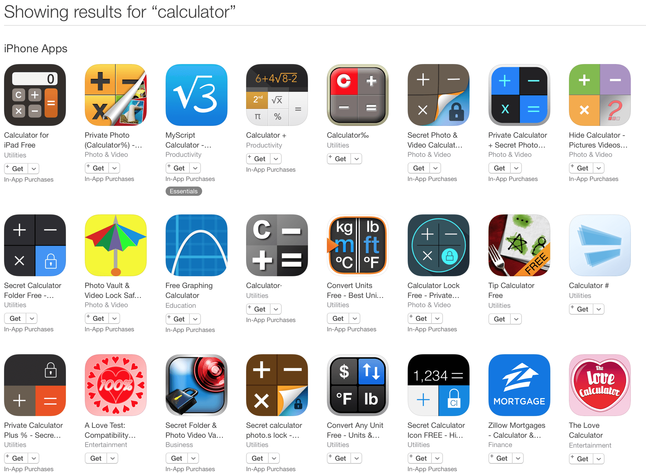 I didn't realize this was "a thing" until creating this post, but apparently there are hidden picture/file apps that appear to be calculators, but open to the hidden files when the correct password is entered. Sneaky!
And also represented well by the icons. Users can instantly determine which calculator apps are these vaults, or are for tipping or converting units of measurement. If your screenshots are feature-focused (they should be), an icon that aligns reduces confusion and reinforces the main features of your app.
I didn't realize this was "a thing" until creating this post, but apparently there are hidden picture/file apps that appear to be calculators, but open to the hidden files when the correct password is entered. Sneaky!
And also represented well by the icons. Users can instantly determine which calculator apps are these vaults, or are for tipping or converting units of measurement. If your screenshots are feature-focused (they should be), an icon that aligns reduces confusion and reinforces the main features of your app.
Note:
If you have a brand that is readily identifiable by your target market - you should absolutely incorporate it. Hotels.com, Kayak, Facebook and Tweetbot (for example) don't need to be feature forward in their app icon because those who are familiar with their brands already understand the features and benefits (at least as well as what could be communicated in an app icon). Under Armour does both - for their brand specific apps, they use their logo. In apps that serve a specific purpose - the add the logo to the feature-forward icon. 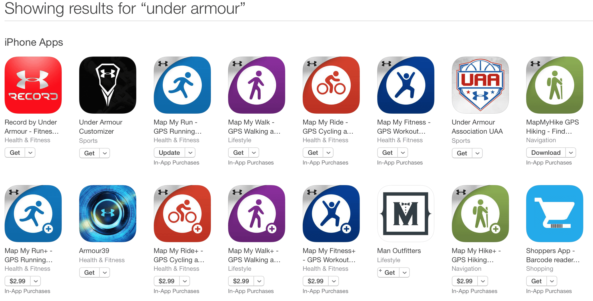
Does it align with your target audience?
Features and benefits don't exist in a bubble, features provide benefits to someone and that someone is your target market. Age, gender, location, language, and the
subject of the app all should have an impact on the app icon design. A good starting point is reviewing competitive and complimentary apps used by your target audience. Once a few design directions are established, testing icon designs with a focus group made up of your target market is ideal. Who better to test
an icon's impact on specific actions, and receive qualitative feedback from than who you are trying to reach? Focus groups provide a tool for testing bigger variations in app icon designs without negatively affecting actual results in the app store. Once an app and app icon are published and live, Google provides a tool for A/B testing called experiments - where small adjustments can make a big difference.
Does it stand out against its search competition?
Using the keywords and phrases you are targeting in your ASO efforts, compare your app icon with other in those results. Does it look the same as the others?
Does it stand out in any way?
Are you following Google and Apple design guidelines?
Both Apple and Google provide style guides for icons or for the desired user experience in general. Stray too far from their recommended approach and you risk being passed over for featured spots or other manually curated lists. Google's style guide is here. Apple's is in the developer
portal.
Other tips:
remove the standard gloss that Apple adds
keep it simple - icons are small
keep it consistent with your app screenshots
Want some mobile app icon inspiration?
Similar Articles

Posted on October 6th, 2023
Ghostly happenings are among us... and in your app listing too? If you aren't leveraging the power of app seasonality to make relevant tweaks to your store listing you're leaving precious engagement and conversions on the table.

Posted on November 8th, 2021
Developers on the iOS App Store should plan in advance of the upcoming Holiday Schedule to allow enough time for apps to get approved during the busy holidays.
Posted on November 1st, 2021
App Store Optimization is an involved process that should be regularly revisited based on recent changes in trends. Iteration is one of the key drivers for success in ASO.