
App Store Holiday Schedule 2020
Posted on November 23rd, 2020
When is the App Store Holiday Schedule 2020? Learn about the dates of this year's shutdown and how to prepare.


Google Play has updated with a new way to design app icons. These provide dynamically rounded corners and remove shadows, creating a more uniform shape throughout the Play Store. As developers create new icons for their apps, they should consider the App Store Optimization best practices for creative assets and the value that icons provide to an app.
Starting in April, developers will be able to upload new icons to the Google Play Console using the new specifications, although icons designed with past specifications will still be accepted until May.
The icons will remain the same size, but transparent backgrounds are no longer allowed. Instead, the icons will take square shapes with rounded corners, with a consistent corner radius across the Play Store. Google Play will dynamically add a drop shadow around the icon, so developers can create shadow and lighting within the artwork, but not on the final asset of the icon itself.
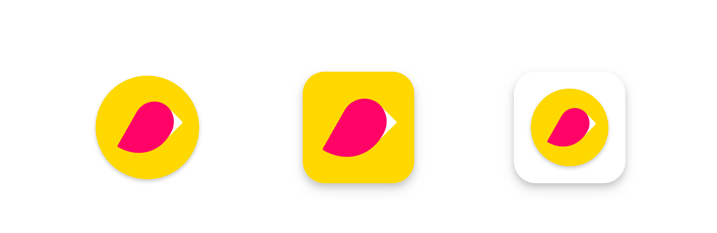
Original icon, new icon and original icon in legacy mode. Photo via Android Developers Blog
Starting in May, any new icons uploaded to the Play Console will have to follow the new specifications. Original icons will remain unchanged, until they’re converted to “legacy mode” on June 24th. “Legacy mode” icons display the original icons, scaled down to 75% of the keyline grid size and placed within a box shape.
Per the specifications, the icons should be:
Developers only need to provide a full square version of the icon – Google Play will dynamically mask it to handle the rounded corners.
Google has provided some recommendations for working within the new design specifications. For icons utilizing logos, developers should utilize the keyline grid to fit them in, rather than try to make the logo itself fill up the entire space. Icons can use background colors that complement the brand icon to maintain the iconography and imagery while keeping the icon uniform with the new designs.
For illustrated artwork, on the other hand, it should be designed to fill the space. If developers try to design icons with different shapes or corners, they may not look right when added to Google Play. Instead, filling the space in the corners with the knowledge that it will be rounded ensures effective designs.
Embedded badges in the corners of icons are not recommended, as they will be partially cropped out when the image is rounded.
An app’s icon is an important cornerstone of its creatives. On Google Play, the icon is typically the only visual representation of the app users see before they click on the listing, so it has to make a powerful first impression. A good icon can help an app’s click-through-rate (CTR) by engaging with users and encouraging them to click and see what the app has to offer.
App icons should reflect the core value of the app, whether it’s a helpful tool for everyday life or a mobile game. As icons are small, they should be clear and easy to understand at a glance. That is why apps associated with certain brands or companies often display the recognizable iconography of their brand on the icon, while games will include a logo or close-up images of a character.
Now that Google Play is changing the style of icons, developers will want to begin adapting their existing icons to match the new styles. This may involve adding a new background color, as opposed to transparent backgrounds, or expanding existing designs to fit the square shape.
If icons are left alone to convert into legacy mode, they could lose their intended presentation and impact. This could have a negative effect on CTR and conversions.
Keep in mind that the icon changes only impact the Play Store – the Launcher icons will remain unchanged. Android launcher icons can continue to use adaptive icons, providing more variety and customization for the icons once the app is downloaded.
There is time to design and test new icons before the changes begin rolling out in April, but the icon’s importance cannot be underestimated. It is key to the app’s brand and identity, as well as a major player in improving an app’s CTR, so the icons must be designed with intention and care.
Want more information regarding App Store Optimization? Contact Gummicube and we’ll help get your strategy started.
When is the App Store Holiday Schedule 2020? Learn about the dates of this year's shutdown and how to prepare.
Apple's App Store Guidelines have strict privacy requirements. Developers now must provide information to users on the App Store listing regarding the data they access.
The Google Play Developer Console has been updated with a new design and adjusted tools. What's different, and how will it impact App Store Optimization?