App Icon Optimization
September 22nd, 2023
 Tagged: Research, Creatives, Icons, App Icon Optimization
By Anh Nguyen
COO & Co-Founder at Gummicube, Inc
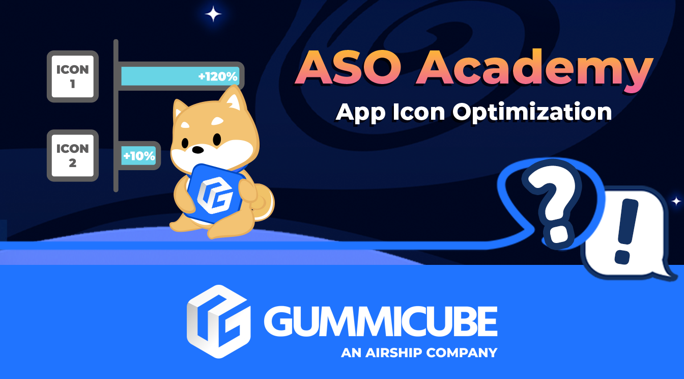
No app listing element goes untouched when it comes to App Store Optimization, especially your creative assets. And what creative dictates a first impression more than the App Icon?
Your App Icon plays a significant role in drawing users to the app and driving conversions. Creating an optimized icon is essential to your ASO, but where do you begin?
App Icon Design Research
The first step to creating a quality app icon is through competitive research. Start by looking at leading apps in your niche to see if there are any recurring design styles or themes that would be applicable to you. Approaching your app icon optimization this way gives you the opportunity to identify winning strategies as well as gaps in competitor listings.
Mobile games will often include a central character in their icon, as we can see with several of the games listed on Apple Arcade. At the same time, there are many ways these characters can be presented. What kind of expressions do they use? Are they humans or mascot characters? Are the backgrounds detailed or just a general color?

This same research can be applied to other categories. Music player apps will frequently use musical notes and related symbolism for their icons - out of the top five “music player” apps, four include a musical note. At the same time, there are still elements like color choice to be considered.

eBook apps may frequently use different styles, such as minimalistic designs or bookmark symbolism. Looking at some of the top eBook apps in Google Play, we can see that the use of books is prevalent, calling back to the app’s core feature. If you are developing such an app, you may want to see how you can use similar designs while making your icon stand out through unique branding.

App Icon Best Practices
Understanding what elements users respond well to is important, but you must also be able to put that information to good use. Below we’ll list a few ASO best practices that will let you take those design elements and turn them into an effective app icon.
- The icon needs to represent the app, whether through brand iconography or relevant visuals
- Maintain consistent branding with the rest of your creative assets
- Keep the design simple, due to the small size and limited space of the icon
- Use minimal text; single words or titles will be visible but avoid filling the image with too many characters.
Best Practices in Action
We can look at several apps on the App Store or Google Play Store to see how their icons follow these best practices.

The Monopoly Go icon uses an identifiable brand character familiar to users of the board game. It leverages its established identity to create an easily identifiable icon.

Snapchat maintains consistency throughout its creative assets, using the same yellow color scheme for its icon and screenshot sets.

I am includes short text on its icon to call out the name of the app while utilizing brand-relevant colors and font that are consistent throughout the rest of its app listing images
All of these icons use a core design or visual element that establish or reinforce the brand design without cluttering the icon. That makes them easy to find and identify while searching on the App Store and Play Store.
Mobile A/B Testing
Mobile A/B testing is essential for any App Store Optimization strategy. Running A/B tests lets you identify what performs best and build on your successes, so continuously experimenting with different icon designs is essential.
While conducting your A/B tests, you may want to test two or more variants. What color scheme do users prefer? Does a character work better with their mouth closed or open? Does the icon perform better with or without text? You can find out what works best by running A/B tests.

Apps will frequently change their icon designs based on what performs best. Pandora, for instance, changed its icon from a solid blue P to one with a blend of colors that create a wave-like pattern to then its current logo that uses the same color scheme with a different design within the P.
One Test at a Time
While testing, be sure to change only one element at a time. If you test both a new icon and description, you won’t be able to tell if the changes in conversions came primarily from one or the other.
If you change your icon’s color scheme and character choice, it could be that users respond positively to one change but negatively to another. By isolating and testing individual aspects, we can identify the top-performing variants.
Testing in Two Territories
If your app is available in multiple regions, you may want to run a test in a territory that provides a smaller but similar audience to your main target. This will depend on where your app is live and what territories you’re focusing on.
For example, running A/B tests in Canada can provide feedback that can be used for your app in the United States, which also gives you time to test different creative sets in the US. This can help you experiment and optimize your app without compromising any tests by changing multiple aspects at once.
App Icon Optimization - Get Started
Your app icon creates the first impression for your app, whether users see it in search results, on a featured list or from an ad. That first impression can dictate whether a user engages with your listing or passes on.
By researching your category, following ASO best practices, and performing A/B tests, you can help ensure your App Icon is performing as well as it possibly can.
Need help with your app icon? Contact Gummicube and we’ll help you get started.
More blog-posts like this:
App Store Screenshot Dimensions & Guidelines
Make sure your app stays compliant with the latest App Store Screenshot Dimensions & Guidelines here
Apple Contingent Pricing
Soon developers will be able to extend their customer lifetime value with a handy new way of providing subscription offers directly through Apple. Contingent Pricing looks to act as a revolutionary new system for leveraging new upsell & cross-sell opportunities all within Apple’s ecosystem.
A/B Testing on Google Play
Have you ever A/B tested your Google Play listing? If not, you're probably navigating the Play Store marketing blind, and leaving valuable installs on the table.