App Store Creatives: The Movie Edition
August 5th, 2024
 Tagged: Streaming Apps, Movie Apps, Screenshots, Creatives, Tips
By David Bell
CEO at Gummicube, Inc.
In an app store we only have a matter of seconds to convince a user to click through and install our app. To highlight the importance of this, here we’re focusing on the creative designs of a couple of apps in the streaming vertical: Redbox and Google TV.
We’ll point out The Good, The Bad, and The… ‘Missing.’ None of them are really “ugly”, but we’ll dive into what may be missing from an App Store Optimization perspective.
First, let’s go over some of the general best-practice methods for creatives for the iOS App Store.
App Store Creative Tips
Almost 70% of downloads in the iOS App Store happen in search. The importance of the title, subtitle, and first three screenshots that appear in the search result can’t be understated.
While the words we choose for the title and subtitle must speak to both the algorithm and individual, for creatives it is purely targeted for the human eye.
The obstacle we must overcome as app store promoters is that our creative must inspire and teach the user within a few seconds. On a broad spectrum, honing in on a few basics acts as a starting point for further development and testing:
- Large text and succinct messages. Give them the appetizer, not the full menu. As the user scrolls, they may only give your app 2-3 seconds to read before they move onto the next app. In order to allow the user to understand app functionality or major value propositions immediately, screenshots need to use large fonts with brief text.
- Key features in action. What will the majority of the market enjoy most about the app?. Should it be a figurative display of what the user gets out of the app, or a literal snapshot from within the app with some post-production? Are you separating each of the first three screenshots into their own messages, or are they all connected in one visual display? Whatever is key for your app or from a user’s perspective should be prioritized in your screenshots, but these are also some of the things we can A/B test.
- Use most or all of the screenshot allotments. Developers have the option to use 10 screenshots for app store landing pages. After the first three screenshots, use the rest to highlight the secondary features of the app. Best practice doesn’t necessarily mean to use all 10 screenshots in every case. Lifestyle apps, for instance, could sum up their messaging in 3 to 5 screenshots. Entertainment apps usually have so much content and a variety of tastes to accommodate that, generally, the first 5 screenshots may not be enough. If a user is enticed to click through to your landing page, rather than download from search in iOS, you must tailor to their desire to learn more.
Let’s dig into Redbox and Google TV.
Redbox

The Good
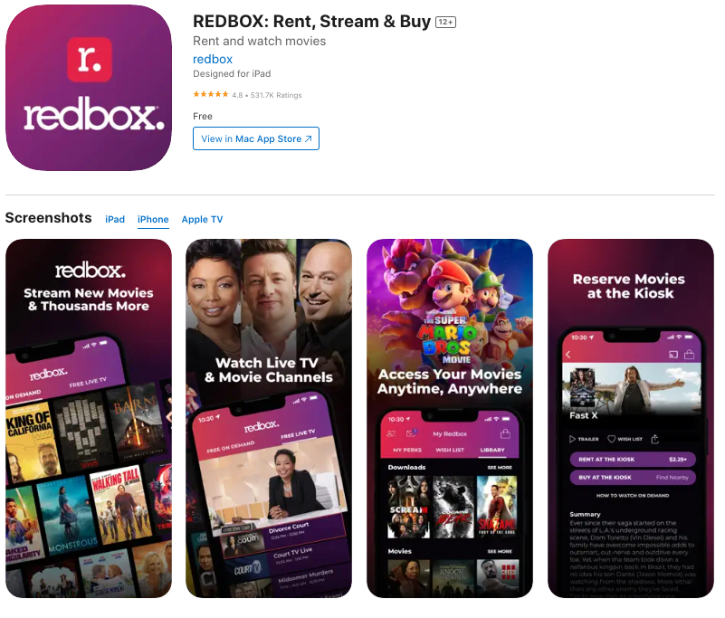
The breadth of film and TV content displayed in the first two screenshots works to show Redbox’s breadth. Redbox offers new movies, old movies, and live TV. The font is just large enough so that it is easy to read. The text length is ideal, with only a few words per line, and only two lines per screenshot.
The Bad
When Redbox says “Access your movies anytime, anywhere” in screenshot #3, it can be seen as redundant. This message is already implied in screenshot #1 when they say “Stream new movies…”
Instead, Redbox would benefit from moving the messaging of screenshot #4 to the #3 position. The ability to reserve DVDs at a kiosk is a large differentiator for Redbox compared to its competition.
To briefly touch on their metadata, Redbox is using a redundant keyword in its title and subtitle of “rent,” which is taking away from their ability to target even more keywords.
The Missing
Redbox competitors show at least one or two images of blockbuster movies in initial screenshots. Presenting that in one of the first two screenshots may be useful so that a scroller knows the breadth of the movies offered by Redbox is at least similar to its competitors.
Google Play Movies & TV

The Good
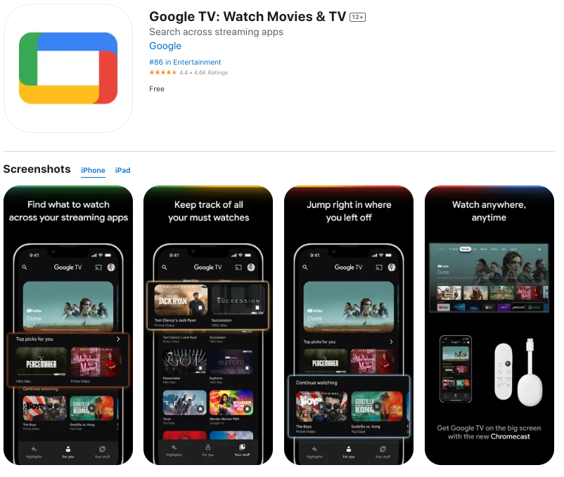
If this is their goal, then Google TV is doing a good job of capturing Sci-fi and Fantasy enthusiasts because around half of their screenshots are representative of that.
Google presents a platform to integrate other streaming apps into a seamless experience with their first two lines of text in screenshot #1. This is a good differentiator compared to competitors. Today’s content consumers have the blessing and curse of being able to access so much content across various streaming apps, so being able to consolidate this into one app or platform creates a good user experience.
Three out of the 4 screenshots have a good use of text length and font size.
The Bad
Movie banners are repeated on 3 of 4 of Google TV’s preview screenshots. Why are we limiting our market? Expand it by including images of children’s, romance, documentary, and sports movies to name a few.
Let’s talk about screenshot #3. As this blog is written it’s 2024, and Google TV finds it necessary to highlight that after pausing a movie its users are able to continue playing where they left off. This could be around letting users pause in their other streaming apps and picking up where they left off within the Google TV app but without the visual context, Google is effectively antiquating themselves.
The Missing
Google could continue the theme of consolidation and feature a more interesting perk, such as Google TV’s integration with Google Assistant. This allows people to control various smart home devices from their TV.
Getting a bit sweaty from this horror movie? “Hey Google, turn down the temperature in the house by three degrees.”T-Rex about to roar and you can’t find the remote? “Hey Google, turn down the volume by half so I don’t wake up the baby.”
In Sum
Designing creatives for app stores combines a short list of technical musts (font size, number of words used, and dimensions depending on the device), visual presentation of features and benefits, capturing the must-haves, and having context that you have seconds to convert someone.
Avoid redundancy and unnecessary messages. If you show the umbrella in screenshot #1, then the user doesn’t need an explanation in screenshot #2 that it blocks rain.
There isn’t an exact science behind executing all these decisions perfectly, but we have the ability to lean on A/B testing and historical data. No matter what happens on your next set of creatives–success or failure–you will have the knowledge to adapt accordingly.
More blog-posts like this:

App Store Keyword Search Volume: What You Need To Know for ASO
When your keyword strategy aligns with how users actually search in the App Store, your app is positioned for sustained growth and long-term success. Read more!

How Can I Help New Users Find My App?
By aligning your strategy with platform differences, optimizing metadata, & leveraging data-driven insights, you can boost your app’s visibility & performance.

Leveraging ASO Tools to Boost App Conversion Rates
Developers who rely on data-driven insights gain a significant advantage, enabling them to optimize their App Store presence with precision and confidence.
