How App Icons Can Make or Break Your App's First Impressions
August 1st, 2025
 Tagged: App Store Optimization, Aso Strategy, Aso Services, App Metadata, App Ranking
By Anh Nguyen
COO & Co-Founder at Gummicube, Inc
Imagine you’re searching for a new productivity app, and a dozen options populate the App Store screen. They all promise to help you work smarter, faster, or more efficiently. But which app do you tap first?
For many users, that decision begins with the app icon.
While app keyword research and screenshots often dominate the App Store Optimization (ASO) conversation, app icons deserve just as much strategic attention. A strong app icon can draw users in. A weak app icon can deter new users, regardless of how optimized your metadata may be.
First impressions are everything, and your icon is the first piece of visual real estate that represents your brand. Optimizing is an essential component of your overall ASO strategy. If your icon fails to align with platform standards or user expectations, you are missing out on valuable conversion opportunities, no matter how well your app performs.
WHAT MAKES A GOOD APP STORE ICON?
A good app icon does more than just “look nice.” It needs to capture the user’s attention, immediately communicate the app’s value, and support the app’s positioning all within a very limited amount of space. It’s a brand signal, a conversion asset, and a visual differentiator rolled into one.
At a glance, an app icon should be:
Visually distinct and memorable
Aligned with the app’s purpose or category
Compliant with platform-specific guidelines
Designed with scalability and cross-device clarity in mind
Easy to identify, even at small sizes
Aligned with your app’s color story and brand tone
A high-performing icon communicates trust and credibility in an instant. A weak one can suggest inexperience, neglect, or low quality, even if the product behind it is solid.
Your app icon competes in a visual lineup with dozens of others, often in just a few seconds. That makes design decisions like color scheme, simplicity, and clarity even more critical. Visual clutter, irrelevant imagery, or off-brand styles can directly impact your app’s conversion rates.
While the “ideal” design varies by category and audience, both Apple and Google provide detailed icon guidelines. Following these guidelines not only ensures compliance but also helps unlock the visual polish users expect from high-ranking apps.
APPLE APP STORE APP ICON BEST PRACTICES
Apple is meticulous about how it wants icons to appear. Their design documentation emphasizes depth, responsiveness, and visual harmony. With the introduction of newer system-wide features like Liquid Glass, the icon’s interaction with light, color, and motion has become even more important.
Here are a few key principles Apple wants developers to follow:
1. Layered App Icon Design with Depth Apple encourages a layered approach that gives icons dimension and liveliness. This includes:
Clearly defined edges in foreground layers
Strategic use of opacity to enhance depth
Subtle gradients in background layers
Responsiveness to lighting and device movement
For example, when users move their devices, the icon subtly shifts, creating a responsive effect that feels native to the platform. This type of detail signals polish, which can improve trust and engagement.
2. Use Vector App Graphics When Possible Apple strongly encourages the use of vector formats like SVG or PDF for scalability and clarity. Raster images can be used for specific textures or effects, but vectors tend to render much cleaner across different screen resolutions and devices. Vector files also allow for easier refinement in Apple's Icon Composer tool, which previews how design elements behave under system effects.
3. Avoid Overly Detailed or Crowded App Designs Overloading your icon with fine details or excessive layers does not increase its effectiveness. In fact, it often has the opposite effect. At smaller sizes, fine details get lost. Icons become blurry or unreadable. Simplicity and contrast lead to better recognition and stronger user recall.
4. Avoid App Icon Text Unless Necessary Most app icons do not need any text. Brands that rely on a single letter or shape (such as Duolingo, Instagram, or Gmail) tend to perform better in crowded visual environments. If text is required for brand identity, keep it minimal and readable.
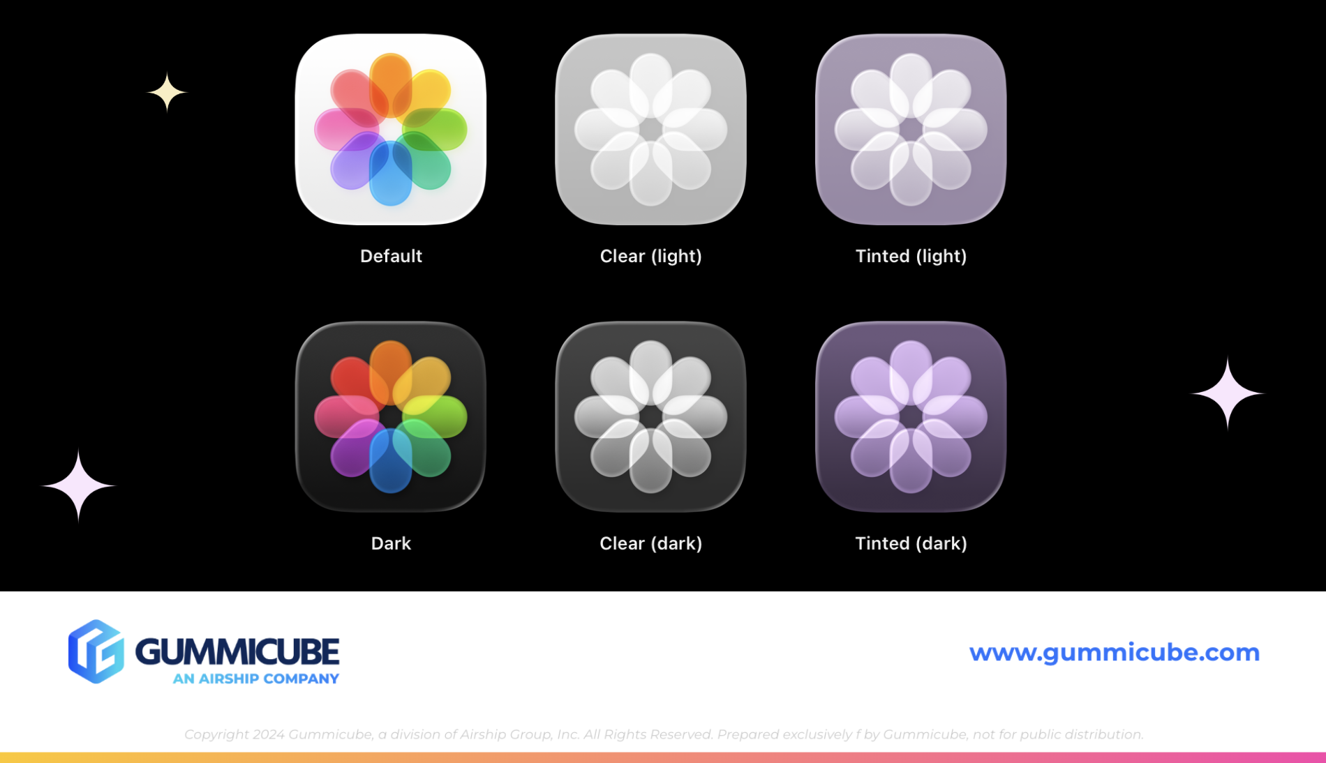
5. Consider App Icon Theme Customization Users can now adjust how app icons appear based on their preferred themes like light, dark, clear, or tinted. Icons that are overly dependent on shadows or light-based illusions may not perform consistently across modes. Designing with theme adaptability in mind ensures consistency in user perception and prevents degradation in visual quality.
6. Follow Required Specs Apple requires app icons to be:
Square shaped
1024x1024 pixels
Rounded corners
Layered for compatibility with visual effects
Optimized for all appearance types, including default, dark, clear light, clear dark, tinted light, and tinted dark
Icons that ignore these standards risk rejection, inconsistent rendering, or diminished discoverability in App Store placements.
GOOGLE PLAY STORE APP ICON BEST PRACTICES
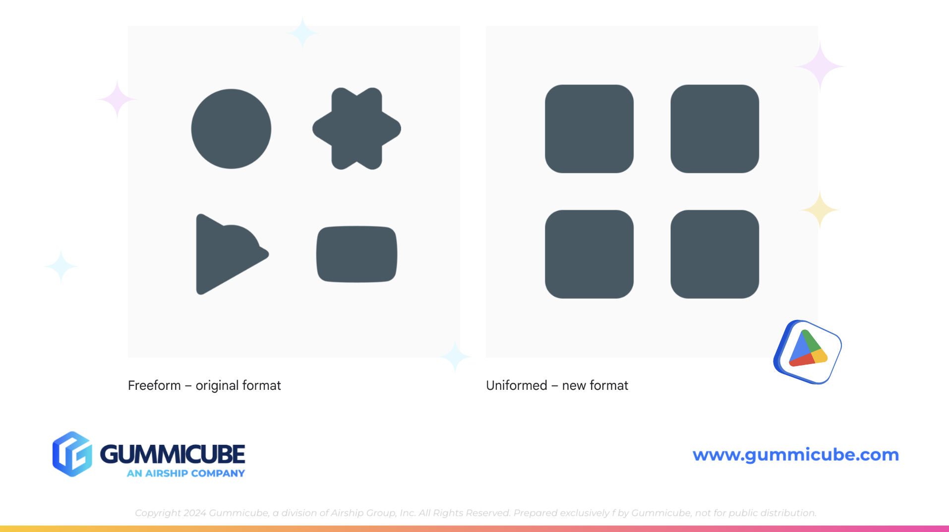
Google Play takes a slightly different approach but with the same goal: consistency and clarity. In 2019, Google transitioned from freeform icon styles to a uniform, rounded square format. This move aimed to eliminate visual noise and create a more consistent browsing experience for users.
Here is what Google recommends:
1. Follow the Standard Icon Format The required icon format for Google Play is:
512x512 pixels
32-bit PNG
Max size: 1MB
Rounded square with no transparency
Full-bleed design that uses all available space
Icons that do not meet these specifications are subject to being downgraded. When this happens, Google applies a default treatment that scales the icon down and places it within a visual frame. This treatment makes the icon smaller and less prominent, which can reduce visibility and harm conversion.
2. Avoid Certain Elements and Messaging Google prohibits the use of the following inside app icons:
Promotional text such as “Sale” or “50% Off”
Rankings or review indicators (e.g., “#1 App”)
Participation badges for Play programs
Misleading symbols or unrelated graphics
Your app icon should focus on conveying your app’s core experience, not marketing claims or temporary incentives. These types of elements should be reserved for promotional banners or in-app messages, not your permanent icon.
3. Use the Full App Icon Asset Space Thoughtfully Many developers make the mistake of shrinking their logos to fit within the keyline grid. Google recommends avoiding this unless the shape of the logo requires it. You want the icon to be as visible and impactful as possible without becoming distorted.
4. Avoid Transparency Transparent icons can interact unpredictably with UI backgrounds. Instead, use solid, brand-aligned backgrounds that reinforce recognition. If the asset has transparency, it will default to the Play Store's UI color, which may not align with your brand palette.
5. Avoid Clutter and Complex Layering Google, like Apple, supports the use of clean, simple designs. Avoid layering too many elements, using photos, or overcomplicating the visual composition. Simplicity makes your icon easier to recognize and more consistent across screen sizes and device types.
By following these rules, you’re helping Google’s system render your app cleanly—and helping users understand what you offer at a glance.
ICON STRATEGY IS ABOUT MORE THAN AESTHETICS
An optimized app icon is not a design project—it is a performance asset.
When approached strategically, your icon becomes a tool for increasing conversions, attracting qualified users, and reinforcing brand identity. This means:
Benchmarking competitor icons in your category
Identifying color trends and design norms that resonate with your target audience
Running A/B tests through Apple’s Custom Product Pages or Google’s Custom Store Listings
Testing seasonal or campaign-based icon variations and tracking performance impact
Ensuring consistency between app icon, in-app design, and ad creative
These efforts can reveal which visual elements make the strongest impact—and which should be left behind. You might find that something as simple as darkening a color palette or simplifying a shape leads to meaningful improvements in conversion rate.
FINAL THOUGHTS
App store real estate is limited, and user attention spans are even shorter; your icon is your first line of engagement. A polished, compliant, and strategically designed app icon can improve conversion rates, reinforce your brand, and support your broader ASO goals.
Icons that follow platform guidelines, align with user expectations, and visually reinforce the app’s value are positioned to outperform competitors. Those that neglect the icon or treat it as an afterthought risk being overlooked.
If you want your app to stand out, get noticed, and earn the tap, the work starts with your icon.
LET’S CHAT!
Your app icon can either invite users in or push them away. Gummicube’s ASO services help you understand what works, what doesn’t, and how to iterate based on real data. Whether you need help aligning with platform guidelines or are needing guidance A/B testing new app icon designs, our team is here to support you. Let’s connect and make your first impression count.
More blog-posts like this:

ASO Marketing Strategies for App Developers
For developers, ASO is an ongoing marketing strategy that evolves alongside user behavior, search trends, and competitive landscapes.

ASO Tools that Every App Developer Needs
The most successful app developers understand that ASO is an ongoing strategy supported by data, testing, and regular optimization.

ASO Tips for Google Play Store & Apple App Store Algorithms
Every day your app fails to rank, you risk losing downloads, revenue, and market share to competitors that have invested in smarter App Store Optimization (ASO).