Window Shopping for ASO Wins with the Nordstrom Rack Shopping App
November 21st, 2025
 Tagged: Aso Services, Aso, App Store Video, App Screenshots, App Metadata, App Ranking
By Anh Nguyen
COO & Co-Founder at Gummicube, Inc
For any retail app competing in a crowded marketplace, a strategic App Store Optimization (ASO) approach is essential for long-term visibility and conversion growth. ASO helps developers understand how their metadata, keyword strategy, and creative assets work together to attract relevant users. This week’s App Store Spotlight focuses on Nordstrom Rack: Shop Deals. Known for offering discounted designer brands and a strong in-store presence, Nordstrom Rack has translated its lower-price retail identity into an app experience that prioritizes savings and convenience. In this analysis, we review their App Store listing from top to bottom to identify what they are doing well and where they can refine their ASO strategy.
The purpose of this Spotlight is to help developers understand how to approach ASO with intention. We want to highlight how ASO supports keyword decisions, A/B testing, visual strategy, and app store seasonality. While Nordstrom Rack benefits from strong brand recognition and polished design, there are still areas for improvement that could enhance its performance within the App Store environment.
APP STORE METADATA ANALYSIS
Nordstrom Rack’s metadata communicates its mission clearly and aligns with user expectations. The title “Nordstrom Rack. Shop Deals” and the subtitle “Great Brands at Great Prices” reinforce the identity of a deal shopping designer marketplace. The language speaks directly to what returning and new users expect from the Nordstrom Rack experience, and this messaging sets the foundation for relevance within the shopping category.
From an ASO perspective, clarity is a strength, but it is not the entire equation. Visibility within the App Store depends on how effectively the metadata captures broad category intent while still serving existing audiences. Nordstrom Rack has an opportunity to expand its reach by testing additional keywords that sit within the high-volume shopping ecosystem. Keywords like “outlet”, “clothes”, “shopping”, “buy online”, or “shoe store” are broad but highly competitive terms that align with user search behavior. Introducing variations of these terms could allow Nordstrom Rack to reach users who may not be searching for the brand specifically but are looking for discounted retail options.
A/B testing tools allow developers to test variations of their title and subtitle before publishing updates. For a well-known brand like Nordstrom Rack, even small adjustments could reveal insights into which keyword combinations drive conversion rates. For example, experimenting with verbs that indicate action, such as “shop”, “browse”, or “find deals”, could improve discovery in search results.
There is also an opportunity to integrate App Store seasonality. Seasonal keywords can significantly improve discoverability during high-traffic retail periods. Shopping behavior changes throughout the year, influenced by holidays, weather transitions, gift-buying seasons, and promotional cycles. For a discount-driven app like Nordstrom Rack, aligning metadata with seasonal intent could be a meaningful visibility driver. For instance, terms connected to winter apparel, summer styles, holiday gifts, or annual clearance events could support time-sensitive search trends.
Overall, Nordstrom Rack has a strong foundation in its metadata. The messaging aligns with its brand identity and user expectations. Expansion through keyword diversification and seasonal targeting can provide additional reach and create a stronger alignment with users' search patterns throughout the year.
NORDSTROM RACK APP STORE CREATIVE ASSET ANALYSIS
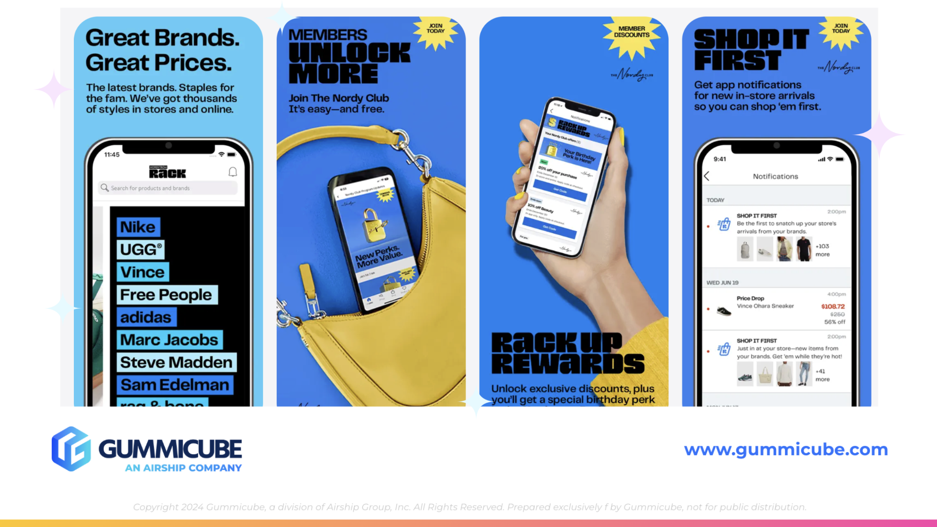
Creative assets are often the determining factor in whether a user converts. The first three screenshots are the most impactful and must communicate value quickly, with clarity and a clear visual hierarchy. Nordstrom Rack currently uses six out of the ten available screenshot slots. While the creative direction reflects strong branding, several elements create visual density that may limit quick comprehension.
The first screenshot includes two bold standout lines reading “Great brands. Great prices.” This is strong value positioning that immediately reinforces the brand promise. However, the text is followed by a paragraph-length text and a large iPhone mockup. Although the design elements are cohesive, the screenshot feels crowded. Users scanning quickly may not absorb all the information before moving on or exiting the page.
Screenshot two adopts a similar structure with three large bold text lines followed by two more lines of smaller text. Below that is a large lifestyle photo of a purse with an iPhone inserted. This image is slightly grainy compared to the higher quality visuals in the remaining screenshots. When image quality varies within an asset set, it can impact user trust and visual consistency. Maintaining uniform quality standards across screenshots helps reinforce professionalism and reliability.
Screenshot three shifts the visual structure by placing the focal point on a hand holding an iPhone, giving users a clear representation of in-app navigation. The bold text appears at the bottom, accompanied by a second paragraph of smaller supporting copy. While the visual concept is strong, the density of text across the screenshots creates repetition that may feel overwhelming.
Screenshots two, three, four, and six feature a design element in the top right corner that resembles a yellow starburst or a sunshine shape. These contain prompts such as “member discounts”, “join today”, or “new perks”. While these callouts help highlight additional benefits, repeating them across multiple screenshots creates visual noise rather than a hierarchy. When used too frequently, callouts compete with primary text and weaken their intended emphasis.
Nordstrom Rack could benefit from simplifying its creative assets. Reducing the amount of text, enlarging the iPhone mockups, or restructuring the layout to highlight one message per screenshot could create a more streamlined experience. They could also benefit from expanding their set to all ten screenshots. By condensing the lengthier text sections and distributing key information across additional screenshots, the design could feel more balanced.
Experimentation through A/B testing tools would allow Nordstrom Rack’s team to measure which creative styles resonate more effectively with their users. Simple refinements such as adjusting text size, spacing, color hierarchy, or image placement can make measurable differences in conversion performance. This is especially important in competitive retail categories, where visual clarity can influence user decisions in mere seconds.
COMPETITOR APP ANALYSIS: ALIEXPRESS SHOPPING APP
While Nordstrom Rack and AliExpress offer different shopping experiences, they share a common goal within the App Store. Both apps want to appeal to deal-seeking users navigating a crowded category. AliExpress provides a strong example of how consistent creative assets and seasonal relevance can influence user engagement.
AliExpress includes the subtitle “Shop Deals on Better Choices,” which maintains the savings-driven focus. Similar to Nordstrom Rack, AliExpress could enhance their ASO strategy by experimenting with additional search-driven keywords tied to electronics, clothing, household goods, and accessories. Each category has high search volume and significant user intent. Diversification within their keyword bank could support better long-term organic reach.
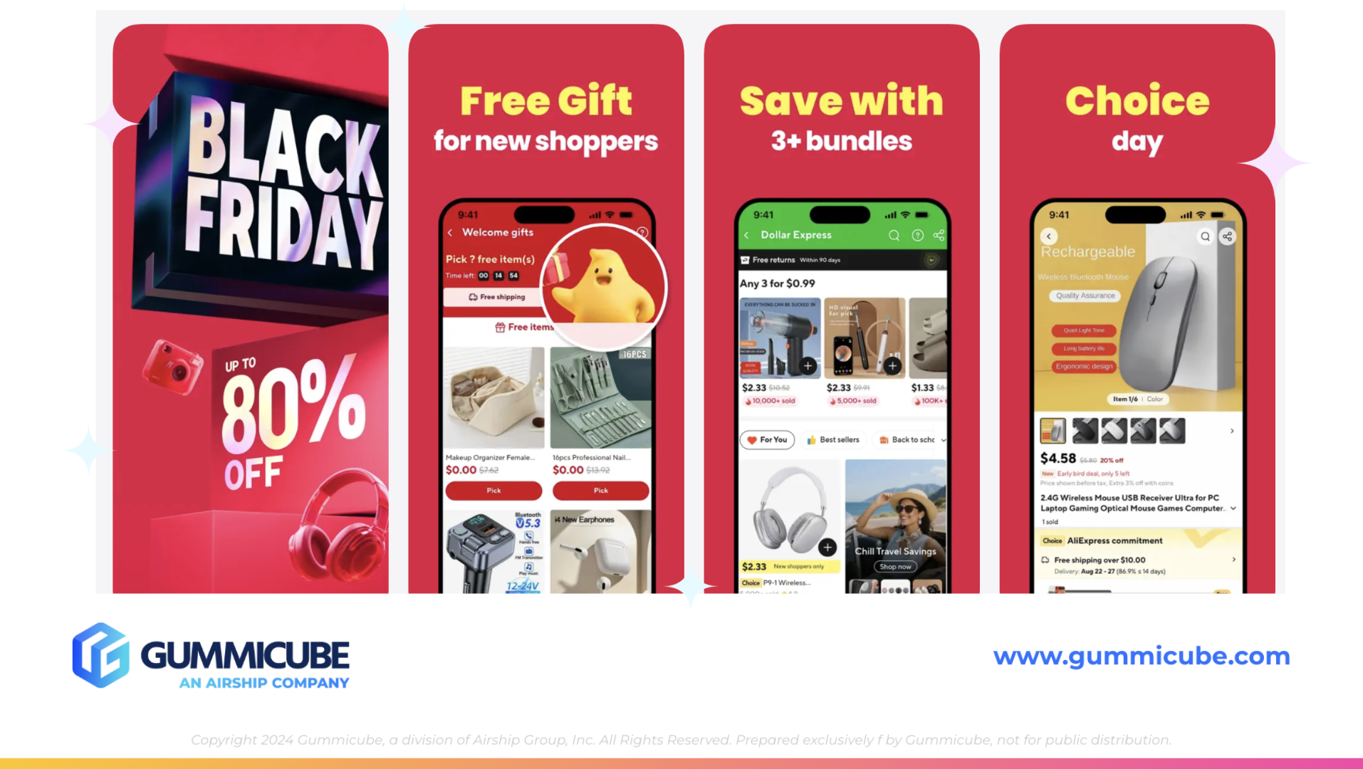
AliExpress excels in seasonality. Their current first screenshot features Black Friday, with bold text announcing discounts of up to 80 percent off. This instantly positions their app within one of the highest demand shopping periods of the year. Seasonal creatives capitalize on user expectations during major retail cycles and can generate substantial conversion lifts when deployed strategically.
The remaining screenshots follow a consistent visual pattern across all seven images. Each screenshot contains a first line of text in bright yellow, followed by a large, white, bold text line. This simple color contrast creates a visual flow that makes the message easy to scan and read. While the colors are bold, the composition remains minimal and clean.
AliExpress also does an excellent job of demonstrating variety. Each mockup showcases a type of product or a unique shopping experience. From self-care products to electronics and daily accessories, users can quickly understand the range of items available within the app.
This visual clarity is something Nordstrom Rack could adopt. A simplified text hierarchy, consistent styles, and evenly spaced layouts can reduce cognitive load and improve user retention. AliExpress proves that retail apps do not need overly dense visuals to convey strong value.
OVERALL ASO RECOMMENDATIONS FOR NORDSTROM RACK
Nordstrom Rack has a strong starting point, but improvements in ASO could elevate both visibility and conversion. The main opportunities include:
• Keyword expansion into broader shopping categories • Integration of seasonal keywords for time-sensitive search spikes • A/B testing alternate versions of title, subtitle, and keyword selections • Streamlining creative layouts to reduce text density • Improving consistency in image quality • Expanding to all ten screenshot slots to create a more balanced narrative • Testing new visual hierarchies to determine what drives higher engagement
These refinements would not require a significant departure from the existing brand identity. Instead, they would strengthen the listing’s ability to serve both existing brand loyalists and new discovery-driven users.
FINAL THOUGHTS
Nordstrom Rack’s App Store listing already benefits from strong brand equity and recognizable positioning. Their emphasis on designer brands at discounted prices is consistent across their metadata and creative assets. With targeted ASO refinements, this app could reach an even wider audience. Improving keyword diversification, applying seasonal strategy, simplifying creative assets, and conducting structured A/B tests could all help the app strengthen its competitive performance within the shopping category.
ASO is an ongoing process that requires continuous learning and iteration. Nordstrom Rack has laid a strong foundation, and with strategic enhancements, it can continue to grow and adapt as user behavior shifts throughout the year.
LET’S CHAT!
To understand how your app’s metadata, screenshots, and keyword strategy are performing, our ASO services can provide valuable insights. Reach out to learn how a data-driven ASO approach can help your app stay competitive and create more opportunities for sustainable growth.
More blog-posts like this:

Preparing for ASO Takeoff with Skyscanner
Every successful App Store listing needs to begin with a strong first impression. Read more!

That's a Wrap On Edits ASO Strategy
Let's take a closer look at where Edits succeeds and where there is room for optimization.

On The Air: FM Radio ASO Audit
In this week's App Store Spotlight, we're putting FM Radio under the ASO microscope.