App Store Optimization for Medical Apps: Analysis for MyQuest
February 27th, 2026
 Tagged: App Screenshots, A/b Testing, App Store Optimization Tips And Tricks, Aso Tips And Tricks, App Store Optimization, App Ranking
By David Bell
CEO at Gummicube, Inc.
Medical apps operate in a uniquely high-stakes environment. Users are not browsing casually. They are looking for lab results, appointment confirmations, prescription information, and direct communication with providers. Trust, clarity, and functionality are not optional. They are essential. Yet even when downloads are driven by physician recommendations or healthcare networks, App Store Optimization (ASO) remains critical. Visibility in search, competitive positioning, and conversion-focused creative assets still determine long-term growth and user engagement.
In this week’s App Store Spotlight, we analyze MyQuest for Patients and evaluate where the listing performs well and where strategic ASO improvements could strengthen its visibility and conversion rate. We will focus on keyword optimization, App Store screenshots, A/B testing opportunities, and competitive positioning against MyChart.
MYQUEST APP TITLE AND SUBTITLE ANALYSIS
MyQuest is titled “MyQuest for Patients.” The subtitle is simply “Medical.”
From a clarity standpoint, the title successfully identifies the brand and signals that the app is patient-facing. However, the subtitle represents drastically underutilized real estate. The App Store subtitle field allows up to 30 characters. Using a single word leaves significant keyword value on the table.
Subtitles are not decorative. They are indexed. They support discoverability. They clarify functionality. For an app like MyQuest, which allows users to view lab results, manage appointments, and access personal health records, the subtitle should reinforce those core functions.
According to DATACUBE insights, high-volume keywords in this app category include terms such as “lab results,” “health records,” “medical labs,” “book appointments,” and “personal health record.” These app keywords reflect real user search behavior. Even if many downloads originate from provider recommendations, patients may still search independently when setting up accounts, checking results, or reinstalling the app.
Potential optimized app subtitle examples could include:
- View Labs & Book Appointments (29 characters)
- View Medical Labs & Appts (30 characters)
Both options expand functionality messaging while incorporating searchable, high-intent keywords. This type of strategic keyword layering ensures that MyQuest competes not only for specific medical queries but also for broader medical utility searches.
Medical apps cannot rely solely on word of mouth. They must remain visible in App Store search results to protect market share and support ongoing patient adoption.
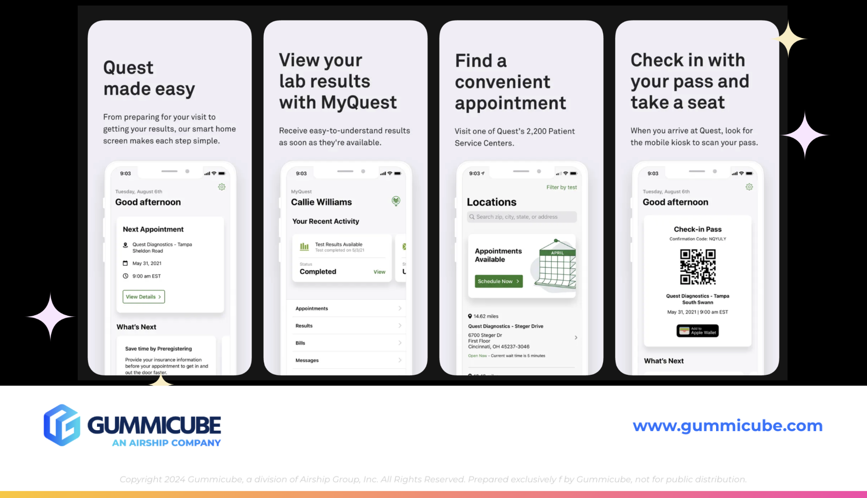
CAN APP STORE SCREENSHOTS BOOST CONVERSION RATES?
Currently, MyQuest utilizes four App Store screenshots. From a quantity perspective, this is underleveraged. Apple allows up to 10 screenshots per device size. Limiting to four reduces the opportunity to communicate full functionality.
From a design perspective, the screenshots are uniform in structure. Each uses a light gray background, large bold black text at the top, smaller subtext below, and a white iPhone mockup centered beneath. While clean and professional, the overall presentation feels repetitive and visually flat.
Consistency can reinforce brand identity, but overuniformity can reduce engagement. When every screenshot looks identical, the user’s eye has no reason to continue scrolling. In an environment where attention spans are limited, scroll-stopping design matters.
Medical apps should absolutely maintain clarity and professionalism. However, that does not mean creative stagnation. Strategic ASO tips for improving these screenshots include:
- Increasing the total number of screenshots to showcase more functionality
- Rotating background colors within brand guidelines for visual segmentation
- Alternating device mockup placement to create motion across the gallery
- Dragging UI elements between screenshots to visually encourage swiping
- Incorporating clearer demonstrations of features such as telehealth visits, lab result dashboards, or appointment booking flows
The iPhone mockups could also benefit from a stronger contrast against the background. When device frames blend into the surrounding color palette, UI visibility suffers.
Most importantly, screenshot messaging should balance clarity with specificity. Instead of broad feature statements, screenshots should articulate outcomes. For example:
- “View Lab Results in Seconds”
- “Schedule Appointments Without Calling”
- “Access Your Complete Health Record”
Specificity builds confidence and demonstrates functionality rather than just implying it.
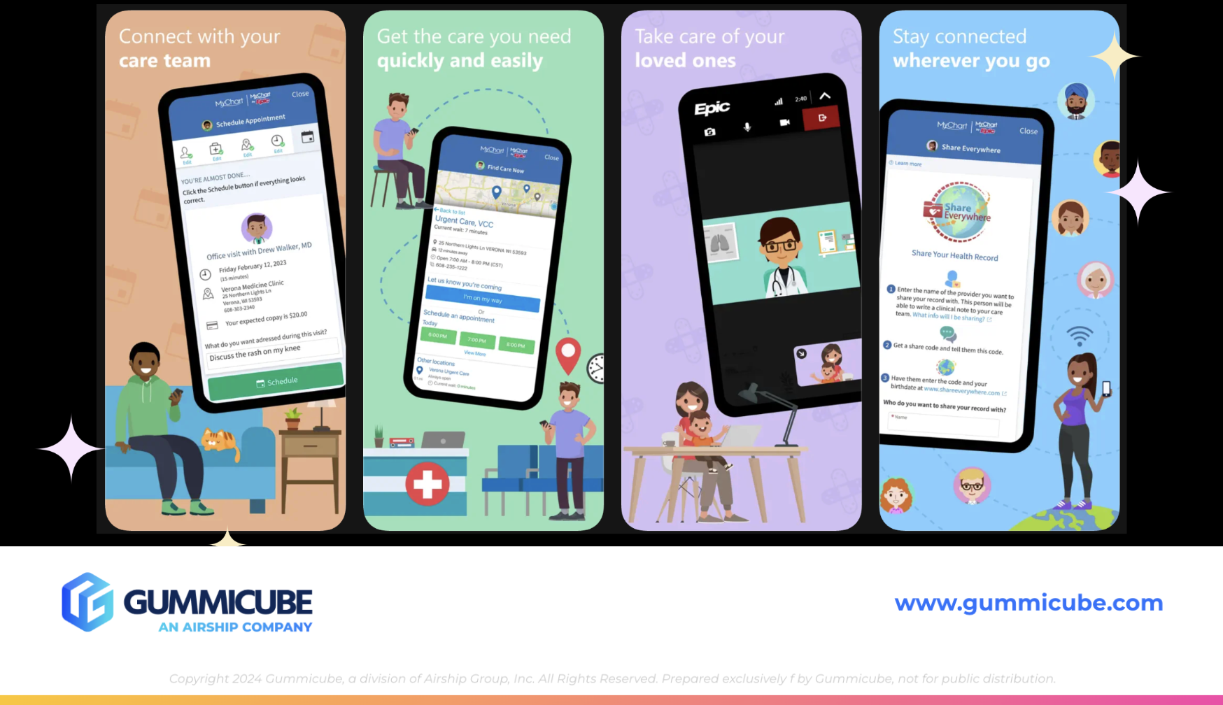
COMPETITOR APP ANALYSIS: MYCHART
To better contextualize MyQuest’s positioning, it is useful to compare it against MyChart, a dominant competitor in the medical app category.
MyChart carries the title MyChart and the subtitle “Your secure health connection.” Immediately, the subtitle reinforces trust and security. The messaging speaks directly to a patient concern: data privacy. In the medical space, trust messaging is not optional. It is a conversion driver.
From an icon perspective, MyChart clearly signals healthcare through universally recognizable medical design elements. In contrast, MyQuest’s icon features a stylized letter Q within a circle. While brand-forward, it does not immediately communicate medical functionality to new users unfamiliar with the brand.
This presents a strong A/B testing opportunity. Through structured icon testing using Splitcube, MyQuest could evaluate whether incorporating subtle medical cues improves conversion rate. Even small visual refinements can meaningfully impact tap-through behavior.
When evaluating screenshots, MyChart uses five of the available 10 slots. Their first screenshot reads: “All your health info in one place. Join over 100 million patients. Works with Apple Health.” Subsequent screenshots highlight connecting with care teams, accessing quick care, managing loved ones’ health, and staying connected on the go.
While MyChart’s messaging could benefit from incorporating more specific medical terminology, its execution demonstrates several strengths:
- Each screenshot uses a distinct background color
- Visual elements vary from screen to screen
- Cartoon illustrations of patients, doctors, and families create approachability
- UI mockups demonstrate real workflows such as booking visits and reviewing records
The experience feels dynamic. It feels guided. It invites exploration.
Importantly, the app balances professionalism with warmth. The addition of illustrated characters, pets, and family scenarios softens the medical environment without diminishing credibility. It communicates accessibility while preserving trust.
MyQuest does not need to replicate this exact style. However, it should evaluate how dynamic variation and narrative progression within screenshots can improve engagement.
THE ROLE OF ASO TOOLS IN MEDICAL APP GROWTH
Effective App Store optimization is rooted in data-driven results.
DATACUBE provides keyword intelligence, competitive insights, and search volume data that medical apps can leverage to refine metadata strategy. Understanding which health-related terms patients are actively searching for ensures that metadata aligns with real-world behavior.
For MyQuest, this means evaluating opportunities beyond branded queries. Patients may search for:
- Lab results app
- Medical test results
- Health records online
- Book doctor appointment app
A/B testing through Splitcube enables iterative improvement across visual and textual elements. Icons, subtitles, screenshot order, messaging hierarchy, and design variations should all be tested. User behavior evolves. Seasonal trends shift. Competitive landscapes change.
Without structured A/B testing, listing updates rely on internal assumptions. With testing, decisions are validated by user data.
For medical apps in particular, even subtle improvements in clarity, trust signaling, or visual hierarchy can meaningfully increase install rates. Given the importance of patient engagement, these incremental gains compound over time.
WHY MEDICAL APPS STILL NEED SEARCH VISIBILITY
It is easy to assume that medical apps tied to provider networks can deprioritize ASO because users are directed by their healthcare provider. That assumption is flawed.
Patients replace devices. They forget app names. They search generically. They compare platforms. They may relocate and seek alternatives. Healthcare networks expand partnerships. Visibility ensures accessibility at every stage.
Competition within digital health continues to grow. Telehealth platforms, lab tracking tools, and personal health record apps compete for overlapping keyword territory. Even if MyQuest owns strong brand recognition within certain networks, maintaining search presence protects long term positioning.
ASO best practices apply universally. Keyword optimization, metadata refinement, compelling App Store screenshots, structured A/B testing, and competitive benchmarking are not optional strategies. They are foundational.
FINAL THOUGHTS
MyQuest for Patients demonstrates clear branding and professional presentation, but there are meaningful opportunities to elevate its App Store performance. Expanding and optimizing the subtitle would strengthen keyword visibility. Enhancing App Store screenshots with more dynamic design, increased quantity, and clearer feature specificity would improve conversion potential.
Medical apps operate within a trust-driven ecosystem, but trust alone does not guarantee discoverability. Strategic App Store optimization ensures that when patients search for lab results, appointment booking, or health record access, MyQuest remains visible and competitive.
Even apps supported by healthcare providers must compete in search. The App Store is is an evolving marketplace shaped by user behavior, competitive movement, and algorithmic shifts. Regular optimization is the standard, not the exception.
LET’S CHAT!
If you are evaluating your own medical app listing and wondering where opportunities may exist, we are here to help. Our ASO services are rooted in data, competitive intelligence, and structured A/B testing that uncovers real user preferences.
Whether you are refining metadata, redesigning App Store screenshots, or exploring testing strategies, thoughtful optimization can drive measurable impact. Let’s start a conversation about how your app can remain visible, competitive, and positioned for long-term growth in an increasingly crowded digital health landscape.
More blog-posts like this:

Preparing for ASO Takeoff with Skyscanner
Every successful App Store listing needs to begin with a strong first impression. Read more!

That's a Wrap On Edits ASO Strategy
Let's take a closer look at where Edits succeeds and where there is room for optimization.

On The Air: FM Radio ASO Audit
In this week's App Store Spotlight, we're putting FM Radio under the ASO microscope.