Depositing ASO Best Practices Into the Bank of America App
November 14th, 2025
 Tagged: App Metadata, App Seasonality, Mobile App A/b Testing, App A/b Testing, App Title, App Screenshots
By Anh Nguyen
COO & Co-Founder at Gummicube, Inc
Bank of America Mobile Banking has one of the most recognizable names in the financial category, and its listing reflects a strong understanding of App Store Optimization (ASO) fundamentals. The title is direct and supported by a clean subtitle that reads: Banking, Budgeting & Investing. This combination positions the app clearly within the finance vertical, while providing Apple’s algorithm with the high-value semantic signals it needs to understand the full scope of the product.
From an ASO perspective, the metadata is structurally strong. The title leverages a major brand term and places the primary banking intent front and center. The subtitle supports it with broad financial terms that remain highly competitive year-round. Budgeting and investing are reliable evergreen queries, and Bank of America benefits from the natural search volume these keywords provide.
While the current app metadata serves the brand well, one area that could be A/B tested is the opportunity to update its listing for app store seasonality. The finance category experiences predictable seasonal shifts driven by major spending periods, significant shopping cycles, and changes in consumer interest during the holidays. With the peak holiday season approaching, developers often have an opportunity to incorporate seasonal high-volume keywords that reflect how users search during this period.
Bank of America could test a version of its subtitle that leans into savings or holiday-adjacent language. Savings-related keywords trend upward beginning in November, and many apps across the finance category experiment with terms such as holiday budgeting, gift spending, shopping tools, and similar language to capture timely intent.
ASO tools like Splitcube allow developers to test variations of titles, subtitles, and promotional text before pushing an iteration live. By collecting real human behavioral data, developers can identify which keywords resonate most with their audience. Knowing whether users respond more strongly to saving money language or planning ahead language can inform a more strategic iteration.
Keyword research also plays a central role in shaping future metadata tests. Using seasonality insights, developers can search for rising terms and compare them against competitor strategies, market volatility, and recent search trends. Holiday searches often shift toward savings, budgeting, deal hunting, and purchase planning. If Bank of America wants to drive incremental visibility, testing holiday-aligned financial terms would be a strategic next move.
Overall, the metadata is strong in its foundational structure. The opportunity lies in A/B testing and seasonal explorations that can maximize visibility during one of the highest conversion periods of the year.

APP STORE CREATIVE ANALYSIS
Bank of America uses eight of the ten available screenshots on the App Store. All eight screenshots follow the same visual structure. They feature a dark navy blue background, consistent iPhone mockups, and a single line of text placed at the top of each screenshot. This uniformity creates a cohesive brand identity, but it also limits the app’s ability to compete in a visually aggressive category where engaging screenshot design directly influences conversion rates.
The most noticeable issue is that the screenshots look nearly identical. The same background, device placement, and general design are repeated throughout the screenshot set. While consistency benefits brand perception, it also creates the risk of blending the images together in the eyes of a browsing user. Potential new users may skim past these screenshots without fully digesting the messaging, simply because the images do not visually differentiate from one another.
Another opportunity is the text size. The current screenshots use relatively small typography that does not capitalize on the few seconds developers have to capture attention. High-performing financial apps typically use large, bold, easy-to-skim text that communicates the core value proposition quickly. The Bank of America screenshots rely on concise yet understated messaging that is not immediately apparent at a glance.
A/B testing can play a major role here. By experimenting with larger text, alternative layouts, refreshed color palettes, and more dynamic imagery, developers can determine which visual direction yields the strongest conversion lift. Since the screenshots represent one of the most impactful elements of an App Store listing, even a minor design adjustment could translate into a measurable increase in user acquisition.
Developers can also test screenshot sets that highlight specific holiday-relevant features, such as budgeting for gifts or tracking seasonal spending. Seasonal creative testing has historically yielded strong results in the financial category, as users experience increased urgency around money management during key shopping months.
Bank of America’s current creative set establishes trust but does not maximize engagement. With data-driven testing and refreshed visual direction, there is a significant opportunity to strengthen the conversion rate and better compete within the category.
APP COMPETITOR ANALYSIS: CAPITAL ONE SHOPPING
To place Bank of America’s listing in context, it helps to compare it with one of its category competitors. Capital One Shopping: Save Now is an ideal comparison point because the app approaches the financial space with a savings-oriented value proposition. Its subtitle, Coupons, Rewards, and Deals, takes a more transactional approach, appealing to users who are looking for immediate financial benefits.
At a metadata level, Capital One Shopping focuses on high-intent savings keywords. These terms tend to trend upward during holiday spending peaks, making the app well-positioned for increased seasonal visibility. While the core value proposition differs from a full-service banking app, the overlap in financial intent makes this an insightful comparison.
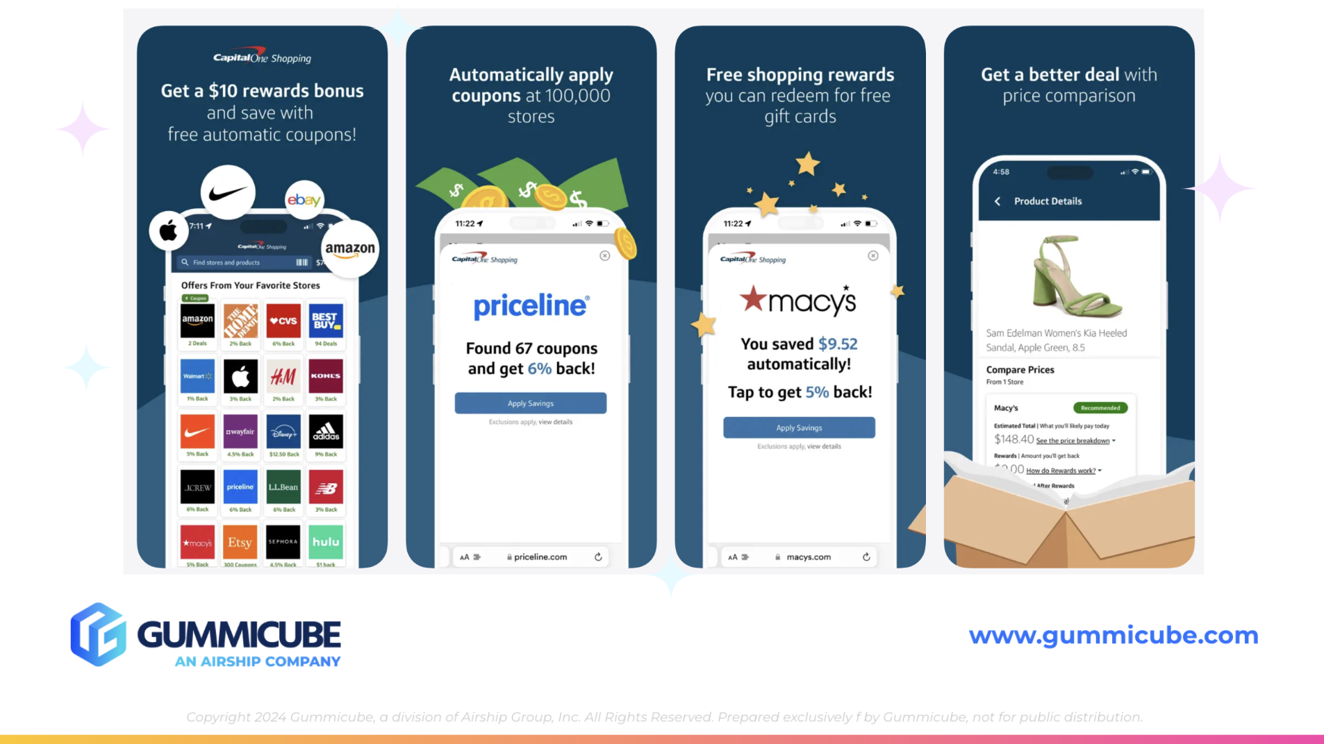
Where Capital One Shopping delivers the most noticeable advantage is in its creative strategy. The app uses seven of the ten available screenshot slots, but the visual execution is more dynamic and engaging compared to Bank of America’s current set. Each screenshot features a prominent iPhone mockup with clear, bold text and supporting visuals that reinforce the messaging. The mockups are large and strategically placed to draw attention. The background features a navy wave pattern that extends across the screenshot set, creating movement and helping the user stay engaged as they scroll.
Another strength is the hierarchy in the text. Capital One Shopping uses large, bold keywords paired with smaller supporting phrases. This technique enables users to quickly skim and retain the most important messaging points. The first 3 screenshots are the most impactful, so including a clear typographic hierarchy can increase the chances that users will understand the primary value before scrolling away.
The more playful UI elements and cohesive visual direction create a compelling narrative that encourages users to browse through the content. Without increasing the screenshot count, Capital One Shopping delivers more depth, more storytelling, and more visual interest than Bank of America’s current set.
From a competitive standpoint, Bank of America has an opportunity to match or exceed this design level using A/B testing. By introducing more dynamic backgrounds, larger device frames, bigger text, or even animation-inspired visual cues, Bank of America can create an experience that feels more engaging while still maintaining the professional tone expected in the finance category.
This comparison highlights how creative strategy influences conversion. When two apps compete in the same general category, the more visually compelling listing often wins the user’s attention. With strategic testing, Bank of America can position its app to compete more effectively.
OPPORTUNITIES FOR APP STORE OPTIMIZATION
Keyword research, seasonality awareness, and competitor insights all point to several clear opportunities for Bank of America’s next iteration.
App developers may consider:
• Seasonal metadata tests focused on savings, budgeting, holiday planning, or gift spending • Creative tests with improved visual hierarchy and larger text • Testing new color palettes or subtle variations of the brand navy • Using lifestyle or benefit-focused messaging to enhance the emotional connection • Comparing static creative tests with movement-inspired designs • Mapping App Store trends to upcoming seasonal shifts
These strategies align with best practices in the category and support long-term ASO growth. The Bank of America listing already benefits from strong brand authority, so optimization is less about correcting weaknesses and more about maximizing performance through data-driven iteration.
FINAL THOUGHTS
Bank of America Mobile Banking maintains a strong presence on the App Store, supported by recognizable branding and clear metadata. The foundation is solid, and the value proposition is communicated effectively. The primary opportunities for improvement lie in creative optimization and A/B testing for app seasonality. By exploring larger text, more engaging visuals, and strategically timed metadata variations, the app can strengthen its conversion rate and compete more aggressively within the financial landscape.
Competitor analysis reinforces the value of dynamic creative execution. Capital One Shopping demonstrates how thoughtful design, bold typography, and cohesive visual structure can elevate an App Store listing. Bank of America can leverage these insights to inform future creative iterations and refine its presentation.
A successful ASO strategy requires ongoing testing, intentional iteration, and data-driven decision-making. With the right approach, Bank of America can continue to expand its visibility, attract new users, and maintain strong performance throughout seasonal fluctuations.
LETS CHAT!
Our team specializes in helping developers improve their app store strategy through data-backed keyword research, creative testing, metadata optimization, and competitive insights. If you are looking to strengthen your visibility or refine your app listing, our ASO services are here to help guide your next steps.
More blog-posts like this:

Preparing for ASO Takeoff with Skyscanner
Every successful App Store listing needs to begin with a strong first impression. Read more!

That's a Wrap On Edits ASO Strategy
Let's take a closer look at where Edits succeeds and where there is room for optimization.

On The Air: FM Radio ASO Audit
In this week's App Store Spotlight, we're putting FM Radio under the ASO microscope.