Saving Pennies and the ASO Strategy of Money Manager
December 23rd, 2025
 Tagged: Aso Services, Aso, App Creatives, App Subtitle, App Title, App Screenshots, App Metadata, App Ranking
By Anh Nguyen
COO & Co-Founder at Gummicube, Inc
In a category as competitive as finance, visibility is everything. Budgeting, expense tracking, and money management apps all compete for the same high-intent users who are actively searching for tools to take control of their finances. In this environment, App Store Optimization (ASO) is not optional. It is a core growth lever that directly impacts discoverability, conversion rates, and long-term user acquisition efficiency.
This week’s App Store Spotlight takes a closer look at the app Money Manager Expense & Budget, analyzing how its current App Store listing performs across key ASO elements. These include the app title, subtitle, keyword strategy, and creative assets such as screenshots. We will identify where the listing is performing well, where opportunities are being missed, and how targeted ASO improvements could unlock greater visibility and stronger conversion performance.
To provide additional context, we will also compare Money Manager to a leading competitor in the same category, PocketGuard. This comparison highlights best practices that are currently effective in the finance category and demonstrates how strategic ASO decisions can significantly impact user perception and download behavior.
The goal of this analysis is not criticism for the sake of critique. It demonstrates how thoughtful ASO execution can transform an already functional listing into a high-performing acquisition channel.
APP TITLE AND SUBTITLE ANALYSIS
The current title of the app is:
Money Manager Expense & Budget
The subtitle is:
20M+DN,Budget&Expense Tracker
At first glance, it is clear that the app is attempting to fully utilize available character space. This is not inherently a bad strategy. In fact, maximizing title and subtitle character limits is often recommended. The issue here is not character usage. It is keyword efficiency and relevance.
App Keyword Stuffing Versus Keyword Strategy
The subtitle uses its full 30-character limit, but not all characters are working equally hard. The phrase “20M+DN” is particularly problematic. While it likely refers to 20 million downloads, it is not a commonly searched or widely understood abbreviation. From an ASO perspective, this phrase does not contribute to discoverability and occupies six valuable characters that could be used to target high-volume, relevant search terms.
Additionally, the subtitle repeats the words “budget” and “expense,” which are already present in the title. While some level of reinforcement can be useful, duplication across the title and subtitle often results in wasted opportunity. The subtitle should expand keyword coverage and reinforce value propositions rather than mirror the title.
Missed App Keyword Opportunities
There is a significant opportunity to broaden visibility by incorporating adjacent, high-intent keywords that align with the app’s functionality. Terms such as personal finance, budget planning, expense management, money tracking, and credit card management are frequently searched within this category.
By diversifying keyword usage across the title and subtitle, Money Manager could increase its reach without sacrificing relevance. This approach allows the app to appear in more search results while still accurately representing its core functionality.
Leveraging ASO Tools for Keyword Research
Effective keyword selection should never rely on guesswork. ASO tools like DATACUBE can offer crucial insights into keyword volume, competition, and relevance. These tools also reveal competitor keyword strategies and highlight terms where an app may currently be unranked but has strong potential to compete.
With access to this data, teams can make informed decisions about which keywords belong in the title, subtitle, and keyword field. Over time, iterative testing and refinement allow apps to continually optimize for discoverability as market trends evolve.
THE ROLE OF A/B TESTING IN APP LISTING OPTIMIZATION
ASO is not a one-time effort. It is an ongoing process that requires continuous iteration. A/B testing plays a crucial role in validating what actually resonates with users rather than relying on assumptions.
Testing different title and subtitle combinations can reveal which messaging drives higher conversion rates. Similarly, creative A/B tests can help identify which visuals, colors, text treatments, and value propositions most effectively communicate the app’s benefits.
Seasonality also matters. User priorities shift throughout the year, especially in the finance category. Tax season, holiday spending, and new year budgeting goals all influence user behavior. Regular testing helps ensure that the app listing remains relevant and aligned with user intent across different seasons.
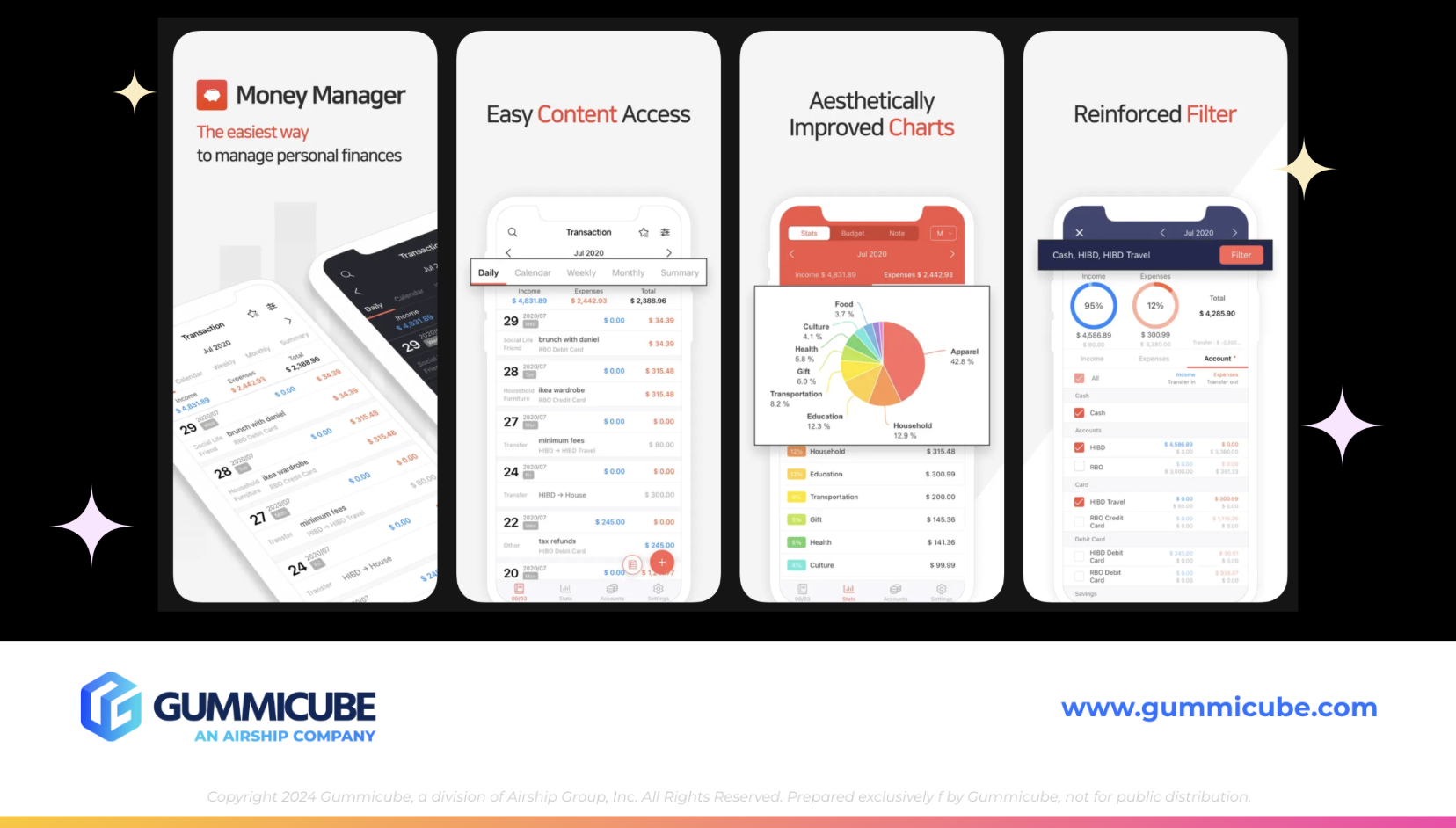
APP SCREENSHOT STRATEGY AND CREATIVE ANALYSIS
Money Manager currently uses eight out of the ten available screenshot slots. This is a strong starting point. Fully leveraging screenshot real estate is essential, as screenshots are one of the most influential factors in driving conversion once a user reaches the app page.
Visual Contrast and Design Considerations
The primary challenge with the current screenshots lies in visual contrast. The screenshots feature an all white background paired with an all white iPhone mockup. While the design is clean, the lack of contrast causes the visuals to blend together, especially in search results where screenshots are viewed at smaller sizes.
Higher contrast between the background and the device frame would help the app stand out more effectively. Even subtle adjustments, such as darker backgrounds, color gradients, or outlined device frames, could significantly improve visual impact.
Text Treatment and Messaging Clarity
The screenshots use minimal, clean text, which is generally a positive approach. However, minimal text must still be precise and benefit-driven. Currently, some of the messaging lacks clarity and specificity.
Examples such as “easy content access” and “aesthetically improved charts” are vague. While they describe features, they do not clearly communicate why those features matter to the user. Users want to know how an app will improve their financial life, save them time, reduce stress, or help them make better decisions.
The Importance of the First Three Screenshots in an App Listing
The first three screenshots are the most critical. These are often the only screenshots a user views before deciding whether to download. They should clearly communicate the app’s primary value propositions and core functionality.
The first screenshot states that the app is the easiest way to manage personal finances. This is a strong claim, but it is not fully supported by the subsequent messaging. To strengthen this narrative, the screenshots should focus more explicitly on how the app simplifies financial management and what specific problems it solves for the user.

COMPETITOR COMPARISON: POCKETGUARD
To better understand where Money Manager can improve, it is helpful to examine how a top competitor approaches ASO and creative execution.
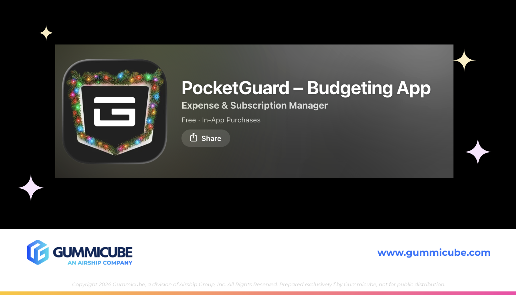
Seasonal App Icon Strategy
PocketGuard immediately stands out with its app icon. By incorporating seasonal elements, such as a garland with holiday lights, the app demonstrates an understanding of App Store seasonality. Seasonal icon updates can help an app feel timely and relevant, increasing its chances of capturing attention in a crowded marketplace.
App Title and Subtitle Optimization
PocketGuard’s title and subtitle are clear, concise, and free from keyword stuffing. The title communicates the brand, while the subtitle expands on functionality without unnecessarily repeating terms. This balance improves readability while still supporting discoverability.
App Screenshot Excellence and Trust Signals
PocketGuard also uses eight screenshots, but the difference in execution is immediately noticeable. The first screenshot delivers a clear, benefit driven message: “All accounts in one pocket.” This instantly communicates value.
Subsequent screenshots incorporate social proof, including app reviews and recognizable brand logos. These trust signals are incredibly powerful, particularly in the finance category where users are cautious about data security and credibility.
The remaining screenshots break down specific features such as bill organization, budget planning, subscription management, and financial control. Each screenshot uses bold, high-contrast text supported by smaller descriptive lines. The device mockups are clearly outlined and stand out against vibrant gradient backgrounds.
KEY TAKEAWAYS FOR MONEY MANAGER
The differences between Money Manager and PocketGuard highlight several actionable opportunities.
Money Manager can improve keyword efficiency by replacing low-value abbreviations with high-volume, relevant terms. It can strengthen its subtitle by expanding keyword coverage rather than repeating the title. Its screenshots can benefit from improved contrast, more benefit-driven messaging, and stronger visual hierarchy.
Small changes in ASO execution often result in significant improvements in both visibility and conversion rates. The core functionality of Money Manager is solid. The opportunity lies in better communicating that value to potential users at every touchpoint within the App Store.
FINAL THOUGHTS
App Store Optimization is about more than ranking for keywords. It is about understanding user intent, presenting value clearly, and continuously refining your listing based on data and performance insights.
Money Manager Expense & Budget has a strong foundation, but its current App Store listing leaves room for growth. By refining its keyword strategy, embracing data-driven A/B testing, and elevating its creative execution, the app could significantly improve both discoverability and conversion rates.
In a crowded finance category, clarity wins. Apps that clearly articulate their value, build trust quickly, and stand out visually are the ones that earn downloads and long-term users.
LETS CHAT!
ASO is not a one-size-fits-all solution. Every app, category, and audience requires a tailored strategy built on research, testing, and continuous optimization.
If you are curious how your app listing is performing or where hidden opportunities may exist, we are always happy to take a closer look. Expert ASO services paired with a data-driven ASO strategy can turn your App Store listing into one of your most efficient and scalable growth channels.
Let’s chat and explore what is possible for your app.
More blog-posts like this:

On The Air: FM Radio ASO Audit
In this week's App Store Spotlight, we're putting FM Radio under the ASO microscope.

FotMob's ASO Analysis: Penalty kick or On Target?
Apps that fail to evolve their App Store presence risk being buried beneath competitors that are actively optimizing for visibility & conversion rates.

Timeleft: Finding Friends, But Is It Finding App Store Visibility?
A/B testing alternative subtitle structures, and experimenting with screenshot designs could set Timeleft apart from its competition. Read more!