ASO Insights on Badoo Dating
January 23rd, 2026
 Tagged: App Metadata, App Description, App Visibility, App Store Search, App Listing, App Subtitle, App Title, App Screenshots
By Anh Nguyen
COO & Co-Founder at Gummicube, Inc
As Valentine’s Day approaches, dating apps enter one of the most critical periods of the year for visibility, relevance, and conversion. This seasonal surge is not accidental. It is driven by user intent, cultural timing, and heightened emotional motivation. In App Store Optimization (ASO), this moment is defined as App Store seasonality. It is the practice of aligning app metadata, creative assets, and messaging with real-world moments that directly influence user behavior and search demand.
In this week’s App Store Spotlight, we are examining the dating app titled Badoo Dating: Meet New People, a lifestyle category app designed to help users chat, date, and form new connections. The purpose of this analysis is to break down the app’s App Store listing element by element, from its title and subtitle to its screenshot strategy and overall creative execution. We will identify where the app is performing well, where opportunities for improvement exist, and how strategic adjustments could unlock stronger conversion performance during a high-impact seasonal window.
Later in the blog, we will compare Badoo Dating: Meet New People to a key competitor in the same category, Coffee Meets Bagel: Dating App. By analyzing how a similar app communicates value, utilizes screenshot space, and highlights differentiating features, we can extract actionable inspiration that could elevate the current listing.
Finally, we will explore how A/B testing, keyword optimization, and evolving AI-driven discovery are shaping modern ASO strategies. The goal is to provide a clear path forward for dating apps looking to maximize visibility and conversion, not just during Valentine’s Day, but throughout the year.
APP TITLE AND SUBTITLE ANALYSIS
The app title Dating: Meet New People and subtitle Chat and date or make friends establishes a strong foundation from an App Store Optimization perspective. These elements immediately communicate the core purpose of the app without ambiguity. Users scanning search results can quickly understand what the app offers and who it is for. This clarity is essential in a competitive category like dating, where users make decisions in seconds.
From a keyword standpoint, the title and subtitle include high-volume, high-intent terms such as dating, meet new people, chat, date, and make friends. These keywords align well with common user search behavior in the lifestyle category. They capture broad discovery while still maintaining relevance. This balance is critical, as overly narrow keyword targeting can limit reach, while overly generic phrasing can reduce conversion quality.
Where the app has room to improve is in expanding its keyword footprint without sacrificing clarity. Keywords related to singles, finding new people, and chatting with singles are all closely aligned with the app’s value proposition and are frequently searched by users looking for dating experiences. Even slight variations in phrasing can unlock new search opportunities and broaden visibility. For example, incorporating language that emphasizes singles or connection intent could help capture users earlier in their decision-making journey.
It is also important to note that App Store metadata is not static. Seasonality presents an opportunity to test variations that lean into heightened emotional intent. During Valentine’s Day, users are more likely to search with urgency and purpose. Adjusting wording to reflect connection, relationships, or meaningful matches could resonate more strongly during this period.
Overall, the title and subtitle are doing many things right. They are clear, relevant, and keyword-rich. Strategic iteration through testing could help the app reach adjacent audiences and strengthen its position during peak seasonal demand.

APP CREATIVES AND SCREENSHOT PERFORMANCE
The app currently uses eight of the allowed 10 screenshots, which is a solid starting point. However, screenshot quantity alone does not determine performance. How each screenshot uses space, communicates value, and guides user attention is what ultimately drives conversion.
Screenshot one features large red text on a light purple background with the message “a quicker, easier way to date.” The color contrast is strong, making the text easy to read at a glance. This is a positive execution choice. The screenshot also introduces an iPhone mockup, which carries over into screenshot two. However, the placement of this mockup creates a significant issue. Large portions of screenshot one are left unused, resulting in a layout that feels empty rather than intentional. This unused space represents a lost opportunity to communicate value or reinforce credibility.
Screenshot two compounds this issue by displaying only the iPhone mockup without any supporting messaging. From a conversion standpoint, this is a critical miss. The first three screenshots are the most influential in a user’s decision to download. Using one of those slots without text or context reduces the app’s ability to persuade and inform.
Screenshots three through eight adopt a more consistent structure, with alternating placement of iPhone mockups and bold text positioned above or below the device. The messaging is large and readable, and the use of real-life human imagery helps humanize the experience. These are strong foundational elements. However, consistency alone does not guarantee effectiveness. The earlier screenshots set expectations, and by underutilizing that space, the app risks losing users before they ever reach the stronger visuals later in the sequence.
The core issue is not design quality, but strategic prioritization. Dating apps must immediately communicate why they are worth downloading. Features, benefits, and emotional outcomes should be front-loaded. Empty space, even when aesthetically clean, does not serve conversion goals when it replaces meaningful messaging.
HOW DOES BADOO COMPARE TO COFFEE MEETS BAGEL?
Coffee Meets Bagel: Dating App provides a compelling example of how intentional creative strategy can elevate an App Store listing. Its subtitle, “Meet & date serious singles,” mirrors similar keyword territory while clearly signaling a more specific audience. This positioning helps filter users and attract those aligned with the app’s core experience.
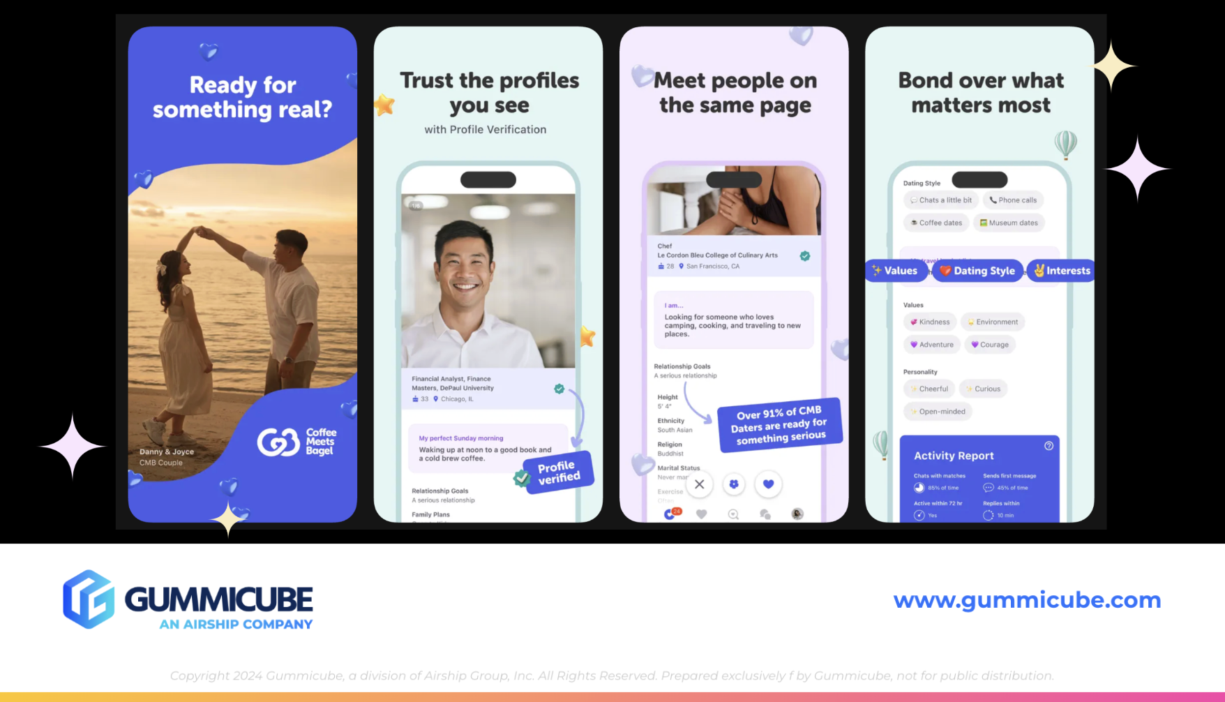
What truly sets Coffee Meets Bagel apart is its screenshot execution. Despite using only six screenshots, the app maximizes every available inch. The first screenshot immediately establishes relatable intent with real-life imagery, soft design elements, and the question “Ready for something real?” This instantly conveys purpose and invites the user to reflect.
Screenshots two through six follow a consistent and highly effective format. Large, bold text appears at the top of each screenshot, paired with an iPhone mockup beneath it. Select areas of the interface are zoomed in to highlight specific features, guiding the user’s eye and reducing cognitive load. Messaging such as “Trust the profiles you see” and “Meet people on the same page” clearly articulates the app's differentiators, setting it apart from generic dating platforms.
The design is clean without being sparse. Alternating background colors and subtle visual elements keep the experience engaging without overwhelming the user. Most importantly, the first three screenshots clearly convey the app’s value proposition. Users are not left guessing how the app works or why it is different.
Dating: Meet New People could significantly benefit from adopting this level of intentionality. By using each screenshot to tell a clear story and highlight specific benefits, the app could improve both clarity and conversion. The goal is not to copy another app’s design, but to learn from how effectively it communicates value within a limited space.
WHY DOES APP SCREENSHOT REAL ESTATE MATTER SO MUCH?
Screenshot real estate is one of the most powerful conversion drivers in the App Store, yet it is often underutilized. Users do not read App Store listings the way they read articles. They scan. They glance. They make decisions quickly. Every screenshot must earn its place by communicating something meaningful.
The first three screenshots are especially critical. They appear above the fold and are often viewed before a user scrolls. If these screenshots fail to communicate value, users may never engage further. This makes empty space, vague messaging, or redundant visuals particularly costly.
Effective screenshots do three things well. They explain what the app does, they highlight why it is different, and they emotionally resonate with the target audience. Dating apps, in particular, must balance functional clarity with emotional appeal. Users are not just looking for features. They are looking for connection, trust, and possibility.
When screenshot space is underutilized, it creates friction. Users may feel uncertain or unconvinced. In contrast, intentional use of space builds confidence. Clear messaging reduces hesitation. Visual hierarchy guides attention. These elements work together to move users closer to downloading.
Dating: Meet New People has strong raw materials, including readable text and real human imagery. By restructuring the first screenshots to eliminate unused space and introduce clearer messaging earlier, the app could significantly improve its conversion potential, especially during high-intent seasonal periods like Valentine’s Day.
MOBILE APP A/B TESTING AND THE ROLE OF DATA-DRIVEN ASO
One of the most powerful advantages of modern App Store Optimization is the ability to test. A/B testing removes guesswork and replaces it with data. Whether it is swapping a single keyword, adjusting a screenshot headline, or redesigning an entire creative set, every change can be measured.
For dating apps, testing is especially valuable because user preferences can vary widely. Messaging that resonates with one audience segment may fall flat with another. A/B testing allows developers to identify what actually drives engagement and conversion.
Testing can be applied to metadata, including titles and subtitles, to determine which keyword combinations attract the most qualified users. It can also be applied to creatives, testing different value propositions, visual styles, or feature highlights. Even small changes can lead to meaningful performance gains.
ASO tools also play a critical role in keyword discovery. By analyzing what users are actively searching for, developers can align their listings with real demand. Incorporating high volume, relevant keywords into titles, subtitles, and descriptions increases discoverability and ensures the app appears in the right contexts.
As AI continues to influence how apps are surfaced, listings must also answer user questions clearly. Phrases like “What is the best dating app?” or “How can I meet new people?” are increasingly shaping discovery. Listings that address these questions directly are more likely to perform well in evolving search environments.
FINAL THOUGHTS
This App Store Spotlight highlights both the strengths and opportunities within the Dating: Meet New People listing. The app benefits from clear metadata, relevant keywords, and a solid creative foundation. However, there is significant room to improve how effectively it uses its screenshot space and communicates value early in the user journey.
By learning from competitors like Coffee Meets Bagel, prioritizing intentional screenshot design, and embracing A/B testing, the app could unlock stronger conversion performance. Valentine’s Day seasonality amplifies the importance of these optimizations, making now an ideal time to refine strategy and execution.
App Store Optimization is not about one-time changes. It is about continuous improvement driven by data, creativity, and user understanding.
LET’S CHAT!
If you are looking to elevate your app’s visibility and conversion performance, thoughtful ASO services can make the difference. From keyword strategy and creative optimization to A/B testing and seasonal planning, a data-driven approach ensures your app is positioned for long-term success.
If you are ready to explore how your app listing could work harder for you, let’s chat.
More blog-posts like this:

Preparing for ASO Takeoff with Skyscanner
Every successful App Store listing needs to begin with a strong first impression. Read more!

That's a Wrap On Edits ASO Strategy
Let's take a closer look at where Edits succeeds and where there is room for optimization.

On The Air: FM Radio ASO Audit
In this week's App Store Spotlight, we're putting FM Radio under the ASO microscope.