Planting a Brighter ASO Strategy for Seed Time
March 6th, 2026
 Tagged: Aso Services, App Creatives, App Category, App Ranking, App Metadata, App Title, App Screenshots
By David Quinn
VP of Strategy & Partnerships at Gummicube, Inc.
The mobile app marketplace is saturated with productivity tools, lifestyle apps, and niche solutions designed to help users improve everyday tasks. Gardening is no exception. As more consumers turn to mobile technology to plan seasonal planting, manage crop schedules, and optimize harvest yields, developers have responded by creating garden planning apps that promise structure and simplicity.
However, launching an app in a niche category does not guarantee visibility or growth. Success within the App Store requires strategic positioning, strong metadata, and engaging creatives that clearly communicate an app’s value proposition. This is where App Store Optimization (ASO) becomes critical.
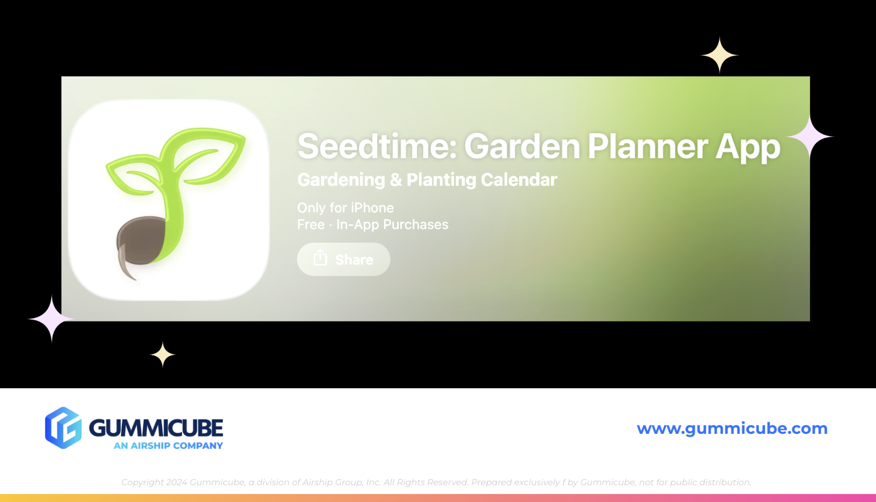
In this week’s App Store spotlight, we are examining Seedtime: Garden Planner App, with the subtitle Gardening & Planting Calendar. This gardening planner has developed a strong brand identity and communicates its purpose clearly through its metadata. However, there are also areas where its App Store listing could evolve to improve discoverability and conversion.
By evaluating the app’s title, subtitle, icon, screenshots, and overall listing strategy, we can identify what Seedtime is doing well and where optimization opportunities exist. We will also compare the listing with a competing gardening app to better understand how developers can refine their ASO strategies in a competitive category.
SEEDTIME’S STRONG FOUNDATION WITH CLEAR APP METADATA
A strong App Store listing begins with clear metadata. An app’s title and subtitle are among the most important elements for both discoverability and user understanding. The app’s title, Seedtime: Garden Planner App, immediately communicates the primary function of the product. Including the phrase “garden planner” helps the listing align with common search behavior from users looking for tools that help organize and plan gardening activities. The subtitle, Gardening & Planting Calendar, further expands on this functionality. It reinforces the planning aspect of the app while also introducing the concept of scheduling through a calendar-based experience.
Together, the title and subtitle utilize the majority of the available character limits while remaining concise and descriptive. This balance is important in App Store Optimization. Developers must communicate functionality while also incorporating high-volume keywords that improve discoverability.
The clarity of this messaging benefits both search algorithms and potential users. When a consumer searches for a gardening planner, the listing immediately signals that Seedtime offers a structured solution for managing planting timelines and garden organization.
SEEDTIME’S CLEAN AND RELEVANT APP ICON
The app icon is another element where Seedtime performs well. App icons are often the first visual element a user sees when browsing search results or category pages. Because of this, an icon must communicate brand identity quickly while remaining recognizable at small sizes. Seedtime’s icon achieves this through simplicity and thematic relevance.
The design features a sprouting seedling emerging from soil, which directly connects to the concept of gardening and growth. The imagery is easy to understand and visually aligned with the app’s purpose. This type of icon design works well because it avoids unnecessary complexity. A user browsing the App Store can immediately associate the imagery with planting and gardening.
For lifestyle apps like this, visual clarity often performs better than abstract branding. Seedtime’s icon communicates the product category instantly, which helps strengthen brand recognition within search results.
WHERE SEEDTIME’S APP SCREENSHOTS SHOULD IMPROVE
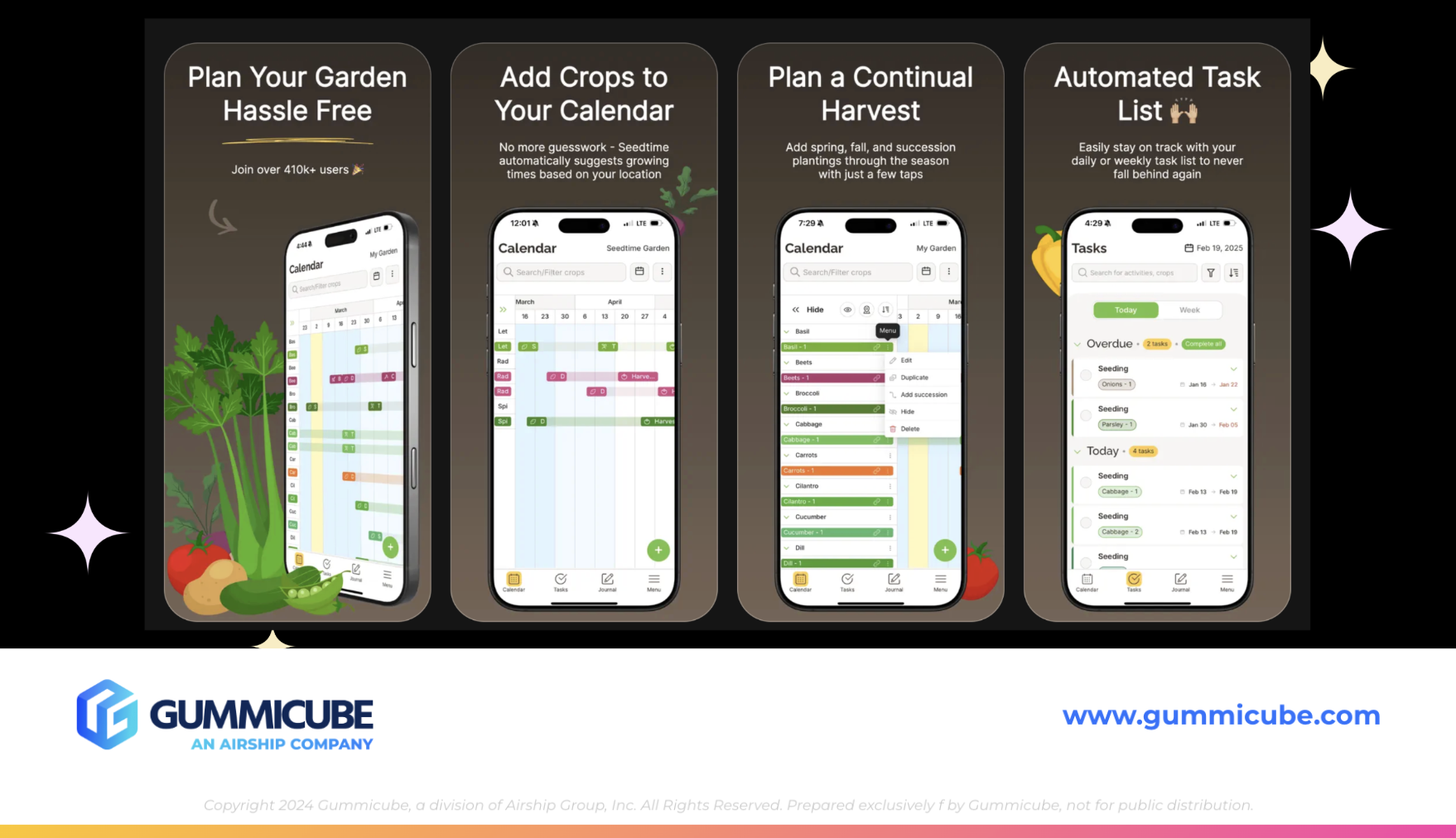
While the app’s metadata and icon establish a strong foundation, the screenshot gallery presents several opportunities for improvement. Screenshots are one of the most influential elements of an App Store listing because they serve as the primary storytelling tool for communicating an app’s functionality. Seedtime currently utilizes seven of the ten screenshots allowed by the App Store. While this is a common approach, the design and presentation of those screenshots limit their effectiveness.
Screenshots 2 through 7 follow nearly identical layouts. Each contains a large headline at the top, a smaller paragraph of text beneath the headline, and an iPhone mockup positioned below the messaging. Consistency can be helpful for brand cohesion, but in this case the repeated design structure reduces visual engagement.
The smaller secondary paragraph text is particularly problematic. Although the text contrasts well against the dark background, the font size is extremely small. In search results previews, users would likely struggle to read the messaging at all. This creates a missed opportunity. Secondary text should support the main headline and reinforce the value of the feature being presented. If the text is too small to read easily, it fails to contribute to the conversion process.
The iPhone screenshot mockup does not clearly highlight the specific features being described. The device screens appear as standard app interface previews rather than targeted feature callouts. Effective screenshot design often involves zooming into key areas of the interface. Highlighting specific tools, icons, or actions helps users understand exactly what the feature does and how it improves their gardening experience. Without engaging visual cues, the screenshots feel more like general app previews rather than strategic marketing assets.
MISSED OPPORTUNITIES WITHIN THE APP SCREENSHOTS
The first screenshot is arguably the most important creative asset in any App Store listing. This is one of 3 screenshot images that appear directly in search results and often determines whether a user taps the listing.
Seedtime’s first screenshot displays the headline:
“Plan your garden hassle free”
Below that headline is smaller messaging stating:
“Join over 410K+ users”
This is a strong credibility claim. Social proof can be a powerful conversion driver. However, the messaging is placed in extremely small text that is difficult to read within the App Store search preview. As a result, the impact of that claim is significantly reduced. If this statistic is accurate and meaningful to the brand, it should be displayed more prominently. Highlighting the size of the user base can reinforce trust and signal that the app is widely adopted within the gardening community. Increasing the font size and improving the visual hierarchy would allow this credibility message to support the conversion process more effectively.
App Screenshot Design and Engagement Improvements
Another area where Seedtime’s screenshots could evolve is its visual engagement. The screenshots currently use a dark brown background that feels clean and minimalist. While minimalism can be effective, it can also lead to visuals that feel static or flat if there are not enough engaging elements.
Several improvements could enhance the screenshot set. App developers could alternate the placement of iPhone mockups to create a more dynamic visual flow. They could also incorporate zoomed-in interface highlights to clearly emphasize individual features. Adding design elements such as feature callouts, icons, or contextual visuals related to gardening could also strengthen the storytelling aspect of the screenshots.
Another opportunity would be incorporating an app store video. App store videos provide a short, focused demonstration of how an app works. These engaging video elements allow developers to showcase user flows, feature interactions, and real in-app experiences. For a garden planning tool like Seedtime, an app store video could demonstrate how a user builds a garden layout, schedules planting timelines, or tracks growth cycles. This type of visual walkthrough could make the app experience easier to understand and more engaging for potential users.
APP COMPETITOR ANALYSIS: GROWIT GARDEN PLANNER
To better understand how Seedtime’s listing compares within its category, it is helpful to examine a competing app that uses a similar positioning strategy. One example is GrowIt: Garden Planner, with the subtitle Veggie & Fruit Planting Guide.
Both the GrowIt and SeedTime apps position themselves as garden planners, suggesting they target a similar core audience. However, GrowIt introduces additional specificity in its subtitle by referencing vegetables and fruit. This language may appeal to a slightly different segment of gardeners, particularly those focused on growing food rather than general garden planning.
This highlights an important aspect of App Store Optimization, where even small changes in keyword targeting can shift how an app reaches different audiences. Using tools such as DATACUBE allows developers to identify relevant search terms that could expand visibility. According to keyword insights from DATACUBE, related high-value keywords in this category include:
- sprout garden
- garden plants
- grow apps
- my garden pro
- garden food
These types of keywords could potentially be integrated into metadata over time as part of iterative optimization strategies. Keyword experimentation helps developers test whether alternative search terms connect with different segments of the gardening audience.
WHY GROWIT’S APP SCREENSHOTS ARE EFFECTIVE
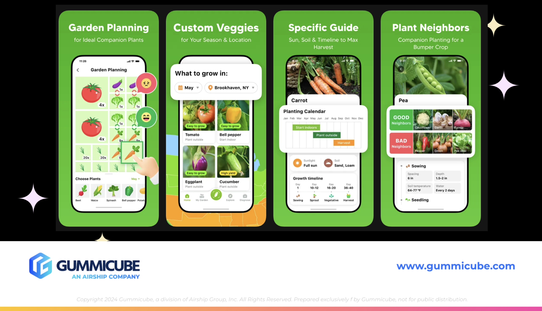
GrowIt also utilizes seven screenshots, similar to Seedtime. However, the structure and presentation of those screenshots are more effective in communicating functionality.
The first three screenshots deliver clear and concise feature messaging.
Examples include:
“Garden planning for ideal companion plants”
“Custom veggies for your season and location”
“Specific guide: sun, soil and timeline to max harvest”
Each screenshot follows a similar structure of headline, supporting text, and iPhone mockup. The difference is that the supporting text is only one sentence long. This makes the messaging easier to read and digest quickly. Additionally, the iPhone mockups are zoomed into the specific feature being discussed. This allows users to visually connect the text description with the interface element being highlighted. One screenshot also introduces a geographic design element by displaying a map of the United States. This visual directly supports the message about location-based growing recommendations.
The final screenshot features the headline “Grow food by yourself” paired with a real-world image of fruits and vegetables. This type of lifestyle imagery helps reinforce the tangible outcomes of using the app. Overall, the screenshot gallery feels more engaging and easier to interpret than Seedtime’s current presentation.
THE ROLE OF ITERATION IN APP STORE SUCCESS
Even well-designed app listings require regular refinement. App developers cannot simply create a polished set of screenshots and assume that the listing will perform optimally forever. The mobile app ecosystem is constantly evolving. Seasonality plays a role in many categories, including gardening. Search behavior can shift depending on planting seasons, regional climates, and trending gardening topics. User preferences also change over time, and visual styles that perform well today may become less effective as design trends evolve. Because of these factors, app developers must regularly evaluate their listings through competitor analysis and keyword research.
Mobile app A/B testing is important for testing different screenshots, messaging approaches, and metadata combinations to help developers identify which variations resonate most with users. Real user data provides the insights needed to refine listings and improve conversion rates. This iterative process ensures that apps remain competitive within their categories while adapting to shifting market dynamics.
FINAL THOUGHTS
Seedtime: Garden Planner App presents a solid foundation for a successful App Store listing. Its title and subtitle clearly communicate functionality, and the app icon effectively represents the gardening theme.
However, the screenshot gallery presents several opportunities for optimization. Improving text readability, highlighting specific features within the iPhone mockups, and introducing more engaging visual elements could significantly strengthen the listing’s conversion potential. Comparing the listing with competitors like GrowIt also reveals how small design adjustments and targeted messaging can make screenshots easier to interpret and more visually compelling.
For app developers in the gardening category and beyond, the key takeaway is that App Store success requires continuous evaluation. Strong metadata, thoughtful creative design, keyword research, and consistent A/B testing all play an essential role in maintaining visibility and improving conversion rates. App Store Optimization is a dynamic process driven by real user behavior, evolving search trends, and ongoing experimentation.
LET’S CHAT!
Optimizing an App Store listing requires data, A/B testing, and continuous strategic refinement. At Gummicube, our team specializes in helping developers navigate the complexities of App Store Optimization through advanced tools, market insights, and proven strategies.
If you are looking to strengthen your app’s visibility, refine your creative assets, or uncover new keyword opportunities, our experts are here to help. Reach out to learn more about how our ASO services can support your app’s growth and long-term success in the App Store.
More blog-posts like this:

Preparing for ASO Takeoff with Skyscanner
Every successful App Store listing needs to begin with a strong first impression. Read more!

That's a Wrap On Edits ASO Strategy
Let's take a closer look at where Edits succeeds and where there is room for optimization.

On The Air: FM Radio ASO Audit
In this week's App Store Spotlight, we're putting FM Radio under the ASO microscope.