Checking In on Booking.com's ASO Strategy
April 17th, 2026
 Tagged: App Title, A/b Testing, App Metadata, App Ranking
By Anh Nguyen
COO & Co-Founder at Gummicube, Inc
As festival season ramps up with events like Coachella Valley Music and Arts Festival and summer travel demand begins to surge, users are actively searching for reliable ways to book accommodations, flights, and transportation. This seasonal behavior creates a critical window for travel apps to capture high-intent users through strong App Store Optimization (ASO) strategies.
Among the most established players in this space is Booking.com. With a globally recognized brand and a massive inventory of listings, Booking.com has a significant advantage in user trust and awareness. However, even dominant apps must continually refine their App Store presence to maintain visibility, improve conversion rates, and stay competitive in a crowded category.
In this week’s spotlight, we break down Booking.com’s App Store listing to evaluate what is working, where improvements can be made, and how it compares to a key competitor.
BOOKING.COM’S APP TITLE AND SUBTITLE STRATEGY
Booking.com’s app title, “booking.com: Hotels & Travel,” paired with the subtitle “Hotels, flights, & car rentals,” demonstrates a broad and inclusive keyword strategy. From an ASO perspective, this approach is intentional and effective in capturing a wide range of high-volume search queries.
By incorporating core terms such as “hotels,” “travel,” “flights,” and “car rentals,” the app positions itself to rank across multiple high-intent search categories. These are foundational keywords within the travel vertical, and their inclusion signals relevance to both Apple’s algorithm and potential users browsing the App Store.
While this breadth is valuable, it also introduces a strategic trade-off. Broad keyword targeting can sometimes dilute ranking strength for more specific, high-conversion search terms. This is where advanced ASO tools become essential. Identifying high-volume, high-relevance keywords and balancing them with more niche, intent-driven phrases allows apps to refine their visibility strategy over time.
Booking.com’s current metadata does an excellent job of establishing reach. The opportunity lies in continuous optimization through data-backed keyword iteration to ensure the app maintains strong positioning as search trends evolve.
BOOKING.COM APP ICON: BRAND RECOGNITION VS. DISCOVERABILITY
The Booking.com app icon is a simple blue square featuring the text “booking.” While minimalistic and instantly recognizable for users already familiar with the brand, it lacks visual context for new users encountering the app for the first time.
From a branding standpoint, this approach is effective. It reinforces brand identity and maintains consistency across platforms. However, from a discoverability and conversion standpoint, it presents limitations.
App icons serve as a critical first impression, particularly in search results where users are quickly scanning multiple options. Icons that visually communicate the app’s purpose can significantly improve tap-through rates. In this case, the icon does not explicitly convey travel, hotels, or booking services beyond the text's implied meaning.
There is an opportunity here to test variations that incorporate subtle visual cues related to travel, such as location markers, beds, or transportation symbols. A/B testing different icon treatments can provide actionable insights into what resonates most with users and drives higher engagement.

APP SCREENSHOT STRATEGY AND VISUAL ENGAGEMENT FOR BOOKING.COM
Booking.com uses 9 of the 10 available App Store screenshots, indicating a strong intent to fully communicate the app’s value proposition. However, the execution of these screenshots leaves room for improvement.
The current design relies heavily on a white background, simple black text, and standard iPhone mockups. While the messaging is informative, the visual presentation is highly uniform across all screenshots. This consistency, while clean, ultimately works against the app by failing to capture attention.
In a competitive environment where users make split-second decisions, screenshots must do more than inform. They must engage. Booking.com’s current set risks being overlooked because it lacks visual hierarchy, contrast, and dynamic design elements.
Each screenshot appears nearly identical in layout and style, which can lead to user fatigue. Instead of guiding the user through a compelling narrative, the visuals feel repetitive and easy to skim, making it hard to fully absorb the messaging.
This is a critical area for optimization. Introducing stronger visual contrast, varied layouts, and more engaging design elements can significantly improve conversion rates. Color blocking, bold typography, and differentiated compositions can help each screenshot stand out while still maintaining a cohesive brand identity.
Additionally, prioritizing the first three screenshots is essential. These are the only visuals users see in search results before tapping into the full listing. If these images do not immediately communicate value and differentiation, the app risks losing potential downloads at the earliest stage of the funnel.
THE ROLE OF MOBILE APP A/B TESTING IN CREATIVE OPTIMIZATION
A/B testing is one of the most powerful tools available to app marketers seeking to refine their App Store presence. For an app at the scale of Booking.com, even marginal improvements in conversion rate can translate into substantial increases in downloads and revenue.
Testing should be approached methodically. Each element of the app listing, including icons, screenshots, and messaging, should be evaluated individually to isolate performance drivers. This ensures that changes are intentional and backed by real user behavior rather than assumptions.
Mobile app A/B testing tools allow developers to experiment with different creative approaches and measure their impact before rolling out updates broadly. This reduces risk and enables continuous improvement.
For Booking.com, testing more visually engaging screenshot designs, experimenting with icon variations, and refining messaging hierarchy could unlock significant performance gains. The current listing provides a solid informational foundation, but it lacks the level of creative optimization required to fully capitalize on user attention.
APP COMPETITOR COMPARISON: HOTELTONIGHT
To better understand where Booking.com stands, it is useful to compare its listing with a direct competitor, HotelTonight.
HotelTonight positions itself with a more focused value proposition. Its title, “HotelTonight: Hotel Booking,” and subtitle, “last minute deals on hotels,” clearly emphasize urgency and savings. This targeted messaging differentiates the app and appeals to a specific user need.
This contrast highlights a key strategic difference. While Booking.com aims to serve a broad audience, HotelTonight leans into a niche, high-intent segment. Both approaches have merit, but HotelTonight’s specificity can lead to stronger conversion among users searching for last-minute deals.
APP ICON DIFFERENTIATION AND USER SIGNALS
HotelTonight’s app icon takes a different approach by using an abstract image that resembles a bed. While it does not include text, the visual cue immediately communicates the app’s purpose.
This is an important distinction. Visual storytelling through icon design often outperforms text-based branding in crowded search environments. The ability for a user to instantly recognize what an app offers without reading can improve engagement and drive more downloads.
Compared to Booking.com’s text-based icon, HotelTonight’s design provides clearer contextual signaling. This is an area where Booking.com could benefit from experimentation.
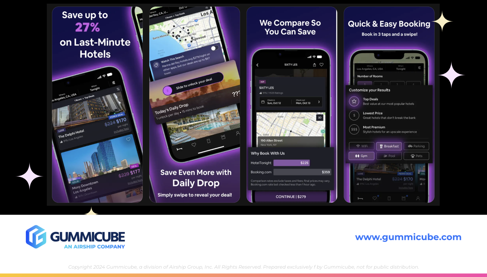
APP SCREENSHOT EXECUTION AND USER ENGAGEMENT
HotelTonight’s app screenshot strategy is a strong example of effective creative execution. Despite using only 7 screenshots, the listing feels dynamic, engaging, and visually distinct.
The use of a navy blue background paired with bold white text creates immediate contrast and readability. Design elements such as the light purple halo around the iPhone mockups add depth and visual interest without overwhelming the user.
More importantly, each screenshot feels intentional and unique. The layouts vary, the messaging evolves, and the overall presentation guides the user through a clear and compelling narrative.
The first 3 screenshots are particularly impactful. Messaging such as “save up to 27% on last-minute hotels” and “save even more with daily drop” immediately communicates value and urgency. These are the types of high-impact statements that capture attention in search results and encourage users to take action.
This highlights a key takeaway. Effective screenshots are not just about aesthetics. They are about communication. Strong visuals paired with clear, benefit-driven messaging create a powerful combination that drives conversions.
KEY TAKEAWAYS FOR ASO SUCCESS
Booking.com’s App Store listing demonstrates the strength of a well-established brand supported by a solid metadata foundation. Its broad keyword strategy ensures visibility across a wide range of searches, and its comprehensive screenshot set communicates functionality effectively.
However, the analysis also reveals clear opportunities for improvement. The app’s visual assets, particularly its screenshots and icon, lack the level of engagement needed to stand out in a competitive landscape. In contrast, HotelTonight showcases how thoughtful design, strong visual hierarchy, and focused messaging can elevate an app listing and drive user action.
For developers and marketers, the lesson is clear. ASO is not a one-time effort. It is an ongoing process that requires continuous testing, iteration, and refinement. Balancing keyword strategy with compelling creative execution is essential for maximizing both visibility and conversion.
FINAL THOUGHTS
As travel demand continues to rise, the competition within the App Store’s travel category will only intensify. Apps like Booking.com have the advantage of scale and brand recognition, but maintaining leadership requires ongoing optimization.
By investing in more engaging creative assets, leveraging A/B testing, and refining its keyword strategy, Booking.com can further strengthen its App Store presence and capture even more high-intent users during peak travel seasons.
Success in the App Store is driven by a combination of discoverability and conversion. Apps that excel in both areas consistently outperform the competition.
LET’S CHAT!
If you are looking to elevate your app’s performance in the App Store, a strategic and data-driven approach to ASO is essential. From keyword optimization to creative testing, every element of your listing plays a role in driving growth.
Our team of experts specializes in helping apps identify opportunities, test effectively, and implement strategies that deliver measurable results. If you are ready to refine your App Store presence and reach your app’s full potential, our ASO services are here to help.
More blog-posts like this:

Preparing for ASO Takeoff with Skyscanner
Every successful App Store listing needs to begin with a strong first impression. Read more!

That's a Wrap On Edits ASO Strategy
Let's take a closer look at where Edits succeeds and where there is room for optimization.

On The Air: FM Radio ASO Audit
In this week's App Store Spotlight, we're putting FM Radio under the ASO microscope.