Headway- Daily Micro Learning's ASO Analysis
September 12th, 2025
 Tagged: Aso Services, Aso, App Metadata, App Ranking, Headway
By Anh Nguyen
COO & Co-Founder at Gummicube, Inc
App Store Optimization (ASO) is the cornerstone of app discoverability and long-term success. Positioning your app with the right metadata, creative assets, and messaging can determine whether you rise in rankings or get lost in the shuffle. In this week’s App Store Spotlight, we analyze the ASO strategy of Headway - Daily Micro Learning. We will identify where improvements can be made in the title, subtitle, and creative assets. Then, we will take a look at one of Headway’s competitors and outline the lessons that can be applied to long-term growth opportunities.
HEADWAY’S APP TITLE AND SUBTITLE ANALYSIS
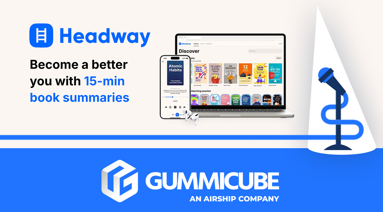
The app title, “Headway - Daily Micro Learning,” uses the popular term “micro learning”. This term is growing in search popularity among professionals and students seeking an efficient way to absorb new knowledge quickly. Including this keyword in the app’s title could help to place Headway in better positioning to appear in more search results. Despite the mention of “micro learning”, the title fails to show users what kind of learning they can expect.
The subtitle “self improvement, growth, care” provides a glimpse into the app’s features but lacks specificity. Subtitles are an opportunity to communicate app value directly and differentiate your app from competitors. Headway misses that opportunity by choosing general lifestyle terms rather than specific high-level terms that describe what users will actually engage with once they open the app. For example, including topics such as “Art, science, sports, & more” showcases the variety of topics that users can expect to learn about.
A current user reading the current subtitle may still question what topics they would be learning and how the app fits in with their goals. By naming concrete topics and categories, it could reduce friction in the discovery and downloading decision-making process.
HEADWAY APP SCREENSHOT ANALYSIS
Screenshots are the storefront windows of any app listing. They can often be the first, and sometimes only, visuals that users see before deciding whether to install your app or not. Headway’s screenshots start strong but lose momentum as you scroll through their screenshot sets.
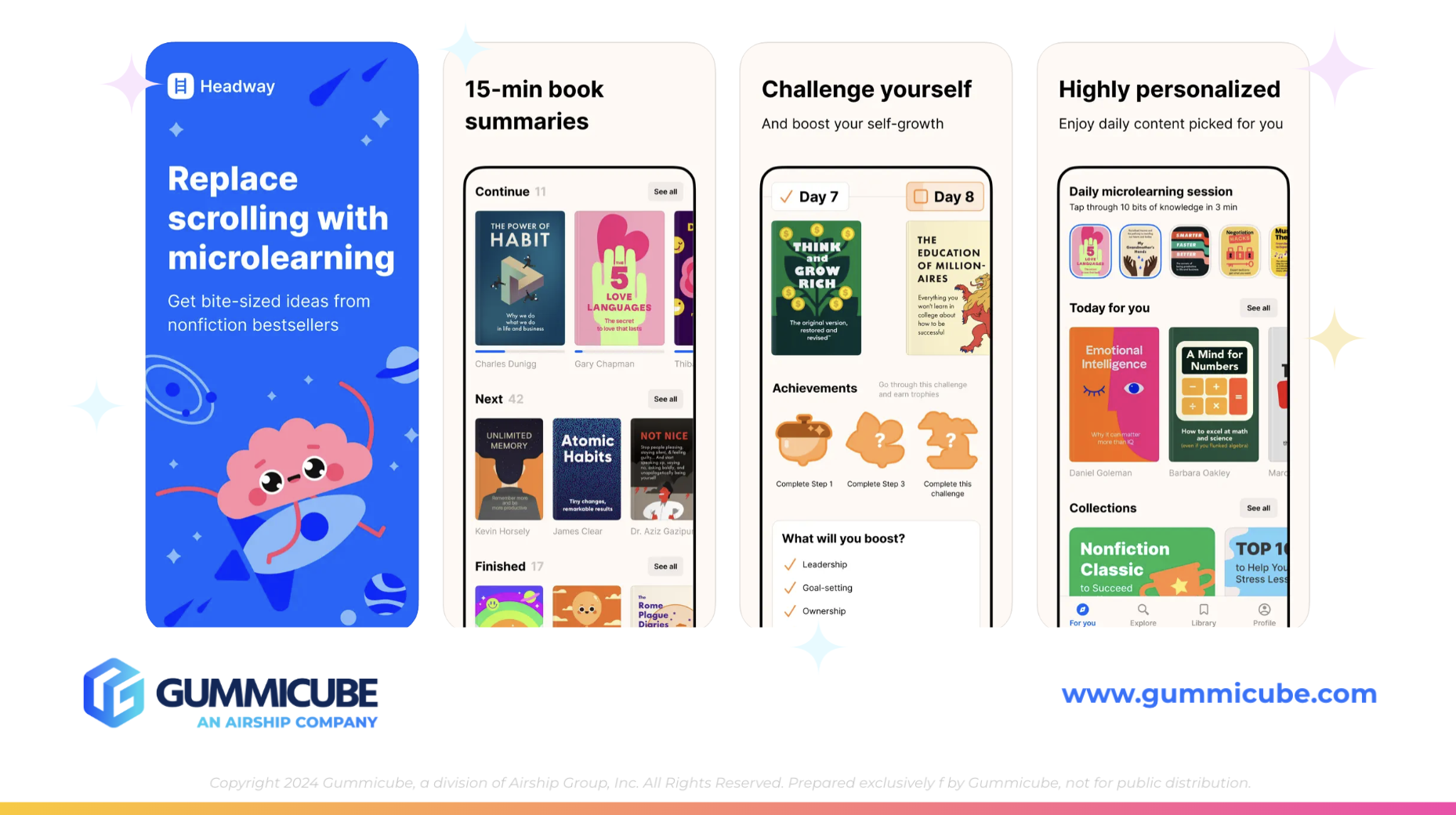
The First Screenshot: Setting The Foundation
Headway’s first screenshot is bold and engaging. The bright blue background immediately catches the eye, and the use of a fun, brain-themed character adds a lighthearted but polished element. Importantly, the first screenshot defines the meaning of micro learning as “bite-sized ideas from non-fiction best sellers”. This is where users find their clarification on what micro learning this app has to offer.
Headway’s Remaining App Screenshots
Where Headway falters is in its sequence of screenshots following the first one. Screenshots two through seven are repetitive and may not introduce enough variety to hold a user’s attention. While there is mention that micro learning involves “15-minute book summaries,” the rest of the app sequences miss opportunities to showcase app features in depth.
Screenshot three reads, “Challenge yourself,” with a smaller line of text beneath stating, “and boost your self-growth.” Unfortunately, the smaller text is too thin and small to read easily on a mobile device, especially if the user is seeing the app appear from a search result. The iPhone mockups are equally unengaging, with bland presentations that do not give users a clear sense of what the in-app experience usually looks like.
The last screenshot showcases a good review accompanied by a little more detail than the previous screenshots, and this element is eye-catching. Headway could consider moving this element toward the front of the app screenshots since its design elements make it more engaging than the iPhone mockup screenshots.
A strong creative sequence should use the first three screenshots to communicate core benefits with clarity, variety, and engaging designs. Headway’s visuals contain the right intent, but lack execution, leaving plenty of creative potential in their app listing.
LEARNING FROM THE COMPETITION
One of the most effective ways to improve an ASO strategy is through competitor analysis. Comparing Headway to Nerdish: Daily Micro Learning reveals clear differences that could impact visibility and conversion rates.
Clear App Subtitles Drive Clear Expectations
While both apps share nearly identical titles with “daily micro learning,” the subtitles take different approaches. Nerdish uses “Science, Art, History Articles” to immediately communicate content categories for micro learning. This can give potential users a precise idea of what they can expect to read and learn while using the app.
By defining its niche, Nerdish reduces the likelihood of a mismatched download from a user who was expecting different results. Headway’s vague subtitle could initially attract installs, but users who discover the content does not match their expectations are more likely to uninstall quickly. Nerdish’s clarity can help build trust between users and the app and set the stage for long-term engagement.
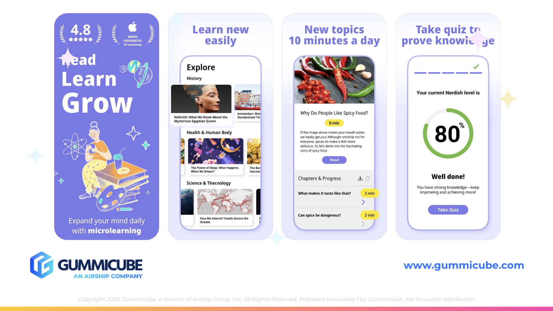
Visual Storytelling that Builds Trust
Nerdish also delivers a more polished and compelling set of screenshots. The first screenshot features bold text like “Read, Learn, Grow,” which is clear for new users. Nerdish also includes trust signals right off the bat in screenshot one, with a 4.8 rating and design elements, along with the “Apple of the Week’s Favorites 17 countries” recognition design. These elements immediately build credibility and could position the app as a proven choice above competitors.
Screenshots two through five maintain consistency but introduce variations that keep users engaged. Each screenshot uses large, bold headers and includes iPhone mockups with pop-out elements highlighting specific features. This design technique emphasizes details without overwhelming the viewer.
The background gradient that transitions from white to light purple adds a subtle but appealing aesthetic, creating a more visually appealing screenshot experience than using solid background colors.
Overall, Nerdish demonstrates how clarity, bold design, and inclusion of credibility elements can help your app listing make a better first impression with new viewers.
A/B TESTING YOUR APP LISTING
Identifying weakness and analyzing competitors is one-half of the process. The other half is testing. A/B testing ensures that changes are guided by data, rather than just guessing what your next move will look like.
ASO tools like Splitcube can test every visible element in an app listing. If users can see it, it can be tested within this platform. This includes the app title, subtitle, screenshots, and descriptions.
For Headway, meaningful A/B testing opportunities could include:
- A/B testing a subtitle that names specific learning categories versus one that emphasizes lifestyle benefits.
- Experimenting with bold, readable text sizes and redesigned mockups to see if it helps increase conversion rates.
- Recording screenshots so that the core benefits are mentioned in the first three screenshots.
- Comparing different keyword sets in metadata to identify which combinations resonate best with your target audience.
A/B testing helps developers make decisions rooted in real users’ behaviors. Over time, these insights help create data-driven ASO strategies that can be regularly improved as seasons change or the market shifts.
FINAL THOUGHTS
Headway already has several areas where its app listing is doing well. Using high-volume keywords like “micro learning” helps give the app a better chance at appearing in search results when a user searches for this term in the search bar. The first screenshot is visually appealing and introduces the concept of bite-sized learning clearly.
However, these strengths are undermined by a vague subtitle, repetitive screenshots, and weak design elements. In contrast, Nerdish shows how clarity in the subtitle and bold, trust-building visuals can set your app apart from the crowd. By comparing Headway to Nerdish, we see areas of improvement that Headway can apply to its ASO strategy.
LET’S CHAT!
If you are looking to strengthen your ASO strategy and optimize your app listing to be a powerful representation of your app, Gummicube is here to help. Our ASO services are rooted in data-driven results and proven strategies. From keyword research to creative optimization, we help apps stand out and make smart iterations that can help to set your app apart from the crowd. Contact us today to get started!
More blog-posts like this:

On The Air: FM Radio ASO Audit
In this week's App Store Spotlight, we're putting FM Radio under the ASO microscope.

FotMob's ASO Analysis: Penalty kick or On Target?
Apps that fail to evolve their App Store presence risk being buried beneath competitors that are actively optimizing for visibility & conversion rates.

Timeleft: Finding Friends, But Is It Finding App Store Visibility?
A/B testing alternative subtitle structures, and experimenting with screenshot designs could set Timeleft apart from its competition. Read more!