Taking a Look at Apple's Design Award Winners
June 18th, 2025
 Tagged: App Icons, Apple Design Awards, App Ranking, Aso Strategy, App Metadata
By David Bell
CEO at Gummicube, Inc.
Each year, Apple’s Design Awards shine a spotlight on the best of the App Store. The awards celebrate innovation, creativity, and exceptional user-focused experiences. While these winning apps span a variety of genres and functionalities, there is one consistent feature that is hard to miss while scrolling through the list of winner: their app icons. Before users know what a winning app does or how it feels, they see its icon next to its name. That first impression holds weight.
For developers focused on App Store Optimization (ASO), the Apple Design Awards are more than a source of inspiration. They can offer a chance to assess how icons and app creatives can influence user behavior. Great app design should be reflected not only within the app itself, but also in every touchpoint of an app store listing. The app icon is one of the most visible and impactful of those touchpoints.
This year’s award winners not only showcase what great design looks like in practice, they also present an important opportunity for app developers to rethink their own creative strategies. Specifically, the potential of seasonal icon updates to keep users engaged and boost performance over time.
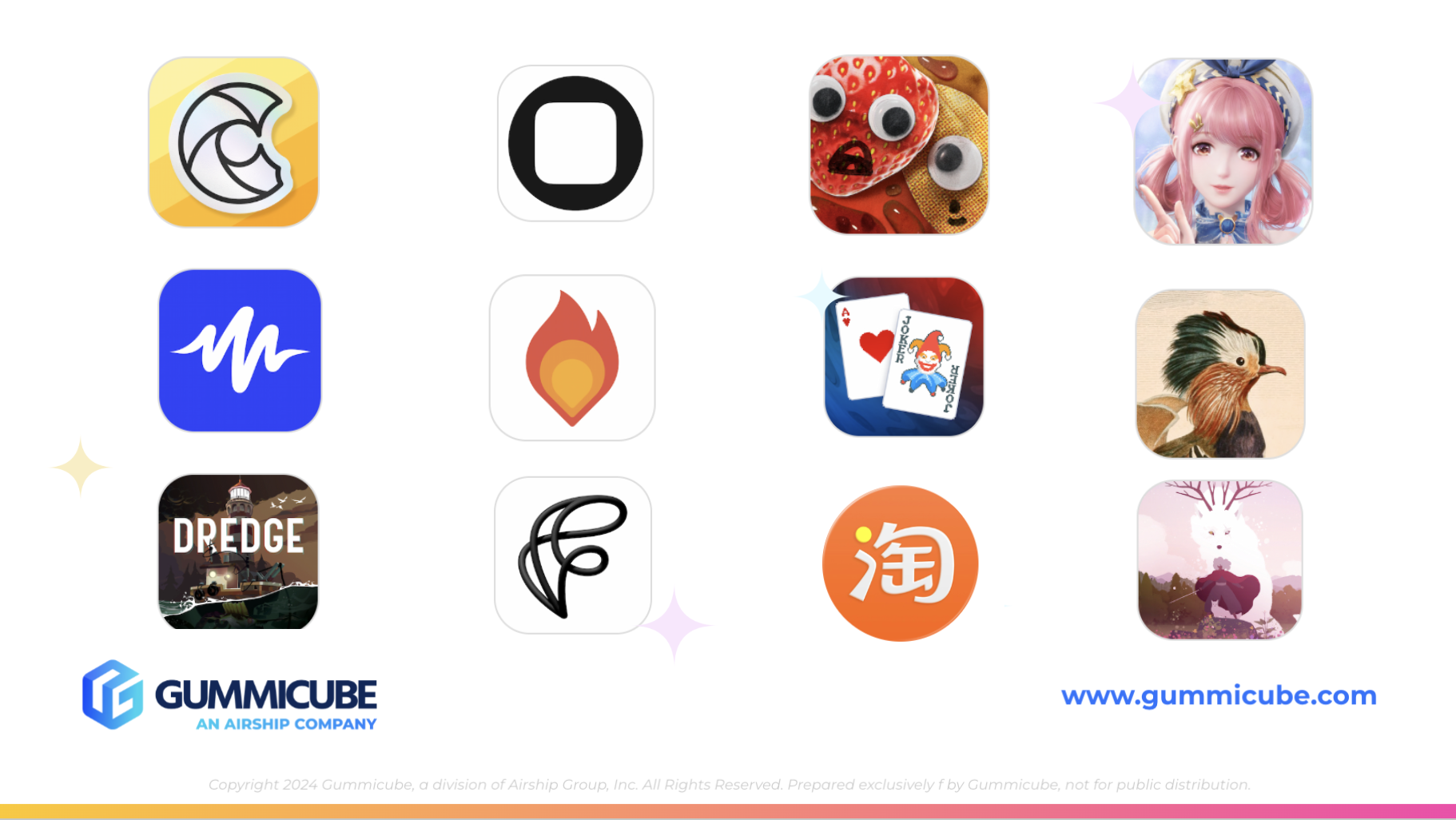
2025 APPLE DESIGN AWARD WINNERS
Apple’s most recent Design Award winners excel across categories like innovation, interaction, inclusivity, and visual excellence. These apps and games stood out to Apple’s judges not only for how they function, but for how they feel to use. Here is the list of this year’s recognized apps:
- CapWords – Delight and Fun
- Balatro - Delight and Fun
- Speechify – Inclusivity
- Art of Fauna - Inclusivity
- Play – Innovation
- PBJ - The Musical – Innovation
- Taobao – Interaction
- DREDGE – Interaction
- Watch Duty: Wildfire Maps – Social Impact
- Neva – Social Impact
- Feather: Draw in 3D – Visuals and Graphics
- Infinity Nikki – Visuals and Graphics
Apple features each of these winners with their app icon prominently displayed next to the app name. That pairing becomes the first and most persistent way users experience these apps outside of their actual usage. In the App Store, your icon acts as your lead creative asset. It is what appears in search results, top charts, and curated lists.
This year’s winners succeed in part because they understand the visual power of the icon. Their design choices go beyond the interface. They make strong use of color, composition, and alignment with the app’s purpose.
THE ROLE OF APP ICONS IN ASO
App Store Optimization is a process focused on developing a strategy that could increase app visibility or maximize app conversion rates. While much of ASO focuses on metadata like titles, subtitles, and keyword fields, creative assets carry just as much weight. The app icon is central among those assets.
Your app icon appears:
- Next to your app name in all search results
- On Apple-curated feature lists
- Inside user libraries and recommendation carousels
- As the primary branding element in marketing materials
For users encountering your app for the first time, the icon creates the initial impression. If the design is visually appealing and contextually appropriate, it invites further exploration. If the icon feels unclear, outdated, or disconnected from the app’s purpose, users may scroll past without ever learning more.
DESIGN PATTERNS FROM THIS YEAR’S WINNERS
Looking closely at this year’s Design Award recipients, a few common themes stand out in their app icon strategy:
1. Simplicity over complexity Effective icons are focused. They avoid unnecessary detail and instead deliver strong shapes and clean lines that scale well to small sizes. An icon should be instantly recognizable, even on the smallest screen.
2. Strategic use of color Color choice sets the tone. Speechify, for instance, uses high-contrast colors that help it stand out. Consistent use of color can reinforce an emotional response before a user even engages with the app.
3. Brand cohesion The icon should reflect the overall aesthetic of the app. When users open a Design Award-winning app, the visual tone established by the icon often carries through the full experience. That visual consistency builds trust and reinforces brand identity.
These best practices are not exclusive to award-winning developers. Any app can benefit from designing with clarity, color, and cohesion in mind.
WHY SEASONALITY SHOULD BE A PART OF YOUR ICON STRATEGY
While most of the Design Award icons are built for timelessness, there is a growing opportunity for seasonal icon updates that align with user expectations and market cycles. Seasonal updates are a powerful tactic in ASO.
What is a Seasonal App Icon?
A seasonal icon is a temporary update to your main app icon that reflects holidays, seasonal events, or cultural moments. These changes are often subtle: a wreath or snowflake in December, a heart in February, or a beach umbrella in July. The base design remains familiar, but the update brings a sense of freshness and relevance.
Why Seasonal App Updates Work
- They show app activity: When users see that your app updates its icon throughout the year, they perceive it as well-maintained. Regular updates signal reliability.
- They can increase app visibility: Holiday-themed icons often catch the eye more quickly. In a long list of search results, the app that feels in sync with the current moment has an edge.
- They can create a moment of curiosity: A familiar app with a new look encourages re-engagement from existing users and may intrigue new ones who are browsing for something fresh.
Best Practices for Seasonal App Icons
To be effective, seasonal updates should be handled carefully. Here are a few principles to follow:
- Maintain brand recognition: Your icon should still be clearly associated with your app. Do not overhaul the core design. Instead, introduce seasonal accents.
- Align changes with broader app updates: Coordinate icon changes with seasonal screenshot swaps, promotional text, or in-app events to create a unified seasonal campaign.
- Avoid over-complication: Small, clean visual additions work best. Too much visual clutter can reduce clarity and recognition for viewers.
- Plan ahead: Treat seasonal icon updates like any other campaign. Map out your calendar, allocate design resources, and leave time for review.
HOW TO TEST APP ICON PERFORMANCE
One of the most compelling aspects of seasonal updates is the opportunity to test. On iOS, app icon A/B testing is limited. You cannot test two live icons against one another in the same storefront. However, that does not mean testing is off the table.
Using mobile app A/B testing ASO tools like Splitcube, you can simulate an App Store environment and test icon variations with real users before committing to an update. This helps:
- Determine which app design performs better in user acquisition
- Understand how seasonal app designs affect perception
- Reduce risk when pushing visual changes to your live app audience
For app developers working across many markets, this approach also allows you to test cultural relevance in different regions. What works for one audience or territory may not perform well in another. A/B testing helps ensure your seasonal update is a strategic move, not just a shot in the dark.
SEASONAL APP ICON UPDATES AS PART OF A BROADER ASO PLAN
Incorporating seasonal app icon updates is part of a broader ASO strategy that aligns design with app discoverability to help boost app installs. When users browse the App Store, especially during high-traffic periods like holidays or major events, an updated icon signals that your app is active and aligned with the moment.
For app developers in competitive categories, these small updates can lead to a meaningful boost in app installs. Combined with high-volume keywords, fresh app creative assets, your seasonal icon becomes a subtle but powerful way to gain attention in the app stores.
It is also worth noting that Apple tends to reward activity. Regular updates, even cosmetic ones, indicate to Apple’s algorithms that your app is being maintained. This can support discoverability and increase your chances of being included in editorial picks or curated collections.
FINAL THOUGHTS
Apple’s Design Awards offer a glimpse into what excellence looks like in the App Store. These winners demonstrate that great design is not limited to functionality or aesthetics in isolation. It spans the entire user journey, beginning with the icon and continuing through to every in-app interaction.
While most developers will not win a Design Award, every developer can adopt the same principles. Start with a clear, purposeful icon. Consider how your visuals evolve over time. Use seasonality not as a gimmick, but as a method to stay relevant, increase visibility, and engage both new and returning users.
ASO is not just about being seen. It is about being chosen. And that choice often starts with a single square icon.
LET’S CHAT!
Your app icon might be holding your app back. Want to find out?
We’ve helped top apps boost their visibility and drive downloads using our proven ASO services. From creative asset analysis to deep keyword insight, we turn data into growth. Reach out today to take the first step into creating a winning ASO strategy.
More blog-posts like this:

iOS App Store Updates for Brazilian App Developers
Developers will soon have new options for distributing iOS apps and processing payments in Brazil.

Apple is Rolling Out a Refined Interface for the App Store
At WWDC 2026, Apple unveiled several creative enhancements that give App Store Optimization (ASO) professionals significantly more control over how its apps appear throughout the App Store.

Subscription-based App Developers are Losing Business
A canceled app subscriber is lost revenue that may never return. Read more!