An Open Table to an Elevated ASO Strategy
June 13th, 2025
 Tagged: Opentable, Resy, App Store Spotlight, Aso Services, Aso Strategy, App Ranking, App Metadata
By David Quinn
VP of Strategy & Partnerships at Gummicube, Inc.
Standing out in the App Store takes more than name recognition. Even category leaders need to fine-tune their listings to stay competitive and convert users effectively. Converting users from a search result to a loyal customer requires thoughtful execution of every component of your App Store listing. Even well-established brands can benefit from continued refinement and optimization. This is where strategic App Store Optimization (ASO) comes into play.
In this week's App Store Spotlight, we’re turning our attention to OpenTable, a widely recognized app that has become a go-to for diners across the country. While OpenTable currently holds the #19 position in the Food & Drink category on the App Store, there’s still a great deal of opportunity to further optimize their listing to drive even stronger results.
This week’s spotlight breaks down OpenTable’s metadata, app creative assets, and ways that they can hone in their ASO strategy. Below, we will highlight what OpenTable, and other apps, can leverage to increase app visibility, enhance user trust, and ultimately drive higher conversion rates.
APP TITLE AND SUBTITLE ANALYSIS
OpenTable has secured a strong position at #19 in the Food and Drink category, but there is still untapped potential within their app store listing that could help them climb even higher. The first area to evaluate is their App Title and Subtitle strategy.
The current App Title is simply "OpenTable," using just 9 of the 30 available characters. While OpenTable as a brand is widely recognized, the limited use of the title character space misses a key ASO opportunity. Including a high-volume keyword can increase visibility in search results and provide clarity about the app’s purpose to users unfamiliar with the brand.
An example title improvement could be:
OpenTable: Food Reservations (28 of 30 characters)
This addition keeps the brand front and center while incorporating a keyword that aligns with user search behavior.
Their subtitle, "Find Restaurant Reservations," is a stronger example, using 28 of 30 characters and including a clear, search-friendly phrase. However, even here, there is room for refinement. The subtitle could better connect with users by adopting a more action-oriented and engaging tone:
Explore and Book a Table (22 of 30 characters)
Using the full character count across both title and subtitle is a simple yet impactful way to boost keyword reach, improve context, and guide user expectations in a crowded marketplace. These metadata elements do not just serve as labels. They are powerful ranking signals for Apple’s algorithm and act as a user’s first impression. Leveraging every available character ensures you are maximizing discoverability and increasing the likelihood of a meaningful conversion.
APP SCREENSHOTS AND CREATIVES
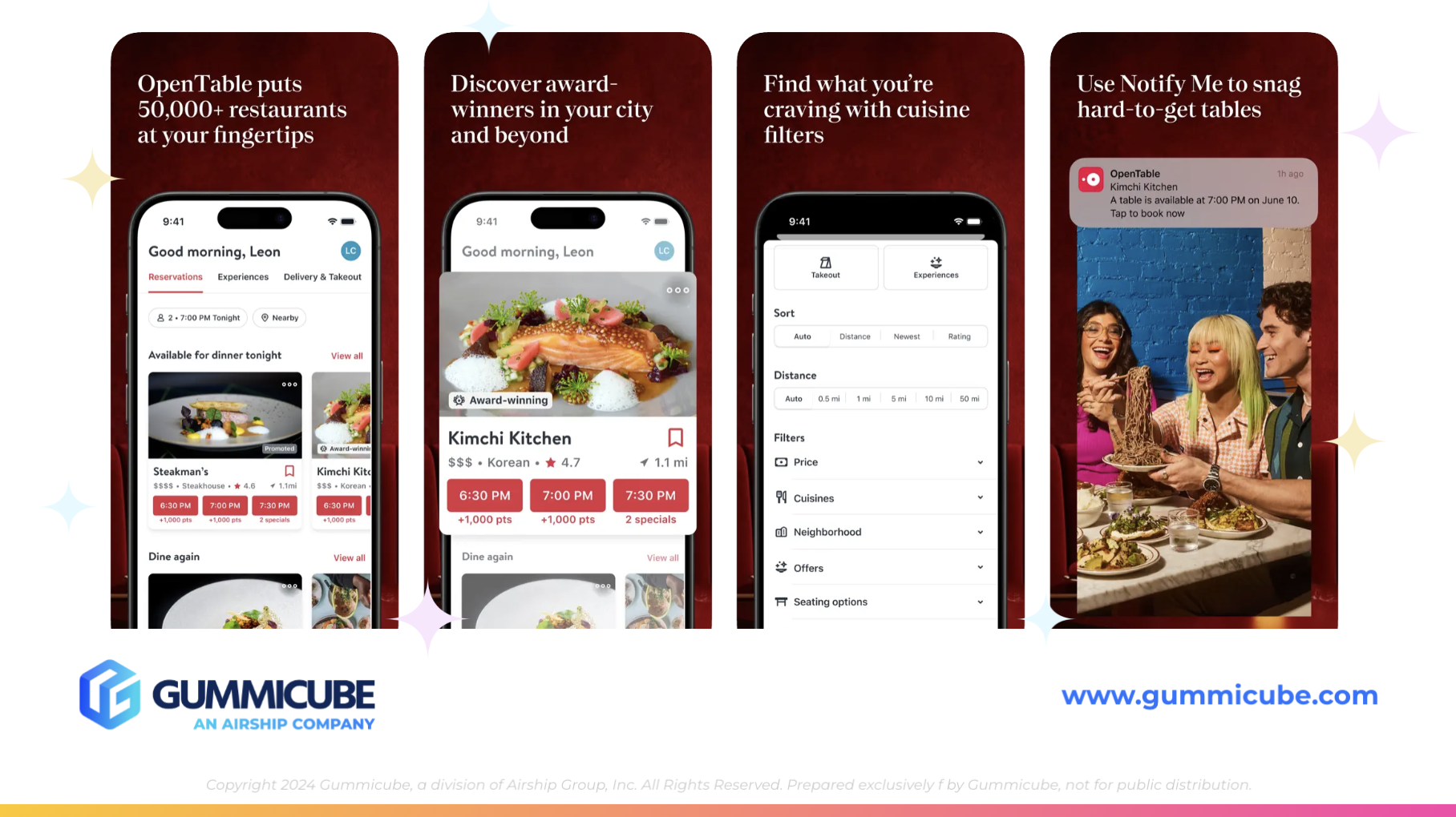
Next, we turn to OpenTable’s app creatives. They currently utilize 6 of the 10 allowed screenshots. While that’s a decent start, they are leaving valuable space unused that could further communicate app value, highlight differentiators, and increase engagement.
A few observations stand out:
- Font Readability: The screenshots use a thin, stylized white font over a dark burgundy background. While the color contrast is a smart design choice, the font is difficult to read at a glance. Readability is critical in screenshots. If the message isn’t instantly clear, users are more likely to scroll past or bounce.
- Repetition in Screenshot Layouts: The screenshot designs are quite repetitive. Each screenshot looks and feels very similar, making it easy for users to tune out. While the use of iPhone mockups is a positive, OpenTable could benefit from a more dynamic layout that includes design continuity from one screenshot to the next. A connected design or background pattern could guide the eye and encourage continued scrolling.
- Prioritization of App Key Features: Surprisingly, the core function (reserving a table) isn’t mentioned until the final screenshot. The first three focus on features like “50,000+ restaurants,” “discover award winners,” and “finding what you’re craving.” These are valuable features, but they don’t immediately convey the app’s core purpose. The first three screenshots are the most important for conversion and need to clearly communicate the app’s primary value proposition.
OpenTable should aim to highlight its core functionality of "restaurant reservations" within the first two or three screenshots. Reinforcing this early can help users quickly understand why they should download.
Adding a few more screenshots opens the door to highlighting different features for specific user types and allows for more opportunities to include high-volume keywords. Each screenshot should have a clear purpose and be part of a larger narrative. Without this intentional design, even high-ranking apps can miss out on driving users deeper into the listing experience.
WHY MOBILE APP A/B TESTING MATTERS
One of the most effective ways to refine an app listing is through A/B testing. With the right tools, developers and marketers can test variations of:
- Screenshot order
- Font type and size
- Color palette and contrast
- Real-life photography versus illustrations
- Inclusion or removal of iPhone mockups
For OpenTable, mobile app A/B testing could offer insight into whether users engage more with screenshots that use real photography, brighter backgrounds, or alternate copy placements. Even subtle changes, such as emphasizing "Book a Table" earlier, could produce measurable improvements in conversion.
Mobile app A/B testing doesn’t just apply to screenshots. It can and should be used for icons, promotional text, and even an app subtitle. Understanding what visual and textual elements resonate with your specific user base is essential to staying competitive in the app marketplace.
Regular testing allows developers to stay ahead of shifting user preferences. It also helps keep the listing fresh, relevant, and optimized for the audience’s current expectations. In the increasingly competitive Food and Drink category, these tweaks can be the difference between ranking in the teens or the top ten.
COMPETITOR COMPARISON: RESY
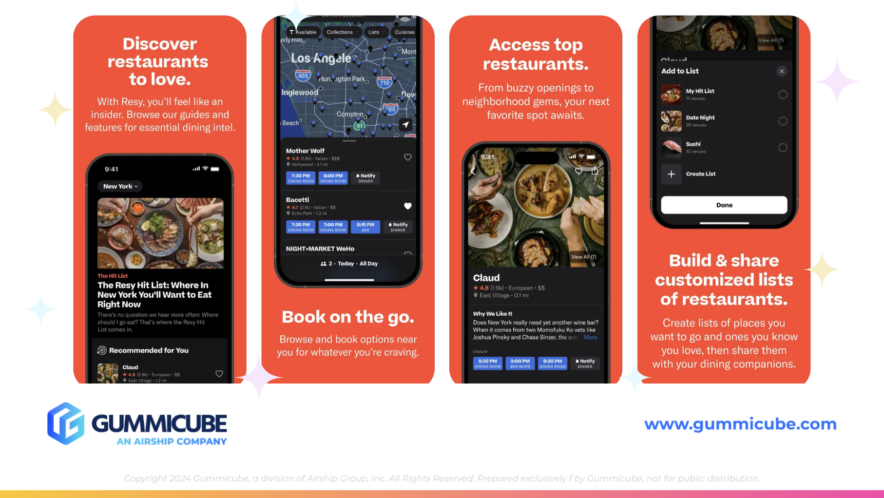
Looking at OpenTable’s competition helps contextualize what’s working and what could be improved. Resy, another app in the restaurant reservation space, ranks lower in the Food and Drink category (#40) compared to OpenTable, but is making smart ASO choices that could elevate its future ranking.
Resy’s subtitle is simply “Restaurant Reservations.” While basic, this phrasing is effective and keyword-rich. It communicates value clearly and succinctly.
On the screenshot front, Resy utilizes 7 out of 10 available slots. What stands out most is their screenshot design:
- High-Contrast Design: Each screenshot features a bold orange background with large, white, easily readable text. The clarity is immediate and impactful.
- Feature Prioritization: Screenshot number two includes the phrase “Book on the go,” which communicates the app’s core function right away. This is something OpenTable delays until the final screenshot.
- Smart Visual Alternation: Resy alternates iPhone mockup placement from top to bottom across screenshots. It’s a simple visual strategy that keeps the layout fresh without becoming chaotic. The listing remains uniform but not monotonous.
The contrast in creative strategy between OpenTable and Resy reveals clear opportunities. OpenTable has the brand strength but lacks immediacy in its messaging. Resy, though less known, communicates its core function quickly and effectively. Bridging that gap could make OpenTable’s listing more competitive.
Resy’s use of brighter, more vibrant color choices creates a sense of urgency and modernity that stands out against App Store search result pages. OpenTable, on the other hand, risks blending into the background visually due to darker tones and less distinct textual hierarchy.
By embracing elements that Resy has done well, without sacrificing brand identity, OpenTable could rejuvenate its listing and see measurable performance gains.
CONCLUSION
OpenTable’s brand equity has undoubtedly helped secure their place in the top 20 of the Food and Drink category. But strong brand recognition alone isn’t enough to sustain long-term ASO success. There are key areas of their listing that could be refined to attract even more users:
- Expand the app title with a high-volume keyword
- Revise the subtitle to make better use of available characters
- Improve font readability and layout variety in screenshots
- Reorder screenshots to highlight the core reservation feature earlier
- Explore design elements that increase visual engagement
- Mobile app A/B test creatives and messaging consistently
The app’s success to date has been bolstered by strong user demand and brand presence. However, leaning too heavily on brand recognition without regular listing optimization leaves opportunity on the table. As the competition sharpens and user preferences shift, taking a proactive approach to ASO is essential.
App Store Optimization is not a one-time task. It is an ongoing process of iteration, testing, and refinement. The most successful apps in any category are the ones that continue to search for ways to improve.
LET’S CHAT!
For those looking to change their ASO strategy based on data-driven analystics, Gummicube’s ASO services are here to help. Incorporating ASO tools and mobile app A/B testing can make a significant difference in driving app visibility and downloads.
Reach out today to connect with our ASO experts and take the first step to improving your app store listing.
More blog-posts like this:

Preparing for ASO Takeoff with Skyscanner
Every successful App Store listing needs to begin with a strong first impression. Read more!

That's a Wrap On Edits ASO Strategy
Let's take a closer look at where Edits succeeds and where there is room for optimization.

On The Air: FM Radio ASO Audit
In this week's App Store Spotlight, we're putting FM Radio under the ASO microscope.