App Icon Design for Google Play
July 29th, 2015
 Tagged: Google-Play
By David Quinn
VP of Strategy & Partnerships at Gummicube, Inc.
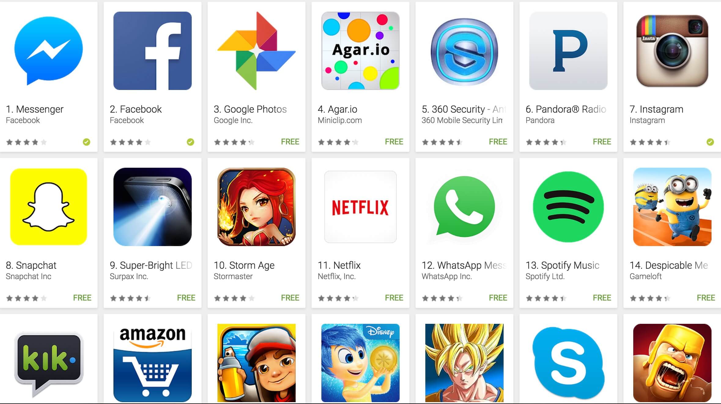
Before a potential user sees an app's description, screenshots, video or ratings, users see an app's icon. Used as sort of an app logo - the app icon's primary role in app store optimization for Google Play is in conversion. There are many theories on app icon design, from which colors to use to the use of text vs no text. Generally, the goal should be to efficiently communicate the app's main features or otherwise align to them. "Efficient" app icon design in this case means "simple". Because of the impact of the App Icon design on app conversion, we we recommend asking potential users, via a focus group or polling an email list.
App icon design tips
Regarding the use of text vs no text in an app icon, icons on Google Play tend to fit into a few buckets: No text at all  A single letter
  A small amount of text - 4 characters or less
  Lots of text - a name
  Looking at what the market is currently responding can provide
guidance as to what approach will work best for an app. For example, looking at the top ranking free apps in Google Play, 30 of the top 35 use no text or a single letter (like Facebook or Skype). Google has provided additional app icon design guidelines here.
Looking at what the market is currently responding can provide
guidance as to what approach will work best for an app. For example, looking at the top ranking free apps in Google Play, 30 of the top 35 use no text or a single letter (like Facebook or Skype). Google has provided additional app icon design guidelines here.
More blog-posts like this:
How to Write an Apple App Store Description
Learn how to approach App Store descriptions the right way so you can effectively engage and convert users.
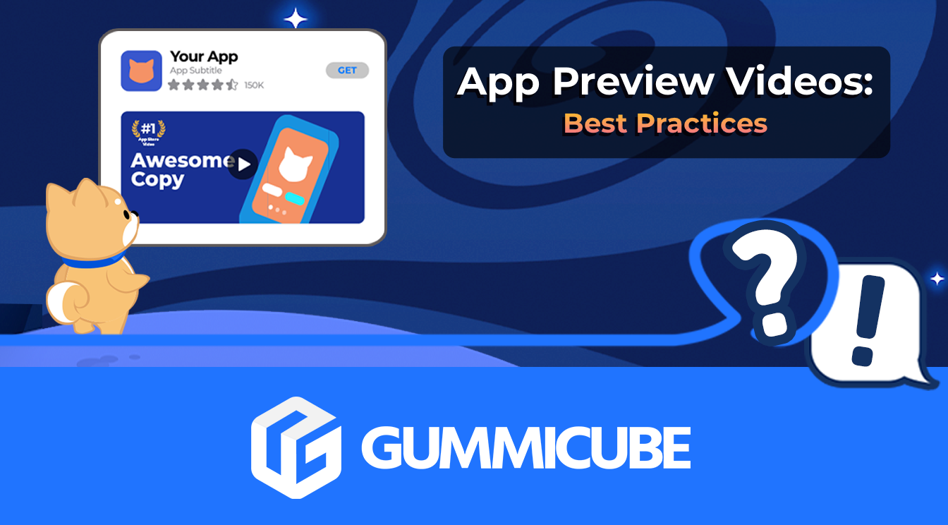
App Store Preview Video: Best Practices for ASO
Learn how to grab your audience's attention through effective and engaging app store preview videos.
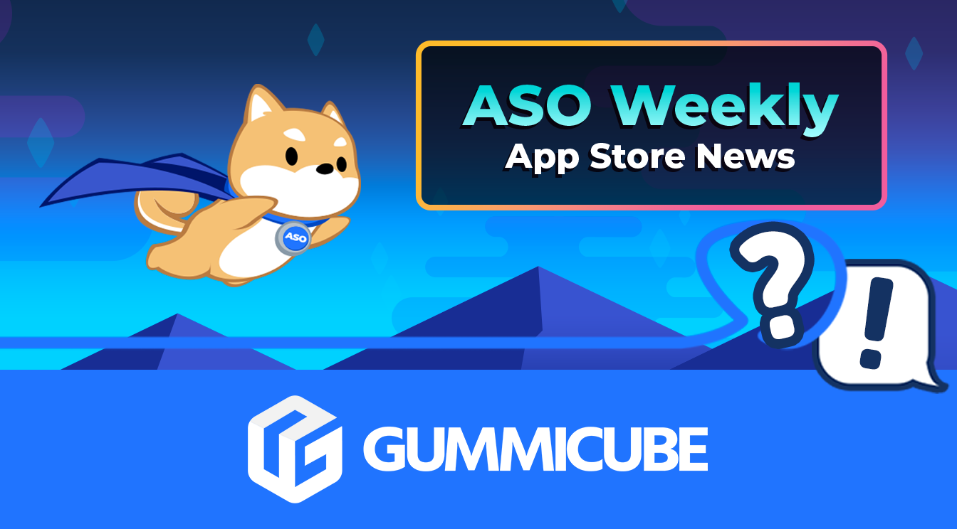
App Store News - Gambling Ads Nixed, New NFT & Crypto App Regulation
Welcome to this week’s ASO Weekly - The App Store halts gambling ads amidst outcry and the Apple takes a bite out of NFT app sales.