Armello App Store Screenshot Spotlight
March 20th, 2020
 Tagged: App-Store-Screenshot, App-Store-Spotlight, Screenshots
By David Quinn
VP of Strategy & Partnerships at Gummicube, Inc.
App Store Screenshot best practices guide app developers on how to best present their app to users. Good screenshots can help improve the clickthrough rate (CTR) and conversions for an app, while poor screenshots fail to convey the benefits of the app or can even repel users. For today’s App Store Spotlight, we take a look at the mobile game Armello, which is currently featured on the App Store, and see how its App Store Screenshots follow ASO best practices.
App Store Screenshots
An analysis of Armello’s screenshots identifies several design choices and patterns. As the app is a game that brings a tabletop game experience to mobile devices, its screenshots should reflect that while appealing to users with appealing visuals and callout text.
Armello uses the same five screenshots on the Apple App Store and Google Play Store. As Apple allows up to ten screenshots and Google Play allows up to 8, it has room to add more. These could provide additional information, such as the gameplay, variety of cards players can collect and so on.
The screenshots all include callout text on the bottom of the screen, and four of the five include a character from the game positioned to the side of the image. The callout text provides additional information about the mobile game, such as the multiplayer battle options. The character art to the side of each image helps showcase the character options available; this is commonly used by mobile games with a variety of playable units or based on popular franchises.
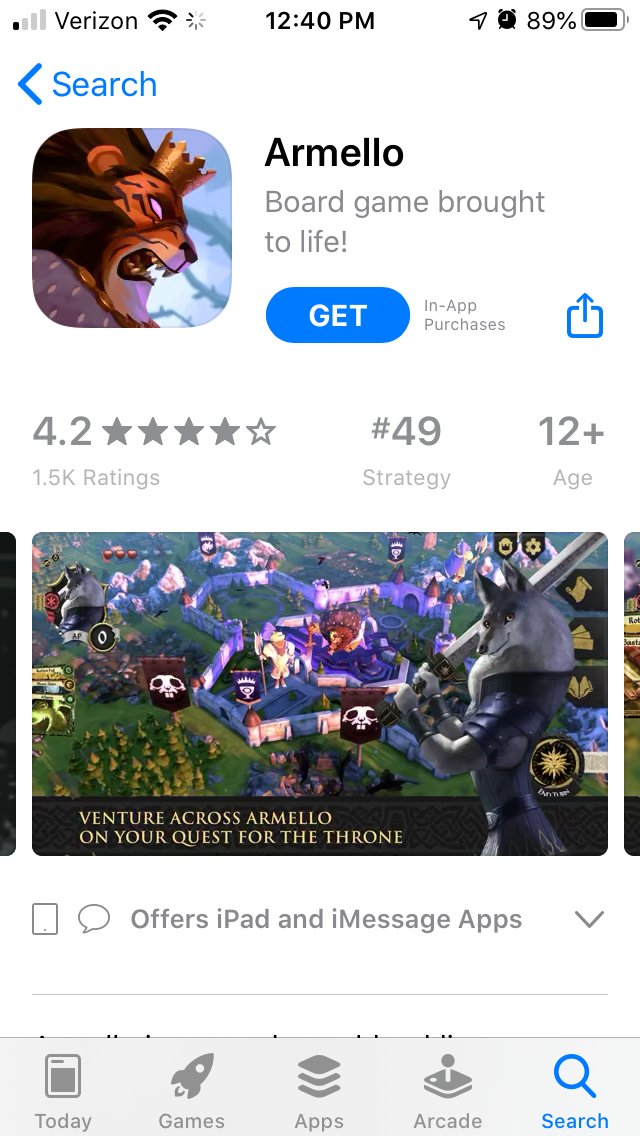
The text here typically uses lengthy lines, such as “Venture across Armello on your quest for the throne.” Callout text often appeals more to users when it’s short and to the point while still conveying its purpose. It can also present the main value in a few words before expanding on it in a second line, but there should be concise value propositions.
Some of the values presented in the callout text could be split into two screenshots. For instance, “Play multiple heroes with a true tabletop feel” presents two aspects of the mobile game: the variety of characters and the tabletop game design.
By splitting this into two screenshots, it could focus on the characters in one and the tabletop aspects in another, thus providing more focused content. Armello’s keyword rankings are primarily for competitor apps, rather than its own features. It could use the callout text to emphasize relevant, feature-focused keywords that the developer wants to target. That would help drive conversions for users searching for those terms by showing its relevance.
The screenshots also show Armello’s artwork well, emphasizing the scenery, color use and card art. This helps present an idea of how the game will look and utilizes its visual style to appeal to users.
Competitor Apps
Looking at competing apps on the stores, we can see how other mobile games design their screenshots. Identifying common themes and elements can help developers design creatives that help drive conversions.
On the Apple App Store, Hearthstone - one of Armello’s competitors - uses a similar screenshot style. Its screenshots also put callout text on the bottom of the screen and character art to the side, although some of the screenshots do not utilize character art. The callout text is shorter on average, using lines like “Duel Epic Heroes” to describe the game in a few words.

On Google Play, Ancient Terror is another app based on a tabletop game. This one calls that aspect out in the first screenshot, whereas Armello mentions it in the fourth screenshot; this could contribute to Ancient Terror outranking Armello for “Tabletop RPG” at #36. While Ancient Terror uses shorter callout text, it does not include any character artwork.
Ancient Terror also uses seven screenshots, although it switches from landscape to portrait mode in the third screenshot. The portrait mode screenshots also appear to be two landscape images placed on top of each other, each with distinct callout text. This makes them harder to read at a glance while browsing the store listing.

Overall
Looking at Armello’s App Store Screenshots, we can see many aspects of App Store Optimization best practices in use. There are still areas where it can improve, such as the length of the callout text and the number of screenshots, but those should be tested to determine what variants perform best. Good screenshots can attract users with stunning visuals and explain the app’s value through use of callout text, making them an indispensable part of App Store Optimization.
Want more information regarding App Store Optimization? Contact Gummicube and we’ll help get your strategy started.
More blog-posts like this:

Timeleft: Finding Friends, But Is It Finding App Store Visibility?
A/B testing alternative subtitle structures, and experimenting with screenshot designs could set Timeleft apart from its competition. Read more!

Checking In on Booking.com's ASO Strategy
Success in the App Store is driven by a combination of discoverability and conversion. Apps that excel in both areas consistently outperform the competition.
Mark Your Calendar: Howbout's ASO Audit
By introducing dynamic design elements & leveraging ASO tools such as App Store video and A/B testing, Howbout can significantly enhance its App Store listing.