Mark Your Calendar: Howbout's ASO Audit
Posted on April 10th, 2026
By introducing dynamic design elements & leveraging ASO tools such as App Store video and A/B testing, Howbout can significantly enhance its App Store listing.

Whataburger is a powerhouse in the fast food world, particularly across the Southern United States. With decades of brand loyalty, a distinct regional identity, and a menu that is recognizable across their loyal customers, the company has carved out a strong place in both physical and mobile markets. Living in a digitally-driven world, even legacy brands are being forced to compete in more strategic ways, where app visibility, conversion rates, and long-term retention start with a single tap.
App Store Optimization (ASO) is a non-negotiable for apps that want to see long-term mobile growth. A restaurant’s mobile app is often the first digital touchpoint between the brand and the customer. Whether it’s placing an order, checking in for curbside pickup, or showcasing a unique rewards points system, the app experience needs to deliver immediately. But first, users have to discover the app, and then be convinced to download it. That’s where a data-driven ASO strategy makes all the difference.
In this week’s App Store Spotlight, we’re examining Whataburger’s App Store listing through the lens of ASO best practices. We’ll look at the app’s metadata choices, critique the creative presentation, and compare it against a top app competitor in the space. While Whataburger may have the brand awareness to drive downloads from loyal customers, it is missing key optimization ingredients that could help it reach and convert a much broader audience.
Strong ASO isn’t just about having a good-looking listing. It’s about having a data-driven strategy for discoverability and a creative presentation that drives action. Let’s break down where Whataburger is performing well and where their ASO order still needs seasoning.
Whataburger’s app title is simply the brand name: “Whataburger.” This is a common practice among restaurant chains, with most sticking to just their storefront name. While that simplicity may preserve brand clarity, it also means the title is missing out on potential keyword coverage.
At only 11 characters, Whataburger’s title leaves ample unused space. The App Store allows for 30 characters in this field. Filling that space with relevant, high-volume terms could boost visibility in user searches. Incorporating standalone terms like “rewards,” “order ahead,” or “pickup” could help the app show up in more relevant results without sacrificing brand identity. This small change could have a major impact on discoverability.
The subtitle, “order, earn rewards and offers,” is close to being effective, but still leaves room for refinement. It hits on core features but lacks precision. A revision like “order ahead and earn rewards” hits on two major behavioral triggers, fits within the 30-character count, and strengthens keyword targeting. It’s a subtle shift, but one rooted in strategy.
ASO tools like DATACUBE allow app developers to uncover which terms have the highest search volume and relevance. Using this data to shape your metadata ensures that you are not only found, but found by the right users. Most downloads start with a search. If your metadata isn’t supporting visibility, then your install numbers will suffer, no matter how good your product is.

Whataburger’s current app creatives feel like a solid start, but not a fully baked execution. There are key principles every app should follow when designing screenshots. They must:
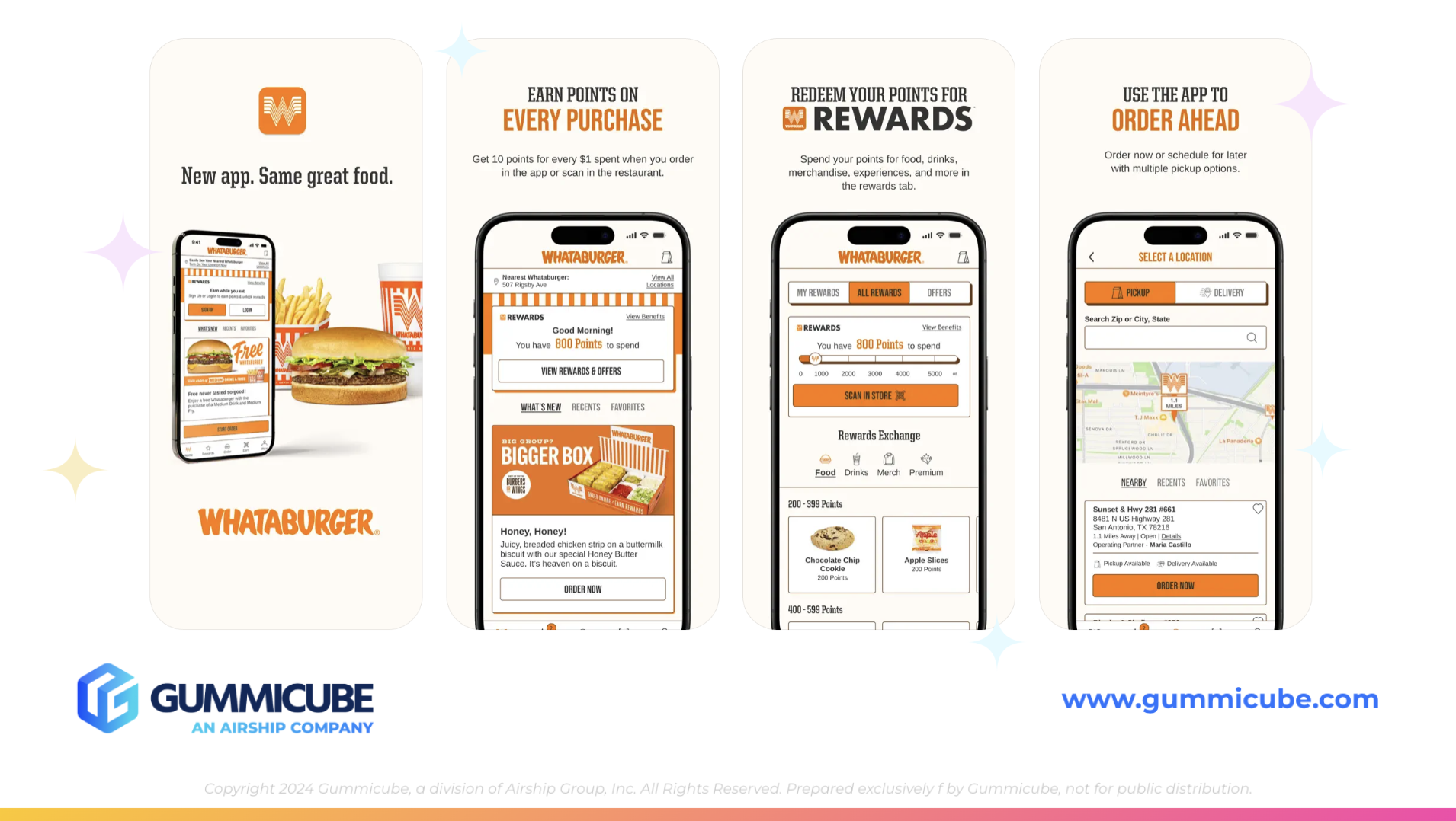
Whataburger’s screenshots fall short on several of these points. The first screenshot begins with thin, dark writing that is difficult to read. The next line is oversized and orange, creating a jarring contrast. Beneath that is small, dense text that is hard to digest quickly. Visual hierarchy matters, and this current layout lacks consistency and clarity.
From screenshots two through seven, the design remains largely static. The same iPhone mockup appears in the same position with only minor changes to the content inside the device. This lack of variation causes the listing to feel stagnant. The average user only spends a few seconds on an App Store page. If they see repeated visuals and dense text, they are likely to scroll past or bounce out.
The app’s top value propositions are buried deeper in the screenshot lineup. For instance, “order ahead” does not appear until screenshot four. That is a strategic misstep. The first three screenshots are the most pivotal. This is where the app must showcase its strongest selling points. “Order ahead” and “earn points with every purchase” should absolutely be prioritized earlier. These features define the core functionality and speak directly to what users are seeking in a food app.
Whataburger has a chance to bring its creative assets in line with ASO best practices. Improvements might include:
App creatives are more than just a pretty picture; their job is to help your app convert. If your screenshots don’t encourage users to tap “Get,” then they are not accomplishing their goal.

To see what a refined ASO strategy looks like in action, we can turn to Chick-fil-A. Their app serves a nearly identical purpose (mobile ordering, earning points, and redeeming rewards), but the way they present it is much more strategic.
Chick-fil-A’s app title is also just the brand name, like we see with Whataburger. Their app subtitle, however, says exactly what the user needs to know: “Order ahead. Redeem rewards.” It is short, clean, and uses strong keywords in a natural, readable way.
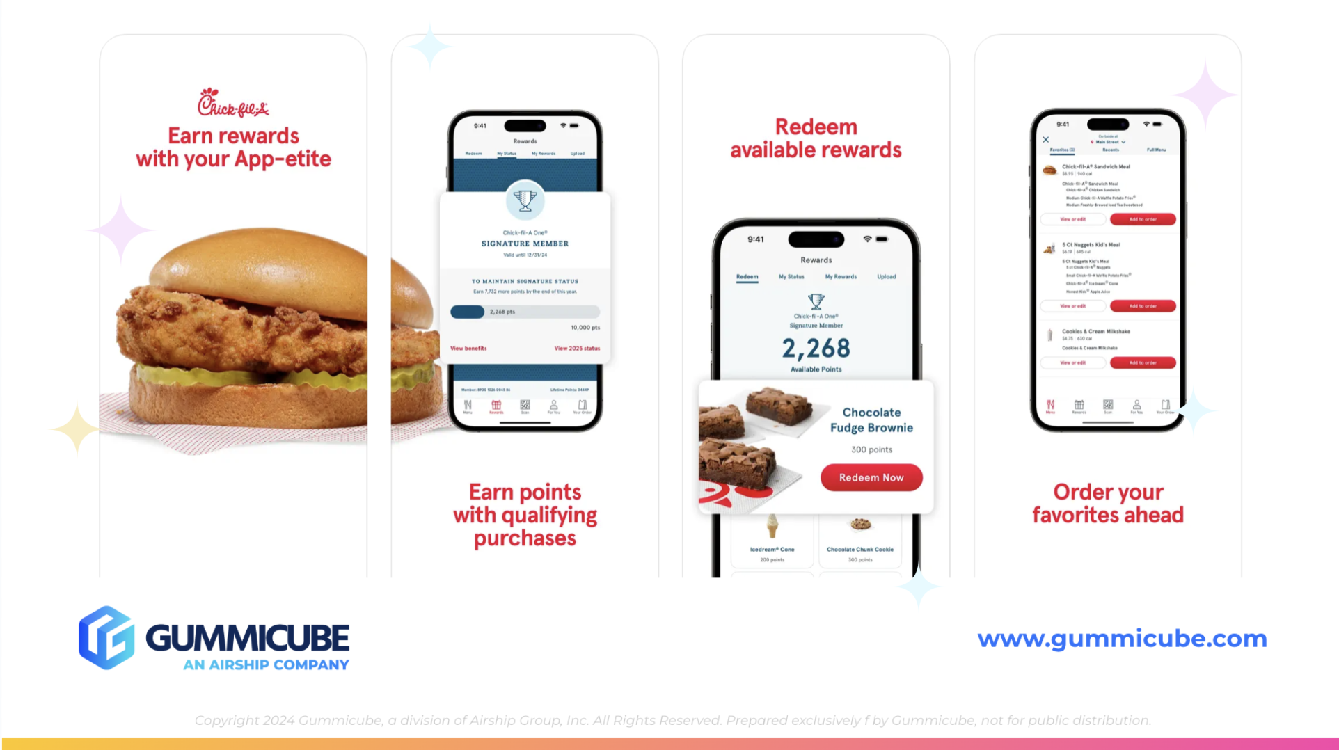
Chick-fil-A is our competitor app in this scenario, but there is still room for improvement in their app listing. Whataburger’s UI is far more advanced, while Chick-fil-A’s stark white backgrounds appear washed out and lack the contrast needed to perform well in Light Mode. However, there are elements in Chick-fil-A’s screenshots that Whataburger could take inspiration from.
Each screenshot shifts slightly using an iPhone mockup layout, adding just enough movement to feel dynamic without distracting the viewer. A standout design choice is the way the first image flows seamlessly into the second through continuous imagery. That visual connection keeps users engaged and subtly encourages them to keep swiping. Chick-fil-A makes the most of every frame, and its first three screenshots are laser-focused on their unique, key functionality and rewards program. They use clean white backgrounds, bold red typography, and real-life imagery to convey both brand and utility. Nothing feels cluttered or repetitive, and all copywriting is easy for users to digest quickly.
Although Chick-fil-A could enhance its app creatives with improvements to UI and background color choices, it remains a strong benchmark in the restaurant app space. Chick-fil-A’s visuals are not flashy and do not rely on gradients, effects, or elaborate mockups. But they are effective. The screenshots feel inviting and informative, which is all a user needs to get excited about downloading.
The success of Chick-fil-A’s approach is a lesson in restraint. Good design in the App Store is about clarity, not complexity. Developers do not need to say everything at once. They need to say the right thing first.
If Whataburger adopted a similar strategy, it could significantly improve how new users interact with their listing. That means placing the highest-value features up front, cutting down on dense copy, enlarging the main text, and using simple but strategic design as a storytelling device.
Whataburger is not far off of where they could improve in their ASO strategy. They have the brand awareness, the user base, and the core app features that users want. But without a clearer metadata strategy built around keyword research and without a creative strategy built around visual engagement, the app could eventually lose download momentum.
App search visibility and conversion rates are supported by your app metadata and screenshots. Together, these elements determine how many users find your app and how many actually download it.
There is no reason for Whataburger to leave valuable traffic and installs on the table. With the right adjustments, they could set themselves up to secure stronger placement in search results and convert casual browsers into loyal mobile users.
Whataburger’s app is backed by a trusted brand and serves a loyal customer base. But when it comes to App Store Optimization, trust and loyalty do not replace strategy. Strong ASO requires intentional decisions in your metadata, execution of app creatives, and in the way in which your value is communicated.
With just a few changes to their subtitle and the order of their screenshots, Whataburger could unlock significantly more visibility and drive stronger conversion rates. A deeper investment in ASO strategy would ensure that their mobile experience lives up to their in-store reputation.
If your app listing is missing key ingredients, Gummicube can help. Gummicube’s ASO services help to build data-backed strategies that can boost app discovery and increase conversion rates. Apps that view their listing as a living, data-driven asset tap into the true power of mobile and can unlock lasting app growth.

By introducing dynamic design elements & leveraging ASO tools such as App Store video and A/B testing, Howbout can significantly enhance its App Store listing.

By combining data-driven insights with thoughtful design, developers can create listings that not only attract users but also convert them effectively.

In this week’s App Store Spotlight, we are taking a closer look at Sweepy: Home Cleaning Schedule. Read more to see how the app can improve its ASO strategy.