Discovering ASO Opportunities for Mercari
October 31st, 2025
 Tagged: Aso, Aso Services, App Ranking, App Metadata, App Subtitle, App Title, Mercari
By Anh Nguyen
COO & Co-Founder at Gummicube, Inc
As part of our ongoing App store Spotlight series, we take a closer look at popular apps across various categories to identify what they’re doing well–and where they can elevate their presence to align with App Store Optimization (ASO) best practices.
This week, we’re focusing on Mercari, the well-known marketplace app that connects buyers and sellers in a user-friendly resale environment. Mercari has long been a staple in the shopping category, but with increasing competition and shifting creative trends, there's room to refine its listing for stronger conversion performance and visibility.
ANALYZING MERCARI’S APP STORE PRESENCE
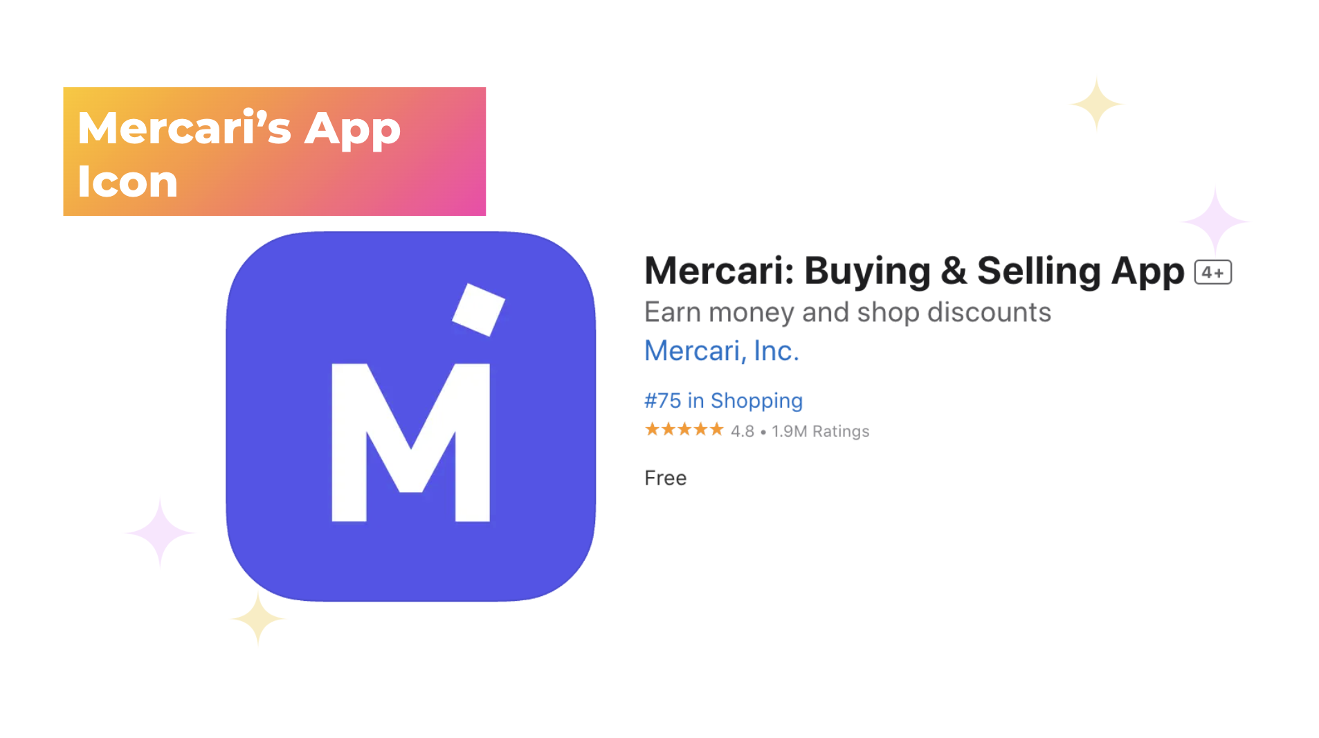
Mercari currently holds the title “Mercari: Buying & Selling App,” and its subtitle reads “Earn Money and Shopping Discounts.” At first glance, these metadata elements clearly communicate the app’s core functionality, but there’s more potential to explore when it comes to maximizing discoverability and appeal.
App Title and Subtitle
Both Mercari’s app title and subtitle clearly communicate the app’s functionality and value to users, making it immediately clear that they are a platform for users to buy and sell clothing items. Mercari also effectively utilizes its available character count, creating opportunities for both the brand name and functional descriptive words to appear in search results.
Even strong metadata benefits from regular refinement. The app store ecosystem is dynamic and constantly evolving, meaning developers need to stay prepared for shifts in user search behavior and changes in keyword rankings over time. To maintain visibility and stay competitive, Mercari can benefit from regular A/B testing of its app title and subtitle, switching out current terms for new, higher-volume terms or seasonal and relevant terms. Identifying which iterations resonate best with its users. This ongoing optimization can help strengthen its organic search results while keeping the listing current, intentional, and aligned with how users search.
App Icon
Mercari’s app icon features a minimalist purple background with a stylized “M,” where the right leg of the letter mimics an “i” to hint at the brand’s name. While this design choice shows creative intent, it ultimately feels understated.
App icons serve as the first visual impression users have of a brand in the App Store, making recognizability and memorability essential. Currently, Mercari’s icons risk blending in rather than standing out.
A more engaging approach could involve:
- Adding dimension or gradient effects to create visual depth.
- A/B testing alternate color schemes that maintain brand identity while offering stronger contrast.
An A/B test comparing different design variations could yield data-driven insights on which aesthetic drives higher conversion and retention.
App Creatives
When analyzing Mercari’s app listing creatives, a few key trends emerge that impact user engagement and clarity. Mercari currently does not utilize an app store video. This is a significant missed opportunity, especially given that app previews can immediately communicate the app’s experience and value proposition in motion.
A well-produced video showcasing how easy it is to list an item, browse details, and connect with buyers could drastically improve user understanding and encourage faster installs. Video is one of the most effective tools for boosting conversion rates in today’s fast-paced app store environment.
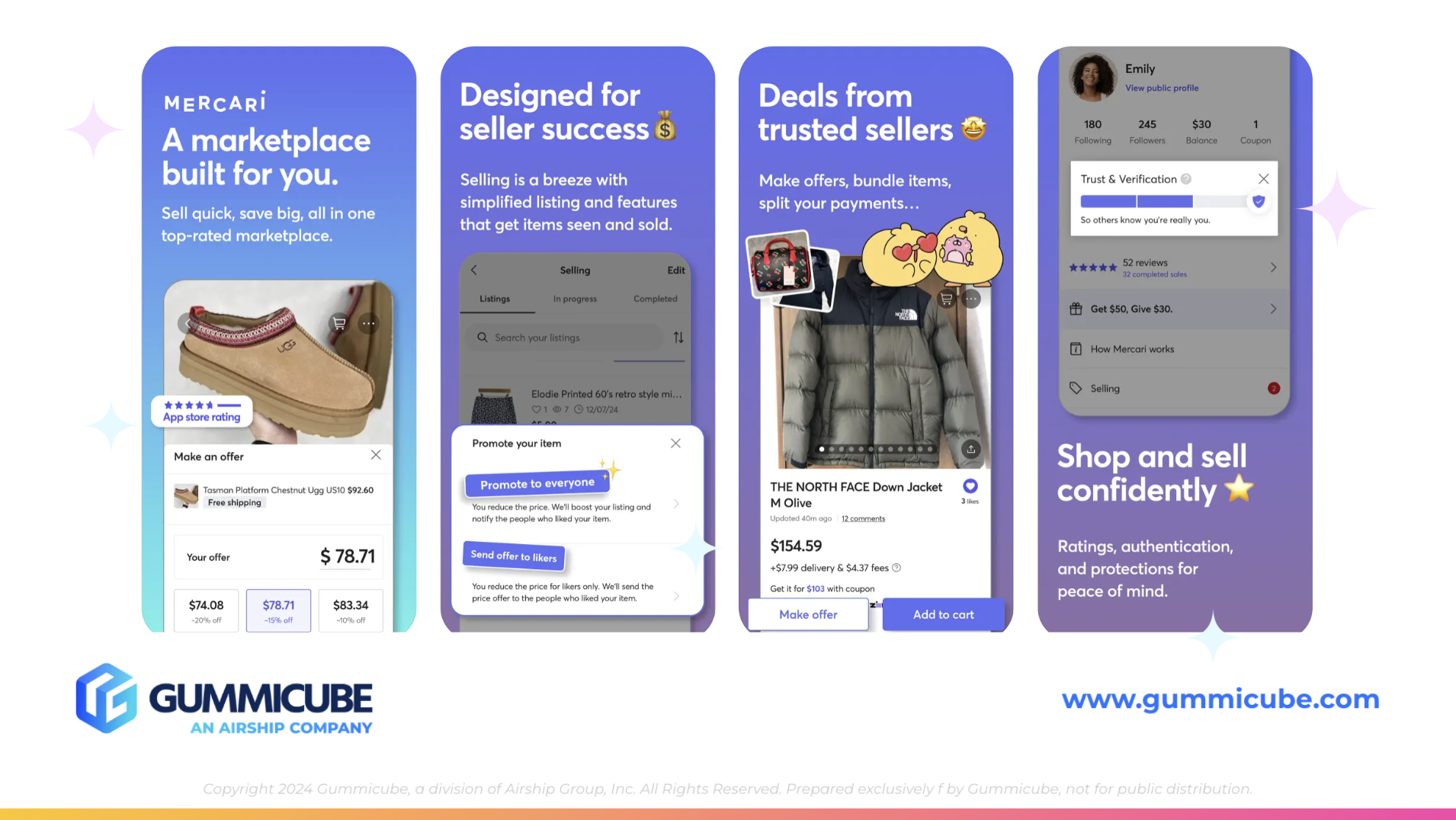
Mercari also makes full use of its 10 available screenshots, which is a great start at maximizing visibility within the listing. However, quantity doesn’t always mean the quality is equal.
The first three screenshots effectively highlight the app’s core functionality, but they’re overloaded with text. Each includes two large lines of copy followed by a paragraph with smaller, supporting text. The layout feels cluttered, and requires users to work harder to interpret the messaging.
App Store users typically skim screenshots within seconds. Excessive text can cause potential new users to skim or click out of an app listing rather than convert.
To strengthen app listing impact, Mercari should focus on:
- Simplifying copy: Use concise, benefit-driven phrases.
- Prioritizing visual storytelling: Let imaginary and in-app experiences demonstrate value.
- Creating variation across screenshots: Avoid redundancy by highlighting unique selling points across each frame.
COMPETITOR COMPARISON
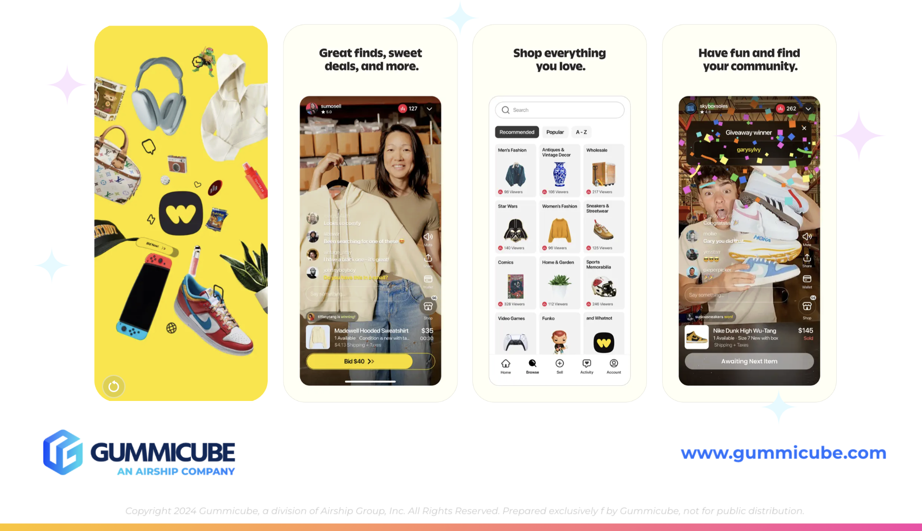
Examining competitor apps within your app category is a great way to identify areas where your app listing can be improved. Let’s take a look at another shopping app category competitor, Whatnot: Shop, Sell, Connect. While not a direct resale competitor, Whatnot occupies the #2 position in the category, compared to Mercari’s #75. Their ASO strategy offers a useful contrast in terms of creative direction and messaging clarity.
App Icon
Whatnot’s icon design demonstrates how minimalism can still be impactful. The bold black background contrasts sharply with a bright yellow, stylized “W” that appears almost like a squiggle. This ambiguity makes it memorable–the viewer may pause just long enough to wonder what it represents. That moment of curiosity can be the difference between a glance and a tap.
App Preview and Screenshots
Whatnot’s App Store video opens with clear branding and transitions into real user experiences, showing live shopping interactions in action. The video immediately establishes community, engagement, and excitement, effectively translating the app’s unique value proposition.
Following the video, Whatnot includes four static screenshots–fewer than Mercari’s ten, but more efficient in delivery. Each screenshot features:
- Clean, bold text set against a neutral backdrop.
- A single, direct message like “Shop everything you love” or “Great finds, sweet deals, and more”.
- In-app imagery that visually demonstrates the experience.
This minimalist approach ensures instant comprehension. Users can understand Whatnot’s purpose and appeal quickly, which is an essential factor in driving conversions.
KEY TAKEAWAYS FOR MERCARI’S ASO STRATEGY
While Mercari maintains solid fundamentals, its App Store listing could benefit from refinement in the following ways:
Streamline Visual Messaging
Reduce the amount of text on each screenshot. Use one strong headline per frame and support it with visual storytelling rather than dense copy blocks.
Introduce a Preview Video
Leverage video to highlight real use-cases–listing an item, earning money, or discovering unique deals. This adds a dynamic approach and a human touch to the brand. Video assets can also be more engaging and potentially capture user attention faster than static imagery.
Refresh the App Icon Design
Experiment with A/B testing on multiple icon variations. Consider small but meaningful visual updates, such as subtle gradients, added depth, or secondary brand elements that communicate marketplace energy.
Refine Metadata through Keyword Research
Use targeted keyword research tools to uncover high-performing terms and integrate them into the title, subtitle, and description. This could enhance organic visibility and position Mercari appears relevant in results.
Create Variations and Visual Flow
Ensure each screenshot adds new information or emphasizes a different feature. Avoid repetitive visual styles that cause screenshots to blend together. By applying these optimizations, Mercari could increase its conversion rate and improve discoverability within the competitive shopping category.
FINAL THOUGHTS
Mercari has a strong foundation as a trusted buying and selling platform–but in the competitive landscape of the App Store, clarity, creativity, and consistency in presentation are what separate recognizable marketplace leaders from the rest.
The comparison with Whatnot reveals a broader ASO truth: it’s not just about what your app does, but how effectively and quickly you communicate your value. Every visual, every word, and every design choice plays a measurable role in user perception and conversion rates.
From a strategic standpoint, Mercari’s current app listing demonstrates a common pitfall for established apps by over-explaining rather than optimizing strategically. When screenshots are too text-heavy, icons lack memorability, and messaging doesn’t leverage targeted search terms, potential users may disengage before fully understanding the app’s benefits. Simplifying that narrative through succinct copy, strong visuals, and cohesive creative flow would not only help the listing stay fresh but also make it more competitive against other competitors in the same shopping app category.
Ultimately, effective ASO is about regularly analyzing, A/B testing, and updating your strategy to better communicate your app’s core features and boost visibility. User expectations are always changing, and trends come and go. By embracing an iterative approach that integrates data-driven strategies to their app listing, Mercari can position their app to stay successful over time and create opportunities to boost visibility.
LET’S CHAT!
At Gummicube, we help apps like Mercari uncover new opportunities through data-driven App Store Optimization. Whether you are refining your app’s creative assets or rethinking your metadata strategy, our expert ASO services can guide you through every step, providing the tools and insights to help you reach your full potential.
Reach out today and let's discuss how regular ASO updates can help your app make a greater impact.
More blog-posts like this:

Preparing for ASO Takeoff with Skyscanner
Every successful App Store listing needs to begin with a strong first impression. Read more!

That's a Wrap On Edits ASO Strategy
Let's take a closer look at where Edits succeeds and where there is room for optimization.

On The Air: FM Radio ASO Audit
In this week's App Store Spotlight, we're putting FM Radio under the ASO microscope.