Foursquare Swarm App Store Spotlight
October 2nd, 2018
 Tagged: App-Store-Spotlight
By Anh Nguyen
COO & Co-Founder at Gummicube, Inc
When Foursquare first launched, users enjoyed checking in to their favorite locations to become its “mayor” for fun and bragging rights. As its grown, Foursquare has expanded into multiple apps – Foursquare City Guide and Foursquare Swarm. While City Guide provides travel tips and recommendations, Foursquare Swarm continues the tradition of checking in and logging the places you visit. However, is it optimized for the App Stores? In this week’s App Store Spotlight, we take a look at Foursquare Swarm.
iOS
On the Apple App Store, Foursquare Swarm ranks highly for all terms related to “Foursquare,” including variations such as “4 square,” as well as “Swarm” terms like “swarmapp.” It’s in the top ten for high-volume keywords like “lifelog,” “keep track app” and “check in app,” although most of the keywords it ranks highest for are low-volume ones with moderate relevance or misspelled variants of other relevant keywords. Its rankings for keywords drop after those terms, as it comes in at the 23rd ranked app for “travel journal” and 215th for “travel log.” Creatives: Foursquare Swarm utilizes shades of orange and yellow for its creative set, utilizing bee iconography for its “swarm” theme. The icon itself is designed to look like a bee made out of smaller shapes on an orange background, while the orange coloration of the creatives matches the app’s design. 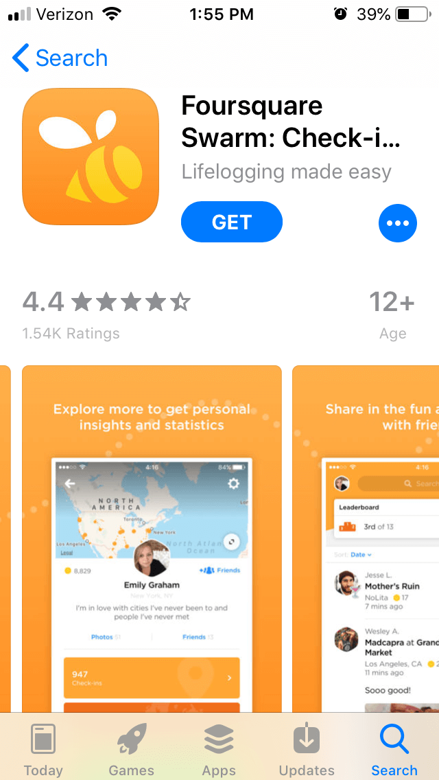 Each of the screenshots shows off a different feature of the app, including checking in, getting insights and charting the places users have traveled to. Each one has a short callout text above it, describing what the features do. However, out of the ten allowed screenshots, it only uses five, so there is room to include more screenshots. Doing so would enable Foursquare to show off more functions and benefits. Title & Subtitle: The app’s full title is “Foursquare Swarm: Check-in App.” The inclusion of “Check-in app” after the name is a good decision, as it provides information about the function of the app while incorporating more keywords and makes the most of the store’s 30-character limit. The subtitle, “Lifelogging made easy,” is on the shorter side and only includes one important keyword. While it does quickly provide an idea of the app’s functions, it could still include more relevant keywords in there. Description: The description for Foursquare Swarm consists of an introductory paragraph and three bulleted paragraphs. However, as each of them are large chunks of text, users tend to glance over them without gleaming all the information within. The introductory paragraph could easily be broken into smaller sections of 1-2 lines each, which potential users can more easily read. Similarly, the bulleted paragraphs could themselves be broken into bullet point lists, each one talking about a different feature. ASO best practices recommends smaller lines of 1-2 sentences each, as well as separate sections for features that call out their benefits as bulleted lists. The information included in the description does still call out the app’s features and benefits, such as tracking the places you go to or gaining insights and tips on them. Yet there are more features that it could expand on with a proper features list, rather than just a general overview of what the app can do. Additionally, it could benefit from utilizing more keywords within the description. While it does include some, like “explore,” “check-in” and “lifelog,” utilizing more keywords more frequently would help index it better for Search Ads.
Google Play
Foursquare Swarm’s keyword rankings on Google Play tend to drop quickly. While it is the top-ranked app for “Swarm,” as well as the third-highest for “Check in,” it plummets in search results after that. It’s the 78th ranked app for “places,” 67th for “nearby businesses” and doesn’t even rank for useful and relevant keywords such as “life log.” Creatives: On Google Play, Foursquare Swarm uses a similar icon to its iOS version, but the designs of the screenshots are very different. Instead of an orange background, the Google Play listing uses city iconography being the screenshots, although the screenshots themselves are the same. The pictures themselves are displayed as landscape images, rather than the portrait-style pictures on iOS, which allows Foursquare to place the callout text next to the screenshots and in a much larger font for improved readability. 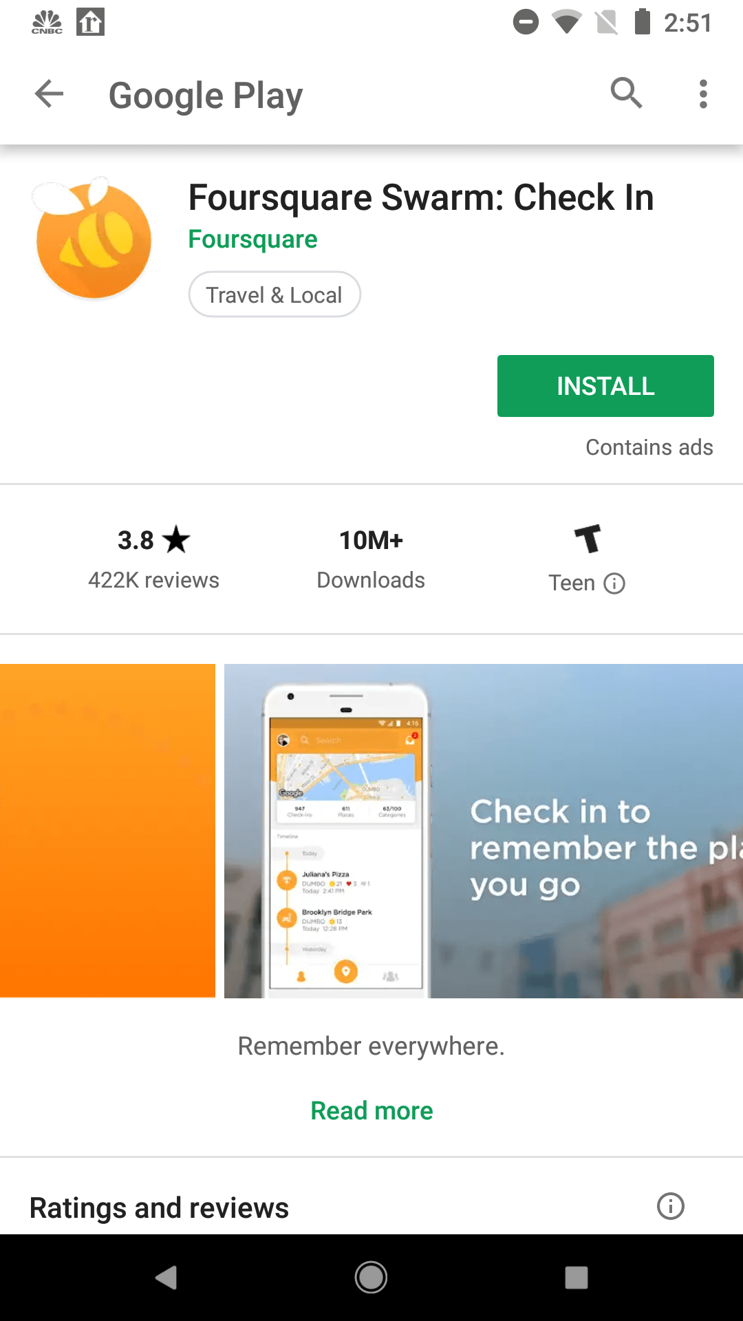 Additionally, the Google Play listing includes a video that narrates how Foursquare Swarm works and its benefits. The video focuses on a woman using the app as she travels and checks-in to places, rather than showing the app itself, so this video would not be usable on the Apple App Store. On Google Play, however, it properly illustrates the app’s functions and benefits in a well-filmed manner, which should be helpful for conversion. Metadata & Description: The description on Google Play is written the same as on iOS, although it uses bold font to call out important features or benefits such as “remember everywhere with Swarm” or “keep up and meet up with friends.” Unlike iOS, Google Play allows for emojis and basic HTML markup. Having the key selling points in bold can allow users to briefly glance at the description and see the most important topics at a glance. The larger paragraph size is acceptable on Google Play, although it could still benefit from a features list that calls out the functions of the app and what it can provide to users. Additionally, the way it’s written does not help it index for relevant keywords. On Google Play, Google’s algorithm starts with the beginning of each line and sentence to crawl for relevant terms. While there are some sections in the Google Play description that contain important keywords early on, such as “lifelogging made easy” or “share your location,” many lines do not. As such, the algorithm may index the app for terms like “Indian restaurant” and “don’t have any friends nearby,” rather than more relevant keywords.
Overall
While Foursqaure Swarm is a useful app and benefits from the Foursquare brand, it does have some ASO missteps. While its creatives do effectively illustrate the app’s uses and benefits, it could utilize more to further demonstrate everything the app has to offer. The descriptions have the most room to improve, as the iOS and Google Play descriptions could both be reformatted to better suit each store and make more use of its keywords. Although the app still sees success on the app stores, its rankings and visibility could be improved with a solid App Store Optimization strategy. Want more information regarding App Store Optimization? Contact Gummicube and we’ll help get your strategy started.
More blog-posts like this:
Unlock App Rewards with Google Play Points
Google Play's latest Points update highlights evolving user engagement. Learn how app developers can use to stay visible in a shifting marketplace.
2025 SCAM Alert: WhatsApp and Other Messaging Service Scammers Impersonating Gummicube®
Have you received a WhatsApp message, LinkedIn message, or a message from another messaging app offering a remote work opportunity by an individual claiming to be affiliated with Gummicube?
What Are Google Custom Store Listings?
Keyword targeting has arrived to Google's Custom Store Listings, opening up opportunities for more granular audience targeting and even more personalized experiences. Learn how you can use them to your advantage!