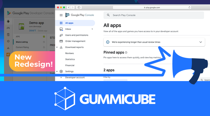
Google Play Store Launches Redesign: What it Means for ASO
October 5th, 2018
 Tagged: Google-Play, Google-Play-Store
By David Bell
CEO at Gummicube, Inc.
Earlier this year, Google Play began testing redesigns for the Google Play Store. It seems the testing is complete, as the new design is rolling out to more and more Android devices. With this change, it’s important to understand what the impact will be on App Store Optimization and what developers should do to ensure their apps stay optimized.
What Changed?
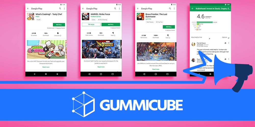
The largest change is to the feature graphic. This is a change that’s been seeing tests since May, but the Google Play Store update has made it official - the feature graphic itself has been moved to the gallery, replaced by the app’s icon and name. If an app has a preview video, the feature graphic will still serve as its poster frame, so it will still appear before the screenshots. Apps without videos lose the feature graphic altogether. The gallery itself has moved up on the page and placed above the fold, so as to replace the dominant position of the feature graphic. Videos are also in the gallery now, before the screenshots, so users viewing an app with a video will have to scroll past it to see the screenshots and associated callout text.  Additionally, the page now shows an app’s category, ranking and acclaim like “Editors’ Choice” underneath the title. If it is an Editor’s Choice app, there’s a new section before the Reviews and Ratings that lists why the editors picked it, although that portion is not yet available on all devices. The Evaluation Panel has changed as well, replacing the green badges with simple text and an age rating. The average rating is more easily visible, which should help conversion rates for apps with positive reviews. The installation button remains unchanged, although Instant Apps have a “try now” button right next to it. App pages will look different for users, depending on whether or not they’ve installed the app. For users with the app installed, the “What’s New” and review prompt will appear at the top, along with suggested apps. This bumps the gallery down, providing actionable content up top rather than trying to convert already existing users.
What Does This Mean for ASO?
By moving and reformatting how app pages are viewed, Google has changed the importance of various elements. The feature graphic, which once accounted for up to 30% of an app’s conversions, is now a part of the video. The video itself still serves an important role, so the visual appeal of the feature graphic remains, but in a different location and alongside the other creatives. The app’s other creatives, especially screenshots, now serve an equal role to the feature graphic. However, apps using a video will have to make sure users are encouraged to view it and look through the screenshots. As the video appears in the gallery before the screenshots themselves, it may block the other images and callout text from any users who don’t immediately start scrolling. Apps with portrait screenshots can typically fit more into the screen at once, but landscape screenshots take up less vertical space. The app’s ranking and rewards listing adds a degree of importance to the app’s ranking, as users can see rankings such as “#3 Top New Apps.” The increased visibility of “Reviews and Ratings” adds more weight to overall ranking and individual reviews. Apps with positive reviews may benefit from more users seeing positive feedback, while apps with more negative reviews should focus on reputation management. If the app uses landscape screenshots, the large text showing the average rating will appear above the fold and stand out to users. 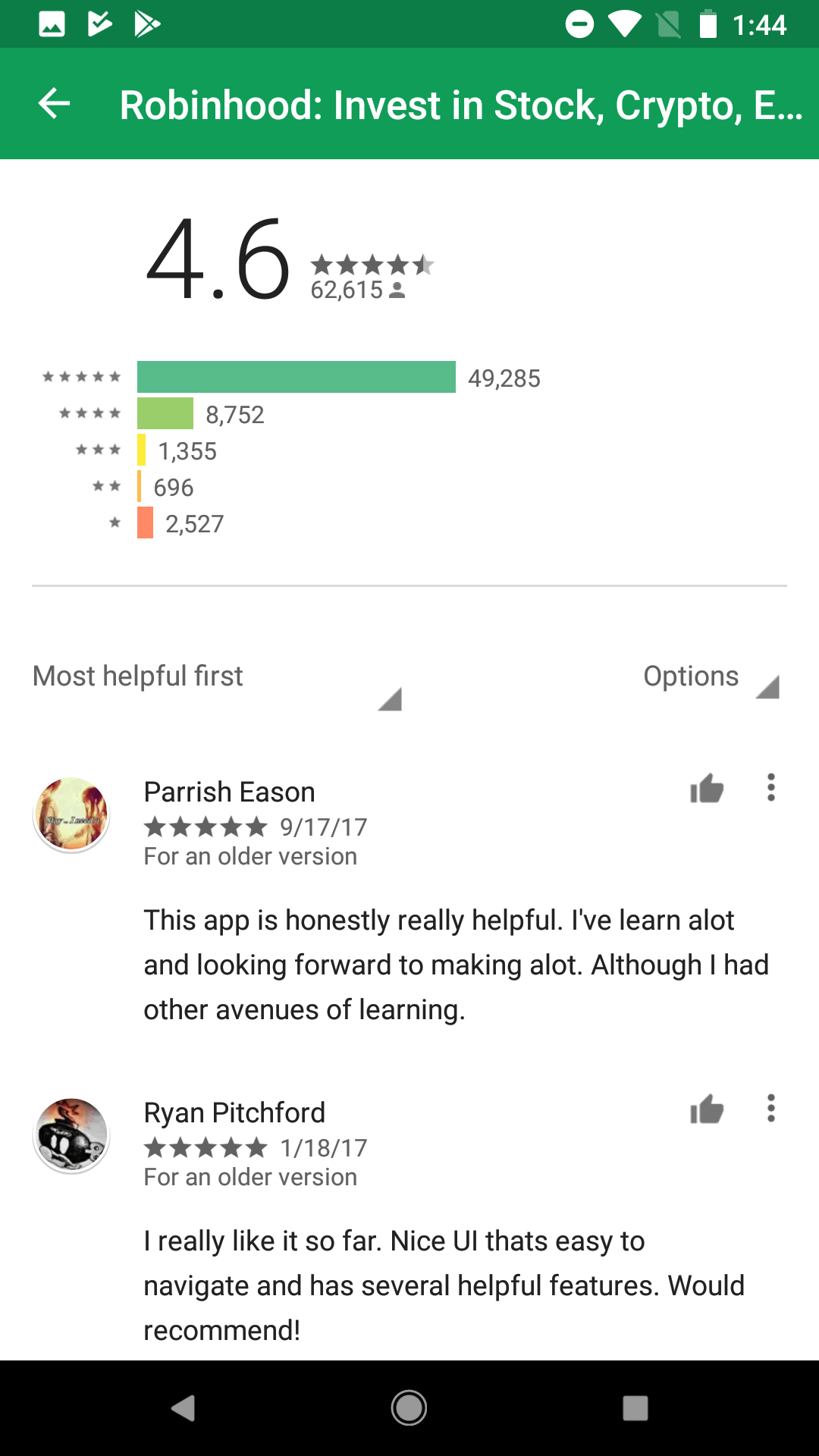
What Developers Should Do
As with any change to an app store, developers should adapt to the changes to keep their ASO strategy strong. The biggest hurdle will be the change to the feature graphic, but this is not an unexpected change, so they should already be prepared for it. For apps without a video, losing the feature graphic means the icon and screenshots must provide the same information and appeal to users. Apps with videos can still benefit from the graphic in a different capacity. Developers should ensure that they follow best practices for creatives, including engaging visuals and callout text that illustrates the features and benefits of the app. The video and gallery will have a larger impact on conversion rates than it did before, so prepare accordingly. Similarly, reviews and ratings will have an increased effect on conversion rates, since they’re made more visible. Reputation management will be of utmost importance, since it will be easier for potential users to see what people are saying and how you’re responding; even an app with negative reviews can still turn them into a positive by responding well to user feedback. The app’s description is mostly unaffected by the change, although the short description is shifted to underneath the screenshots. The short description is still above the fold and remains an important asset to A/B test in Google Play Experiments.. As long as developers ensure their short and long descriptions continue to follow best practices, they won’t need to make changes there. However, the short description is still important for A/B testing and conversion, due to its location by the screenshots and over the fold. The redesign may seem like a seismic shift for the Google Play Store, but it is a change that developers can work with. As long as they can adapt to the changes and follow ASO best practices, their apps will make it through. Want more information regarding App Store Optimization? Contact Gummicube and we’ll help get your strategy started.
More blog-posts like this:
App Store Holiday Schedule 2020
When is the App Store Holiday Schedule 2020? Learn about the dates of this year's shutdown and how to prepare.
App Store Guidelines Add New Privacy Information Requirements
Apple's App Store Guidelines have strict privacy requirements. Developers now must provide information to users on the App Store listing regarding the data they access.
Google Play Developer Console Launches New Design & Tools
The Google Play Developer Console has been updated with a new design and adjusted tools. What's different, and how will it impact App Store Optimization?