Rooting for Success: An App Store Deep-Dive into PlantNet
June 6th, 2025
 Tagged: Aso Stools, Aso Services, Aso Strategy, App Ranking, App Metadata
By David Quinn
VP of Strategy & Partnerships at Gummicube, Inc.
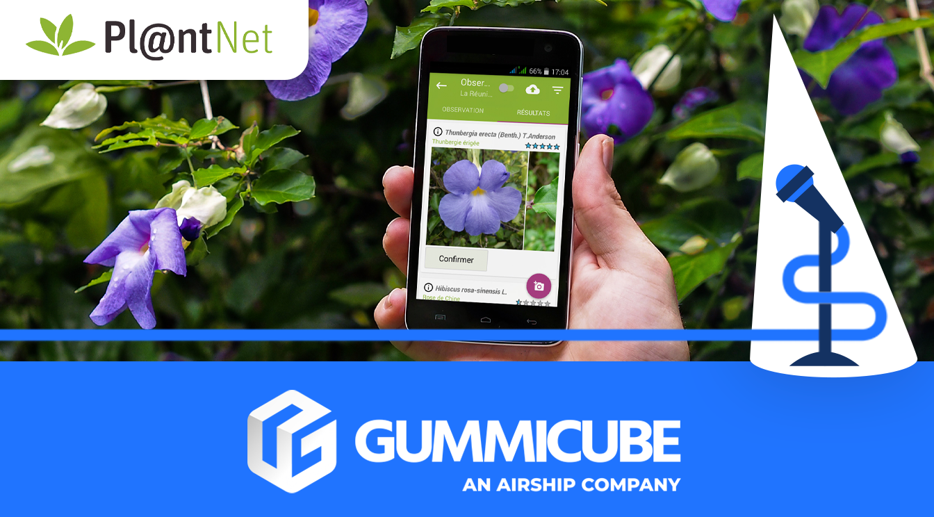
In this week’s App Store Spotlight, we’re analyzing the app store listing of PlantNet, currently ranked #45 in the Education category on the Apple App Store as of June 5, 2025. While PlantNet is a well-known app among gardening and botany enthusiasts, its App Store Optimization (ASO) strategy is underdeveloped. This is a missed opportunity given how influential metadata and creative assets are in driving discoverability and conversion. A few strategic changes could dramatically enhance the app’s performance in search and increase install rates.
Below, we will focus on three core components of PlantNet’s listing: their app title, subtitle, and creative assets. We will also compare it to a direct competitor, Greg: Plant Identifier & Care, to highlight the impact a refined ASO strategy can have. With each element, we’ll provide concrete recommendations for improvement based on data-driven ASO best practices.
APP TITLE: MISSING OPPORTUNITY
The current title for the app is simply "PlantNet." That’s it. Just eight characters out of a possible thirty. In the world of ASO, the app title is one of the most powerful tools developers have to signal relevance and rank for high-volume search terms. It is one of the most heavily weighted metadata fields in Apple’s App Store search algorithm, so failing to fully optimize this space is an immediate disadvantage.
ASO tools like DATACUBE can help apps discover high-volume keywords to incorporate into their metadata. PlantNet is missing out on a rich set of high-volume keywords that are directly relevant to its core functionality. Terms such as:
- plant finder
- grow plants
These are keywords that users frequently search for when looking for apps related to plant identification and gardening. By ignoring the opportunity to integrate even one or two of these into the title, PlantNet is limiting its discoverability potential.
This is a particularly pressing issue for an app that relies heavily on organic visibility. With thousands of apps in the Education category and hundreds related to botany and gardening alone, competition is fierce. Every character in the title should work to bring the app closer to relevant search results.
SUGGESTED APP TITLES
To improve keyword visibility while maintaining brand identity, consider these suggested app titles:
- PlantNet: Photo Plant Finder
- PlantNet – Capture and Grow Plants
Each of these options retains the brand name but appends valuable, relevant keywords that could significantly improve visibility in search results. Each option gives the user immediate clarity on the app’s primary function, all while aligning with search behavior trends.
APP SUBTITLE: CLARITY WITHOUT DEPTH
Currently, the subtitle is simply "Plant Identification." While accurate, this lacks strategic depth. It offers little clarity about how the identification works. Is it through AI? Is it via user-submitted photography? What differentiates PlantNet from dozens of similar apps?
The subtitle is a secondary metadata field that plays an important role in search ranking. It should reinforce what the app does, how it does it, and include at least one or two relevant keywords. More than anything, it should give users a reason to stop scrolling and engage.
APP SUBTITLE SUGGESTIONS
To align with user behavior and the app’s functionality, here are some suggested app subtitle options:
- Photography Plant Finder
- Capture and Grow Plants
- Snap a Photo, Get Results
- Identify Plants With Your Camera
Each of these options expands on the core idea of plant identification but does so by connecting the functionality with action words. The focus on the camera/photo feature not only adds clarity, but also brings in valuable keywords that users may be entering into the App Store search bar.
APP CREATIVES: NEEDING A CHANGE IN STRATEGY
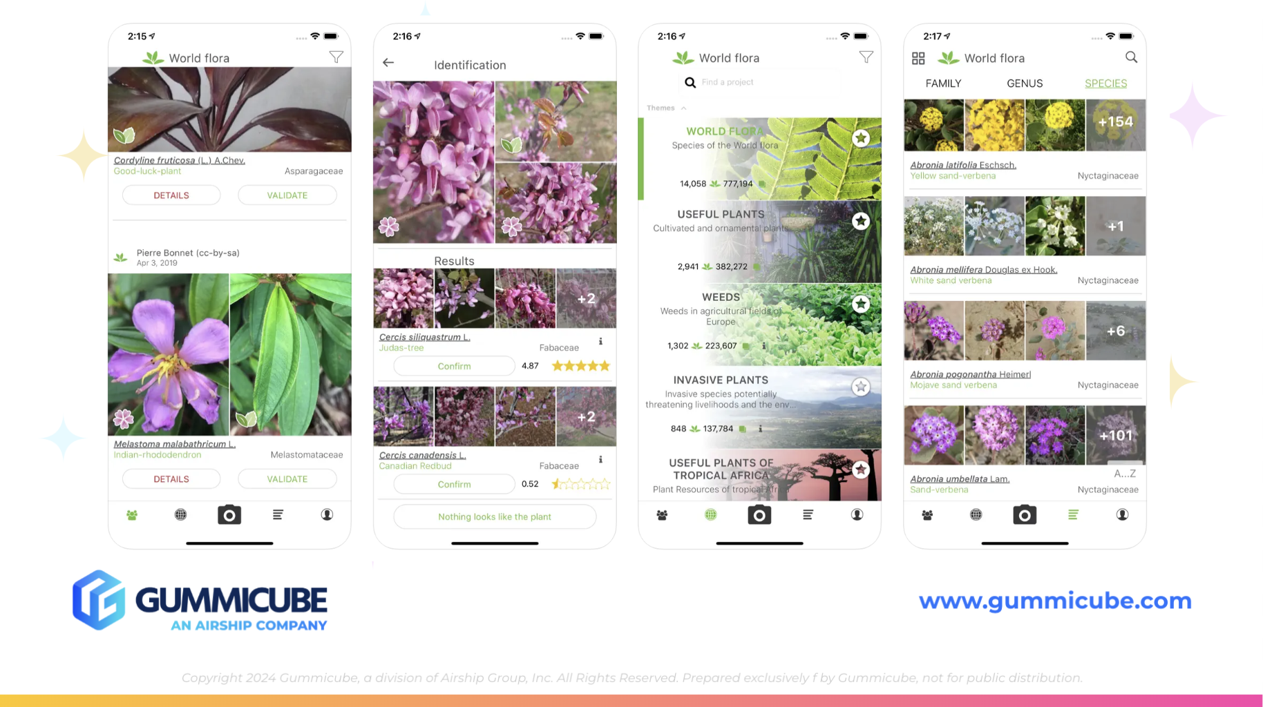
Where PlantNet’s ASO strategy falls apart entirely is in the creative presentation. The first three screenshots are essential real estate for driving installs. These should clearly highlight the app’s primary features with clean visuals, bold callouts, and an aesthetic that aligns with the app’s brand and audience expectations.
PlantNet’s current screenshots are literal in-app screen grabs with no added design, context, or explanation. There are no visual cues to explain what the app does or why it’s valuable. The lack of annotated callouts, lifestyle imagery, or even clear branding makes the experience feel far from engaging.
Additionally, the app uses only 6 out of 10 possible screenshots. This is a waste of space that could otherwise be used to build a strong narrative arc, introduce value props, and persuade users who are scrolling through the listing. Every screenshot is a chance to reinforce value, solve a user pain point, or visualize a benefit.
APP CREATIVE OPPORTUNITIES
Here’s how PlantNet can elevate its creative assets:
- Add annotated captions on each screenshot to explain the benefit of the feature shown
- Incorporate design elements such as plant illustrations or earthy tones to match the app theme
- Use mockups with zoomed-in UI elements to draw attention to specific features
- Showcase onboarding, community features, or recently identified plants to expand on use cases
- Add an App Store Preview video demonstrating how to take a photo and get identification results
- Include user reviews or credibility signals such as awards or recognition from Apple editorial teams
Beyond these improvements, PlantNet should consider mobile app A/B testing different screenshot styles and sequences to learn what resonates most with its target audience. A/B testing will reveal what PlantNet’s target audience prefers to see. Without A/B testing, even beautifully designed assets can underperform if it does not resonate with your target audience.
APP COMPETITOR COMPARISON: GREG
Let’s take a look at an app competitor that is implementing ASO best practices that PlantNet could pull inspiration from. Greg: Plant Identifier & Care, currently ranked #115 in the Education category, demonstrates strong ASO fundamentals despite its lower category ranking compared to PlantNet.
APP TITLE AND SUBTITLE
This week’s competitor app is titled “Greg: Plant Identifier & Care". This title packs in two core functionalities and important keywords without sacrificing clarity. The competitor app’s subtitle is "Identify, Diagnose & Reminders". This subtitle offers a concise, keyword-rich description that gives further clarification on what the app does. It expands the promise made in the title and gives prospective users a better understanding of what to expect.
This contrast makes one thing clear: Greg is capitalizing on metadata to support both app discoverability and conversion.
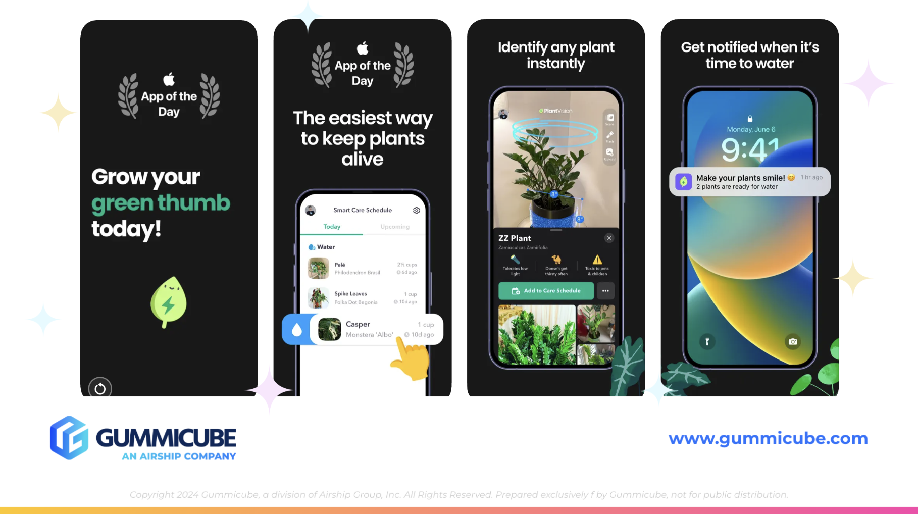
APP CREATIVES
Greg’s app creatives are polished, intentional, and engaging. The app uses all 10 available screenshots and an App Store video to bring the app’s value proposition to life.
Their app screenshots include:
- Bold, white typography with direct messaging
- High-contrast black backgrounds for readability
- iPhone mockups that highlight zoomed-in app features
- App Store accolades such as "App of the Day" are prominently displayed
- Visual storytelling that guides users from onboarding to plant care
Greg’s visuals guide the user through a journey from initial identification to ongoing care. This creates a complete narrative from the time a user finds their app to the time they decide to download. Greg makes it immediately clear what the app does, how it does it, and why it’s worth downloading. Their App Store Preview video adds a motion component that strengthens user engagement and improves conversion.
In contrast, PlantNet’s screenshots feel disconnected and unfinished. This comparison alone should prompt action for a creative overhaul.
FINAL RECOMMENDATIONS
For PlantNet to remain competitive and truly own its position in the Education category, the following ASO strategies should be prioritized:
- Rework the title to include high-volume keywords while preserving brand equity
- Revise the subtitle to clarify functionality and increase search relevance
- Completely overhaul creatives to highlight core features, implement design consistency, and visually guide the user
- Utilize all 10 screenshots and include an App Store video to boost engagement and conversion
- Conduct A/B testing on new creatives and metadata to refine strategy based on actual user behavior
- Incorporate lifestyle imagery or thematic visuals to enhance emotional connection
- Revisit App Store reviews and ratings for potential UGC (user-generated content) callouts in screenshots
The App Store is not a static environment. Trends shift, user expectations evolve, and competitors continually raise the bar. ASO is an ongoing strategy. Without meaningful updates, PlantNet risks being buried beneath more ASO-savvy competitors like Greg.
LET'S CHAT!
For those looking to elevate their ASO strategy, exploring advanced tools like SplitCube can provide deeper insights and greater flexibility in optimizing app performance. Incorporating data-driven A/B testing can make a significant difference in driving app visibility and downloads.
At Gummicube, we specialize in ASO services that will set your app up for long-term success. Whether you're launching a new app or optimizing one that has been around for a while, our team is here to help you reach your goals.
If you're ready to take your app listing to the next level, let’s chat.
More blog-posts like this:

Preparing for ASO Takeoff with Skyscanner
Every successful App Store listing needs to begin with a strong first impression. Read more!

That's a Wrap On Edits ASO Strategy
Let's take a closer look at where Edits succeeds and where there is room for optimization.

On The Air: FM Radio ASO Audit
In this week's App Store Spotlight, we're putting FM Radio under the ASO microscope.