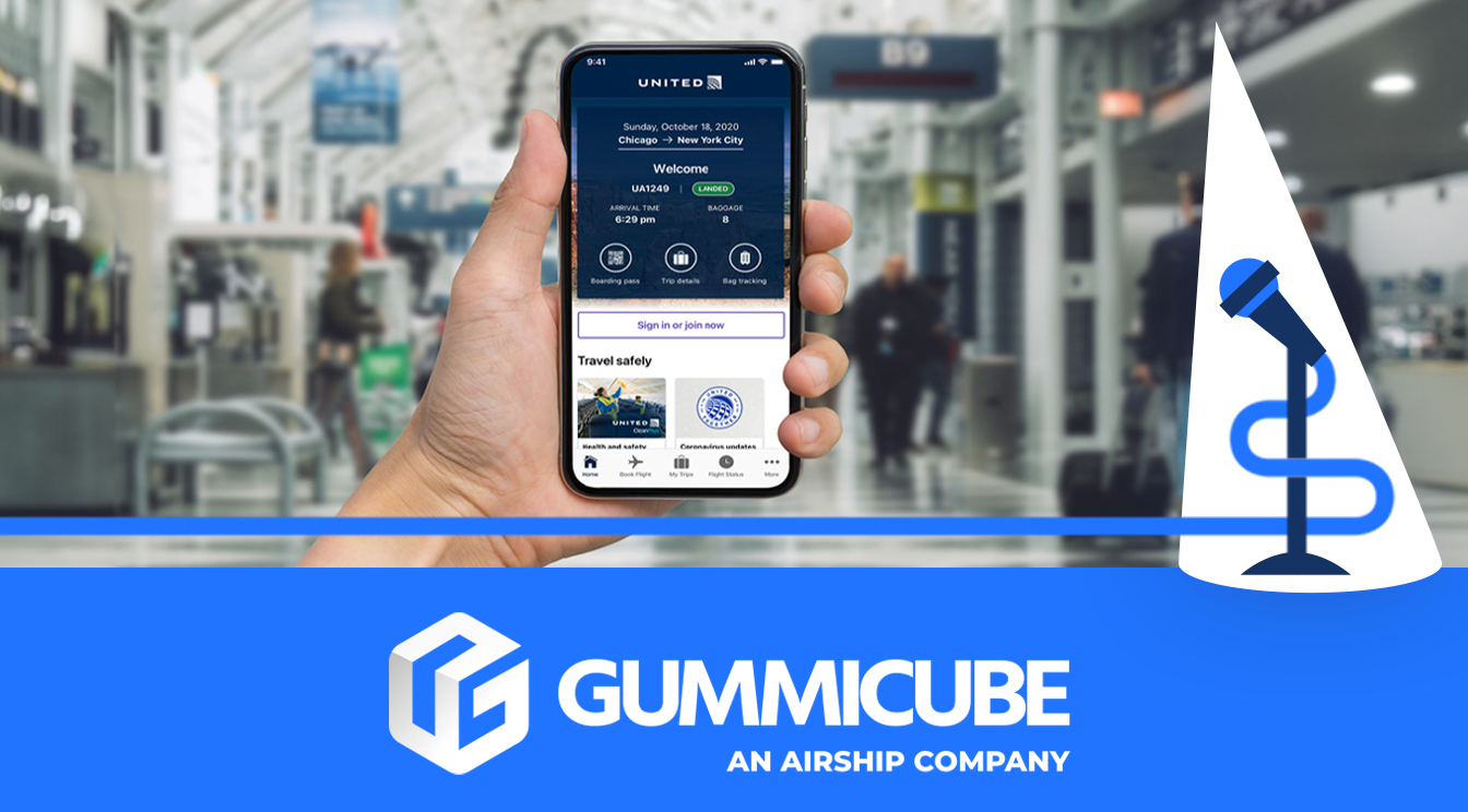
Soaring Above or Falling Flat? An iOS App Review of United Airlines
December 18th, 2024
 Tagged: App Ranking, App Promotion, App Screenshots, Aso Strategy, App Metadata
By David Quinn
VP of Strategy & Partnerships at Gummicube, Inc.
IS UNITED AIRLINES READY FOR TAKEOFF?
In the highly competitive world of travel apps, where hundreds of options are just a tap away, effective metadata and engaging visuals are paramount to standing out in the crowded App Store. For apps in the travel sector, such as United Airlines, these elements are even more critical due to the need to capture the attention of users seeking convenience, reliability, and an intuitive user experience. The success of an app isn’t just about offering great functionality; it’s also about how well it presents itself within the App Store to attract, engage, and convert users. Metadata plays a key role in ensuring an app is discoverable, while visuals provide the first impression that can either compel a user to download or push them toward a competitor.
For United Airlines, which is competing against industry giants with vast resources and loyal customer bases, every detail matters. A well-optimized app listing not only helps the app get found more easily but also enhances its appeal to potential new users. The stakes are high: with the ever-growing presence of other airline and travel-related apps, failing to maximize metadata and visuals could result in lost visibility and engagement. For this week’s App Store Spotlight, we’ll do a detailed review of the United Airlines iOS App Store Optimization strategy, comparing it to best practices and offering actionable insights to help the app soar above its competition and ensure it’s ready for takeoff.
TITLE ANALYSIS: A MISSED CONNECTION TO TAKE FLIGHT
A well-crafted title can make or break an app’s discoverability. For United Airlines, the choice of “United Airlines” as the app’s title reflects brand recognition but fails to capitalize on the potential of metadata optimization. Even though this is a popular airline app, without a descriptive title, the app misses a valuable opportunity. By using App Store Optimization best practices and including additional keywords or phrases in the title, United Airlines could boost its visibility in search results.
The absence of a subtitle also limits the app’s ability to communicate its value proposition at a glance. Even though most users know what features they could expect from an airline app, subtitle keywords could still be utilized here regardless. Keywords such as “book flights,” “track trips,” and “flight updates” are great ways to capture the interest of users searching for specific functionalities. By not leveraging these keywords, United Airlines’ app risks being overshadowed by competitors who use titles and subtitles to their full potential.
Adding a subtitle could provide a significant boost. A simple subtitle addition would not only improve keyword coverage but also establish the app’s utility at a glance, making it more appealing to potential users. A descriptive title and subtitle not only help users understand the app’s features but also ensure that it surfaces in relevant search queries, giving it a competitive edge.

SCREENSHOT ANALYSIS: MISSING THE CONNECTION WITH NEW USERS
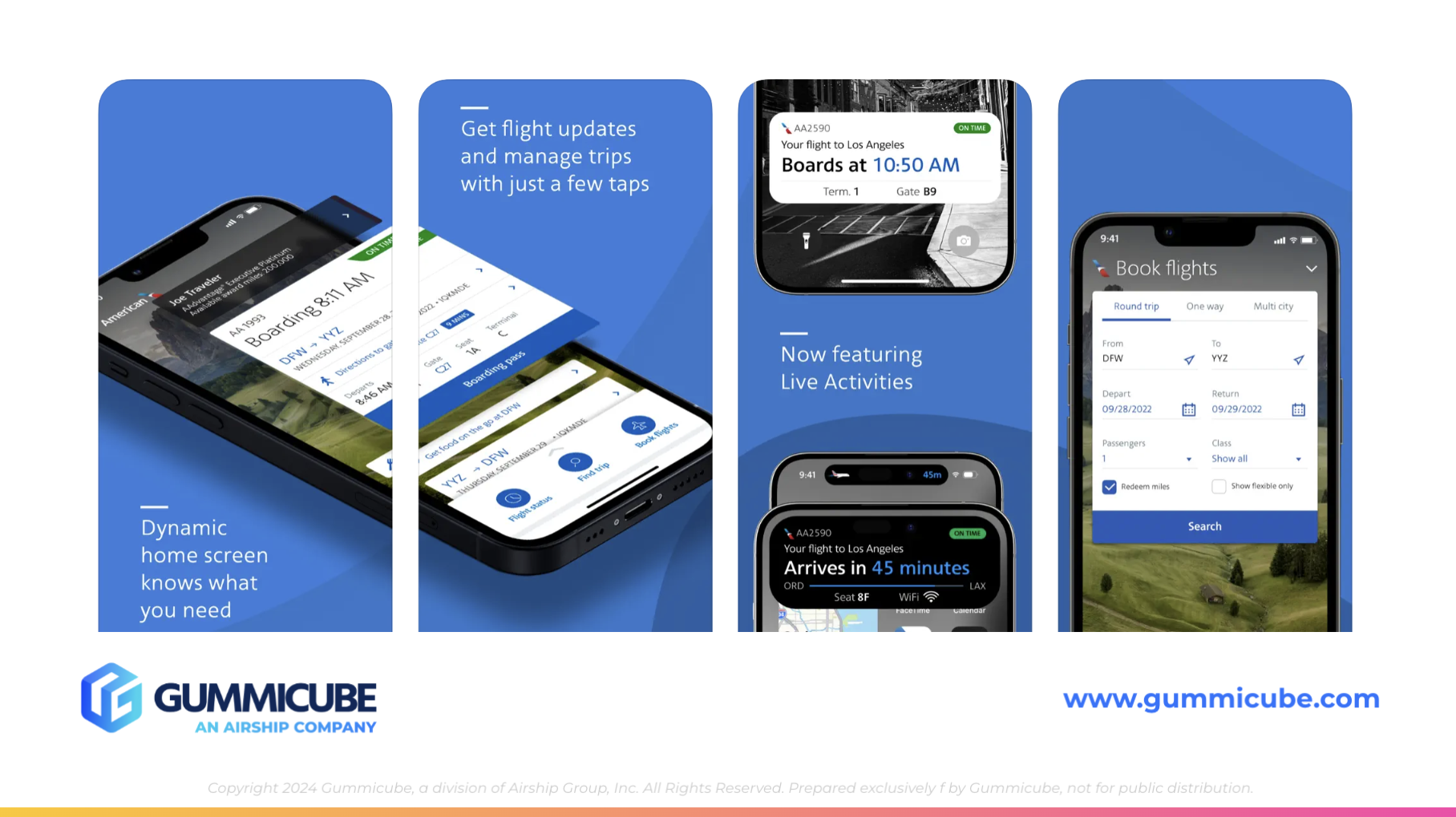
Screenshots are often the deciding factor for users browsing the App Store. As one of the first elements users encounter, screenshots play a crucial role in forming initial impressions. These visuals not only highlight key features but also influence a user’s decision to explore the app further or move on to a competitor. For travel apps, where user needs are diverse and expectations are high, screenshots must bridge the gap between functionality and aspiration. They need to clearly convey the app's capabilities while resonating with the emotions of travelers seeking convenience, reliability, and inspiration. They provide a visual representation of an app’s functionality and play a pivotal role in driving downloads. Unfortunately, United Airlines’ current screenshots fall short in creating a compelling narrative for new users.
The text in the screenshots is small and overly verbose, making it difficult for users to quickly grasp the app’s value. Additionally, the use of the bold frames create a cluttered appearance, overwhelming potential users with too much visual information. The lack of focus on specific features further dilutes the app’s message, leaving users unsure of what sets it apart from competitors.
Improving the screenshots would involve addressing several key areas:
- Larger, more concise text overlays: These should emphasize key features such as “Track Flights Easily” and “Manage Trips Effortlessly.”
- Simplified visuals: Highlighting one feature per screenshot would create a more digestible presentation.
- Focus on standout features: Showcasing capabilities like seamless booking, live flight updates, and loyalty program benefits would resonate more with the app’s target audience.
These adjustments would foster an emotional connection with users, making the app more appealing and driving downloads. By clearly demonstrating its value proposition through well-designed screenshots, the app can turn casual browsers into engaged users.
COMPETITOR ANALYSIS: UNITED AIRLINES VS. AMERICAN AIRLINES
In the highly competitive travel app space, competitors like American Airlines set a high bar for both metadata and creative optimization. American Airlines’ approach exemplifies how a thoughtful combination of design and keyword integration can create a cohesive and compelling user experience. For instance, their screenshots incorporate an aesthetic blue background with subtle dark blue accents in the corners. This design choice is visually pleasing without being distracting, adding depth and tying the images and text together seamlessly.
American Airlines excels in maintaining a clean and sleek presentation. The app uses high-quality iPhone mockups and features white text that is large enough for users to easily scan and understand key functionalities. Keywords are strategically integrated into the text overlays, making the benefits of the app immediately clear. For example, they highlight features like:
- "Get flight updates"
- "Use your miles"
- "Mobile boarding pass"
Although their app lacks keywords in the title or subtitle, the inclusion of terms like “Trip” in their screenshot copy helps balance this gap. This approach ensures users quickly understand the app’s key features while enhancing searchability and engagement. United Airlines could use this as an example to target their audience more effectively by incorporating relevant keywords into their screenshots to communicate value and functionality.
These phrases effectively communicate the app’s value while aligning with user priorities. The screenshots prioritize essential callouts, such as check-in, flight tracking, and rewards programs, ensuring that the visuals directly address what users care about most.
United Airlines could take a page from American Airlines’ playbook by adopting a more user-centric approach in its own app presentation. By emphasizing core features like loyalty rewards, seamless flight tracking, and convenient check-in options, United Airlines can better connect with its audience and showcase the app’s value. Enhancing text readability, integrating high-value keywords into overlays, and aligning visuals with the travel experience will create a more engaging and cohesive presentation. Additionally, incorporating thoughtful design elements, such as clean mockups and subtle yet effective backgrounds, would help United Airlines deepen its connection with users who are seeking not just functionality, but inspiration and convenience in their travel experience.
CONCLUSION: GROUNDED OR READY TO SOAR?
United Airlines’ listing demonstrates both the strengths and weaknesses that come with being a well-known brand in the highly competitive travel industry. While its brand recognition offers a solid foundation, there are notable areas within its metadata and creative presentation that could benefit from refinement. Small but impactful adjustments—such as incorporating a descriptive subtitle, optimizing the clarity of screenshots, and ensuring that the visuals align more closely with the travel experience—could significantly improve the app’s visibility and user appeal.
In an environment where users are presented with a sea of options, even slight optimizations to metadata and visuals can create a noticeable shift in how an app is perceived and discovered. By aligning the app’s metadata with user expectations and capitalizing on relevant search keywords, United Airlines can better compete with rivals in the travel app space. The app’s current strategy, while solid, leaves room for improvement that, when addressed, can enhance its discoverability and engagement.
For travel apps, the visual details are key to making you stand out from one brand to another. By making these subtle yet effective changes, United Airlines can ensure its app is not only seen but also clicked, downloaded, and used on multiple occasions. As competition in the app marketplace intensifies, maximizing metadata and creative assets will be a critical factor in achieving sustained success. With these changes, United Airlines can position itself as a stronger contender in the travel app arena, ready to soar above its competitors and capture the attention of travelers worldwide.
LET’S CHAT!
Are you looking to elevate your app’s metadata and creatives? Gummicube specializes in helping apps take flight. Let’s collaborate to ensure your app stands out in a competitive market. Reach out today to explore how small changes can lead to big results!
More blog-posts like this:

FotMob's ASO Analysis: Penalty kick or On Target?
Apps that fail to evolve their App Store presence risk being buried beneath competitors that are actively optimizing for visibility & conversion rates.

Timeleft: Finding Friends, But Is It Finding App Store Visibility?
A/B testing alternative subtitle structures, and experimenting with screenshot designs could set Timeleft apart from its competition. Read more!
Checking In on Booking.com's ASO Strategy
Success in the App Store is driven by a combination of discoverability and conversion. Apps that excel in both areas consistently outperform the competition.