Elevating Depop's ASO Strategy
July 2nd, 2025
 Tagged: App Metadata, Aso Services, Aso Strategy, App Store Spotlight, App Ranking
By David Quinn
VP of Strategy & Partnerships at Gummicube, Inc.
Popularity alone does not guarantee visibility. For Depop, staying competitive in the app store means refining its App Store Optimization (ASO) approach across the board. The difference between an app that thrives and one that gets buried in search results often comes down to how well its ASO strategy is executed.
This week’s App Store Spotlight will analyze how Depop is currently positioned on the App Store, what it is doing well, where it could improve, and how it compares to a major competitor. We will also provide actionable ASO insights that can help elevate its discoverability, conversion rate, and user engagement.
DEPOP’S APP TITLE AND SUBTITLE
Depop’s current app title is: Depop | Buy & Sell Clothing Character count: 27 out of 30
Depop’s current app subtitle is: Resale Marketplace for Clothes Character count: 30 out of 30
Depop does an excellent job here. The title and subtitle clearly communicate the app’s function, while also utilizing high-volume keywords relevant to fashion, resale, and e-commerce. The use of almost the full character limit in both fields is a smart move, as Apple gives developers limited space to convey maximum value. This real estate is essential for ASO performance.
Keywords in these fields play a crucial role in search ranking. While including high-volume keywords is important, app developers must avoid keyword stuffing or misleading phrases. Keywords must accurately reflect the app’s core offering. Overloading the app title or subtitle with irrelevant or loosely connected terms can result in higher uninstall rates, lower engagement, and even policy violations. It is about balancing visibility with accuracy. In Depop’s case, the balance appears thoughtfully maintained.
That said, ASO is not a one-time task. Trends, search behavior, and language evolve constantly. Apps need regular review of titles and subtitles in order to ensure they are staying relevant and using terms that are powerful enough to continue to boost their app visibility. Keeping an eye on competitor metadata, app store keyword trends, and changes in user behavior can provide insight into when and how to refresh this content strategically.
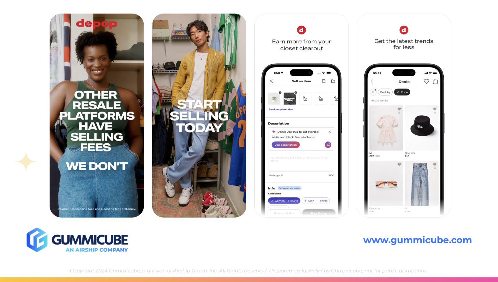
DEPOP’S APP CREATIVES
When it comes to conversion rate optimization, the first three screenshots in your app store listing are critical. They are often the deciding factor between a user downloading your app or continuing their search. Apple even preloads the first few screenshots in search results, so what appears in those slots can have a direct impact on tap-through rates.
Depop’s use of creative assets starts off strong. The first two screenshots showcase the app’s personality and features by blending bold, white typography with real-life photography. This approach feels modern, authentic, and on-brand. It also helps users visualize what using the app might look like in practice. This kind of contextual imagery can significantly improve emotional connection and app perception.
However, beyond the second screenshot, the momentum fades. Screenshots three through six showcase a repetitive design pattern that is redundant. Each image features the same iPhone mockup, with a small font positioned above it. While minimalism can certainly reflect the brand’s aesthetic, it should not come at the cost of engagement.
The text on these later screens is difficult to read at a glance and lacks visual energy. For users quickly scrolling through screenshots, these subtle design choices may go unnoticed or fail to hold interest. It becomes easy to skip over them entirely. Depop could benefit from reimagining how it uses this space.
Here are some actionable suggestions:
- Enlarge the text above the iPhone mockup to improve readability.
- Introduce more dynamic layouts that integrate product photography into the screenshot background, as was done in the first two images.
- Use varied angles or device frames to add visual variety.
- Consider overlaying feature callouts directly on user-generated content or lifestyle imagery to create a stronger emotional impact.
Creative app elements should be updated regularly. New campaigns, feature launches, and seasonal trends can all inform how screenshots are presented. Static creatives are missed opportunities.
Mobile app A/B testing is a powerful ASO tool to take the guesswork out of creative direction. By testing multiple versions of screenshots, developers can see firsthand which versions lead to more conversions. This type of iterative testing allows teams to understand what users respond to and why.
Using an ASO tool like Splitcube can help you evaluate different creative elements, test headline variations, or restructure the layout to see what resonates best with your users. The insights gained from these tests are invaluable, especially in a saturated market where even small creative optimizations can make a measurable difference in conversion rate.
APP STORE COMPETITOR ANALYSIS
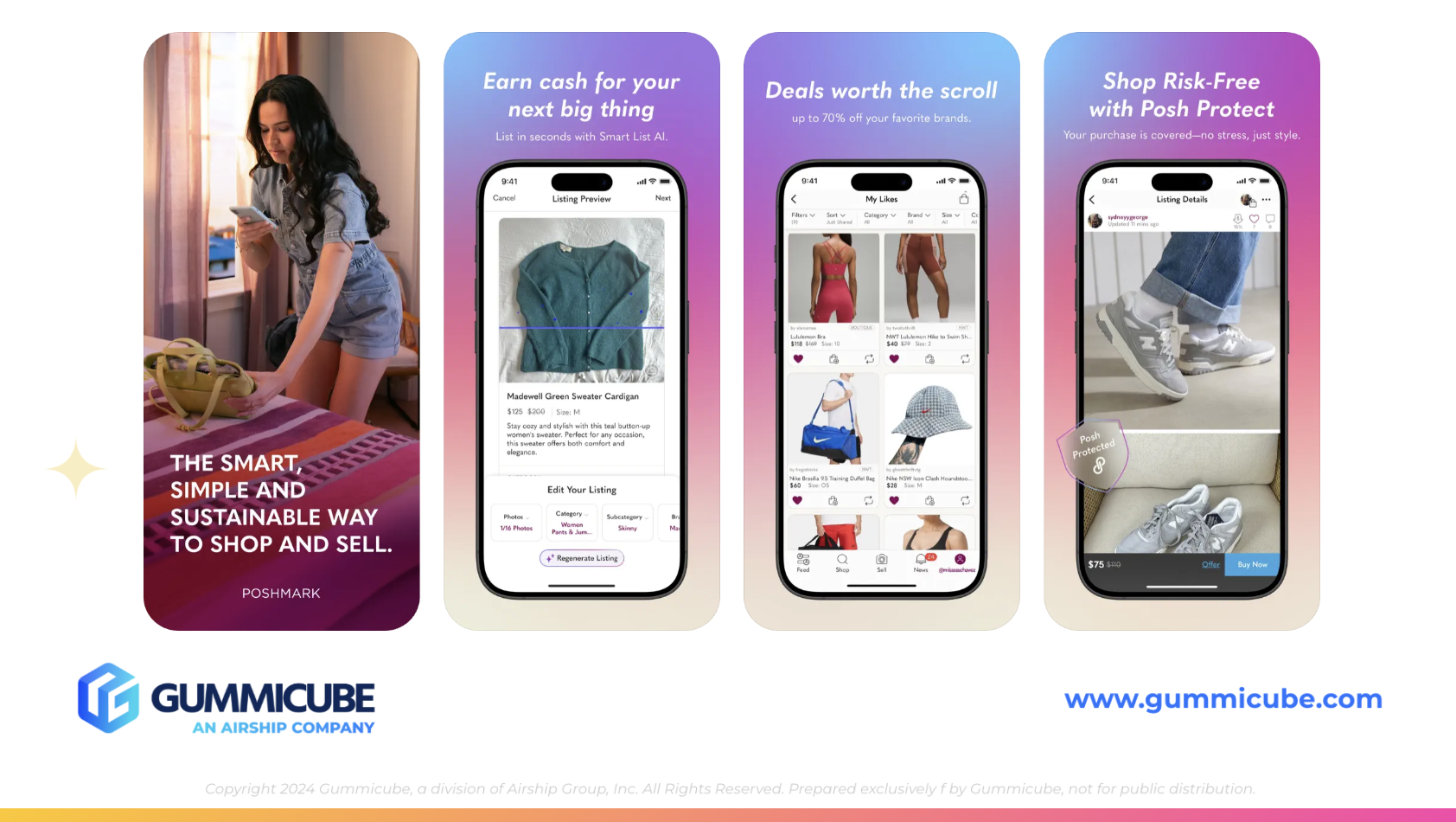
To provide additional perspective, let’s examine one of Depop’s top competitors: Poshmark.
Poshmark’s app title: Poshmark: Buy & Sell Fashion Poshmark’s subtitle: Shop & make money from home
Much like Depop, Poshmark successfully integrates high-volume, relevant keywords that clearly communicate the app’s purpose. Their subtitle is particularly user-centric, speaking directly to the potential value proposition: earning money from home.
Where Poshmark truly shines, however, is in its creative strategy. The screenshots are minimalistic, but they incorporate stylistic elements that keep the viewer engaged. A warm gradient background runs through their screenshot carousel, giving each slide a cohesive and inviting feel. Their use of bold, italicized white text adds emphasis and visual rhythm.
These creative enhancements are not groundbreaking in terms of effort, but they demonstrate attention to detail. By incorporating gradients, more expressive fonts, and visual contrast, Poshmark manages to make its app listing feel more dynamic, without deviating from its brand identity.
This is a lesson Depop could take to heart. Minimalism should not mean monotony. Developers can maintain a clean, modern aesthetic while still experimenting with subtle enhancements. Something as simple as a background color change, a larger font, or an unexpected layout can turn an overlooked creative into a conversion-driving asset.
ASO is not just about being found. It is about converting interest into downloads. Strong creative work paired with keyword-rich metadata forms the foundation of a high-performing app listing.
FINAL THOUGHTS
Depop is well-positioned in the app store, with a clear, relevant title and subtitle that make good use of the available space. Their creative work starts strong, especially in the first two screenshots, but loses energy in the later images. Competitor analysis shows that even small visual enhancements can have a big impact on how users engage with your listing.
ASO is an ongoing process. What works today may not work six months from now. To remain competitive, apps must evolve their metadata, creative assets, and keyword strategies based on user behavior, store trends, and competitor performance.
By incorporating regular creative testing, updating screenshots with engaging visuals, and staying attuned to shifts in search behavior, Depop could unlock new opportunities for growth. The good news is that most of the foundational work is already there. It just needs to be iterated on and tested more strategically.
LET’S CHAT
If you’re ready to take your app store presence more seriously, Gummicube’s ASO services are here to help. Whether you need to refine your metadata, improve your screenshots, or test different creative directions, we provide the expertise and ASO tools to keep your app competitive. Contact us today to take a step towards building your data-driven ASO strategy.
More blog-posts like this:

Preparing for ASO Takeoff with Skyscanner
Every successful App Store listing needs to begin with a strong first impression. Read more!

That's a Wrap On Edits ASO Strategy
Let's take a closer look at where Edits succeeds and where there is room for optimization.

On The Air: FM Radio ASO Audit
In this week's App Store Spotlight, we're putting FM Radio under the ASO microscope.