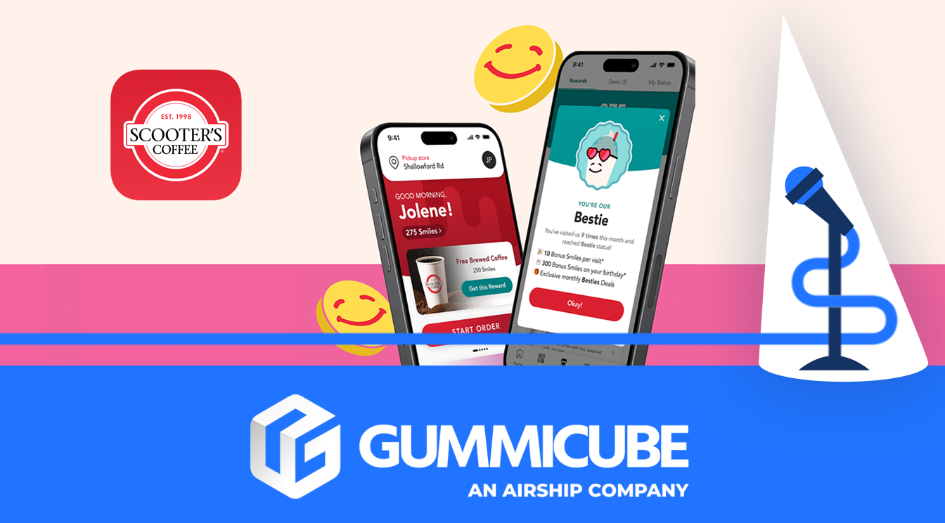
Scooting into ASO Success
June 25th, 2025
Tagged: Aso Services, App Store Spotlight, App Ranking, App Metadata
By David Quinn
VP of Strategy & Partnerships at Gummicube, Inc.
If your coffee shop doesn’t have a mobile ordering app, you are already falling behind. In today’s digital-first world, customers expect convenience, speed, and a seamless digital experience. Mobile ordering has become a core part of how people interact with their favorite food and drink brands.
This shift has changed the fast food and beverage industry entirely. It is not enough to simply have an app that functions well. Even popular brands must make regular updates to their app store listing to remain competitive. Visibility and conversion rates depend on how well your app communicates value from the very first glance in the store.
Updating your app title, app subtitle, and app creatives will help your app stand out once someone lands on your listing. It can also help improve visibility by using strategies that increase how often your app appears in relevant search results.
This week’s App Store Spotlight breaks down how to update your app listing to stay competitive in your local market and expand your reach globally, if that aligns with your goals.
App Store Optimization (ASO) starts with refining the key elements of your app’s store listing. This is the first place potential users will explore before deciding whether to download, and even small changes can lead to meaningful improvements in visibility and conversion.
SCOOTERS COFFEE APP TITLE AND SUBTITLE
App title and subtitle fields can take up to 30 characters each. These fields are great real estate for including high-volume keywords that are popular search terms. Including high-volume keywords in these fields can boost your app’s visibility. Higher visibility can lead to higher app installs.
Scooter's app title is: Scooter's Coffee Scooter's app subtitle is: Order. Pay. Rewards.
The current app title and subtitle are direct and functional, giving users a clear idea of their top app features. While this approach provides immediate clarity, it leaves valuable search visibility on the table. A data-driven mobile app A/B testing strategy could help identify stronger keyword combinations that improve ranking performance without compromising clarity. High-volume keywords in these fields are proven drivers of visibility and should not be overlooked.
Gummicube’s ASO platform, DATACUBE, has pulled some high-volume keywords that could be explored further:
ahead
coffee app
mobile ordering
order
These keywords could be incorporated in the subtitle or even explored through creative variations.
While the current app title is likely aligned with brand guidelines and shouldn’t be modified too drastically, the subtitle provides flexibility. Subtitles can shift slightly to align with user behavior and trending terms without compromising brand clarity.\
A potential keyword-focused subtitle that aligns with the app’s value:
- Order ahead and earn rewards (26/30 characters)
Both suggestions target a different intent. Mobile coffee ordering is largely driven by speed and reward-based engagement, so leading with these values in the metadata is a strong move to implement.

SCOOTERS APP CREATIVES
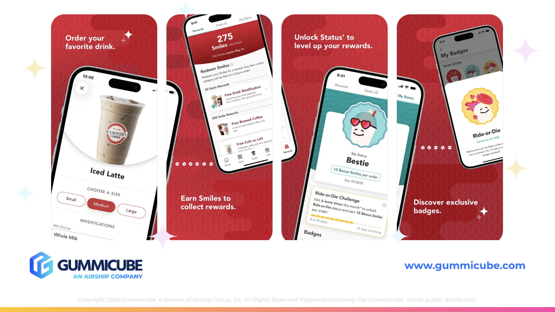
Scooter’s current app creative set has a few things going well. The background aligns well with their deeper red aesthetic, creating a visually unified experience for anyone familiar with their in-store branding. The use of alternating iPhone mockup directions also helps the eye move naturally from one screenshot to the next. These little creative choices matter and keep users visually engaged.
That said, there are opportunities to improve the visual presentation and clarity of their messaging.
One of the most glaring issues is legibility. The text overlays are small and hard to read, especially when skimming through screenshots quickly. Most users do not zoom in or carefully read every line. Your screenshot copy needs to be immediately readable. Think bold, large, high-contrast text that gets the point across quickly.
In addition to font size, the screenshots could benefit from more varied use of lifestyle imagery. Screenshot five incorporates a real-life photo, and this makes the app feel more authentic. More lifestyle photos can build trust and show real-world use cases, which resonates well with mobile-first audiences. Coffee, like many food and drink products, is deeply tied to emotion, routine, and experience. Showing those experiences visually can support a stronger emotional connection and increase the chance of conversion.
Another opportunity: adding an app store video. Scooter’s does not currently utilize one, but incorporating a short, compelling preview could set the app apart. Videos will play in app search results, which can draw more attention to your listing and potentially help boost app installs. Even a 15–30 second clip showing the in-app experience while ordering their favorite drink, how to pay in-app, and track rewards points can be highly beneficial.
With today’s scrolling behavior and short attention spans, adding motion content could be the extra edge your app listing needs to stand out.

APP STORE COMPETITOR ANALYSIS
We will be comparing Scooter’s to Dunkin’. Comparing your app to its competitors is key to continuing to grow. Just because something is working well for your app now doesn’t mean it will always stay that way. User behavior shifts. Competitors launch new features. Algorithms change. Analyzing competitors can give you ideas to boost your individual ASO strategy.
From adopting creative ideas, to exploring new keywords, to changing up your app screenshots, regular review is a key part of winning in the app store.
Dunkin’s app title is: Dunkin’
Dunkin’s app subtitle is: Order ahead and earn rewards (28/30 characters)
This is a clear, direct message. It immediately communicates the two biggest reasons people use food and drink apps: skipping the line and getting perks. This is one of the highest performing app features in the category, and stating it clearly in the subtitle is a smart ASO decision.
Now let’s look at their creatives.
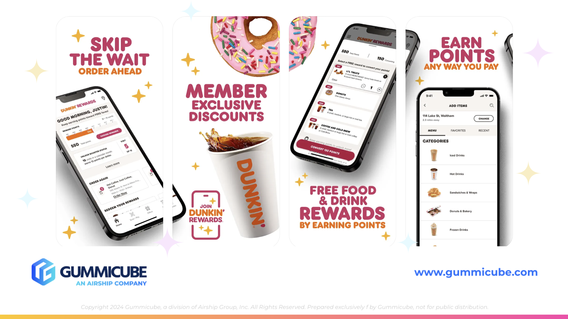
Dunkin’s screenshots are where they truly stand out. They take a plain white background and make it interesting, engaging, and informative all at once. They use a bold, custom font that is easy to read. The font choice helps users spot the app’s most important benefits at a glance. The text is sized appropriately and balanced visually across each screenshot.
They utilize slanted iPhone mockups that alternate direction, similar to Scooter’s. But Dunkin’s visuals also include small, playful design accents that break up the space and keep the images interesting. These interesting design elements make the experience feel more dynamic without distracting from their core app features and copy.
Color contrast also plays a major role. Dunkin’ combines dark purple or pink with their classic orange, which helps keywords and key phrases pop. These touches are intentional and help users digest information quickly as they swipe.
One of the most important takeaways is their use of real food and drink photography. Images of donuts, coffee cups, and actual in-app experiences give the listing personality and credibility. It feels real. These real-world visuals can resonate more deeply with users who are already familiar with the Dunkin’ brand in stores.
Dunkin’ utilizes the first three screenshots to showcase its major selling points. Many users never scroll past the first few screenshots. Getting your biggest conversion drivers into those first frames is a critical ASO strategy, and Dunkin’ does it well.
CONCLUSION
Scooter’s Coffee has built a well-branded app experience that is visually aligned with their in-store identity. But in a crowded market filled with competitors like Dunkin’, there are several areas where strategic ASO updates could help improve performance.
Here’s what we recommend:
Consider updating the app subtitle to include higher volume keywords or more value-based messaging around ordering ahead or earning rewards.
Adjust app creative assets to feature larger, more legible text and use lifestyle imagery throughout more screenshots.
Add an app store video to quickly highlight in-app ordering, payment, and rewards features.
Use competitor analysis to inform creative app layout and keyword strategy.
Reassess your first three screenshots to ensure they highlight the top features with strong, clear copy and engaging visuals.
Mobile ordering is now an expectation, not a novelty. Users want to see that your app is fast, easy to use, and rewarding. Every element of your app store listing should reinforce those benefits. With some adjustments, Scooter’s can push further into app store success and stand out to both local customers and national audiences alike.
LET’S CHAT!
Gummicube’s ASO services have been creating winning strategies for apps for over a decade. We can help you with cultivating a strategy that can keep your app competitive by changing a few app store listing elements, or completely building you a new strategy from the ground up. If you’re looking to take your app listing to the next level, let’s chat.
More blog-posts like this:

Checking In on Booking.com's ASO Strategy
Success in the App Store is driven by a combination of discoverability and conversion. Apps that excel in both areas consistently outperform the competition.

Mark Your Calendar: Howbout's ASO Audit
By introducing dynamic design elements & leveraging ASO tools such as App Store video and A/B testing, Howbout can significantly enhance its App Store listing.

ASO Checkup on Walgreens' App Listing
By combining data-driven insights with thoughtful design, developers can create listings that not only attract users but also convert them effectively.
