SpellTower+ App Store Spotlight
January 20th, 2021
 Tagged: App Store Screenshots, App Store Spotlight, Spelltower
By David Quinn
VP of Strategy & Partnerships at Gummicube, Inc.
App Store Screenshots are a critical component to an App Store Optimization strategy. Whether from a AAA publisher or an indie game studio, conversion optimization is key to acquiring users for any type of app from any source of traffic. App Store Screenshots take up the majority of screen real estate in search results and on the product page- they must have an impact on users that compels them to download.
For this week’s App Store Spotlight, we look at SpellTower+, an app recently featured as the primary app in Apple’s “Indie Spotlight” list. Will their screenshots spell success during and after their feature, or will they leave users searching for more?
Screenshots Overview
SpellTower+ currently uses seven of the available ten screenshots available to show a basic flow of the game, preceded by an App Preview of the gameplay. Words found in the example gameplay help guide the user across the set- starting with basic gameplay in the first two positions, followed by two screenshots showing puzzle mode in-app gameplay, then wrapping up to show “HINTS”, additional game modes and several accolades the app has received. The background UI color changes from one to the next, and each screenshot has brief text at the bottom explaining the game further.
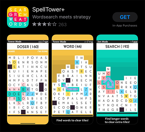
Starting the flow with the most important terms first, expanding into additional ones, is a great way to quickly explain your app and elaborate for interested users. However, some elements of the creatives should be tested to see if they lead to higher conversion.
Screenshot Text
One of the main areas to address is the callout text accompanying each image. By nature of its in-app UI, SpellTower+ is able to use the word displayed at top to guide the user through the process, flowing from “WORD”, “SEARCH” and “HINTS.” This prominently displayed text inherently explains to the user what feature they are seeing.
The accompanying text, however, becomes an issue- especially when viewed in dark mode. Since the app UI itself is so vibrant, and the words at the top of the screen are so prominent, the mostly white text on a black background at the bottom of the image can get lost within the UI of the App Store in dark mode.
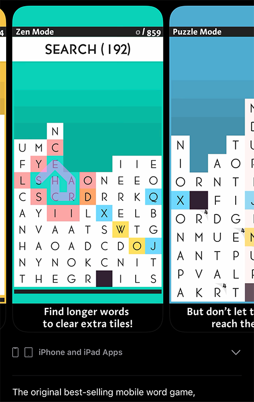
In dark mode, the prominent text shown at the top of the in-app UI may appear to be the callout text- but it's actually at the bottom, on a black background, blending in with the App Store UI.
Prominently displayed callout text can communicate the app’s features and value propositions more instantly to a user who has to examine the UI for a while to see what’s going on. Using high volume keywords in this text can also help increase conversion- so that a user searching “word puzzles” can quickly see how their search is relevant to the app, rather than having to examine the UI to figure out there is a puzzle mode available. Aside from changing the background and font color of the callout area, incorporating more brief, keyword-driven text may also help here.
App Preview - The "First Screenshot"
While the App Preview is its own creative element deserving of its own in-depth assessment- and is subject to separate App Store Review Guidelines than the App Store Screenshots- it behaves as the “first screenshot” for the app, appearing before them in search results and on the product page. Because of this, the Poster Frame, or paused state of the video before it plays, should be treated as the first screenshot.
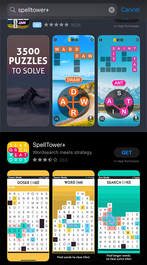
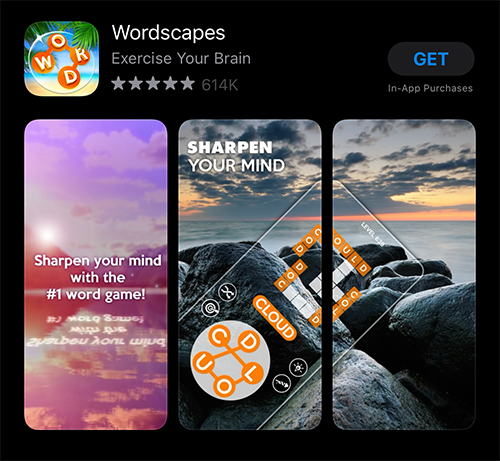
Wordscapes, an app that is among others that appear as an Apple Search Ad for SpellTower_+'s brand, has an App Preview that incorporates clear value propositions, including the extensive amount of levels._
Currently, SpellTower+ uses the first frame of the video, missing out on an opportunity to display call to action text that engages users who aren’t viewing the video. Only one video will play at a time when scrolling through search results- if a competitor App Preview plays before SpellTower+, there is little currently implemented to distract the potential user from the competitor.
Accolades & Value Propositions
The final screenshot showing accolades is a good way to lend credibility to the app, in a store filled with plenty of options for word search games. Competing apps will use accolades and value propositions like ‘#1 Word Game” in their copy; It would be worth testing these accolades- some of which are from big-name institutions like Kotaku and even Apple themselves- in one of the first screenshots that appear in search results.
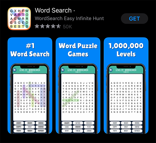
Competitor apps Wordscapes and "Word Search •" use "#1" value propositions in their first screenshot / Poster Frames to position themselves apart from other apps.
While SpellTower+ is doing some things right with its screenshots- such as guiding users through the flow of the gameplay in a logical order, and varying the background UI color to visually communicate the variety of gameplay around a consistent, simple theme- there are definitely areas for improvement that should be tested. The copy used in the callout text can be improved upon to more briefly reflect relevant, high ranking, high volume keywords; the design treatment can be updated so the text stands out in both light mode and dark mode; the impressive accolades can be displayed more prominently. The Poster Frame of the App Preview can also be updated with these concepts in mind to be treated as a first screenshot of its own.
Overall
SpellTower and SpellTower+ are long-standing indie developer favorites, but there is still room to improve and capture users who are not familiar with the app. Whether an app is a long-time favorite with multiple App Store features or just starting out its ASO strategy, conversion optimization is a key part of long-term growth.
More blog-posts like this:

FotMob's ASO Analysis: Penalty kick or On Target?
Apps that fail to evolve their App Store presence risk being buried beneath competitors that are actively optimizing for visibility & conversion rates.

Timeleft: Finding Friends, But Is It Finding App Store Visibility?
A/B testing alternative subtitle structures, and experimenting with screenshot designs could set Timeleft apart from its competition. Read more!
Checking In on Booking.com's ASO Strategy
Success in the App Store is driven by a combination of discoverability and conversion. Apps that excel in both areas consistently outperform the competition.