Stride: Mileage & Task Tracker ASO Assessment
January 16th, 2026
 Tagged: A/b Testing, App Creatives, App Screenshots, Aso Services, App Store Optimization, Stride, Everlance
By David Quinn
VP of Strategy & Partnerships at Gummicube, Inc.
The app stores are getting more competitive every day, and leveraging a data-driven App Store Optimization (ASO) strategy is essential if an app wants to succeed long-term. In this week’s App Store Spotlight, we are taking a deep dive into the iOS app listing of Stride: Mileage & Task Tracker. Stride operates in a highly competitive category where seasonal demand, particularly around tax season, creates both opportunity and risk. The app is clearly designed to support self-employed professionals and drivers who need accurate mileage, income, and expense tracking. While Stride demonstrates strong fundamentals in its metadata strategy, there are notable opportunities to strengthen its creative assets and improve conversion performance.
To provide a complete ASO picture, we also compare Stride against a top-performing competitor in the same category, Everlance: Mileage Tracker. This comparison highlights where Stride is performing well and where adjustments could meaningfully improve visibility, engagement, and installs.
APP STORE METADATA STRATEGY
Stride begins its App Store listing with a strong foundation in its metadata. The app title, “Stride: Mileage & Tax Tracker,” is clear, direct, and strategically aligned with high-intent search behavior. Including tax-related terminology is particularly effective given the seasonality of this category. As tax season approaches, user search behavior shifts from generic mileage tracking to more outcome-driven queries focused on deductions, expenses, and filing preparation. Stride positions itself directly within that demand.
The subtitle, “Expense & Income Tracking,” complements the title well and reinforces the app’s core value proposition. Together, these two metadata elements quickly communicate what the app does and who it is for. More importantly, they make effective use of limited character space by prioritizing relevant, high-volume keywords over branding or vague messaging.
From an ASO perspective, this approach creates multiple opportunities for Stride to appear in search results across both mileage-related and tax-focused queries. The clarity of the metadata also helps users immediately understand whether the app meets their needs, which is a critical factor in conversion.
Stride’s metadata strategy demonstrates an understanding of how to balance keyword relevance with user clarity. This is an area where the app is performing well and establishing a solid baseline for organic growth.
APP SEASONALITY KEYWORD OPPORTUNITIES
One of Stride’s biggest advantages is its alignment with seasonal search trends. Tax season drives a predictable spike in demand for apps that support mileage tracking, expense reporting, and income documentation. By including tax-related language directly in the title, Stride positions itself to capture that seasonal surge.
That said, seasonal ASO should not be static. There is an opportunity for Stride to rotate or test different keyword variations in the title and subtitle throughout the year. During peak tax months, leaning heavily into tax tracking makes sense.
Strategically interchanging high-volume keywords based on seasonality allows apps to broaden their reach without sacrificing relevance. When paired with A/B testing, this approach can help Stride identify which messaging resonates most strongly with different user segments at different times of the year.
OVERVIEW OF STRIDE’S APP STORE CREATIVES
While Stride’s metadata strategy is strong, its App Store creatives represent the most significant area for improvement.
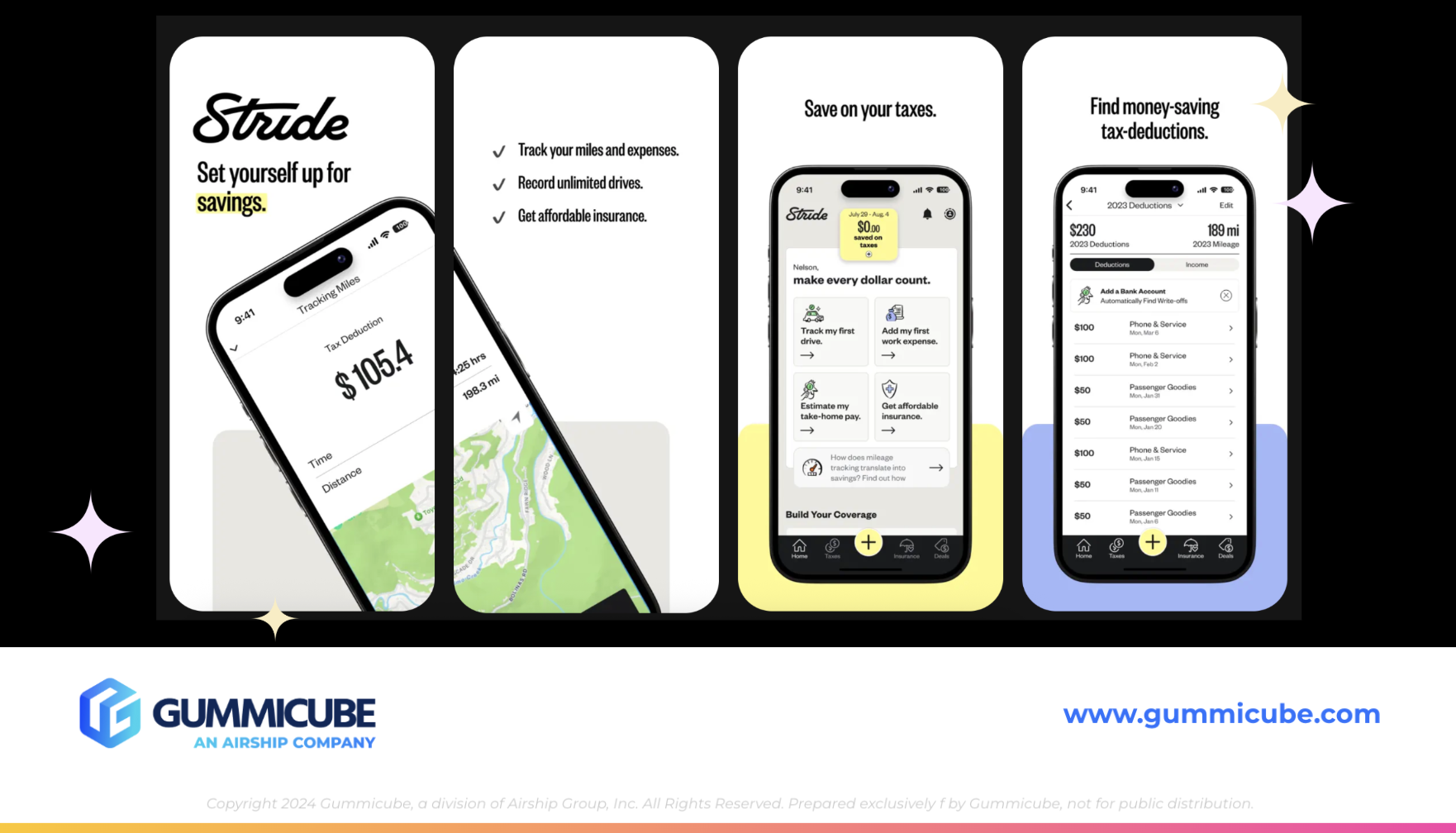
Currently, Stride is using only six of the ten available app screenshot slots. In a category where feature depth, trust, and usability matter, this leaves valuable real estate unused. Screenshots are one of the most influential conversion drivers in an App Store listing, especially for users who discover the app through search.
Stride’s visual approach leans into a minimal aesthetic, which can be effective when executed carefully. However, the primary challenge lies in text legibility. The text in the screenshots, particularly two through six, is very small. When viewed in search results, where only the first three screenshots are visible, this text becomes difficult to read at a glance.
This is a critical issue. Users scanning search results make decisions in seconds. If they cannot easily read and understand an app’s value proposition from the preview view, they are far less likely to tap through to the product page.
STRIDE’S FIRST IMPRESSIONS AND APP SCREENSHOT HIERARCHY
Stride’s opening screenshot is conceptually strong. Featuring the app title prominently helps users quickly confirm they are viewing the correct app, particularly if they are searching for Stride by name. This reinforces brand recognition and reduces confusion.
Screenshots one and two also use an iPhone mockup that spans both frames, creating a sense of continuity and encouraging users to swipe. This is a smart engagement tactic. However, the effectiveness of this approach is undermined by the small text size used to communicate features and benefits.
Screenshots two through six rely heavily on subtle visuals and minimal copy. While this maintains a clean look, it fails to clearly communicate the app’s functionality to users performing a quick scan. Without easily readable headlines, users may struggle to understand the full scope of Stride's offerings, especially if they are unfamiliar with the brand.
Increasing text size, strengthening headline hierarchy, and prioritizing feature clarity would significantly improve these screenshots. Even subtle changes can have an outsized impact on conversion rates when they improve readability and comprehension.
THE ROLE OF MOBILE APP A/B TESTING IN CREATIVE OPTIMIZATION
A/B testing plays a crucial role in identifying which creative elements drive higher conversion rates. For Stride, this could include testing larger text treatments, alternative color palettes, or different value-focused messaging.
Adjustments do not need to be drastic to be effective. Enhancing text size, improving contrast, or simplifying feature callouts can dramatically improve how screenshots perform in search results. Testing different visual styles also allows developers to validate assumptions rather than relying solely on design preference.
Over time, creative testing provides data-driven insight into what resonates most with users and what drives installs. For Stride, this represents a meaningful opportunity to improve performance without altering the app itself.

APP COMPETITOR ANALYSIS: EVERLANCE MILEAGE TRACKER
To better understand Stride’s positioning, it is essential to examine a competitor that is performing well in the same category. Everlance: Mileage Tracker offers a useful point of comparison.
Everlance’s title and subtitle, “Everlance: Mileage Tracker” and “Mile, Expense, & Tax Tracking,” closely mirror Stride’s keyword strategy. Both apps emphasize tax-related functionality while still covering mileage and expense tracking. However, Everlance’s subtitle leans slightly toward tax-specific terminology, which may improve broader search visibility during tax season.
Where Everlance truly stands out is in its App Store creatives.
CREATIVE EXECUTION AND APP TRUST SIGNALS
Everlance utilizes all ten screenshot slots, maximizing its ability to communicate value, features, and credibility. The design uses a darker turquoise green color palette paired with white text, creating a strong contrast and excellent readability.
The screenshots incorporate design elements that resemble data charts, reinforcing the app’s analytical and financial focus. iPhone mockups vary in orientation and placement, keeping the creative set visually engaging and preventing repetition.
Screenshots 1, 2, and 3 are particularly strong. Everlance uses large, bold headlines that are easily readable from search results. Messaging such as “Over 4 million drivers helped” immediately establishes social proof. Featuring logos from trusted publications like The New York Times, CNET, USA Today, and MarketWatch builds credibility and trust.
These trust signals are especially important in financial and tax-related apps, where users need confidence before sharing sensitive data.
EVERLANCE’S CLEAR VALUE COMMUNICATION
Everlance’s screenshots clearly communicate the app’s purpose and functionality. Messaging like “Automatic mileage and expense tracker” and “Live mileage tracking” leaves little ambiguity about what the app does and how it benefits users.
The balance between detail and simplicity is well executed. The screenshots provide enough information to educate users without overwhelming them. Each screenshot focuses on a distinct feature, reinforcing the app’s depth while maintaining clarity.
This clarity is a key differentiator when compared to Stride’s current creative approach.
LESSONS STRIDE CAN APPLY
The point of completing competitor app analysis is not to copy their strategy entirely, but to find areas to draw inspiration from that could help to keep your app competitive with others in this finance app category. This comparison highlights several actionable opportunities for Stride. Improving text legibility, increasing the use of available screenshot slots, and incorporating clearer feature-focused messaging could significantly enhance conversion rates.
Inspiration can be drawn from Everlance’s use of trust signals, varied mockup layouts, and strong headline hierarchy. These elements help users quickly understand the app’s value and feel confident installing it.
Importantly, Stride does not need to abandon its minimal aesthetic. Rather, it can evolve that aesthetic to prioritize readability and clarity while maintaining brand consistency.
THE ROLE OF ASO TOOLS AND COMPETITOR RESEARCH
Ongoing success in a competitive category requires continuous optimization. ASO tools play a critical role in supporting keyword research, creative testing, and competitive analysis. These tools allow developers to monitor ranking performance, identify emerging keyword opportunities, and track competitor changes over time.
For Stride, leveraging ASO tools to inform both metadata updates and creative experiments can help ensure the app remains competitive year-round, not just during tax season.
FINAL THOUGHTS
Stride: Mileage & Task Tracker demonstrates a strong understanding of metadata optimization and seasonal keyword strategy. The app title and subtitle are well constructed, relevant, and positioned to capture high-intent traffic during tax season. These elements provide a solid foundation for search visibility and discovery.
The greatest opportunity for improvement lies in the App Store creatives. Enhancing text readability, fully utilizing available screenshot slots, and clearly communicating feature benefits would significantly strengthen conversion performance. A/B testing and competitive inspiration, particularly from apps like Everlance, can help guide these improvements in a data-driven way.
With thoughtful, creative optimization and ongoing ASO refinement, Stride has the potential to improve both visibility and conversion while maintaining its clear value proposition for its target audience.
LET’S CHAT!
Optimizing an App Store listing is an ongoing process that requires both strategic insight and continuous testing. Whether you are refining app metadata, rethinking creatives, or navigating seasonal demand, our ASO services can help your app remain competitive in a crowded marketplace.
If you are looking to better understand how your app listing is performing or want to explore opportunities to improve visibility and conversion, our team is here to talk. Let’s connect and take a closer look at how ASO can help your app grow.
More blog-posts like this:

Preparing for ASO Takeoff with Skyscanner
Every successful App Store listing needs to begin with a strong first impression. Read more!

That's a Wrap On Edits ASO Strategy
Let's take a closer look at where Edits succeeds and where there is room for optimization.

On The Air: FM Radio ASO Audit
In this week's App Store Spotlight, we're putting FM Radio under the ASO microscope.