What are App Feature Graphics?
July 15th, 2025
 Tagged: Aso Services, Aso Strategies, App Store Presence, App Metadata, App Ranking
By David Quinn
VP of Strategy & Partnerships at Gummicube, Inc.
Are you looking to boost user engagement and improve app conversion rates? If you are publishing on the Google Play Store, one powerful but often overlooked asset is the Feature Graphic. This visual element can play a critical role in a strong App Store Optimization (ASO) strategy. While app screenshots, app store videos, and descriptions can often receive the most attention, the Feature Graphic offers a unique opportunity to influence user behavior at a glance.
No matter where you are in your app’s lifecycle, understanding and strategically optimizing your Feature Graphic is essential. In this week’s Tips and Tricks, we will explain exactly what a Feature Graphic is, how it works, and how you can use it to support your ASO goals.
WHAT ARE APP FEATURE GRAPHICS?
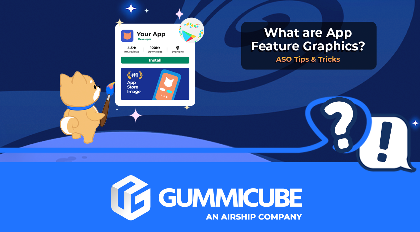
Feature Graphics are static images displayed at the top of Google Play Store app listings when a promo video is included. If you have ever visited an app listing that features a video, the Feature Graphic is what shows up before the video begins to play. Similar to a thumbnail on YouTube, this graphic acts as a visual gateway to your video content and can significantly impact user engagement.
The standard dimensions for a Feature Graphic are 1024 pixels wide by 500 pixels tall. This graphic does not show up on all devices or formats, but when it does, it occupies a prominent position above your screenshots. Even though it only appears if a video is uploaded, the graphic is required for any listing that includes video content.
Beyond drawing the eye in, Feature Graphics can also act as a catalyst for video views. A strong visual prompt encourages users to play the promo video, which often does a better job of educating and converting than text alone. Even though Feature Graphics are not keyword-indexed, they still provide a clear visual cue that communicates your app’s core value proposition. When well-designed, they help reinforce the user’s decision to learn more about your app.
WHY FEATURE GRAPHICS MATTER FOR ASO
While app keywords, app reviews, and app metadata can play a key role in improving app visibility, visual assets like the Feature Graphic influence how users perceive your app once they land on the listing. A thoughtfully designed Feature Graphic can support app conversion rates by reinforcing the app’s value, building trust, and encouraging deeper engagement, such as viewing a promo video or exploring the screenshots.
Here is how a strategically designed Feature Graphic can support your ASO efforts:
- Reinforces App User Intent. When aligned with your core features and audience needs, a Feature Graphic helps reinforce the intent behind a user’s search. It provides visual context that confirms your app is what they are looking for.
- Creates Cohesive App Visual Identity. When your graphic style is consistent across your app icon, screenshots, and Feature Graphic, you create a unified look that builds trust and recognition. A disjointed appearance, by contrast, can feel unprofessional or confusing.
- Encourages Higher App Engagement Metrics. The more compelling your visual elements are, the more likely users are to interact with your listing. Google monitors user behavior like video plays and click-through rates, and an effective Feature Graphic can help lift these signals.
- Maximizes the Value of App Store Videos. Your video can only drive value if users decide to watch it. The Feature Graphic is the visual nudge that invites them to click. Without a strong thumbnail image, your video may go unwatched.
HOW TO MAKE YOUR FEATURE GRAPHIC STAND OUT
A standout Feature Graphic balances visual appeal, technical precision, and strategic alignment with user expectations. Below are practical guidelines and best practices to help your graphic perform at its best.
FOCUS ON THE APP’S USER EXPERIENCE
Design your graphic to showcase a moment from your app or game that clearly conveys value. Whether it is a core app feature, unique gameplay, or compelling UI, this image should give users a sense of what your app has to offer.
Include storytelling elements where appropriate. You do not need full scenes or narratives, but your visual should hint at what users can experience or accomplish. Avoid vague or unrelated imagery that fails to represent your app’s actual function.
AVOID REDUNDANCY IN YOUR APP CREATIVES
Your Feature Graphic should complement your app icon rather than duplicating it. Including your app icon in the Feature Graphic can cause redundancy when both are displayed together in certain formats. Instead, use graphic elements that extend your brand visually, such as color schemes, typography, or background styles.
If your icon includes your app name or brand mark, your Feature Graphic should offer something more. Think of it as the next layer in your visual hierarchy.
PRIORITIZE SIMPLICITY AND CENTRALITY
Keep the design clean. Avoid clutter and fine details that will not translate well on smaller screens. Feature Graphics are often viewed on mobile devices, where intricate elements can easily be lost.
Place the focal point of the Feature Graphic near the center of the graphic. Avoid positioning important elements near the edges, as certain layouts may crop or overlay design elements over your image. Keeping key content within the safe zones ensures your message is not cut off or obscured.
Use outer edges for background elements only. Let the center do the storytelling, while the border provides supporting context or visual balance.
APPLY COMPLEMENTARY COLOR THEMES
Choose colors that energize your graphic without blending into the Google Play background. Avoid using pure white, black, or dark gray, as these tones can disappear into the store’s UI. Instead, opt for vibrant, complementary hues that create contrast and excitement.
Make sure the colors align with your overall visual identity. Your Feature Graphic, app icon, and in-app UI should all feel like they belong together. This consistency helps users mentally associate the design with your brand at every touchpoint.
MOBILE APP A/B TESTING
Mobile app A/B testing is critical. You cannot rely solely on design instincts. Use store listing experiments to test variations of your Feature Graphic and monitor which ones improve conversion rates.
Start by testing different layouts, colors, or headlines one at a time. Track how your target audience responds to each A/B test and apply those insights to future iterations.
FOLLOW GOOGLE PLAY’S CREATIVE POLICIES
Avoid including any content in your Feature Graphic that implies endorsements, accolades, or pricing.
Avoid using third-party trademarks, device imagery, or any Google Play branding unless you have permission. These elements can make your listing ineligible for certain placements.
Steer clear of time-sensitive content unless you plan to update it regularly. Seasonal references, holiday designs, or temporary promotions should be changed out as needed to keep your listing current and compliant.
FINAL THOUGHTS
Feature Graphics are more than decorative banners for your app store videos in the Google Play Store. When used correctly, they can be a powerful tool that boosts user engagement and supports app conversion rates by quickly shaping user perception. While they are not indexed by the Google Play algorithm, their visual influence is significant. The most effective Feature Graphics are visually aligned with the rest of your app’s aesthetic, focused on a single core value or story, designed with technical precision, and strategically A/B tested for performance.
If your app includes an app store video, investing in a well-designed, high-quality Feature Graphic is essential. A well-crafted graphic can serve as the visual cue that turns casual interest into meaningful interaction.
LET’S CHAT!
Looking to elevate your creative assets and improve your app's performance in the stores? Gummicube offers comprehensive ASO services backed by data-driven insights, including creative optimization, metadata strategies, and advanced ASO tools that align with your app growth goals.
From Feature Graphics to app icons, screenshots, and app preview videos, our team brings over a decade of mobile expertise to every project. Let us help you create an app listing that drives results and stands out in a crowded marketplace.
Don’t miss out on losing app installs. Reach out today to discover how our ASO experts can help set your app up for success.
More blog-posts like this:
App Store Keyword Search Volume: What You Need To Know for ASO
When your keyword strategy aligns with how users actually search in the App Store, your app is positioned for sustained growth and long-term success. Read more!

How Can I Help New Users Find My App?
By aligning your strategy with platform differences, optimizing metadata, & leveraging data-driven insights, you can boost your app’s visibility & performance.

Leveraging ASO Tools to Boost App Conversion Rates
Developers who rely on data-driven insights gain a significant advantage, enabling them to optimize their App Store presence with precision and confidence.