Aggretsuko App Store Screenshots Spotlight
October 21st, 2020
 Tagged: Mobile Game, App Screenshots, App Store Screenshots, App Store Spotlight
By David Quinn
VP of Strategy & Partnerships at Gummicube, Inc.
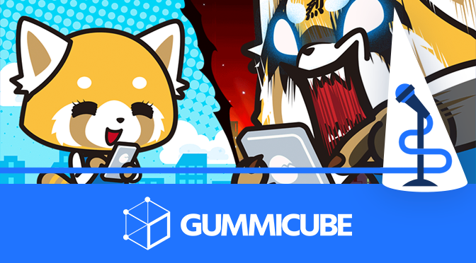
App Store Screenshots are essential for showing users exactly what features an app provides, whether it’s gameplay or video streaming. Even if an app is featured by the App Store, it will still need engaging creatives to convert. One good example is “Aggretsuko: The Short-Timer Strikes Back,” which was recently Apple’s “Game of the Day.” How do the game’s screenshots convey its features, and how do they compare to the competition? We take a look in today’s App Store Spotlight.
App Store Screenshots
The Aggretsuko mobile game is based on a popular Netflix animated series. The game itself is a combination of a matching puzzle game and office design/decorating game, and users can also watch short episodes of the “Aggretsuko” series. Each of these aspects is an important value proposition the screenshots must convey.
Conveying Features
The screenshots should properly convey the gameplay and other core functionality. In this case, the first screenshot is a splash image, capitalizing on the brand. The next image shows in-app features that focus on the office design aspect, followed by the power-ups, the video clips and then the actual puzzles.
These could potentially benefit from being re-ordered. While the office design is a core aspect of the mobile game, so are the puzzles, although the screenshots place the power-ups before the puzzles. It could be beneficial to test the order of the screenshots to see which ones appeal align with user interests the most.
Since the screenshots are presented in portrait mode, users who find the app in searches on the App Store will see the first three screenshots in the search results. These need to present the most important and engaging aspects upfront and should connect to the search in the app is likely to be discovered for.

The app uses six screenshots on both the Apple App Store and Google Play Store. This is below the maximum for either store, so it has room for extra screenshots to tell users more about the app. The extra space could focus on features like additional supporting characters, the office design options or the boss stages.
Screenshot Design
The screenshots utilize a similar design across each image. The in-app imagery is placed in front of a red and fiery background, designed to invoke the rage the main character feels in the show during her iconic “rage karaoke” scenes. This connects to the series’ branding in a way that’s familiar to fans.
There are two exceptions to this design. The first image is the loading page for the game, which serves as a cover image but does not present any information outside of reinforcing the brand. The sixth image is a screenshot presented without any framing, background or callout text.
A notable design choice is the usage of multiple screenshots in a single image. The image focusing on the assist skills includes two in-game screenshots, in addition to multiple characters framing them to illustrate the variety of characters included. Similarly, the image focusing on the animated series uses a collage of screencaps from the show to showcase the numerous episodes available. This allows them to show more of the action in the game and the show, adding a sense of time to an otherwise static image.
Each image includes screenshot copy at the bottom of the image that describes a value proposition, so users unfamiliar with the brand can get a sense of the game.
Screenshot Copy
Four of the six screenshots include copy to describe the features on display. This is a recommended strategy for App Store Optimization, as it can quickly tell potential users more about what the app can do.
ASO best practices suggest the text be short and direct while utilizing keywords. The screenshot copy for the “Aggretsuko” mobile game runs a bit long, with as many as 14 words per image.
It will use lines like “Get help from your coworkers! Use skills to get out of tricky situations!” which are hard to read at a glance. These could be shortened down to focus on the main benefit and keyword so that users can quickly look at the image and understand the message at a glance.
The screenshot copy uses a yellow font that stands out against a black background with gray dots. If the text were shorter, it would be easy to read at a glance as users scroll through the search results.
It is advisable to test variations of the screenshot copy to see if different lengths, value propositions, colors or fonts appeal more to users.

Competing Apps
How does the “Aggretsuko” mobile game compare to other apps in its space? By looking at competitors, we can see how their App Store Screenshots vary.
We Bare Bears Match3 Repairs
On the Apple App Store, a similar puzzle game is “We Bare Bears Match3 Repairs.” Like “Aggretsuko,” this game features match 3 puzzles and design elements with characters from an animated series. Rather than design an office building, this game focuses on repairing areas around the city.
The screenshots for “We Bare Bears” are presented in landscape mode, so each one takes up more screen space but shows more of the app. It only uses one screenshot per image, so each picture takes up the whole screen. This app uses eight screenshots, two more than “Aggretsuko.”

One area where it falls behind the “Aggretsuko” app is in the screenshot copy. “We Bare Bears Match3 Repairs” does not include copy, so the screenshots have no text to support them.
Users viewing the images will have to figure out the features and gameplay based on the image, which can take longer than a screenshot with copy. Since users often see apps while scrolling through search results, that time difference is important.
While “Aggretsuko: The Short-Timer Strikes Back” can stand to shorten the length of its screenshot copy, it is typically better to include some than to leave the images without any copy to support them.
Tintin Match
On the Google Play Store, “Tintin Match” is another puzzle game based on a popular IP. Like “Aggretsuko,” this app uses portrait mode screenshots, along with screenshot copy to focus on the features.
In this case, the screenshot copy is much more concise, using exactly three words per image. These focus on the value propositions and keywords, such as “collect beautiful miniatures.” Including visible keywords in a screenshot can be beneficial, as they connect the app directly to user queries.
The screenshot copy is also framed in a way that thematically connects to the app. Each one is presented in a small box shaped like a case file, which is appropriate for the investigative theme of the game and franchise.
Like Aggretsuko, the colors used help the banner stand out from the background while the text stands out from the banner. This makes everything legible and easy to read at a glance.

The screenshots are also ordered with the puzzle value proposition further up in their order than on the “Aggretsuko” app. Doing so brings it to the users’ attention earlier on. This has helped the app rank #5 for “match 3,” whereas “Aggretsuko” does not rank for any puzzle or match game terms in Google Play.
Overall
App Store Screenshots need to portray the functionality of an app in a way that engages with users and quickly informs them of what it can do. “Aggretsuko: The Short-Timer Strikes Back” includes screenshots that highlight multiple features, but they could be potentially improved by applying more ASO best practices.
The “Aggretsuko” app could test changes like focusing on the puzzle aspects first or shortening the screenshot copy. If users respond well to these changes, it could help improve visibility and conversions. Updating App Store Screenshots is an important aspect of App Store Optimization that is critical in helping users understand an app and get excited about it.
More blog-posts like this:

Preparing for ASO Takeoff with Skyscanner
Every successful App Store listing needs to begin with a strong first impression. Read more!

That's a Wrap On Edits ASO Strategy
Let's take a closer look at where Edits succeeds and where there is room for optimization.

On The Air: FM Radio ASO Audit
In this week's App Store Spotlight, we're putting FM Radio under the ASO microscope.