Amino App Store Screenshot Spotlight
February 29th, 2020
 Tagged: App-Store-Spotlight, Screenshots
By Anh Nguyen
COO & Co-Founder at Gummicube, Inc
App Store Screenshots are vital to an app’s conversion rates. These images should inform users of a variety of the app’s features and functionality, be visually engaging when viewed on a device (whether in light mode or dark mode) and utilize callout text along with in-app visuals. For today’s App Store Spotlight, we take the popular social networking app Amino and assess its Screenshot strategy.
App Store Screenshots
Amino uses four screenshots on both the iOS App Store and Google Play Store. As Apple allows up to ten App Store Screenshots and Google Play uses up to eight, it’s utilizing fewer than the maximum potential images it could, limiting the amount of features it can showcase to users.
Since Amino’s screenshots are in Portrait mode, the first three will be displayed when the app appears in App Store search results. That being said, Apple has recently changed how screenshots appear for certain Apple Search Ads results. When an app appears as the ad for a search it also ranks #1 for organically, the Search Ad will display the first three portrait mode screenshots, while the organic result will show the subsequent three. This allows an app to display more screenshots than would normally be displayed when it appears in search. Since Amino only uses four screenshots, it will not be able to benefit from this.
The screenshots themselves use a distinct visual design, primarily using shades of purple and blue. Each screenshot uses a slightly different color and shows off a different aspect of the app, illustrating the various communities, activities and chat functionality.
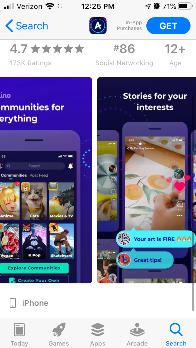
They typically display one device in the image, but the second screenshot includes multiple devices to show the variety of posts within Amino’s community. The screenshots also utilize enlarged chat text bubbles that pop out of the device, providing a clear focal point of the app’s UI at a quick glance.
Each screenshot includes callout text describing the app. While these are short and to the point, they do not typically utilize keywords. The first one “Communities for everything,” does include the “community” keyword included in the app title (“Amino: Communities and Chats”), but phrases like “Find your people” and “Do stuff together” could utilize higher volume search terms to help a user connect their search to the app, leading to potentially higher conversion.
Dark Mode
While the App Store Screenshots are saturated and stand out in light mode, the opposite effect is observed in dark mode. The dark tones of the device and background of some images fade into the dark mode UI, and may not stand out among competitors.

It is important to consider how App Store Screenshots appear in both light and dark mode amongst search competitors. Certain colors or levels of brightness may look good in one mode, but not the other. Not accounting for this may cause users to scroll past an app without really seeing it and download a competitor.
Competing Apps
By looking at competing apps in Amino’s space, we can see how other App Store Screenshots are designed and how they vary from Amino’s screenshots.
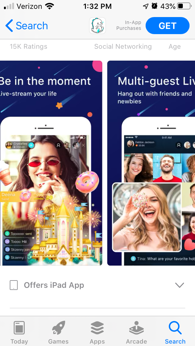
On the App Store, BIGO LIVE uses several similar design concepts. The background is a more consistent dark blue, accented by shooting star-like designs. These screenshots also highlight certain aspects of the app by making them pop out of the screenshot. The callout text is a little longer than Amino’s, but each one begins with a value proposition before going into more detail. The dark background allows the app to stand out in light mode, while the white handset stands out in dark mode.
On Google Play, the competing fan community app FAN GURU also shows different aspects of the app through its screenshots. These use a color scheme that’s split between dark shades and a light blue, with the blue taking up more of the screen as it goes through each screenshot. This two-color background provides a foundation that frames the app in either mode, despite the use of a dark handset. While the callout text is lengthy, FAN GURU highlights the main text for users to focus on.

Overall
App Store Screenshots are important aspects of an app’s search listing and product page. They need to showcase the app and its functionality in an engaging way that is clearly visible on both light mode and dark mode, while including keywords in the callout text to connect a user’s search query to the app. Amino uses several visual designs that work well for the app to highlight its functionality, but there are still areas where it can improve its creative set as part of its App Store Optimization strategy.
Want more information regarding App Store Optimization? Contact Gummicube and we’ll help get your strategy started.
More blog-posts like this:

Preparing for ASO Takeoff with Skyscanner
Every successful App Store listing needs to begin with a strong first impression. Read more!

That's a Wrap On Edits ASO Strategy
Let's take a closer look at where Edits succeeds and where there is room for optimization.

On The Air: FM Radio ASO Audit
In this week's App Store Spotlight, we're putting FM Radio under the ASO microscope.