
Dropbox is an app and website allowing users to upload, store and share files. It’s a useful tool for workplace collaboration, syncing files across devices and editing files remotely. Does the website’s popularity translate into a successful app, or could it be improved with proper App Store Optimization? For this week’s App Store Spotlight, we drop in on Dropbox and see how well it’s performing in the stores.
iOS
On the Apple App Store, Dropbox is the fifth top app in the Productivity category. It holds the #1 spot in searches for its name and several variations or misspellings, such as “dropbox free” and “dropboz,” although it does not have the top spot for any terms outside of its own brand. It is still in the top five for “file sharing,” “video sharing,” “storage app” and “files app,” as well as the top ten for “free storage,” “workspace,” “cloud” and “files.” Its rankings begin to drop for competitor terms like “google drive” (#14) and “One drive” (#15), as well as for terms like “extra storage” (#20) and “uploader” (#21).
Creatives: Dropbox’s icon uses its brand icon, a series of light blue squares that take the shape of an open box. It’s an identifiable design that establishes solid branding. Of the five screenshots it uses, each one has a different background color, while the screenshots show different aspects of the app to keep each image fresh.
While the screenshots do use callout text, they are on the lengthier side. Callout text can catch users’ attention with a few short words that establish the point and functions of the app, but Dropbox uses lengthier descriptions like “Use the doc scanner to save and share work – right from your phone.” It could just as easily get the same message across by simply saying “Scan documents.”
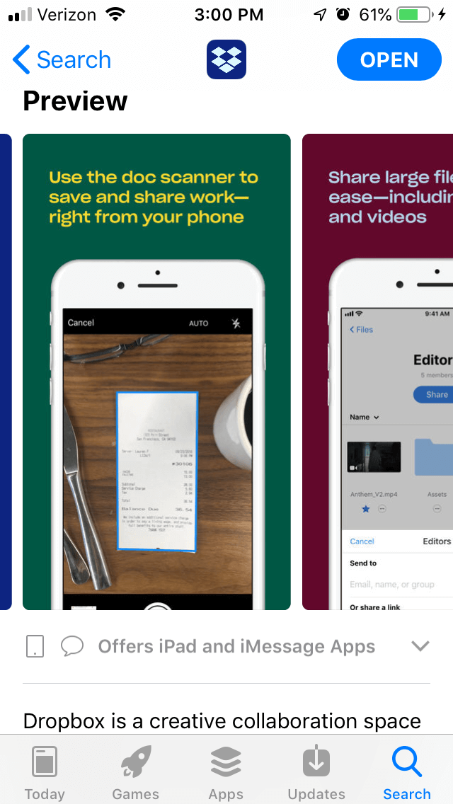
Dropbox has used the same screenshots for several years, with only a few adjustments with each iteration. While there are still visible improvements in the choice of design, such as when it changed from all-white backgrounds to more eye-catching colors, but the overall look has remained primarily the same. While using a trusted and true design can help maintain consistency, creative sets should be updated with the new features and designs of the app, as well as changes in the App Store. Dropbox could showcase new designs and changes just by making five new screenshots, since it’s currently only using five of the ten allowed.
Title & Subtitle: The Dropbox app just uses its own name for its title, which just uses seven of the 30 characters it’s allowed. While apps with strong brands do often use short titles with their names only, expanding it with keywords like “file storage” could provide more information about the app upfront while targeting more keywords.
The subtitle, “A modern workspace,” uses 18 of the 30 characters it’s allowed. While this does help it index for the keywords “workspace” and “workspaces” at #6 and 5, the “modern” keyword does not help it much. While it does rank #3 for “modern for iPhone,” most apps under the “modern” search are shopping apps referring to “modern fashion” and brands.
Additionally, the subtitle does not provide much information about the functions of the app. “A modern workspace” does not indicate the file uploading, storage or sharing it provides. Reworking the subtitle could give users more information about the purpose of the app while adding new keywords to its metadata.
Description: Dropbox tries to keep its description short, with an introduction, feature list and subscription terms. However, the introduction is structured as one lengthy paragraph, which is difficult to read at a glance. It could break this into smaller lines that are more easily understood by users glancing down the screen.
The feature set could also be expanded from a single list into smaller feature sections that call out the different functions. By calling out features and emphasizing the app’s keywords, the description can appeal to users searching for specific functions and improve its relevancy for Search Ads campaigns.
Google Play
On the Google Play Store, Dropbox is ranked #12 for Productivity apps. As with on iOS, it’s the top-ranked app for its own name and variations of its name, while remaining in the top five for terms like “storage app,” “cloud storage” and “cloud send.” It also ranks in the top ten for “free storage,” “upload” and “cloud.” Its rankings get lower for terms like “manage storage” (#17), “backup photos” (#19) and “file sharing” (#38).
Creatives: Dropbox’s creative set is designed the same on Google Play as it is on iOS. They still use different background colors for each image with similar callout text, although there are minor differences in the screenshots. Overall, though, they are very alike.
As with iOS, the callout text is lengthy for each image. Users wanting to know more about the app will have to focus on each picture to see the explanations for each description, whereas a few short words could communicate the point just as easily.
Dropbox does not use a promotional video. While it could create an informative video that explains the uses and features of Dropbox, it can also be tricky to make a video about uploading files engaging. If it were to use a video, it would require A/B tests to ensure the video performs well; while a good video can increase conversions by up to 25%, a poor video can have the opposite effect.
Description & Metadata: Dropbox’s Google Play description is the same as on iOS. While it could still split the introduction to a few shorter lines, the bigger concern on Google Play is the use of keywords.
To index for keywords on Google Play, the app’s description should utilize the targeted keywords near the start of each line. Dropbox could use terms like “Send files” (which it is unranked for), “file storage” (#4) and “upload documents” (which it also does not rank for, although it is #9 for “upload”) to ensure it targets for those terms.
Utilizing feature set lists could help Dropbox better target these terms. The feature sets can begin each set or line with the keywords it wants to target, which would improve its indexation within Google Play. Additionally, users browsing the Play Store and Dropbox’s page could see those terms and know that the app offers the features they want.
Overall
The Dropbox app provides several useful file uploading, saving and sharing features, but those are not made clear from the store pages. Utilizing optimized creative sets and descriptions can provide users with more information about what the app can do, thus boosting its conversions and keyword rankings. Additionally, updating its screenshots to showcase the latest designs and features could be more engaging for the users by showing them everything it can do.
While Dropbox is a useful and well-regarded app, there’s always room to improve. It could use App Store Optimization to boost its keyword and category ranking, so that Dropbox can rise up.
Want more information regarding App Store Optimization? Contact Gummicube and we’ll help get your strategy started.
More blog-posts like this:

Preparing for ASO Takeoff with Skyscanner
Every successful App Store listing needs to begin with a strong first impression. Read more!

That's a Wrap On Edits ASO Strategy
Let's take a closer look at where Edits succeeds and where there is room for optimization.

On The Air: FM Radio ASO Audit
In this week's App Store Spotlight, we're putting FM Radio under the ASO microscope.