Food for Thought: A Review of Yuka’s App Store Presence and Performance
May 9th, 2025
 Tagged: App Category, App Screenshots, Yuka App, App Ranking, Aso Strategy, App Store Spotlight, App Metadata
By David Bell
CEO at Gummicube, Inc.
In the world of mobile apps, visibility isn’t just an advantage, it’s a lifeline. Especially in saturated industries like health, wellness, and beauty, apps are constantly fighting for their moment in the spotlight. Thousands of contenders pack the App Store, each vying for a coveted space on users' screens. Yet, amidst this digital noise, there’s one thing that separates the winners from the forgotten: a well-crafted, optimized store presence. With the right approach, an app can turn a simple search result into an invitation to download, no matter how crowded the category. In this spotlight, we’ll explore Yuka’s App Store presence to uncover whether its strategy stands out or misses the mark in this highly competitive arena. From its metadata to creative assets, let’s dive into how Yuka can fine-tune its approach to not only compete but truly shine.
ASO 101: UNDERSTANDING THE BASICS
In order to analyze Yuka- Food and Cosmetic Scanner, we must first go over App Store Optimization basics. App Store Optimization (ASO) is the process of improving an app's visibility and conversion rate within app stores like Apple’s App Store or Google Play. Simply put, it’s the app world’s version of SEO (Search Engine Optimization). But ASO is more than just keywords, it’s about making an app as appealing and accessible as possible to potential users.
Key Benefits of ASO
Increased Visibility: Higher app rankings in search results mean more potential users discover your app.
Enhanced Conversion Rates: Optimized app titles, app subtitles, and app visuals help convert store views into conversions.
Long-term Success: Regularly updating and optimizing an app store listing keeps it competitive in an ever-changing marketplace.
ASO Elements to Optimize Regularly
App Title and Subtitle: Clear, keyword-rich, and value-focused.
App Icon and Screenshots: Visually appealing and directly communicating app value.
App Store Video: Engaging and showcasing core app functionality.
App Reviews and Ratings: Actively managed for positive reputation.
App Keyword Strategy: Regularly updated based on performance and trends.
Understanding these core ASO principles is crucial when analyzing any app’s store presence. Now that we have covered the basics, we can move forward with analyzing this week's spotlight app, Yuka.
YUKA APP TITLE ANALYSIS
Yuka’s current title, "Yuka - Food & Cosmetic Scanner," effectively communicates core functionality, making it a strong choice. However, there is potential to optimize further. By testing a conversion-focused title, such as "Yuka - Scan & Shop Clean," the app can emphasize its primary benefit — empowering users to make healthier choices. While this approach may slightly reduce keyword density, it can enhance user understanding and drive higher conversions. Strategic mobile app A/B testing will reveal the most effective balance between keyword visibility and user engagement.
From an ASO perspective, app titles are critical. They serve as one of the most impactful metadata elements for App Store search algorithms. A well-optimized title should balance clarity with keyword inclusion, ensuring it is both user-friendly and discoverable. Apps that clearly define their value proposition in the title tend to see higher conversion rates, as users immediately understand the benefit of downloading the app.
Recommendations:
Title Suggestion 1: "Yuka - Scan Items & Shop Clean" (29/30 characters)
Title Suggestion 2: "Yuka - Scan Items and Eat Clean" (30/30 characters)
These alternatives not only maintain clarity but also enhance discoverability by targeting relevant search terms like "shop clean" and "eat clean."
YUKA APP SUBTITLE ANALYSIS
Yuka’s subtitle, "Check What's in Your Products," while informative, doesn’t fully communicate the app's unique value proposition. It focuses more on the “what” rather than “why” or “how,” missing an opportunity to attract users who are particularly interested in shopping for cleaner, healthier products. A more compelling subtitle could incorporate language like “shop clean” or “eat clean,” which are high-volume search terms that help convey the benefits more clearly.
Recommendations:
- Subtitle Suggestion: "Shop What is Good for You" (25/30 characters)
Both options offer clearer messaging and tap into high-volume keywords that resonate with users interested in clean, healthy products. Yuka can leverage these keyword insights, identified by ASO tools like Gummicube’s DATACUBE, to stay ahead of search trends.
YUKA CREATIVES AND APP STORE VIDEO
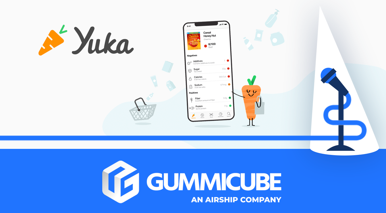
Yuka makes a great first impression with its app store video, which gives the app a head start in standing out among competitors in this category. App store videos are a powerful tool, offering an engaging glimpse into an app's functionality and setting it apart in the crowded marketplace. However, despite this advantage, Yuka’s screenshot design could use some improvement.
The current screenshots lack the engaging, dynamic visuals that are crucial for capturing the attention of potential users. The text in the screenshots is hard to read against the light green background, making it a challenge for users to quickly grasp the value proposition. This is where A/B testing could prove invaluable for determining if darker text, or even bolder design choices, would yield better results.
Yuka could benefit from adding two more screenshots to maximize the potential of the 10 slots available. Adding variety and engaging visuals will not only help convey more information but also improve the app’s overall appeal.
Recommendations for Creative Improvements:
Text Visibility: One of the first aspects to address in Yuka's creatives is the text visibility. Currently, the text in their screenshots is set against a lighter green background, which can make it difficult for users to read clearly, especially on smaller devices or in low-light settings. To enhance this, Yuka could benefit from testing different color contrasts. By using darker text or bolder fonts against lighter backgrounds, the information would stand out more effectively and be easier to read, improving the overall user experience. Mobile app A/B testing can help determine which color scheme performs best with their target audience, leading to more effective and user-friendly creatives.
Additional Screenshots: Another missed opportunity for Yuka lies in its use of only eight screenshots. While they are strategically chosen, there’s still potential to utilize all 10 available slots. The App Store allows up to 10 screenshots, and filling these slots gives more opportunities to showcase features and incorporate relevant keywords that can increase discoverability. Each screenshot provides valuable real estate in the app store, and by taking full advantage of this space, Yuka can maximize its chances of standing out from the competition. More screenshots can also help portray the app’s features more comprehensively, making it easier for potential users to understand the app’s value proposition at a glance.
Engaging Visuals: Yuka’s screenshots, though informative, could benefit from a more dynamic and engaging design. Currently, the visuals are somewhat bland and don’t captivate the viewer’s attention as much as they could. In the highly competitive wellness and health app market, it’s essential to make a strong first impression. To achieve this, Yuka could consider incorporating more vibrant and engaging on-brand design elements. This might include adding visual appeal through the use of attractive icons, attention-grabbing images, and consistent color schemes that align with their brand identity. Engaging visuals not only help grab users’ attention but also convey a sense of professionalism and reliability, which is essential when promoting an app that deals with health-related decisions. By elevating the quality of their screenshots, Yuka can better engage users, making them more likely to explore the app further and ultimately convert into downloads.
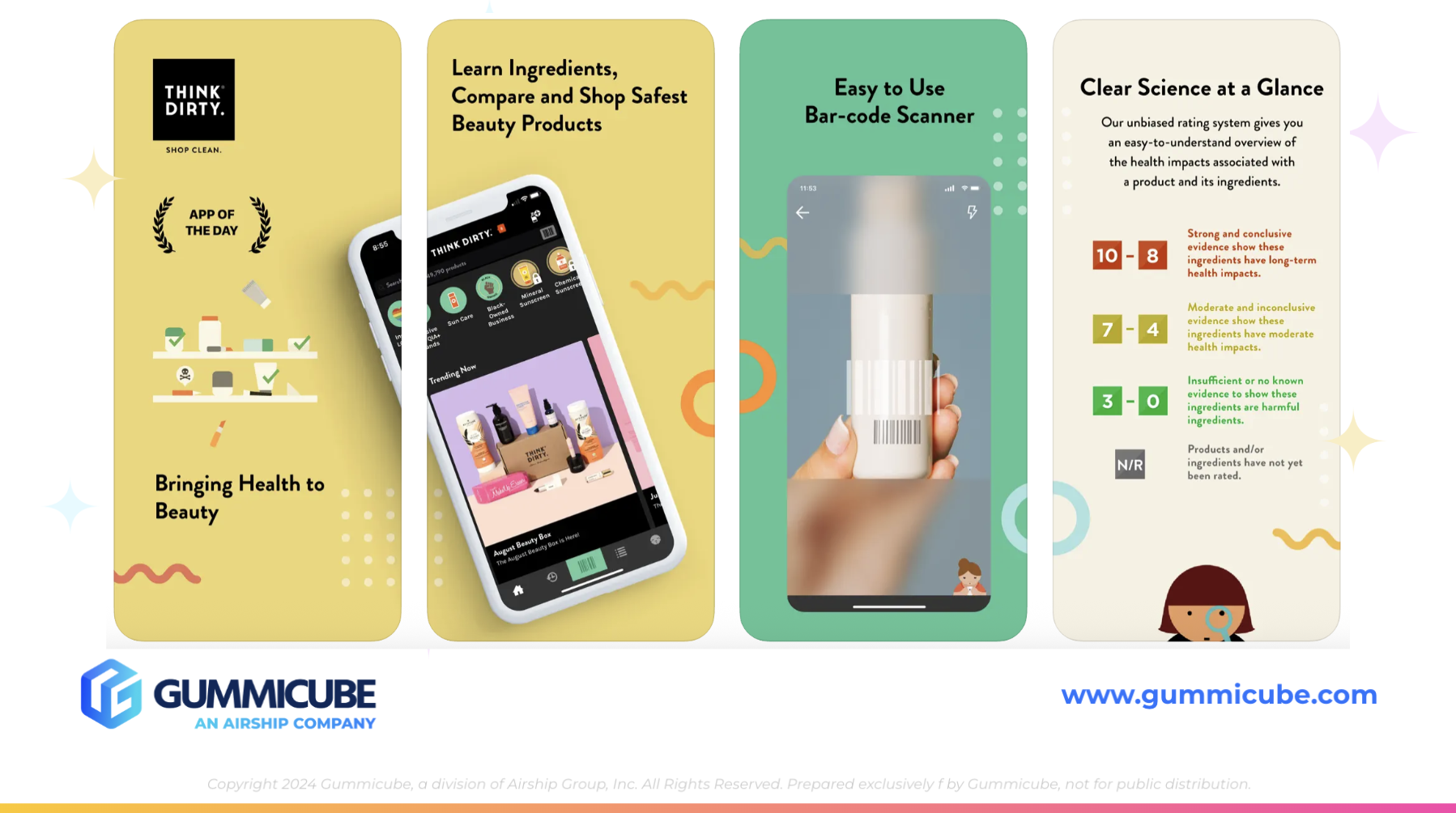
COMPETITOR ANALYSIS: THINK DIRTY – SHOP CLEAN
Now, let’s turn our attention to a competitor app: Think Dirty – Shop Clean. Its title, "Think Dirty – Shop Clean," is straightforward and directly conveys its core value proposition—helping users shop for cleaner, healthier products. This is a powerful use of keywords that target a highly relevant search audience, especially those in the beauty and health-conscious shopping niches.
The subtitle, "Learn Beauty Ingredients ^_^," is charming and effective in tapping into a larger beauty and skincare market. By focusing on beauty ingredients, Think Dirty expands its reach beyond just food and cosmetics into the larger world of beauty, an effective strategy for covering a wider range of potential user searches.
Their app creatives are engaging and well-designed. Despite lacking an app store video, Think Dirty uses its first three screenshots effectively to convey the core function of the app, like scanning barcodes to compare and shop beauty products. The design is clean, simple, and not overcrowded with text, which ensures that the messaging remains clear.
Key Strengths of Think Dirty – Shop Clean’s Creatives:
High-Quality Visuals: Their screenshots are visually appealing without overloading the viewer with text.
Clarity in Messaging: The app’s function is communicated clearly, and the images resonate with users interested in clean beauty products.
Full Use of Screenshot Slots: Think Dirty uses all 10 available slots, allowing for better keyword coverage and taking advantage of prime real estate in the App Store.
Yuka could benefit from taking a closer look at Think Dirty’s approach to both its title and creatives. By adopting a similar strategy for better keyword targeting and more engaging visuals, Yuka could significantly improve its app store presence.
CONCLUSION
In reviewing Yuka’s app store presence, it’s clear that while the app has potential, there are a number of opportunities to optimize its visibility and conversion rates. By refining its title, subtitle, and creative assets, Yuka could see significant improvements in both organic search rankings and user engagement.
App Store Optimization is an ongoing process. It’s not enough to optimize an app once and expect lasting results. Regular updates and A/B testing are essential for staying competitive. By keeping a close eye on user feedback, analyzing keyword trends, and updating creatives regularly, Yuka can continue to grow its user base and maintain a strong presence in the competitive health and wellness category.
LET'S CHAT!
Interested in improving your app store presence? At Gummicube, we specialize in ASO services that help apps optimize their metadata, creatives, and overall app store presence to increase visibility and drive downloads. Let’s chat and see how we can elevate your app to the next level with a data-driven ASO Strategy.
More blog-posts like this:

On The Air: FM Radio ASO Audit
In this week's App Store Spotlight, we're putting FM Radio under the ASO microscope.

FotMob's ASO Analysis: Penalty kick or On Target?
Apps that fail to evolve their App Store presence risk being buried beneath competitors that are actively optimizing for visibility & conversion rates.

Timeleft: Finding Friends, But Is It Finding App Store Visibility?
A/B testing alternative subtitle structures, and experimenting with screenshot designs could set Timeleft apart from its competition. Read more!