New Year’s App Icon Spotlight
December 17th, 2019
 Tagged: App-Icons, App-Store-Spotlight, Creatives
By David Quinn
VP of Strategy & Partnerships at Gummicube, Inc.
With 2020 approaching, user interest in apps for the new year is growing, including New Year Countdown apps and New Year’s Resolution apps. These apps need to make a good first impression when they appear in search results. This is where the app icon comes in.
App icons can play an important role in conversions and App Store Optimization, so for this week’s App Store Spotlight, we look at the top “New Year” apps on the App Store and Play Store and their icons.
App Icon Best Practices
When designing app icons, developers should consider certain best practices:
- Include eye-catching imagery
- Keep the image uncluttered so it fits in a small box
- Maintain consistent branding with the rest of the app’s creatives
- Use visual elements that indicate the app’s purpose
While this is a basic overview of the best practices, they’re important starting points for designing app icons. We can see how the top New Year’s apps follow these best practices.
App Icon Visual Elements
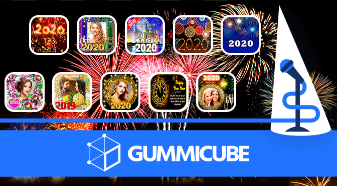
Searching for “New Year” on the Apple App Store and Google Play Store provides a number of apps, primarily some variety of “New Year Countdown.” The app icons tend to share some recurring elements:
- Fireworks
- Clocks
- The year “2020” in large font
- The text “Happy New Year”
Often times these elements are also combined, such as “2020” spelled out in fireworks. These recurring elements help the apps in several ways:
- The fireworks are bright and eye-catching, immediately capturing user attention
- Clocks provide visual representation of the countdown to midnight
- Using the year indicates that the app has been updated for 2020 and is relevant to the new year
- Bold text indicates the purpose of the app

Exactly how these elements are utilized in the app icon varies. For instance, “New Year 2020 Fireworks” on Google Play features multi-colored fireworks on the top of the screen, with a bright “2020” underneath it. This quickly communicates the purpose of the app.
While these are common elements, they are not the only ones. Some apps, such as “New Year Countdown” on the App Store, include countdown timers on the app icon. These are also designed to quickly illustrate the purpose of the app.

App icons need to be designed with large elements so they’re easy to see on a small icon. “Happy New Year 2020” on Google Play did not take the icon size into consideration when designing the icon. While the large glowing clock on the icon provides a good visual, it’s squished to the side to make way for a lengthy line of text in small font. This is next to impossible to read on the small app icon.

Other New Year’s Apps
While those are common for New Year’s countdown and celebration apps, other visual elements are utilized in app icons for New Year’s resolution or greeting card apps.
For example, there are several apps focused on editing photos for New Year’s greeting cards. These apps tend to feature pictures of people in their frames for the app icon, while including the year.

Some New Year’s resolution apps rely more on branding iconography than celebratory imagery. For instance, “Nexmii – My New Year’s Resolutions List 2020” on Google Play uses a large blue N-shaped image for its app icon for branding. Other similar apps use checklists or calendar imagery for their app icons.

It’s important that the app icon is updated for the new year. On Google Play, “Happy New Year 2020” from Prank Studio updated its title and description to talk about using photo frames and effects for 2020. Yet the app icon and screenshots still proclaim “2019” in large text.

Overall
App icons can help conversions by drawing users to the app. Strong visual elements attract users and can inform them about the app’s design. For New Year’s apps, we see several recurring elements in app icons that are designed to draw attention, although we can also see examples of missteps that could hold an app back. Following ASO best practices when designing an app icon can help an app ring in the new year with new downloads.
Want more information regarding App Store Optimization? Contact Gummicube and we’ll help get your strategy started.
More blog-posts like this:

Timeleft: Finding Friends, But Is It Finding App Store Visibility?
A/B testing alternative subtitle structures, and experimenting with screenshot designs could set Timeleft apart from its competition. Read more!

Checking In on Booking.com's ASO Strategy
Success in the App Store is driven by a combination of discoverability and conversion. Apps that excel in both areas consistently outperform the competition.

Mark Your Calendar: Howbout's ASO Audit
By introducing dynamic design elements & leveraging ASO tools such as App Store video and A/B testing, Howbout can significantly enhance its App Store listing.
