PUBG Mobile App Store Spotlight
June 11th, 2019
Tagged: App-Store-Spotlight
By Anh Nguyen
COO & Co-Founder at Gummicube, Inc
There is an ongoing rivalry between multiplayer battle royale shooter games, and one top competitor is PlayerUnknown’s Battlegrounds, also known as PUBG. A mobile game port is available on iOS and Android devices, but if it wants to succeed in the App Store and Play Store, it needs a good App Store Optimization strategy that attracts new players. For this week’s App Store Spotlight, we take a look at PUBG Mobile and see if its ASO is a winner.
PUBG iOS App Optimization
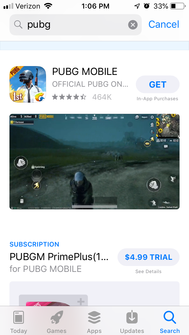
On the Apple App Store, PUBG Mobile is ranked #17 in the Action category (with its rival Fortnite at #7). In addition to ranking first in search results for the “PUBG” keyword, it also ranks #1 for “battleground mobile” and many different variants of the brand. It ranks #2 for its competitor “free fire,” as well as “PUBG lite” and “Battle land royale,” and #6 for “battle royale.” The zombie keywords it added for its latest game mode has helped it rank #21 for “zombie games” and #18 for “survival games,” although it still has room to grow for those keywords.
Optimizing App Store Videos & App Screenshots
The first thing that users see when PUBG Mobile appears in search results is a video. This calls out the latest features, such as the companion system and zombie mode, with clips of in-game footage to show the graphics and gameplay. For a shooting game, it shows very little of the actual shooting, as it primarily features characters running through fields or skydiving in.

The following screenshots call out similar aspects of the game as the video, utilizing three key design aspects:
- Callout text highlighting the feature
- A screenshot from the game connected to the callout text
- A character from the game standing beside the screenshot.
The callout text is large and visible, but also on the wordy side. For instance, one says “100-player classic mode + arcade modes: SOMETHING FOR EVERYONE” which does contain keywords but is too lengthy to quickly highlight the features. Since the app has room for more images, it could divide this into two images: one for “Arcade Mode” and one for “100-Player Battle Royale.”
Additionally, all the screenshots highlight the same features as the video does with the same imagery. While this is still helpful, if it were to find additional screenshots and additional features to highlight, it could demonstrate more features alongside those called out in the video. This would give users a more thorough idea of what the game can give them.
Each of the screenshots are displayed in landscape-mode, so users can see one at a time when looking through them. As the video is also in landscape-mode, it’s the only thing users will see when they find it in search results.
App Title & Subtitle Best Practices
The mobile game’s title is “PUBG MOBILE,” which uses 11 of the 30 characters Apple allows. It has room for 19 more characters, which could be used to add more relevant keywords.
The subtitle, “Official PUBG on Mobile” uses 23 characters, but it repeats the keywords “PUBG” and “Mobile” in both the title and subtitle. It could rework the subtitle entirely to remove the redundant repetition of those terms, opening up new room to tell users about the app and why they should download it as well as target more keywords.
Optimizing the Apple Store App Description
The description starts off with a solid introduction, stating “the official mobile version of PlayerUnknown’s Battlegrounds is here!” followed by listing some of its awards. The description then provides a little information about the game, such as how it’s a port of the PC version and the modes it provides. These are all done in relatively short lines, so it’s easy to read at a glance. However, the second part could still be broken up further to provide shorter, distinct paragraphs based on individual aspects.
The feature set uses bullet lists, but it’s one long list of each feature. This could be broken into smaller feature sets, which would be easier to read through at a glance. As it is, the feature list seems disorganized; one moment it calls out the scenic locations and dynamic weather, the next it talks about the “3D sound effects over 7.1 channel audio,” then the weapons. Organizing these by category and importance would make it easier for users to find the features they’re interested in at a quick glance.
PUBG Play Store Keyword Rankings
On the Google Play Store, PUBG Mobile is ranked #8 in the Action category. In this case, it outranks Fortnite since Fortnite's developers decided to not make it available from the Play Store in order to avoid paying Google a portion of its profits. In addition to ranking #1 for its name, “battleground mobile” and various “PUBG” terms, it’s the top app under searches for “mobile game.” However, its rankings for several key terms are lower on Google Play than on iOS; it ranks #35 for “battle royale,” and does not rank for “zombie games.”
The game’s rankings for competitor terms are lower than on iOS too. While PUBG Mobile does rank #8 for “Fortnite,” it comes in at #74 for “Free Fire” and #65 for “Call of Duty.”
Play Store App Screenshot Optimization
PUBG Mobile’s video is slightly different on Google Play than on iOS. While it does call out some of the same features, such as the various game modes, it also talks about its tournament play. This is accompanied by video footage of actual players competing – as this is not in-app footage, it would not be allowed on the Apple App Store, but it’s okay on Google Play.
While the screenshots are also different, they still follow the same designs: callout text, relevant screenshot, and accompanying character. They are also a little wordy, using callout text like “Erangel, Sanhk, Miramar, Vikdeni: what’s your favorite terrain?” Condensing these into a few keyword-friendly words would help users see the values of the game at a glance.
Optimizing a Play Store App Description With Keywords
PUBG Mobile’s description is identical on both stores. While the description does go over the game and its features well, it does not do so in a way that helps it index for keywords in Google Play.
Since Google Play draws its metadata from an app’s description, PUBG Mobile needs to start lines with its most relevant keywords. Instead, it starts with lines like “Pick your favorite weapon” or “Striking and realistic visuals.” Even if the phrases appeal to users, they’re not helpful for keyword indexation.
In this case, using feature sets instead of a single list would work nicely as well. It could call out terms like “Battle Royale Game” and “First Person Shooter” (which it does not rank for) at the top of the sets to index for those terms. This is in addition to making it easier for users to find the features they’re interested in by glancing down the feature lists.
PUBG Mobile could also take advantage of Google Play allowing HTML in the description. Adding in bold text or highlighting terms with eye-catching font colors could improve user engagement with the description and quickly draw their eyes to the features the description is trying to focus on.
Overall
PUBG Mobile is an impressive mobile port of the console game, although its App Store Optimization can still be improved. It can refine its creatives by showcasing more features and using shorter callout text, which could help improve conversions. Its description could also benefit from using feature sets, and on Google Play it can focus on utilizing keywords it wants to target.
The game itself is still very popular, but it’s in an extremely competitive environment. If it wants to be the one to claim “winner, winner, chicken dinner” in the App Store and Play Store rankings, it needs App Store Optimization.
Want more information regarding App Store Optimization? Contact Gummicube and we’ll help get your strategy started.
More blog-posts like this:

Checking In on Booking.com's ASO Strategy
Success in the App Store is driven by a combination of discoverability and conversion. Apps that excel in both areas consistently outperform the competition.

Mark Your Calendar: Howbout's ASO Audit
By introducing dynamic design elements & leveraging ASO tools such as App Store video and A/B testing, Howbout can significantly enhance its App Store listing.

ASO Checkup on Walgreens' App Listing
By combining data-driven insights with thoughtful design, developers can create listings that not only attract users but also convert them effectively.
