Quora App Store Screenshot Spotlight
January 7th, 2020

By Anh Nguyen
COO & Co-Founder at Gummicube, Inc
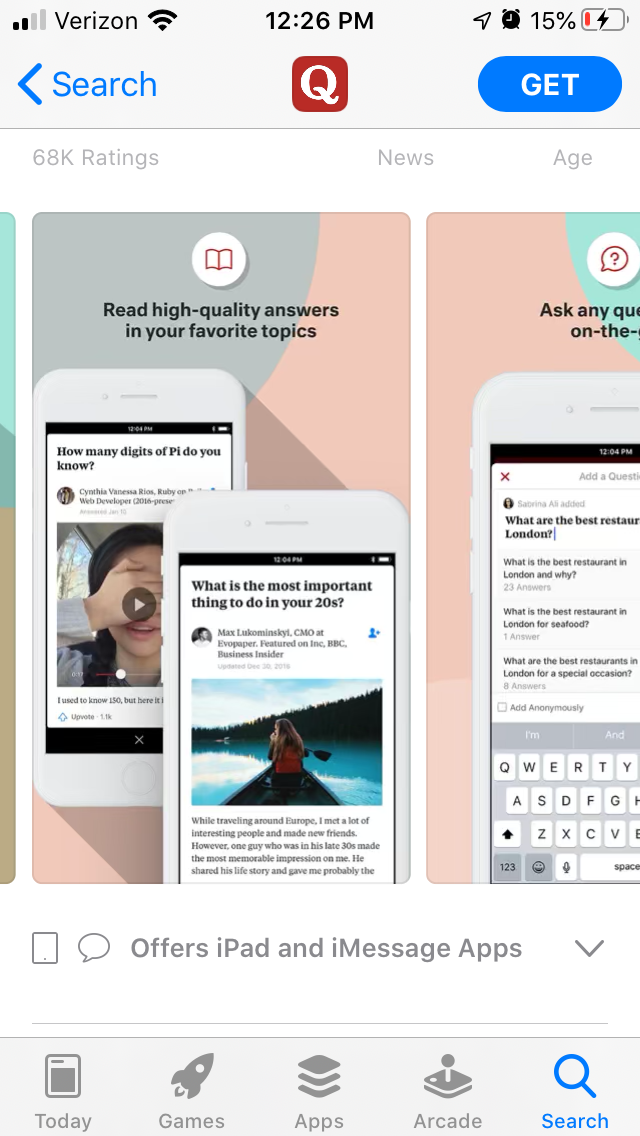
Quora is an online platform where users can ask questions covering a number of topics, with apps available on the Apple App Store and Google Play Store. One component of success on the stores is app store screenshots that showcase the uses and benefits of the app in a visually appealing way. For this week’s App Store Spotlight, we look at Quora’s app store screenshots and see if they follow App Store Optimization best practices.
App Store Screenshots
Quora’s App Store screenshots use six photos. Apple allows up to ten and Google Play up to eight, so it has room for more on each store. There are several design elements that carry across each screenshot to provide visual cues and keep the imagery engaging.
The images feature handsets on a colorful background. The background uses a variety of colors and circular shapes to provide a sense of continuity across each image. This helps draw the user’s eye across each screenshot.
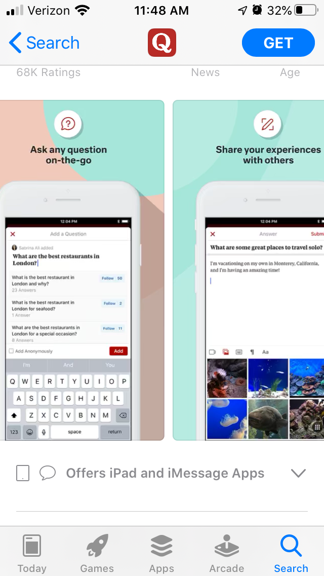
Each screenshot includes callout text describing one of the functions of the app, such as “Ask any question on-the-go” and “discover stories tailored to your interests.” These clearly convey information about the app, but the font is small and could be made larger for easier viewing on mobile screens.
Some of the messaging could also be shortened down. For instance, “Read high-quality answers in your favorite topics” can be condensed so that users could more easily read it at a glance while looking at the page.
There is an icon at the top of each app store screenshot that relates to the connected image and callout text. The screenshot for “Ask any question,” for instance, includes an icon of a question mark in a word bubble. These provide visual indicators of the app’s uses alongside the text and screenshots.
Apps that are primarily text-focused can have difficulty creating engaging app store screenshots. Quora works around this by using screenshots including responses with pictures in them. This adds extra visual elements than just the layout and text to make the screenshots stand out better.
Competitor App Store Screenshots
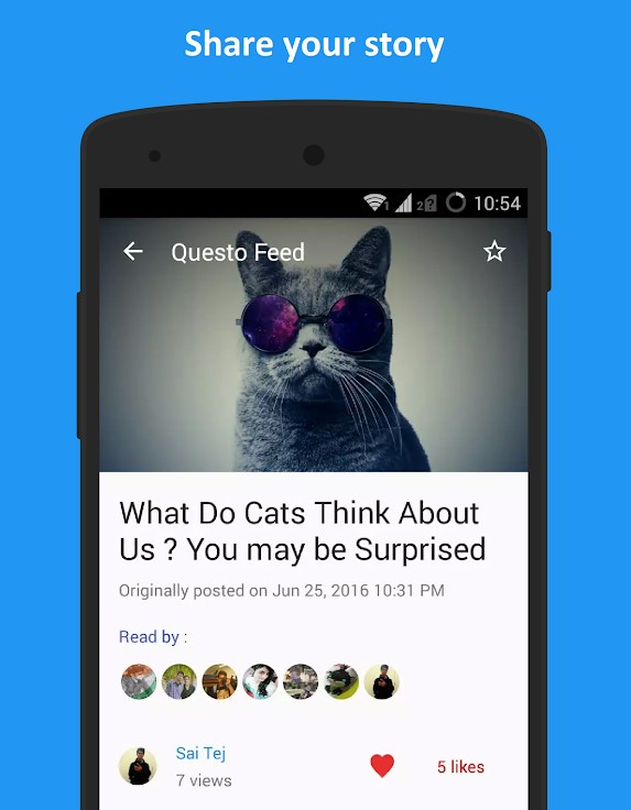
Looking at competing apps, we can see some similar design choices and optimization for the app store screenshots. For instance, Questo on Google Play uses questions chosen for their associated imagery in order to remain visually engaging.
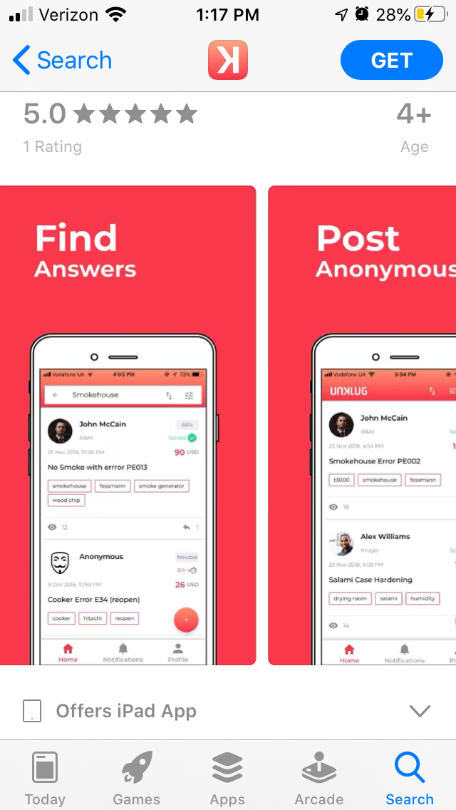
The app store screenshots for UNKLUG utilize short and bold callout text to quickly tell users what the app does. While the imagery may not be as visually active as Quora’s, users browsing the store will immediately see that the app will help them “Find Answers.”
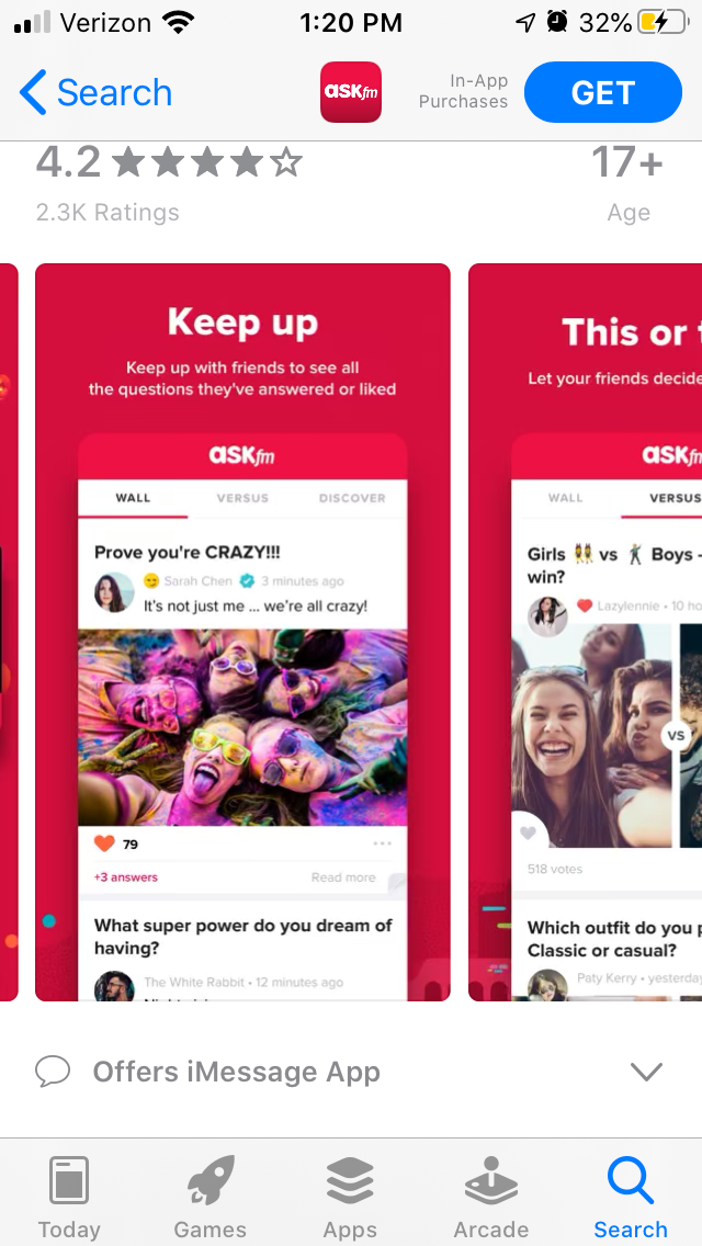
ASKfm’s app store screenshots add visual elements by focusing on questions and answers with colorful photographs attached. These add extra flare to the imagery while still showing the app’s functionality.
App Store Optimization
App store screenshots are important elements of an app’s presence and ASO. Apps that are focused on text-based questions and answers, like Quora, can still find ways to make their app store screenshots visually engaging. Elements like color use, layout, background design, callout text and choosing screenshots with more active visual elements can impact an app’s conversions. These should all be taken into consideration when designing app store screenshots.
More blog-posts like this:

Timeleft: Finding Friends, But Is It Finding App Store Visibility?
A/B testing alternative subtitle structures, and experimenting with screenshot designs could set Timeleft apart from its competition. Read more!

Checking In on Booking.com's ASO Strategy
Success in the App Store is driven by a combination of discoverability and conversion. Apps that excel in both areas consistently outperform the competition.
Mark Your Calendar: Howbout's ASO Audit
By introducing dynamic design elements & leveraging ASO tools such as App Store video and A/B testing, Howbout can significantly enhance its App Store listing.
