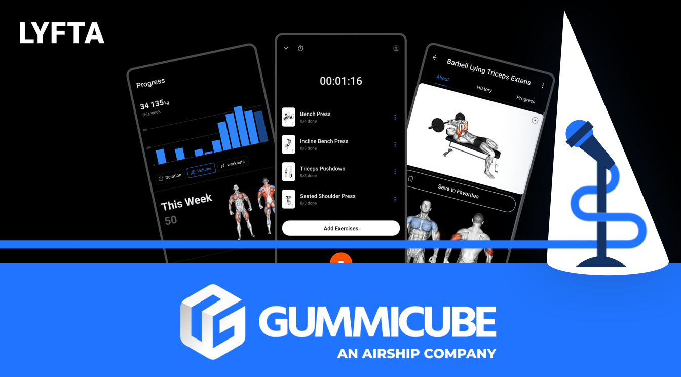
Raising the Bar: How Lyfta Can Pump Up Its App Store Presence
August 22nd, 2025
 Tagged: App Store Optimization Services, Aso, Aso Strategy, App Strategy, App Metadata, App Ranking
By David Bell
CEO at Gummicube, Inc.
Success in the app marketplace goes beyond just having a winning product or a trending app. Even the most effective apps could be missing out on their potential discoverability if they fail to keep their app listing updated strategically. App visibility, clearly stating app benefits, and overall appeal are what can drive app downloads. These elements are brought together in App Store Optimization (ASO) that can help to keep apps competitive in saturated app categories.
In this week’s App Store Spotlight, we are examining the app store listing of Lyfta: Gym Workout Tracker, a fitness app that is currently ranked #51 in the App Store in Health & Fitness. Lyfta has built a strong baseline with its metadata, but there are areas where ASO could boost both app visibility and conversion rate if implemented correctly. We will take a detailed look at Lyfta’s title, subtitle, and app creatives while highlighting what works and where they can improve. We will then compare Lyfta to one of its competitors, Caliber: Strength Training. Identifying the app listing elements that Lyfta could adapt to strengthen its own presence.
LYFTA’S APP TITLE AND SUBTITLE
Lyfta’s current title is “Lyfta: Gym Workout Tracker”, paired with the subtitle “Weight Lifting Routine Planner.” From an ASO standpoint, this is a strong baseline. The app title and subtitle clearly communicate its functionality and align with relevant keywords. Lyfta’s current rank of #51 in Health & Fitness indicates that the app is visible to a degree, but there is still an opportunity to optimize further.
ASO tools that provide keyword research and search volume data highlight high-performing terms in this category, including:
- Gym log
- Gym planner
- Workout tracker
- Strength training workout
- Exercise tracker
- Fitness tracker
While Lyfta has already incorporated strong keywords in their metadata, A/B testing other terms could refine their strategy and reveal which variation outperforms the other.
For example, Lyfta could A/B test their current title against “Lyfta: Gym Planner & Tracker,” which still captures the essence of their app’s functionality, but incorporates other high-volume keywords. Similarly, the subtitle could shift to “Strength Training & Workouts,” which maintains clarity while potentially inviting opportunities for higher app visibility.
Every word must be purposeful and carefully chosen to maximize impact, especially with Apple’s 30-character limit in app titles and subtitles. Lyfta can swap current metadata messaging for other valuable keywords without sacrificing readability and clarity.
The advantage of A/B testing lies in making data-driven decisions. By cycling through iterations that implement high-volume keywords, Lyfta can identify which terms resonate most with its users. Regularly A/B testing ensures that their metadata evolves alongside user behavior and market competition. In competitive categories like Health & Fitness, this adaptability can make the difference between stagnation and new app growth.
LYFTA APP CREATIVES
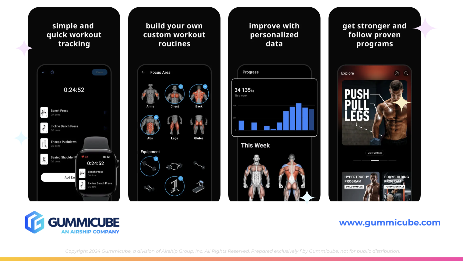
App creatives are critical elements in creating more opportunities for increasing app conversion rates. These creatives include screenshots, app previews, and design elements that communicate the app’s value visually. Lyfta currently uses 6 out of the 10 available screenshot slots. While this is a solid start, it leaves room to showcase additional features, benefits, and value that could persuade potential users to download the app.
Their current screenshot messaging:
- Screenshot 1: “simple and quick workout training”
- Screenshot 2: “Build your own custom workout routines”
- Screenshot 3: “Improve with personalized data”
- Screenshot 4: “Get stronger and follow proven programs”
- Screenshot 5: “5000+ exercises with video gains”
- Screenshot 6: “In-depth analysis for faster strength gains"
The messaging is clear, but the design execution weakens the overall impact. The all-black backgrounds paired with the bold, white text create a visual style that feels flat rather than engaging. The use of vague iPhone mockups does not capture user attention or create a sense of excitement. The lack of engaging visuals can cause users to keep scrolling past their listing.
Strategic Improvements:
- Screenshot order: The first 3 screenshots are the most impactful, as they often determine whether a user continues engaging. Lyfta should consider leading with its most compelling value. The “5000+ exercises with video guidance” screenshot should move to the second or third screenshot positioning, as big numbers can act as a natural attention-grabber and highlight scale in a way that sparks interest.
- Visual Engagement: The current screenshots are heavy on text and lack variation. Breaking up the messaging with strong visuals, lifestyle imagery, or engaging design patterns could make the listing more appealing. Incorporating contrasting colors, dynamic fonts, or layered design elements could help guide the user’s eye through the screenshots.
- Consistency: While minimalism can be effective, Lyfta’s execution lacks brand consistency. By weaving in brand colors, typography, and unique stylistic elements, the creatives could further reinforce brand identity and establish trust with potential users.
- Mobile app A/B testing: As with metadata, screenshots benefit immensely from A/B testing. By experimenting with different messaging orders, background colors, mockup types, and text layouts, Lyfta can determine which designs maximize conversions. Small adjustments, such as adjusting text size, changing icon placement, or experimenting with different types of imagery, can produce measurable improvements.
- Expansion: Since Lyfta currently uses only six screenshots, it is leaving valuable real estate unused. Expanding to the full 10 screenshots allows it to highlight additional features or dive deeper into the currently mentioned features. Each additional screenshot is an opportunity to show users why your app is worth downloading.
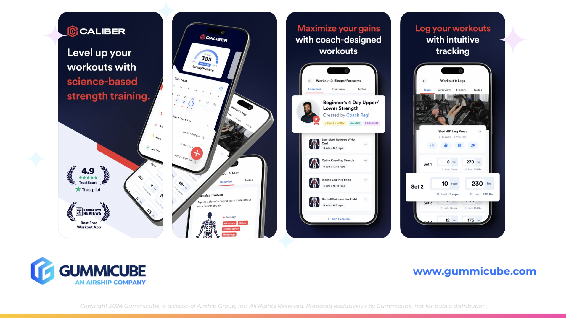
Competitor Analysis: Caliber
To identify opportunities for Lyfta, it is valuable to compare its listing to a competitor. Caliber: Strength Training provides a strong benchmark. Caliber’s subtitle is “Workout Planner & Tracker,” which covers multiple high-volume keywords while staying concise. This mirrors Lyfta’s positioning but does so with a slightly broader keyword appeal.
Where Caliber stands out is in its creatives. Like Lyfta, Caliber uses dark backgrounds and iPhone mockups. However, their execution is more polished and visually appealing.
- Screenshot 1: Displays their logo with the statement “Level up your workouts with science-based strength training.” This immediately communicates credibility and appeals to users seeking expert-backed solutions.
- Screenshot 2: Creates a layered design that begins in the first screenshot and bleeds into the second. Producing more continuity and flow. This creative use of design can help to keep a user engaged.
- Screenshots 3-10: White text-heavy, Caliber’s use of red and white text on a dark navy background creates a clear contrast and visual variety. This pairing of text colors breaks the text up and makes it feel less text-heavy since it is more distinct and easy to skim. Small touches like zoom-ins on iPhone mockups or celebratory confetti effects add dynamism and prevent monotony.
The key takeaway for Lyfta is that redesign execution matters just as much as messaging. By refining screenshot aesthetics and layout, Lyfta can transform its listing from functional to compelling. Borrowing from Caliber’s playbook, Lyfta could:
- Lead with credibility-driven messaging
- Integrate layered designs across screenshots
- Use contrasting text colors to improve readability
- Employ design variations to reduce redundancy
Screenshots should feel immersive and flow visually. Choosing engaging stylistic choices can help to create more of a compelling story within your app listing. Lyfta’s current creatives are functional, but lack the story-telling element. Users should be able to scroll through screenshots and feel as though they are being guided through a visual journey of the app’s top capabilities.
By taking a glance at competitor apps, the goal is not to replicate your competitor. Rather, the goal is to adapt and apply lessons that align with your own brand’s identity.
FINAL THOUGHTS
Lyfta’s App Store listing has a strong foundation. The title and subtitle are clear and keyword-driven, while their current rank in the Health & Fitness category demonstrates relevance. However, there is considerable room for improvement, particularly in the creative execution area.
By implementing the changes we discussed in today's App Store Spotlight, Lyfta could transform its listing from functional to competitive. Even the slightest changes could improve app discoverability and potentially lead to higher conversion rates.
LET’S CHAT!
Optimizing an App Store listing requires a blend of data-driven insights and creative execution. At Gummicube, our ASO services can help apps like Lyfta unlock their full potential through advanced strategies. Whether your app needs support in keyword research, metadata improvements, or A/B testing creative designs, we are here to help. Gummicube has the tools and experts to help your app rise above and stay competitive long-term. Reach out today to start the conversation.
More blog-posts like this:

Preparing for ASO Takeoff with Skyscanner
Every successful App Store listing needs to begin with a strong first impression. Read more!

That's a Wrap On Edits ASO Strategy
Let's take a closer look at where Edits succeeds and where there is room for optimization.

On The Air: FM Radio ASO Audit
In this week's App Store Spotlight, we're putting FM Radio under the ASO microscope.