Smite Blitz App Store Screenshot Spotlight
March 10th, 2020
 Tagged: App-Store-Screenshot, App-Store-Spotlight, Screenshots
By David Bell
CEO at Gummicube, Inc.
An App Store Screenshot can showcase many things about an app, such as its graphics or a mobile game’s characters. Every aspect, from the features highlighted to the order of the screenshots, can make a difference. For today’s App Store Spotlight, we take a look at the screenshots for Smite Blitz, a mobile game currently featured on the Apple App Store.
App Store Screenshots
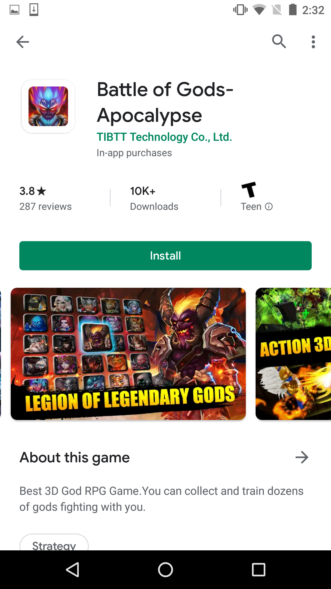
Smite Blitz uses five screenshots on and Google Play Store and six on the Apple App Store. This is three fewer than the maximum on Google Play, and four fewer than the App Store’s maximum, so there is room for more screenshots on both. Screenshots on both stores are in landscape mode, as that’s how the game is formatted.
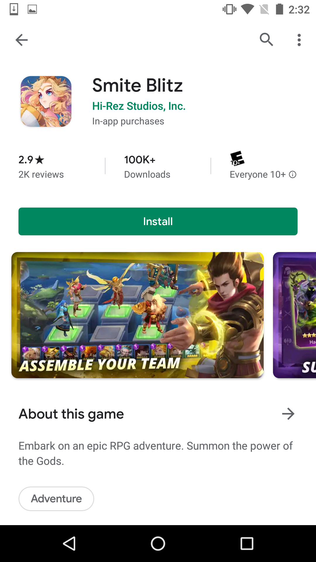
Each screenshot is designed to highlight a different feature of the app, such as the boss battles and team management. Every image includes a character from the game framing the image and bold callout text on the bottom of the screen. The text is short (3-5 words at the very most) with large font, making it easy to read while incorporating keywords. The splash of color on each image matches the color schemes of the characters used, while the screenshots utilize similar composition to create a consistent yet colorful design.
Two screenshots are designed slightly differently than the others in order to further emphasize their features. One is split into three images, showing different levels and areas with the callout text “Embark on a new journey.” Another shows two cards from the game in the foreground, with the game screen itself faded into the background with the callout text “Summon powerful gods.”
While the App Store Screenshots are nearly identical on each store, there are a few differences between them.
- The Apple App Store screenshots start off by highlighting the pre-registration rewards, while Google Play does not include a similar one. The iOS version needs to be updated to remove this, as the game is now available for download. If the game were still in its pre-registration stage, including pre-registration information and rewards can help build early installs.
- On Google Play, the “Summon powerful gods” screenshot uses the app’s logo on the side of the image, whereas the iOS version includes a character from the mobile game.
- The screenshots are ordered differently on each store. The Apple App Store screenshots begin with pre-registration, followed by summoning powerful gods and embarking on a new journey. The Google Play screenshots begin with assembling a team, and also moves the “become the strongest” screenshot before “conquer bosses with friends."
The order App Store Screenshots are presented in can have an impact on conversions. Screenshots should highlight the aspects that are central to the app, ordered based on what drives the most conversions. We can get an idea of what values drive installs by looking at how the app ranks for keywords used in its callout text.
On iOS, Smite Blitz uses a screenshot built around the “summon” and “gods” keyword; it ranks #7 for “summon games” and #15 for “gods.” On Google Play, it begins with an “assemble your team” screenshot, which does not correlate to any keywords it ranks for. This would suggest that the “summon powerful gods” screenshot is a stronger one to start with. It is possible and recommended to A/B test screenshots in different orders to see what users respond to best.
Competing Apps
Seeing what competing apps use for their App Store Screenshots can provide insights into common design patterns.
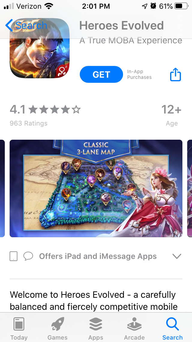
On the Apple App Store, Heroes Evolved begins with a screenshot highlighting its core value proposition: “5v5 Moba On the Go.” The remaining screenshots all have a character from the game placed to the side of the image, while the callout text is placed on the top center of each screenshot. This also uses landscape mode screenshots.
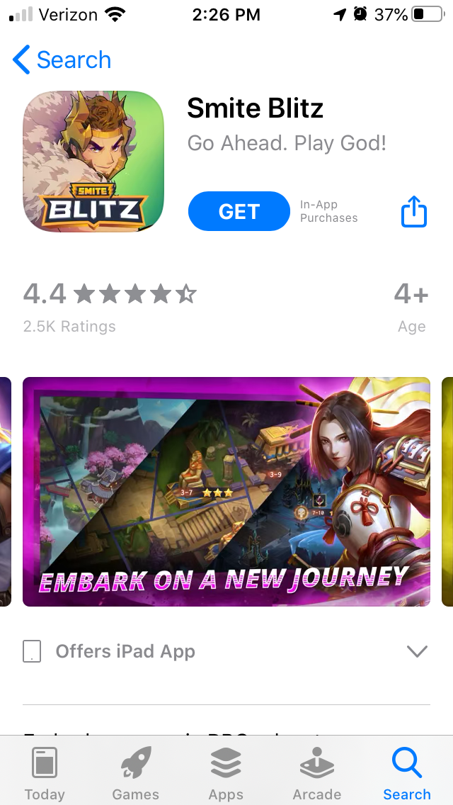
On the Google Play Store, Battle of the Gods-Apocalypse utilizes a similar style. Using character art in the foreground with an accompanying image and callout text is a common design trend that we can see repeated in the game’s category.
The callout text changes its placement from image to image and is occasionally lengthier than that used by competing apps. It also contains one screenshot in the middle of the set with no callout text or additional characters, as Google recommends including one unaltered screenshot image when featuring apps.
Overall
Smite Blitz uses its App Store Screenshots to highlight multiple aspects of the mobile game, including design best practices and common trends in its genre, like callout text to describe core features and including game characters. It does have room for more screenshots on each store, so any additional features could be included as well.
It may serve the developers well to test the screenshot order. The way they’re ordered in one store may result in a higher percentage of conversions than the other.
Every aspect of an App Store Screenshot is worth researching and testing, especially for mobile games in a competitive genre.
Want more information regarding App Store Optimization? Contact Gummicube and we’ll help get your strategy started.
More blog-posts like this:

Timeleft: Finding Friends, But Is It Finding App Store Visibility?
A/B testing alternative subtitle structures, and experimenting with screenshot designs could set Timeleft apart from its competition. Read more!
Checking In on Booking.com's ASO Strategy
Success in the App Store is driven by a combination of discoverability and conversion. Apps that excel in both areas consistently outperform the competition.
Mark Your Calendar: Howbout's ASO Audit
By introducing dynamic design elements & leveraging ASO tools such as App Store video and A/B testing, Howbout can significantly enhance its App Store listing.
