ASO Checkup on Walgreens' App Listing
Posted on April 2nd, 2026
By combining data-driven insights with thoughtful design, developers can create listings that not only attract users but also convert them effectively.

If your App Store Screenshots aren’t engaging and informative, are they even working? A good screenshot set should tell users everything they need to know about the app in a manner that keeps them interested and wanting more – almost like a speech.
This brings us to the TED app, which was recently featured on the Apple App Store in the “Find a Passion Project” list. Does the app include screenshots as interesting as the TED Talks it features? Read on and find out in today’s App Store Spotlight.
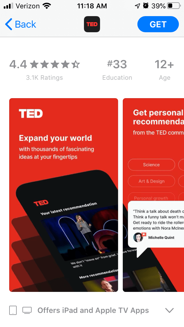
When the TED app first appears on the App Store, users see a pair of screenshots that split an image of a device across two pictures. The red background is on-theme for the TED branding, while the bright color draws attention quickly.
The first screenshot makes its copy the center of attention, calling out the value proposition near the top. By bolding “Expand your world,” it makes that value the core focus, then expands on it by adding “with thousands of fascinating ideas at your fingertips.”

The second screenshot expands on that concept while remaining connected to the first. The screenshot copy highlights the “personal recommendations” feature, while the image includes examples of the topics that users can select.
The inclusion of an example user review is helpful visually, although it does not completely connect to the “personal recommendations” value.
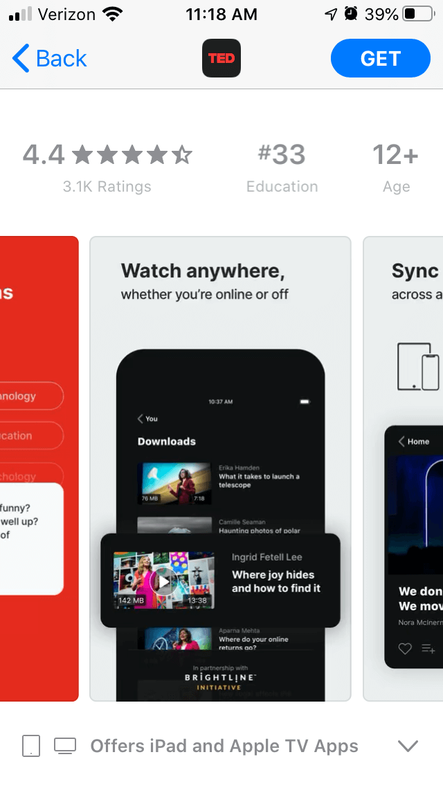
Several of the screenshots also emphasize aspects such as specific videos by highlighting them in the imagery. This calls attention to them while providing more varied visuals.
After the first two screenshots, the style changes. The background turns to a light grey and the images feature a centered device. They do continue to use screenshot copy effectively to call out key values, but the visual change is noticeable.

One thing that the TED app could do to improve its screenshots is to focus on current needs. Using the screenshot copy to highlight how users can watch TED talks from the comfort of their home could help convert users while everyone has to shelter in place.
Additionally, the app currently features five screenshots out of the ten allowed. There’s room for more screenshots to highlight additional features, such as the variety of topics, user reviews and speakers.
Each screenshot is a new opportunity to convert users, so app developers should make full use of them.
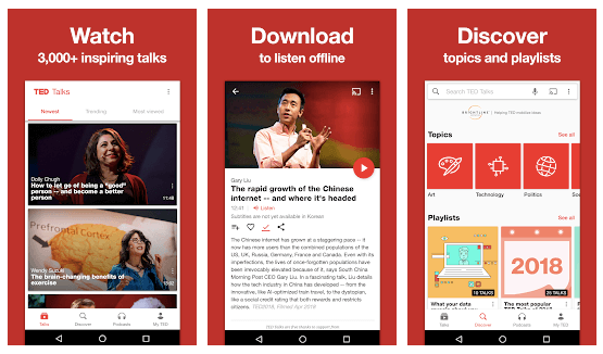
The TED app uses significantly different screenshots on the Google Play Store. Here it features six screenshots, each one placing an image from the app without a handset to create a frame but with the touch screen buttons from an Android device on the bottom of each picture.

The screenshots maintain a consistent design from image to image. Each uses the same red background and white text, as well as identical screenshot placement.
While these are informative, they lack the visual variety of how the iOS app screenshots are designed. They do not emphasize any specific sections of the screenshots, although each image does directly relate to the screenshot copy.
The screenshots on the Google Play Store use the copy text to call out features with one key word in large font at the top of the screen, then in smaller font to elaborate.
For instance, the first value it highlights is “Watch 3,000+ inspiring talks,” with the word “Watch” in large letters at the top of the image. These quickly present the key values or features the screenshots are focusing on.
The design is visually simple and direct, but that makes it lack a level of visual engagement. Using devices to frame the image, like the iOS screenshots, could enhance the imagery in an easy but effective manner.
The square screenshot imagery with the Android menu at the bottom makes the screenshots appear as though they’ve just been taken from the device and placed into the screenshot gallery.
Using a device to frame them could make the screenshots stand out more and present opportunities to highlight certain aspects and adjust the presentation. They could potentially change the positioning of the device, like the first two iOS screenshots, to create a more visually exciting flow from screenshot to screenshot.
These changes are all options that would require testing. Running A/B tests can show if users prefer one style to another, so it’s an efficient way to determine what screenshots improve user conversions. If the tests are successful, they could potentially deploy new creatives that convert more users.
The TED app does a good job calling out its features with screenshot copy and includes some screenshots with unique and informative designs. Yet there is always room for improvement, such as by adding timely information about how the app can be beneficial for users who are under lockdown.
A TED Talk with good delivery and an interesting message will keep an audience engaged. Similarly, App Store Screenshots with visual style and important information will engage users and help gain conversions.
Want more information regarding App Store Optimization? Contact Gummicube and we’ll help get your strategy started.

By combining data-driven insights with thoughtful design, developers can create listings that not only attract users but also convert them effectively.

In this week’s App Store Spotlight, we are taking a closer look at Sweepy: Home Cleaning Schedule. Read more to see how the app can improve its ASO strategy.

Read more to see how The Children’s Place can implement winning ASO marketing strategies that could improve both app visibility & conversion rates.