The Impact of the Feature Graphic for Google Play
May 16th, 2018
 Tagged: Feature-Graphic, Google-Play, Google-Play-Store
By Anh Nguyen
COO & Co-Founder at Gummicube, Inc
Visual assets are an app’s key tool for increasing conversions in the app stores. The icon is the first thing a user sees when browsing through the Google Play Store and screenshots are important to call out the apps core features, but the feature graphic is equally important. For Google Play, the feature graphic should not be underestimated. While icons initially attract users, the feature graphic is what drives conversion home. Once a potential user lands on the app page, the feature graphic appears at the top of the screen, acting as the banner for the app. Paired with a persuasive description, this is where the developer has the opportunity to convince users to click “Install.” However, developers should tread the creative process carefully. Curating the perfect collection of visual assets has a direct correlation to good App Store Optimization. To help increase conversions, developers should keep feature graphic best practices in mind.
Simplicity and Clarity
When designing a feature graphic, remember that a user will only spend a matter of seconds interpreting an image. The graphic should provide a clear understanding of what the app does at a glance while catching users’ attention. Take Poshmark’s feature graphic for example. They manage to keep their feature graphic clean while sprinkling different clothing items around their logo to illustrate a clear retail theme.  Developers should identify a clear theme in their feature graphic to ensure that it is digestible. Keep the graphic clean, as a busy or overcrowded image will only distract from its core message. A user should be able to identify the theme and purpose of the app almost instantly when they see the feature graphic.
Logo Treatment
The placement and size of the logo is important. While it may be tempting to place the logo wherever it feels convenient, its placement needs to complement the image. It should not be so large to where it distracts from the artwork, but large enough to be instantly recognizable. Consider how Dungeon Boss’s logo is positioned in the top center and contrasts against the backgrounds and characters. It doesn’t distract from the character artwork but stands out on its own to create a seamless balance between the two. 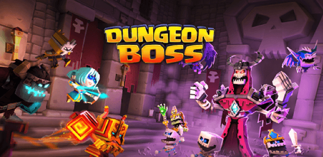 Complementary The purpose of the feature graphic is to complement the
icon and screenshots while sending a clear message of the app’s core functionality. It is the combination of visual appeal and information that draws users to the app and gives them a reason to install it, so the graphic must work with the rest of the app page as a whole to work properly. For instance, Hopper’s feature graphic naturally correlates with their icon by employing a subtle gradient that builds towards the icon’s bright red color. Not only that, the feature graphic is able to tell a bigger story by integrating a clear air travel theme. In Hopper’s case, they also incorporated a call to action, which attributes to conversion as well.
Complementary The purpose of the feature graphic is to complement the
icon and screenshots while sending a clear message of the app’s core functionality. It is the combination of visual appeal and information that draws users to the app and gives them a reason to install it, so the graphic must work with the rest of the app page as a whole to work properly. For instance, Hopper’s feature graphic naturally correlates with their icon by employing a subtle gradient that builds towards the icon’s bright red color. Not only that, the feature graphic is able to tell a bigger story by integrating a clear air travel theme. In Hopper’s case, they also incorporated a call to action, which attributes to conversion as well. 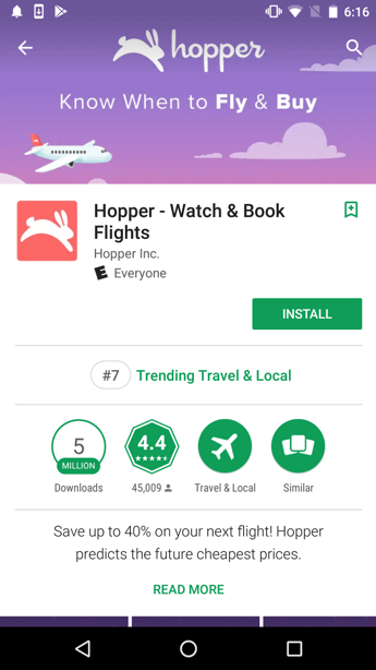 When developers design their feature graphic, it is important make it complement the app’s other visual assets. Otherwise, a graphic that may work well on its own will clash and detract from the app as a whole.
Key Takeaways
Feature Graphics in the Google Play Store play a crucial role in converting users. While icons and screenshots lure users to an app’s homepage, the feature graphic helps with that final push to convert them. However, they shouldn’t be overlooked due to their simplicity. Creating the perfect feature graphic entails relaying a clear theme with stunning artwork while still complementing the app’s other creatives. ----- Keep in mind that Google is always making changes to the Play Store. Recently, we spotted a new update that might impact the feature graphic.
More blog-posts like this:
5 Best Practices for Apple Search Ads
Are you leveraging Apple Search Ads the right way? Take a look at these recommendations to optimize your paid campaigns and target the right users.
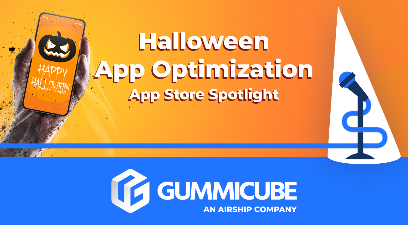
Halloween App Optimization - App Store Spotlight
Ghostly happenings are among us... and in your app listing too? If you aren't leveraging the power of app seasonality to make relevant tweaks to your store listing you're leaving precious engagement and conversions on the table.
App Store Connect Holiday Schedule 2021
Developers on the iOS App Store should plan in advance of the upcoming Holiday Schedule to allow enough time for apps to get approved during the busy holidays.