Tile App Store Spotlight
October 16th, 2018
 Tagged: App-Store-Spotlight
By David Quinn
VP of Strategy & Partnerships at Gummicube, Inc.
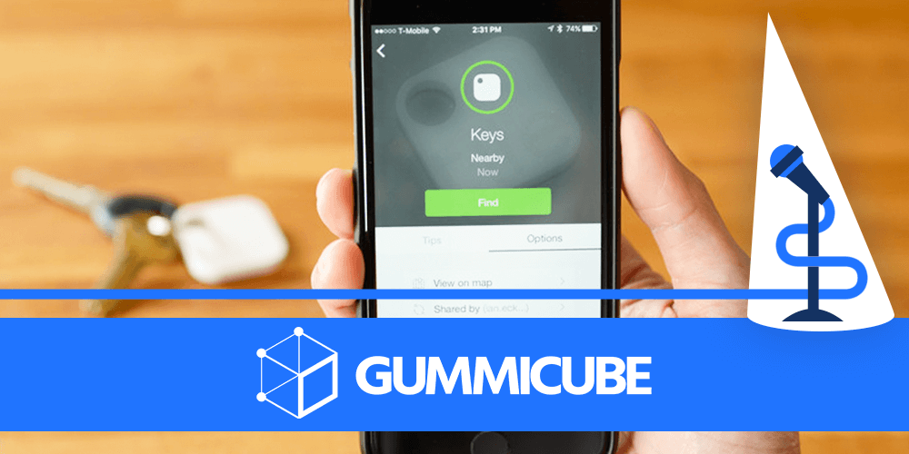
Tile is an app that works with a phone’s Bluetooth connection and GPS to help keep track of objects. Users can place a tag on keychains, boxes or other things they don’t want to misplace and find them through the app. While it’s useful for helping users find their things, can users find it on the App Store and Google Play, or does its App Store Optimization leave it lost? For this week’s App Store Spotlight, we take a look at Tile and examine its ASO.
iOS
On the Apple App Store, Tile is the forty-seventh
highest ranked app in the Lifestyle category. It’s the top-ranked app for keywords like “find my keys,” “lost bags,” and “smart watch apps,” as well “Tile” and all variations or misspellings thereof. It remains in the top ten for other high-volume keywords, such as “phone finder,” “car tracker,” and “dog finder,” and doesn’t start to dip in rankings until it reaches keywords like “location app” or “tracking apps,” where it ranks within the top 30. Creatives Tile’s icon is designed to look like one of the tile trackers users purchase to use with the app, which works well to establish the app’s branding and functionality. The simple image is direct and to the point, albeit not exactly detailed or eye-catching. The screenshots show the various features of the app, including callout text describing each feature. It starts off by showing how Tile can help track “things you care about,” including keys, wallets, backpacks and stuffed animals – the last one creates an emotional appeal that’s reinforced by a commercial for Tile where a family finds their child’s lost stuffed toy. With this one image it provides several cases where Tile would come in handy, making it a great way to start off. 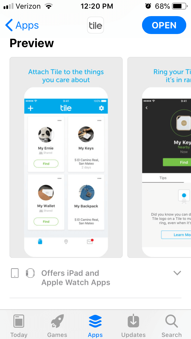 The following screenshots show how the Tile app works, including its “last known location” feature and ability to call devices to ring even when they’re on silent. These are useful features of the app and the callout text makes it clear what each screenshot details. However, out of the ten allowed screenshots, Tile only uses five. While each one does show off another useful feature, it could include further screenshots to show more about the app. The app recently added Tile Premium and is beta testing Smart Alerts, so users don’t accidentally forget their keys when they leave the house. Adding screenshots for these could show off more about the app and provide further information to potential users. Although the iOS listing does not have a video, it’s more understandable to not have one for this kind of app.
Videos on the App Store can only show in-app footage, whereas Tile uses peripheral devices in conjunction with the app, which it would not be able to include. It’s better to have no video than spend resources making a video that is simply not allowed under Apples submission guidelines. Title & Subtitle The full title for Tile is “Tile – Find lost keys & phone.” This makes more use of the provided title space and quickly provides information about what it can do. It does not have a subtitle, though. Including a subtitle would provide even more information about the app and target more keywords.
Leaving it out means the app is missing out on two fronts. Description Tile’s description does a good job at telling users everything they need to know about the app. It integrates its keywords throughout and provides lists of its features and benefits. Yet it does need to be formatted better for ASO best practices. The introduction is a single paragraph consisting of a few lines, which creates a single block of text when viewed on iPhone devices. It could instead be split into a few smaller sections, which is easier for users to read at a glance. Additionally, the features lists are set up so that each one is introduced with a bullet, followed by a longer paragraph describing each feature. To optimize the description, Tile should instead make each feature a short section with bullet points elaborating on each one. When formatted that way, it’s easier for users to quickly look over each section and get an understanding of what the features are. In short, Tile’s description contains all the information it should, but it could be formatted in a more ASO friendly manner.
The following screenshots show how the Tile app works, including its “last known location” feature and ability to call devices to ring even when they’re on silent. These are useful features of the app and the callout text makes it clear what each screenshot details. However, out of the ten allowed screenshots, Tile only uses five. While each one does show off another useful feature, it could include further screenshots to show more about the app. The app recently added Tile Premium and is beta testing Smart Alerts, so users don’t accidentally forget their keys when they leave the house. Adding screenshots for these could show off more about the app and provide further information to potential users. Although the iOS listing does not have a video, it’s more understandable to not have one for this kind of app.
Videos on the App Store can only show in-app footage, whereas Tile uses peripheral devices in conjunction with the app, which it would not be able to include. It’s better to have no video than spend resources making a video that is simply not allowed under Apples submission guidelines. Title & Subtitle The full title for Tile is “Tile – Find lost keys & phone.” This makes more use of the provided title space and quickly provides information about what it can do. It does not have a subtitle, though. Including a subtitle would provide even more information about the app and target more keywords.
Leaving it out means the app is missing out on two fronts. Description Tile’s description does a good job at telling users everything they need to know about the app. It integrates its keywords throughout and provides lists of its features and benefits. Yet it does need to be formatted better for ASO best practices. The introduction is a single paragraph consisting of a few lines, which creates a single block of text when viewed on iPhone devices. It could instead be split into a few smaller sections, which is easier for users to read at a glance. Additionally, the features lists are set up so that each one is introduced with a bullet, followed by a longer paragraph describing each feature. To optimize the description, Tile should instead make each feature a short section with bullet points elaborating on each one. When formatted that way, it’s easier for users to quickly look over each section and get an understanding of what the features are. In short, Tile’s description contains all the information it should, but it could be formatted in a more ASO friendly manner.
Google Play
On the Google Play Store, Tile is the top-ranked app for just “Tile” and “Tiles.” After that, it’s in the top 10 for “xy find it” and “wallet finder,” before its rankings within search terms begin to drop. It’s the 15th-highest app for the “lost bags” keyword, 22nd for “find lost things,” and doesn’t even rank for keywords like “find my keys.” Creatives Tile’s icon and screenshots are the same on Google Play as they are on iOS. They maintain the iconography and callout text, so it’s still clear how users can benefit from the app and what features it offers. Yet like on iOS, it only uses five of the allowed screenshots, so it’s missing out on more opportunities to showcase the app. Unlike iOS, the Google Play listing does include a video. This one shows people using the app and tile to track and find their things, accompanied by a narration telling viewers exactly how it works. This helps demonstrate the app’s benefits and uses, so it’s an effective video. 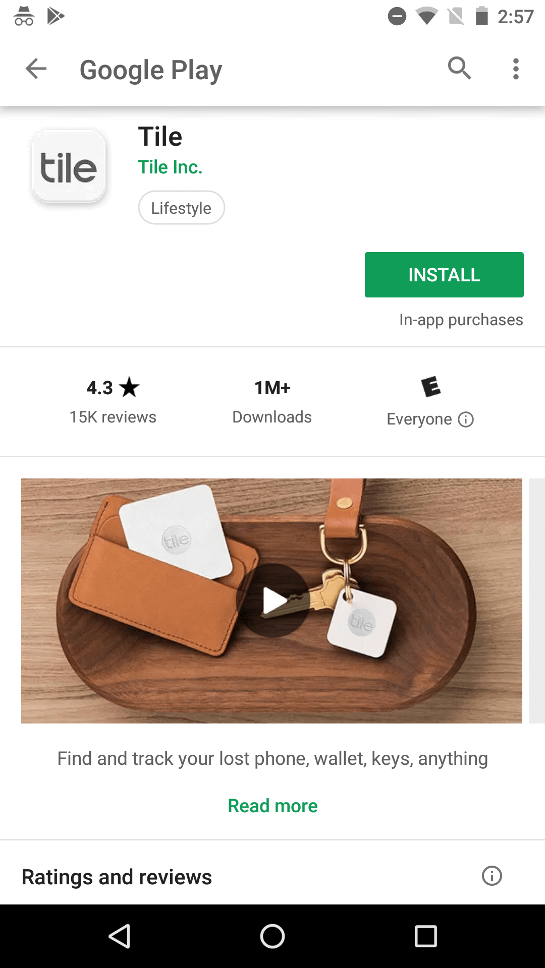 Metadata & Description Tile uses the same description on Google Play as it does for iOS. While it works better in some areas, such as the introductory paragraph’s length, using an identical description comes with several drawbacks. A description for the Google Play Store should be written with Google’s algorithm in mind. Each line and sentence should start with a relevant keyword in order to index for it, but while Tile’s description does include keywords, they’re buried within the text. As such, it will be indexed for phrases like “attack or stick Tile” and “Give your memory a break,” rather than targeted phrases such as “find your keys” or “track your stuff.” Like with iOS, it could also benefit from being reformatted. Lists are very useful on Google Play, as they’re both easy to read and provide new lines for Google’s algorithm to pull keywords from. Turning the features paragraphs into bulleted lists would help Tile improve its relevance for several valuable keywords.
Overall
Tile is a very useful app, there’s no doubting that. Many users will find the app pages on the Apple App Store and Google Play Store simply to use with their Tile devices but finding the app can also encourage people to buy the devices as well. Tile’s iOS rankings are impressive, ranking in the top ten for a multitude of valuable keywords. Those rankings are not reflected on Google Play, though, and it could increase its visibility and rankings by adjusting its description to work better with Google Play’s algorithms. All in all, Tile’s App Store Optimization is good, but could still use some improvement to fully follow ASO best practices. At the very least, it won’t get lost in the App Store listings. Want more information regarding App Store Optimization? Contact Gummicube and we’ll help get your strategy started.
More blog-posts like this:

FotMob's ASO Analysis: Penalty kick or On Target?
Apps that fail to evolve their App Store presence risk being buried beneath competitors that are actively optimizing for visibility & conversion rates.

Timeleft: Finding Friends, But Is It Finding App Store Visibility?
A/B testing alternative subtitle structures, and experimenting with screenshot designs could set Timeleft apart from its competition. Read more!

Checking In on Booking.com's ASO Strategy
Success in the App Store is driven by a combination of discoverability and conversion. Apps that excel in both areas consistently outperform the competition.