Bringing Color To The App Store: Tayasui's ASO Spotlight
May 2nd, 2025
 Tagged: Aso Services, Ios Screenshots, App Screenshots, App Metadata, App Ranking
By David Bell
CEO at Gummicube, Inc.
Even the most brilliant app can vanish into obscurity without a strategy to make it shine. Visibility isn't a bonus in the App Store; it's survival. This is where App Store Optimization (ASO) becomes critical. ASO is not just about inserting keywords into a title; it is a comprehensive approach to making your app listing as appealing, targeted, and engaging as possible to drive conversion. With over 70% of downloads attributed to search traffic on the App Store, optimizing your title, subtitle, and visual creatives is essential for success.
In this week’s ASO Spotlight, we’re focusing on Tayasui Color, a coloring app designed for creativity and relaxation, and examining its current App Store presence. We will evaluate what it does well, what can be improved, and how it compares to a major competitor in the same category. Through this analysis, we will highlight actionable insights that can benefit any app looking to strengthen its ASO strategy.
APP TITLE AND SUBTITLE: FIRST IMPRESSIONS SHAPE DISCOVERABILITY
Let’s begin with the app’s metadata, specifically the title and subtitle. Tayasui Color’s current app title appears simply as “Tayasui.” While this reflects the brand name, it lacks any description of what the app actually does. This decision favors branding over clarity and discoverability. For an app focused on digital coloring, this title is vague and fails to communicate its purpose.
In contrast, the app’s subtitle, “An amazing colouring book,” is slightly more descriptive. It hints at the functionality of the app and offers a basic understanding of its value. However, it does not go far enough. It misses an opportunity to incorporate keyword-rich phrases that could significantly improve the app’s ranking and reach.
A more strategic approach would involve revising the title to something like “Tayasui Color: Adult Coloring” (29/30 characters). This revised title maintains brand identity while adding high-value keywords such as “adult coloring book” or “art therapy,” which align with user search behavior. Similarly, an optimized subtitle like “Relax and De-Stress with Art” (28/30 characters) or “Calming, wellness, & coloring” (29/30 characters) would improve keyword coverage and attract users seeking wellness and mental health tools.
WHY KEYWORD RELEVANCE MUST BE A TOP PRIORITY FOR ASO
The App Store indexes your app’s title and subtitle, making these fields some of the most valuable assets for organic visibility. Without keywords that directly describe the app’s core function, Tayasui Color misses opportunities to appear in highly relevant search results.
Keywords are the link between user intent and app discovery. The clearer and more targeted the language, the more likely an app will appear when users are actively searching. Additionally, properly aligned metadata helps set accurate user expectations, which increases the likelihood of retention and long-term engagement.
While “Tayasui Color” includes a relevant term, it stops short of fully conveying what makes the app unique. By incorporating more descriptive or functional language into the title or subtitle, the app could strengthen its relevance in search, better align with user intent, and improve overall discoverability.
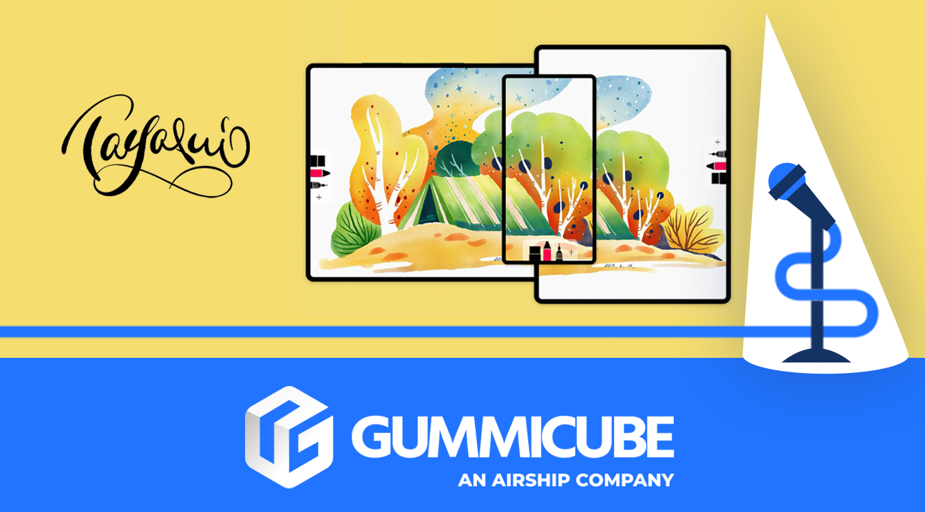
TAYASUI COLOR’S APP CREATIVES
Tayasui Color’s screenshots showcase beautiful, high-quality illustrations that represent the app’s core values of coloring for creativity and relaxation. While the goal is to highlight the breadth of content that users can interact with, they fall short in a few key areas.
First, the screenshots contain minimal copy. The limited text is small, white, and placed at the very bottom of the screen, making it difficult to read, especially against colorful gradient backgrounds. This design choice significantly diminishes the messaging power of these visuals.
Second, the screenshots do not tell a cohesive story. While the imagery throughout the screenshots is beautiful, it does not set itself apart from competitors since it does not state any of the app's key features. Effective creative strategies quickly convey an app’s value proposition. However, Tayasui Color’s visuals prioritize aesthetic appeal over clearly explaining its features, benefits, or unique qualities.
Third, the lack of keyword-aligned messaging is a missed opportunity. While screenshot copy is not indexed by the App Store, the language used still impacts user decision-making. Phrases like “relaxation through color,” “mindful creativity,” or “therapeutic art sessions” could build an emotional connection and reinforce the app’s use case. Incorporating words that are not directly related to coloring, but are still relevant to the app’s purpose, will help their reach due to those searching for those keywords in the Apple App Store.
WHY THE FIRST THREE SCREENSHOTS ARE CRUCIAL FOR CONVERSION
Users browsing the App Store make decisions in seconds. Research shows that the first three screenshots are the most impactful in converting a view into a download. These images serve as the app’s elevator pitch.
Tayasui Color currently fails to leverage these first screenshots to communicate its unique value. Instead of delivering a clear narrative about what the app does, why it matters, and who it’s for, the visuals leave users to infer meaning based on artwork alone.
A more effective strategy would include bold, high-contrast text that outlines core benefits and features. Including phrases like “Explore Thousands of Designs,” “Unwind with Daily Coloring,” or “Designed for Stress Relief” could instantly communicate utility and align the app with a user’s needs.
APP COMPETITOR BREAKDOWN: LAKE - COLORING BOOK FOR ADULTS
To understand how Tayasui Color could improve its App Store listing, it’s useful to compare it to a competitor: Lake: Coloring Book for Adults. Lake offers a well-rounded ASO strategy that covers keyword targeting, emotional messaging, and user trust signals.
App Title and Subtitle:
- The title, “Lake: Coloring Book for Adults,” is direct and includes top-performing keywords.
- The subtitle, “Color Therapy, Calming ASMR,” expands visibility into adjacent verticals like wellness and relaxation, attracting users beyond the core coloring audience.
App Creatives:
- Lake features an app store video that provides a real-time preview of the user experience.
- Screenshots are designed with clarity in mind, featuring black text on a white background for readability.
- Strategic messaging such as “Color Your Day” and “Relax Your Mind” are front-loaded to maximize engagement.
- Early screenshots highlight “13 Million Happy Users” and app awards, building immediate credibility.
- The use of seamless device mockups creates a flowing visual narrative that draws the viewer from one image to the next.
Lake’s creative choices effectively blend function and emotion. The visuals don’t just show off artwork—they tell a story that taps into user intent, offering a compelling reason to download.
KEY TAKEAWAYS AND RECOMMENDATIONS FOR TAYASUI COLOR
Tayasui Color has a strong visual foundation and delivers a high-value experience. However, its current App Store presence does not reflect the full strength of its offering. Several ASO fundamentals are either underused or entirely missing.
ASO Recommendations:
- Revise the title to include both brand and function: “Tayasui Color: Adult Coloring” (30/30 characters)
- Update the subtitle to align with broader user intent: “Relax and De-Stress with Art” (28/30 characters)
- Redesign screenshots to include bold, legible text at the top of the screenshot that conveys app values and features.
- Use the first three screenshots to outline what the app does, who it’s for, and how it benefits the user.
- Add an app store video that demonstrates the in-app experience, improving engagement and retention.
With these updates, Tayasui Color would be in a significantly stronger position to reach more users, improve conversion rates, and differentiate itself in a crowded category.
FINAL THOUGHTS
The App Store rewards clarity, focus, and well-executed storytelling. Tayasui Color is a beautifully designed app that is not reaching its full potential due to limited metadata optimization and underutilized creative assets. In contrast, competitors like Lake have set a clear standard by using ASO to build trust, communicate value, and meet user intent.
To thrive in today’s app ecosystem, discoverability and conversion must be addressed head-on. Through clear titles, emotionally resonant subtitles, and visually optimized screenshots, Tayasui Color can significantly improve performance and long-term success.
LET’S CHAT!
At Gummicube, we understand that every app has unique strengths and challenges. Whether you’re launching a new app or trying to optimize an existing one, we offer tailored ASO strategies that drive real results.
Our 15+ years of App Store Optimization Services have helped apps stand out in the App Store through smart metadata, high-performing creatives, and deep industry insight. If you’re ready to boost visibility, downloads, and user retention, we’re ready to help.
Reach out today and let’s unlock your app’s full potential.
More blog-posts like this:

Preparing for ASO Takeoff with Skyscanner
Every successful App Store listing needs to begin with a strong first impression. Read more!

That's a Wrap On Edits ASO Strategy
Let's take a closer look at where Edits succeeds and where there is room for optimization.

On The Air: FM Radio ASO Audit
In this week's App Store Spotlight, we're putting FM Radio under the ASO microscope.