Lines on Sides - App Store Spotlight
May 21st, 2021
 Tagged: Challenging Games, Minimalistic Games, Minimalist Games, App Store Spotlight, Puzzle Game, Puzzle, Puzzle Games, Lines On Sides
By Anh Nguyen
COO & Co-Founder at Gummicube, Inc
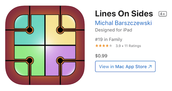
Featured by Apple in “New Games We Love,” Lines On Sides is a minimalist puzzle game that players looking for a real challenge will be sure to love. With an exceptionally popular game mechanic and great reviews, it is surprising that Lines On Sides has such low visibility on Apple’s iOS App Store outside of its recent feature.
In today’s App Store Spotlight, we take a dive behind the scenes to see how Lines On Sides can get off the sidelines and become a number one contender.
Lines On Sides - Overview
Lines On Sides is a color matching puzzle game that really tests your logic skills. Players start with no tutorials or tips, so you have to figure out the strategy as you go along. The only instructions provided are:
Your task is to arrange the tiles correctly so that each side of them is the same color as the adjacent tiles. When the tiles are properly arranged, black lines appear between them.
Not a lot of information there, which could be what users in. A general consensus among gamers who like a challenge is that new games do too much “hand holding,” with numerous tips and special bonuses that make games easier. Lines On Sides trusts that players can figure it out all by themselves. That is great news for elite puzzle gamers who want a real challenge, but from an iOS App Store metadata perspective much is left to be desired.
Title, Subtitle, and Description
From the title through the description, Lines On Sides does not make full use of text fields to incorporate high volume keywords. Apple allots 30 characters in both the title and subtitle, and each word in these fields contributes to keyword indexation in conjunction with the keyword bank.
Lines On Sides uses less than half of the space provided in the title field, which is a big hit to visibility. Adding a keyword heavy title tag following the branded title could end up building hundreds of additional phrases that would improve Lines On Sides’ ranking.
Moving down to the subtitle, there is none. Minimalism might be a fun gameplay feature, but it is not a great look for visibility. Carefully selecting high volume, phrase building keywords that also provide a glimpse of gameplay features will provide more reach to players who will love the challenge provided by Lines On Sides.
Finally, the description is using only one-tenth of the available space to let players know how fun and challenging Lines On Sides is. While the front facing metadata on Apple’s iOS App Store doesn’t build keywords in the same way as the full description on The Google Play Store, they can build relevancy for Apple Search Ads and impact which terms get served. Additionally, by giving a clear description of what the game is all about, new players may be enticed to download and play Lines On Sides to see for themselves if they are up for the challenge.
Creative Elements
Creative elements, such as the icon and App Store screenshots, are important factors for improving conversion. Perusers of Apple’s iOS App Store may make their decision download - or keep looking through competitors in search results - based on these elements alone. While Lines On Sides has a decent icon featuring one of the gameplay tiles, their screenshots are another story altogether.
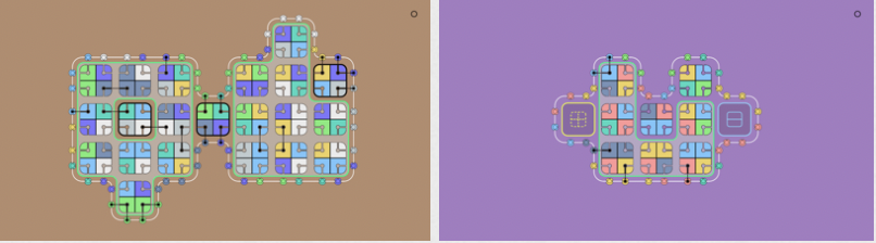
Best practices for screenshots on the app stores include providing informative and clearly visible information as quickly as possible- brief text callouts help accomplish this. These text callouts are a great way to provide insight on certain features and gameplay mechanics that are pictured.
Lines On Sides’ screenshots showcase different puzzles players will encounter, however there are no text callouts to shed light on how those features are desirable and fun to prospective users. Figuring out what the app is all about from the screenshots shouldn’t be where the user experiences a challenging puzzle.
Lines On Sides could benefit from calling out features like “Challenging,” “Minimalistic,” and certain obvious mechanics that don’t breach the “No Tips” philosophy. Using a large, bold font in a color that stands out from the background can make the text callouts stand out, not just to more quickly communicate features but to grab a user’s attention as they scroll through search results.
Overall
Lines On Sides is a tremendously fun and delightfully challenging puzzle game that appeals to puzzle gamers looking for an authentic challenge. While minimalism is the name of the game for Lines On Sides, that philosophy translates poorly to app store visibility. Line On Sides could reach more players who are looking for a game that really tests their logic skills by revising their app store optimization strategy. Adding more high volume, relevant keywords to the front facing metadata will improve visibility, and revamping the screenshots with informative, appealing language could have a huge impact on improving conversion.
Want to learn more about App Store Optimization? Contact Gummicube, and we’ll help get your strategy started.
More blog-posts like this:

Timeleft: Finding Friends, But Is It Finding App Store Visibility?
A/B testing alternative subtitle structures, and experimenting with screenshot designs could set Timeleft apart from its competition. Read more!

Checking In on Booking.com's ASO Strategy
Success in the App Store is driven by a combination of discoverability and conversion. Apps that excel in both areas consistently outperform the competition.
Mark Your Calendar: Howbout's ASO Audit
By introducing dynamic design elements & leveraging ASO tools such as App Store video and A/B testing, Howbout can significantly enhance its App Store listing.