ASO Checkup on Walgreens' App Listing
April 2nd, 2026
 Tagged: App Keywords, App Title, App Screenshots, A/b Testing, App Marketing, Aso Services, Aso, App Store Optimization, App Metadata, App Ranking
By Anh Nguyen
COO & Co-Founder at Gummicube, Inc
App Store Spotlight is an opportunity to take a closer look at how leading apps position themselves within the App Store and where there is room to refine their strategy. In this series, we evaluate both metadata and creative execution, two foundational components of App Store Optimization (ASO) that directly impact visibility, conversion, and long-term growth.
A strong App Store presence is not accidental. It is the result of consistent iteration, strategic keyword targeting, and thoughtful creative design that aligns with both brand identity and user expectations. Optimizing for the App Store or Google Play Store requires more than surface-level updates. It demands a structured approach to improving rankings for high-value keywords while maintaining a clear and compelling user experience.
Metadata updates such as titles, subtitles, and keyword optimization should follow a regular cadence. This allows developers to measure performance, validate changes, and build a roadmap based on real data. Leveraging ASO tools alongside expert guidance ensures that these updates are not only efficient but also aligned with broader growth objectives.
Creative optimization plays an equally critical role. From app icons to screenshots to preview videos, each visual element must communicate value quickly and clearly. Effective creative balances brand consistency with performance-driven design decisions, ensuring that users immediately understand the app’s purpose and benefits.
In this App Store Spotlight, we will analyze the Walgreens app listing, highlighting what it does well and where improvements can be made. We will also compare it to a key competitor to identify additional optimization opportunities.
WALGREENS’ APP METADATA ANALYSIS
Walgreens takes a straightforward approach with its app title, using only its brand name. Given Walgreens' strong brand recognition, this decision does not significantly hinder discoverability. Many users are likely searching directly for the brand, which allows the app to maintain strong visibility without additional keyword support in the title.
The subtitle, “pharmacy, photo, coupon + shop,” expands on the app’s functionality and introduces valuable keyword coverage. This approach helps the app appear in search results for users looking for services such as photo printing, prescription management, and shopping deals. The inclusion of multiple functional keywords strengthens its reach beyond branded searches.
From an App Store optimization perspective, this is a solid foundation. The metadata supports both branded and non-branded discovery, which is essential for maintaining and expanding visibility.
Another notable strategic choice is Walgreens’ placement within the Shopping category rather than the Medical app category. This distinction sets it apart from many other drugstore apps and reinforces its positioning as a retail-driven experience. Because of this, it is essential that the app continues to lean into shopping-focused language within its metadata to align with user expectations and category competition.
WALGREENS’ APP CREATIVE EFFECTIVENESS OVERVIEW
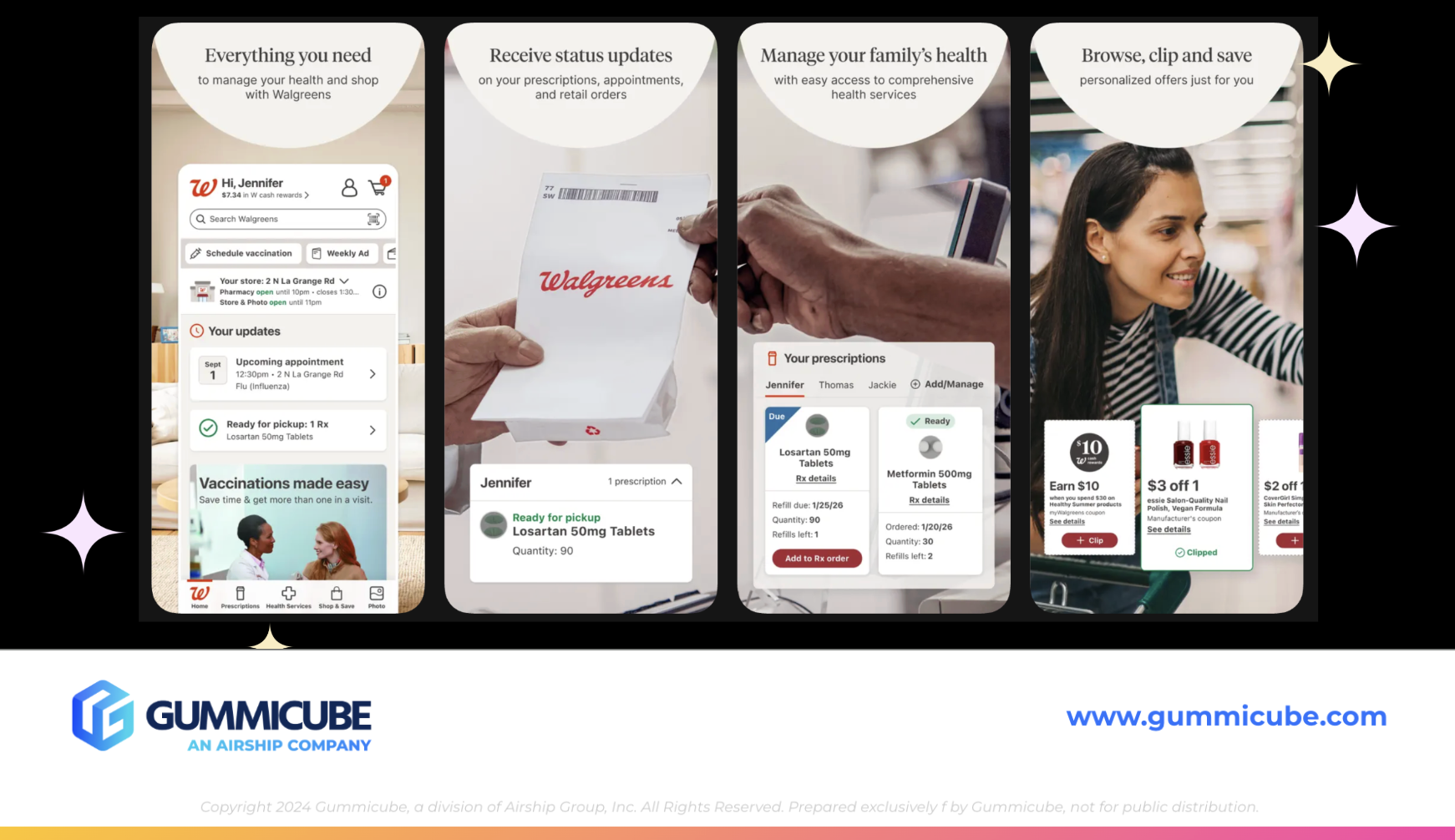
Walgreens utilizes seven out of the ten available screenshot slots in its App Store listing. This provides a strong opportunity to communicate key features and benefits, but execution ultimately determines effectiveness.
The first five screenshots incorporate realistic, lifestyle-driven imagery. These visuals feature hands-on interactions and real-world shopping scenarios, which help create a sense of familiarity and relatability for users. This approach can be highly effective when paired with clear messaging.
However, the effectiveness of these screenshots is limited by how the text is presented. Each screenshot uses a tan semicircle at the top to house its messaging. While visually distinct, this design choice limits available text space, resulting in small, difficult-to-read copy.
This becomes especially problematic in search results, where only the first three screenshots are visible. These initial visuals must immediately communicate value. If users cannot quickly read or understand the messaging, the likelihood of conversion decreases significantly.
Additionally, the combination of real-life imagery and layered design elements creates a somewhat cluttered visual experience. While the intent is to highlight multiple aspects of the app, the result can make it difficult for users to quickly grasp the purpose of each screenshot.
First Impression Impact of App Store Screenshots
The first three app screenshots are the most critical assets in an App Store listing. They function as the primary decision-making point for users browsing search results.
In Walgreens’ case, these screenshots are visually engaging but lack clarity in communication. The text is too small to be easily digestible, and the layout does not prioritize quick understanding. Users should be able to identify key features within seconds, without needing to interpret complex visuals.
A more effective approach would involve increasing text size, simplifying layouts, and ensuring that each screenshot delivers a single, clear message. This would improve readability and make the app’s value proposition more immediately apparent.
Inconsistency Within the App Store Screenshot Set
One of the more noticeable issues within the Walgreens listing is the lack of consistency across its screenshot set. While the first five screenshots rely on real-life imagery, the final two shift to a more traditional format with plain backgrounds and iPhone mockups.
This abrupt transition disrupts the visual flow of the listing. Instead of feeling like a cohesive narrative, the screenshots appear disconnected. Consistency is key to maintaining a polished, professional appearance, and any deviation should feel intentional rather than overlooked.
Extending the lifestyle imagery approach across all screenshots or transitioning more gradually would create a more unified experience. Consistency not only improves aesthetics but also reinforces brand identity.
APP COMPETITOR COMPARISON: CVS HEALTH
To better understand opportunities for improvement, it is helpful to compare Walgreens to a direct competitor, CVS Health.
Similar to Walgreens, CVS uses its brand name as the app title. This is a common strategy among well-established brands that already benefit from high search volume. Its subtitle, “pharmacy, healthcare, shopping,” closely mirrors Walgreens’ approach while placing greater emphasis on healthcare-related functionality. From a metadata perspective, both apps are effectively leveraging their subtitles to expand keyword reach.
APP CREATIVE STRATEGY DIFFERENCES
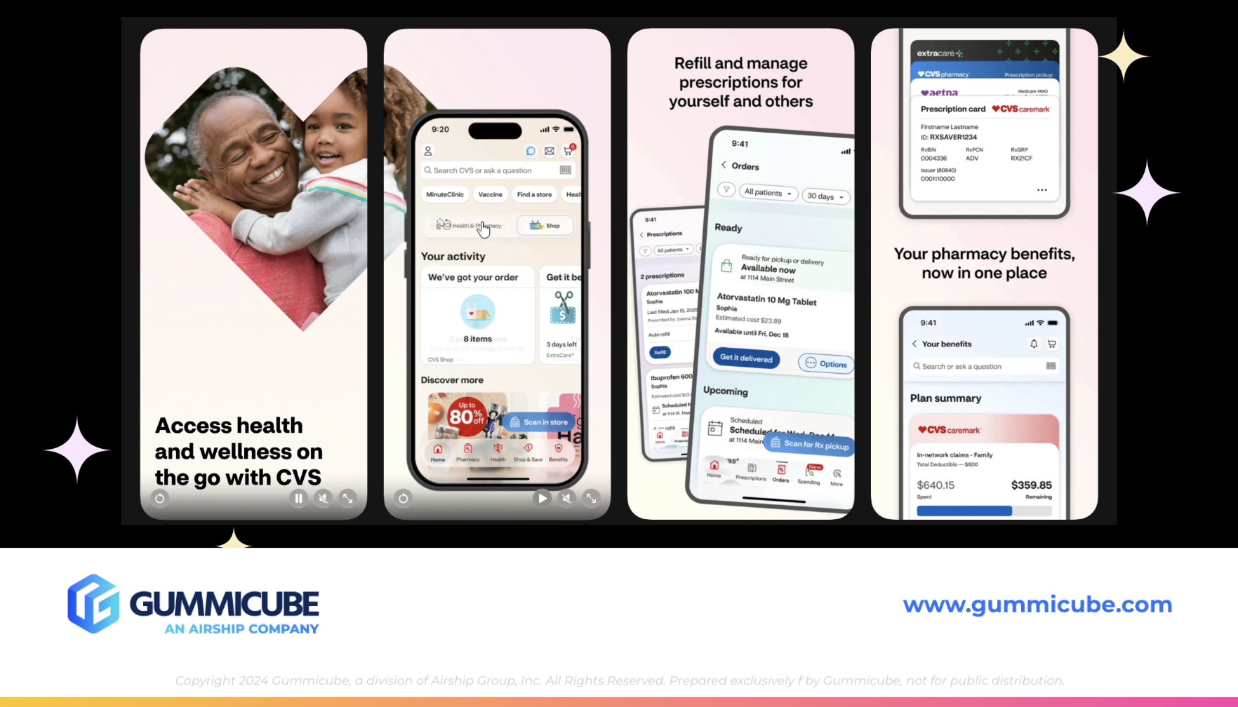
Where CVS begins to differentiate itself is in its creative execution. CVS also uses seven screenshots, but its design prioritizes clarity and readability. The text is large, bold, and easy to interpret, making it more effective at quickly capturing user attention. This is particularly important in search results, where users scan multiple apps quickly.
Additionally, CVS incorporates an App Store preview video. This adds an interactive element to the listing and provides an opportunity to showcase functionality dynamically. Video content can significantly improve engagement and conversion when executed well.
While CVS does not rely as heavily on lifestyle imagery in every screenshot, it compensates with strong layout design. The use of layered iPhone mockups and varied compositions creates visual interest without sacrificing clarity. This variation in layout prevents the screenshot set from feeling repetitive. It encourages users to continue engaging with the listing, which can positively impact conversion rates.
App Screenshot Design Strengths and Opportunities
CVS demonstrates a strong understanding of hierarchy and readability. Its text placement ensures key messages are immediately visible, and its use of mockups highlights app functionality in a structured way.
That said, there is still room for improvement. The background design, which relies heavily on a white-to-pink gradient, could benefit from additional visual elements to create a more dynamic and branded experience.
Even so, CVS provides a strong example of how thoughtful design choices can enhance clarity and engagement.
KEY TAKEAWAYS FOR ASO
The comparison between Walgreens and CVS highlights several important principles of App Store optimization.
First, readability is critical. No matter how visually appealing a design may be, it must communicate clearly and quickly. Text should always be large enough to read at a glance, especially within the first three screenshots.
Second, consistency matters. A cohesive screenshot set creates a more professional and trustworthy impression. Any variation in style should feel intentional and aligned with the overall narrative.
Third, balance is essential. Lifestyle imagery can be highly effective, but it must be paired with clear messaging. Similarly, structured designs using mockups should still feel engaging and visually appealing.
Finally, leveraging additional assets such as preview videos can provide a competitive advantage. These elements offer more opportunities to capture attention and demonstrate value.
FINAL THOUGHTS
The Walgreens app listing establishes a strong foundation with its metadata strategy and recognizable brand presence. Its subtitle effectively expands keyword reach, and its category positioning supports its retail-focused identity. However, there are clear opportunities to improve creative execution. Enhancing text readability, simplifying layouts, and creating a more consistent screenshot experience would significantly strengthen its ability to convert users.
The comparison with CVS Health underscores the importance of clarity and structure in screenshot design. While both apps are well-positioned from a metadata perspective, creative decisions ultimately play a defining role in user engagement.
App Store optimization is an ongoing process that requires continuous refinement. By combining data-driven insights with thoughtful design, developers can create listings that not only attract users but also convert them effectively.
LET’S CHAT!
If you are evaluating your own app listing and wondering where you can improve, you are not alone. App Store optimization can feel complex, but the right strategy makes all the difference.
Our ASO services and team of experts work closely with developers to identify opportunities across metadata and creative, helping turn insights into measurable growth. Whether you are refining your keyword strategy or rethinking your screenshots, even small changes can have a meaningful impact. If you are ready to explore what is possible for your app, let’s start the conversation.
More blog-posts like this:

On The Air: FM Radio ASO Audit
In this week's App Store Spotlight, we're putting FM Radio under the ASO microscope.

FotMob's ASO Analysis: Penalty kick or On Target?
Apps that fail to evolve their App Store presence risk being buried beneath competitors that are actively optimizing for visibility & conversion rates.

Timeleft: Finding Friends, But Is It Finding App Store Visibility?
A/B testing alternative subtitle structures, and experimenting with screenshot designs could set Timeleft apart from its competition. Read more!