ASO Spring Cleaning with Sweepy
March 27th, 2026
 Tagged: App Creatives, App Store Promotional Text, Aso, Aso Services, App Metadata, App Subtitle, App Title, App Ranking
By Anh Nguyen
COO & Co-Founder at Gummicube, Inc
As spring arrives, so does the renewed motivation to reset routines, declutter spaces, and build better habits at home. Seasonal shifts like this do not just impact households; they also influence how users search, discover, and engage with apps on the App Store. This creates a timely opportunity for developers to refine their App Store presence and align messaging with evolving user intent.
In this week’s App Store Spotlight, we are taking a closer look at Sweepy: Home Cleaning Schedule, an app designed to simplify household cleaning routines and make chore management more approachable. With spring cleaning top of mind for many families, this is a highly relevant moment to evaluate how well Sweepy is positioned to capture seasonal demand. As always, we will break down Sweepy’s App Store listing through the lens of App Store Optimization (ASO) best practices, highlighting what the app is doing effectively, where there is room for improvement, and how it compares to a key competitor in the space.
WHAT AN APP LISTING SHOULD ACCOMPLISH
Before diving into Sweepy specifically, it is important to ground this analysis in the fundamentals of ASO. A strong App Store listing is built on three core pillars: keyword optimization, compelling creative, and continuous mobile app A/B testing, all of which work together to drive both visibility and conversion.
Your title and subtitle carry significant weight in search rankings because they are among the most heavily indexed components of your listing. This means they directly impact how often your app appears in relevant search results, making it essential that every word is intentional, high-volume, and aligned with user behavior. With limited character space available, there is no room for redundancy or missed opportunities.
Creative assets, including screenshots and app previews, play an equally critical role by driving conversion and helping users quickly understand your app’s value proposition before they ever tap into the product page. Consistent A/B testing ensures that your listing evolves alongside user preferences and market trends, allowing developers to refine messaging and creative based on real performance data rather than assumptions.
APP TITLE AND SUBTITLE FOR SWEEPY
Sweepy’s current title, “Sweepy: Home Cleaning Schedule,” paired with the subtitle “Schedule Your House Chores,” provides a strong foundation from a keyword perspective, as both fields clearly target relevant, high-intent search terms such as “home cleaning schedule” and “house chores.” These are phrases users are actively searching for, particularly during the spring season when cleaning routines become a priority, which positions the app well to capture that demand.
However, the issue lies in repetition, as both the title and subtitle communicate nearly identical ideas instead of expanding keyword reach. Given that developers only have 30 characters for each field, this duplication represents a missed opportunity to introduce complementary keywords and broaden visibility across more search queries.
A more effective approach would involve using the subtitle to reinforce the app’s value while diversifying keyword coverage. For example, variations such as “House chores made easy” or “Smart cleaning and chore tracker” maintain relevance while introducing benefit-driven language that may resonate more strongly with users seeking simplicity and efficiency. These alternatives also open the door to ranking for additional keyword combinations that the current metadata may not capture.
Implementing these changes should always be supported by A/B testing, as even small adjustments to phrasing can significantly impact tap-through and conversion rates. A data-driven approach ensures that any updates are validated against real user behavior, ultimately leading to stronger performance over time.
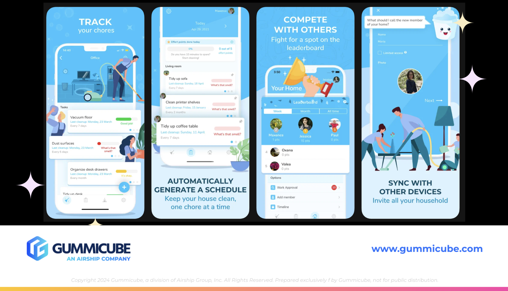
APP SCREENSHOTS: ENGAGING DESIGN WITH ROOM FOR REFINEMENT
Sweepy currently uses 6 out of 10 available screenshot slots, which provides a solid foundation but still leaves additional opportunities to communicate value and showcase features more comprehensively. Maximizing all available creative space can help reinforce messaging and address different user motivations within the same listing.
The app performs well in several areas, particularly in its ability to create visual flow across screenshots. The alternating placement of iPhone mockups establishes a dynamic rhythm, while the wave-like background ties the sequence together cohesively. White text contrasts effectively against the darker blue background, ensuring readability, and the inclusion of illustrated cleaning characters reinforces the app’s purpose in a way that feels consistent with the overall theme.
At the same time, the overall execution feels overly busy, with too many elements competing for attention in each frame. Large text, detailed backgrounds, character illustrations, and device mockups are all layered together, resulting in a lack of negative space that can make it more difficult for users to quickly process key information. In a mobile-first environment where decisions are made within seconds, this level of visual density can hinder clarity rather than enhance it.
A more refined approach would involve slightly reducing the size of iPhone mockups to allow for stronger text hierarchy, while also introducing more negative space to create balance and improve readability. Simplifying background elements and ensuring that each visual component serves a clear purpose would help guide the user’s eye more naturally through the content. The goal is not to remove personality, but to create a more focused and digestible experience that communicates value quickly and effectively.
APP COMPETITOR COMPARISON: FLYLADY ROUTINES AND CLEANING
To better understand Sweepy’s positioning, it is useful to compare it to a direct competitor, FlyLady: Routines and Cleaning. While this app falls under the Lifestyle category and Sweepy under Productivity, both compete for the same core keywords related to cleaning routines and household management, putting them in direct competition in search results.
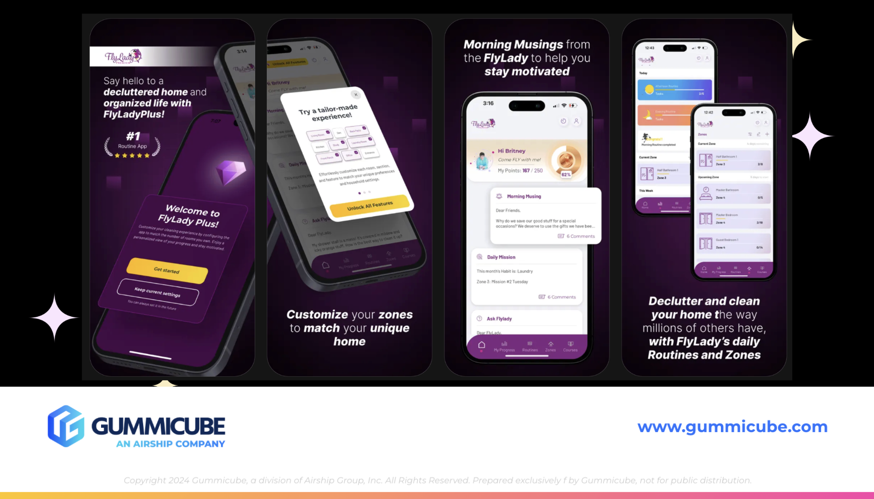
FlyLady holds a strong position with approximately 21,000 ratings and 4.9 stars, compared to Sweepy’s 9.6K ratings and 4.7 stars, indicating high user satisfaction and engagement. From a metadata perspective, FlyLady effectively executes its title and subtitle by clearly communicating the app’s purpose without unnecessary repetition, while the subtitle “Cleaning made easy” reinforces the value proposition in a concise, user-friendly way.
One potential drawback is the app icon, which features a butterfly design that does not immediately convey a cleaning or home organization theme. This could create a disconnect for users scanning search results, where visual cues often play a significant role in decision-making and first impressions.
Where FlyLady truly stands out is its screenshot strategy, which uses 7 screenshots to more effectively leverage available space and guide users through its features. The first two screenshots feature overlapping iPhone mockups that create a seamless visual transition, drawing the viewer’s attention forward and encouraging continued engagement. A consistent dark purple to black gradient establishes a cohesive visual identity, while white text with varied weight creates a clear hierarchy and improves readability.
The inclusion of social proof in the first screenshot adds an additional layer of credibility, which can influence user trust early in the decision-making process. At the same time, the screenshots maintain clarity by avoiding excessive design elements, allowing the messaging and features to remain the focal point. This balance between engagement and simplicity makes the content easy to scan and understand, providing a strong example of effective creative execution.
APP CATEGORY DIFFERENTIATION AND KEYWORD COMPETITION
Although Sweepy and FlyLady are placed in different categories, Productivity and Lifestyle, respectively, they still compete directly for the same search terms, which underscores the importance of a strong keyword strategy. Category placement does not limit visibility within search, as users searching for terms like “cleaning schedule” or “chore tracker” will encounter apps across multiple categories.
This dynamic creates an opportunity for Sweepy to differentiate itself more clearly through positioning. By leaning into its Productivity classification, the app can emphasize themes such as efficiency, time management, and structured routines, which may resonate more strongly with users seeking practical solutions rather than lifestyle inspiration.
THE IMPORTANCE OF CONTINUOUS MOBILE APP A/B TESTING
ASO is not a one-time effort but an ongoing process that requires consistent testing, analysis, and refinement in order to remain competitive. User behavior evolves over time, competitors adjust their strategies, and seasonal trends shift search patterns, all of which necessitate a flexible and data-driven approach.
For Sweepy, this means exploring opportunities to test alternative subtitles, refine screenshot design for improved clarity, expand the number of screenshots to fully utilize available space, and experiment with messaging that highlights its productivity-focused value proposition. Leveraging ASO tools for keyword research, competitor analysis, and A/B testing allows developers to make informed decisions based on performance data, ultimately driving stronger results.
FINAL THOUGHTS
Sweepy is a strong app with a clear and relevant purpose, particularly during the spring season when cleaning routines become a priority for many households. Its App Store listing demonstrates a solid foundation with effective keyword targeting and visually engaging creative, but there are clear opportunities to refine and elevate its performance.
By reducing redundancy in metadata, simplifying screenshot design, and committing to continuous testing, Sweepy can strengthen both its visibility and conversion rates. When compared to competitors like FlyLady, it becomes evident that success lies in balancing engaging design with clarity and focus, ensuring that users can quickly understand and connect with the app’s value.
LET’S CHAT!
App Store Optimization requires a strategic and ongoing approach that combines keyword research, creative refinement, and performance analysis to drive meaningful growth. Every element of your App Store listing contributes to how users discover and engage with your app, making it essential to continuously optimize and adapt.
If you are looking to improve your app’s visibility, conversion rates, and overall performance, ASO services can provide the expertise and tools needed to achieve those goals. Let’s start a conversation about how to position your app for long-term success and ensure it remains competitive in an ever-evolving marketplace.
More blog-posts like this:

FotMob's ASO Analysis: Penalty kick or On Target?
Apps that fail to evolve their App Store presence risk being buried beneath competitors that are actively optimizing for visibility & conversion rates.

Timeleft: Finding Friends, But Is It Finding App Store Visibility?
A/B testing alternative subtitle structures, and experimenting with screenshot designs could set Timeleft apart from its competition. Read more!

Checking In on Booking.com's ASO Strategy
Success in the App Store is driven by a combination of discoverability and conversion. Apps that excel in both areas consistently outperform the competition.